How Paint Color Percentages Work and When To Use Them
If you’ve been following along on Instagram, you know we’re deep in our entryway renovation (which has been two years in the making!) and we’re finally to the fun part… paint. This is the first time we’ve hired professional painters and I really wanted to get the colors just perfect. It’s a big expense, the design plan includes painted stripes, and it’s the room in our home with the most wall space. When swatching, I decided to test some paint percentages for a monochromatic look and immediately received questions. This blog post contains all the answers… everything you need to know about using and ordering paint color percentages, as well as an easy chart showing how it works!
If you missed our entryway renovation before images and design plan, be sure to check that out. My last entryway renovation update covered millwork & electrical, which I shared back in October. Things have certainly evolved since then, and I’ll be sharing the big reveal this spring! The painters are wrapping up this week, but onto all things paint color percentages… let’s dive into how I picked the paint colors.
What Adjusting the Percentage Does To A Paint Color
Adjusting the paint color percent changes the value of the color. What does value mean? It describes the overall intensity of a color, referring to how light or dark a swatch is. If you’d like to adjust the lightness or darkness of a paint color, this is where using percentages comes in handy!
Examples of How Paint Color Percentage Works
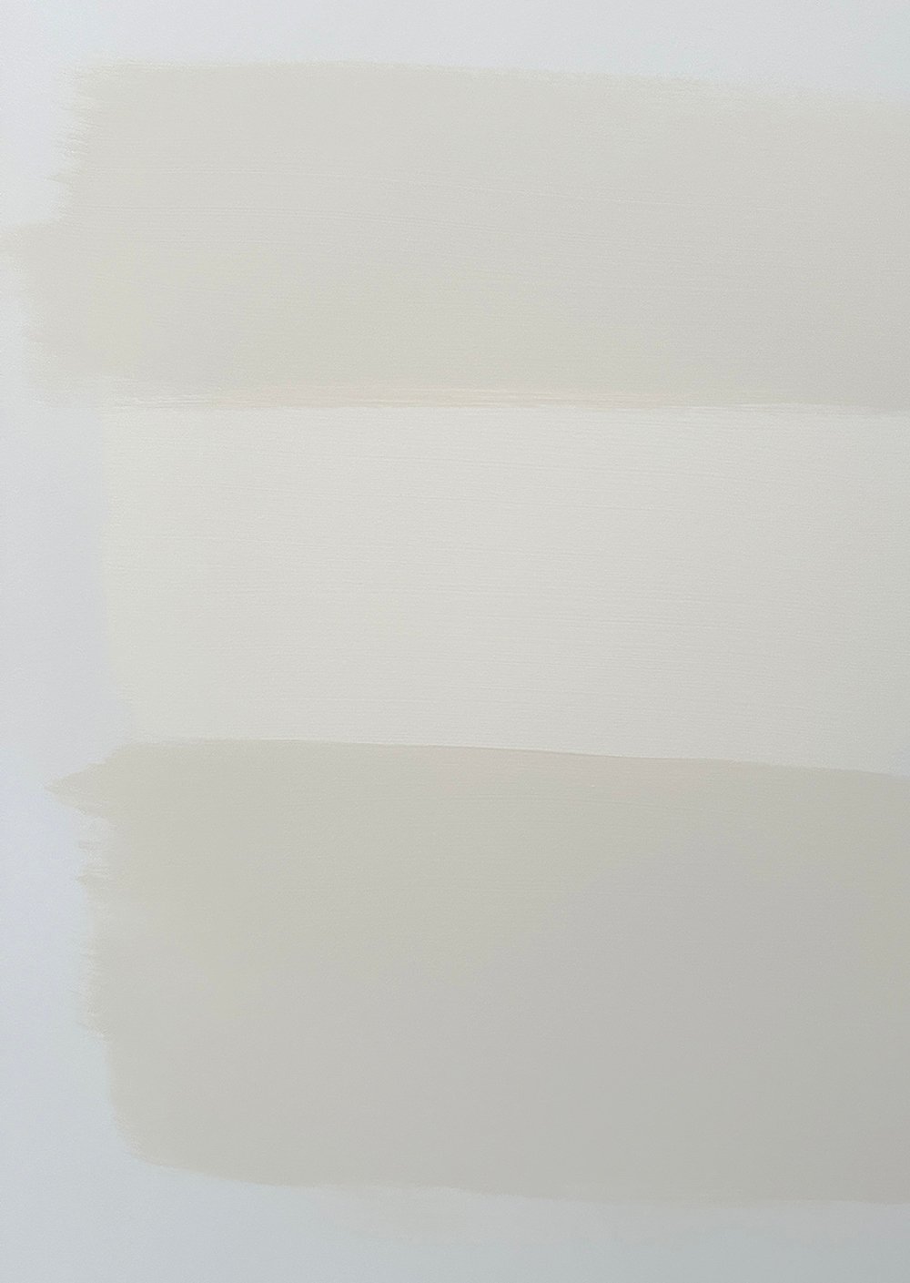
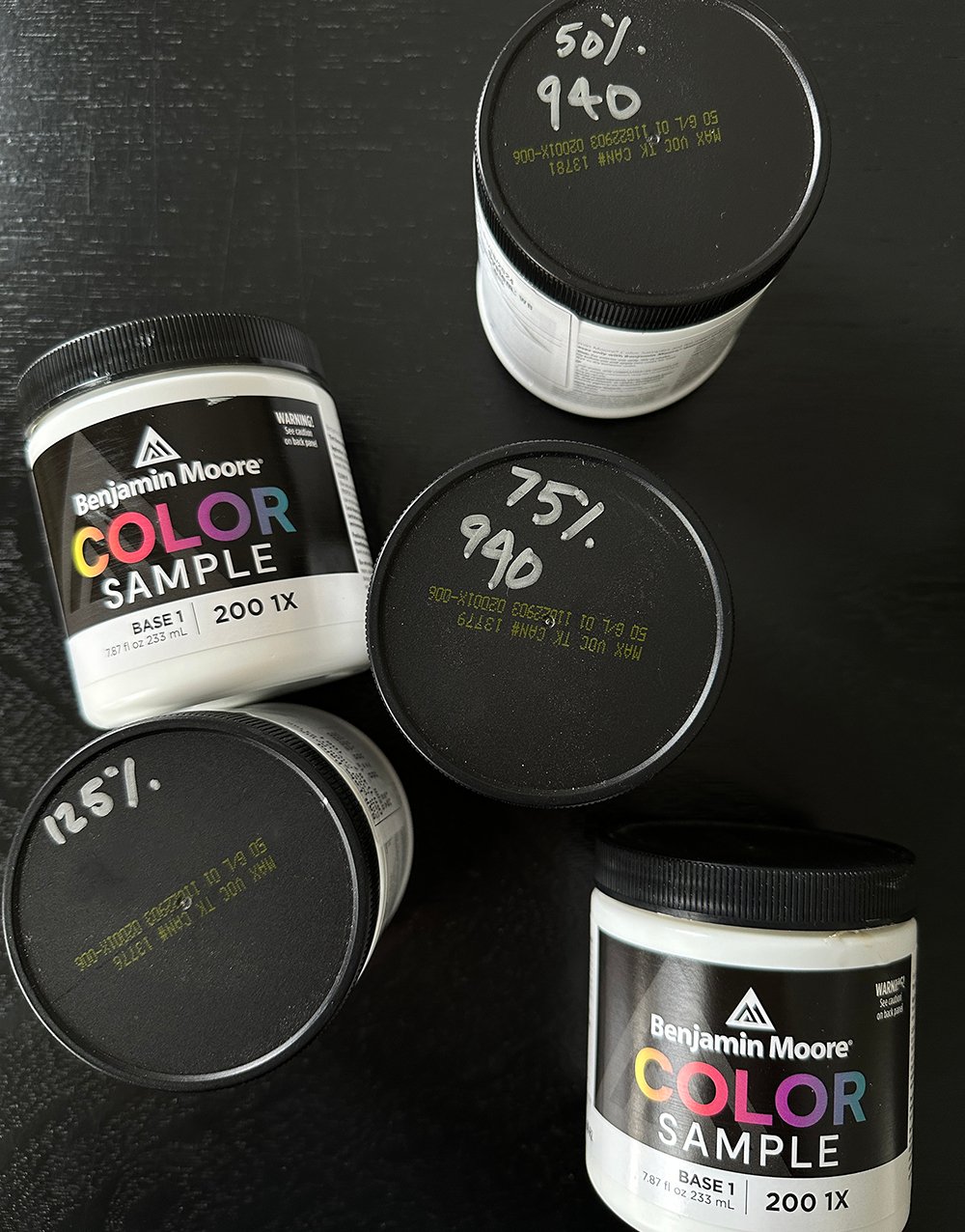
How exactly do paint color percentages work? A paint at 75% means only 75% of the paint formula will go into the paint can. The remaining 25% is the base color (usually neutral white or off white). Here’s an example using Benjamin Moore’s Royal Silk… the true swatch is in the center (at 100%).
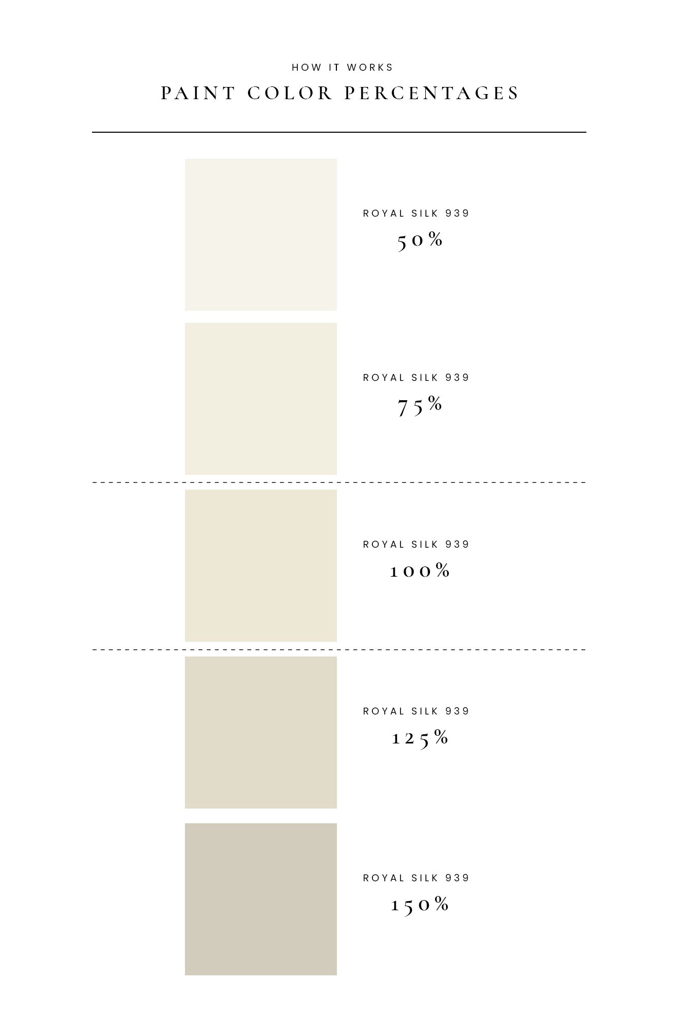
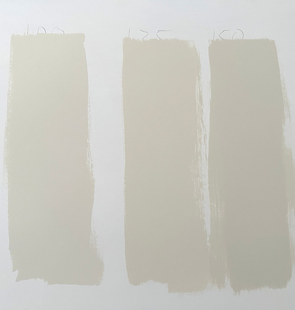
The painted versions of Royal Silk are pictured below on my wall (100%, 125%, and 150%). Paint color percentages typically work in 25% increments, so keep that in mind when ordering or experimenting with swatches.
When To Use a Percentage
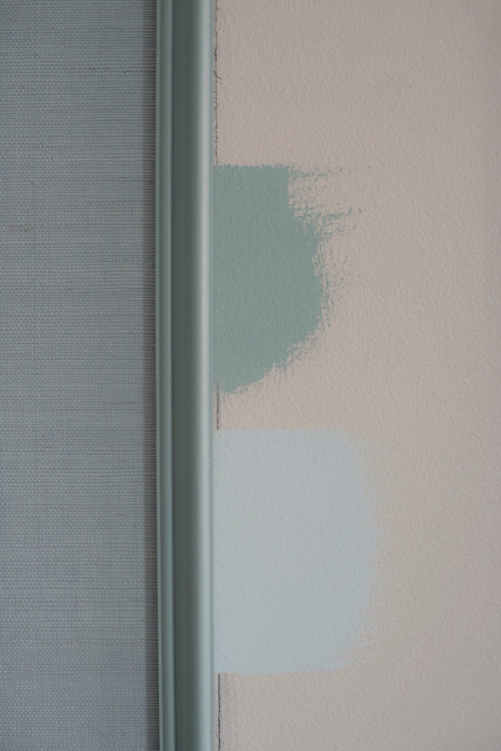
When would you need to use a percentage of a paint color? If you’re trying to achieve a monochromatic aesthetic, tonal look, are color blocking, are painting contrast trim, or just want a variation of a color you love. It’s an easy way to adjust a swatch, if you like a color but need it to be a touch darker or lighter. In the case of my entryway, I was testing percentages for monochromatic color blocked stripes.
How to Order a Paint Color Percentage
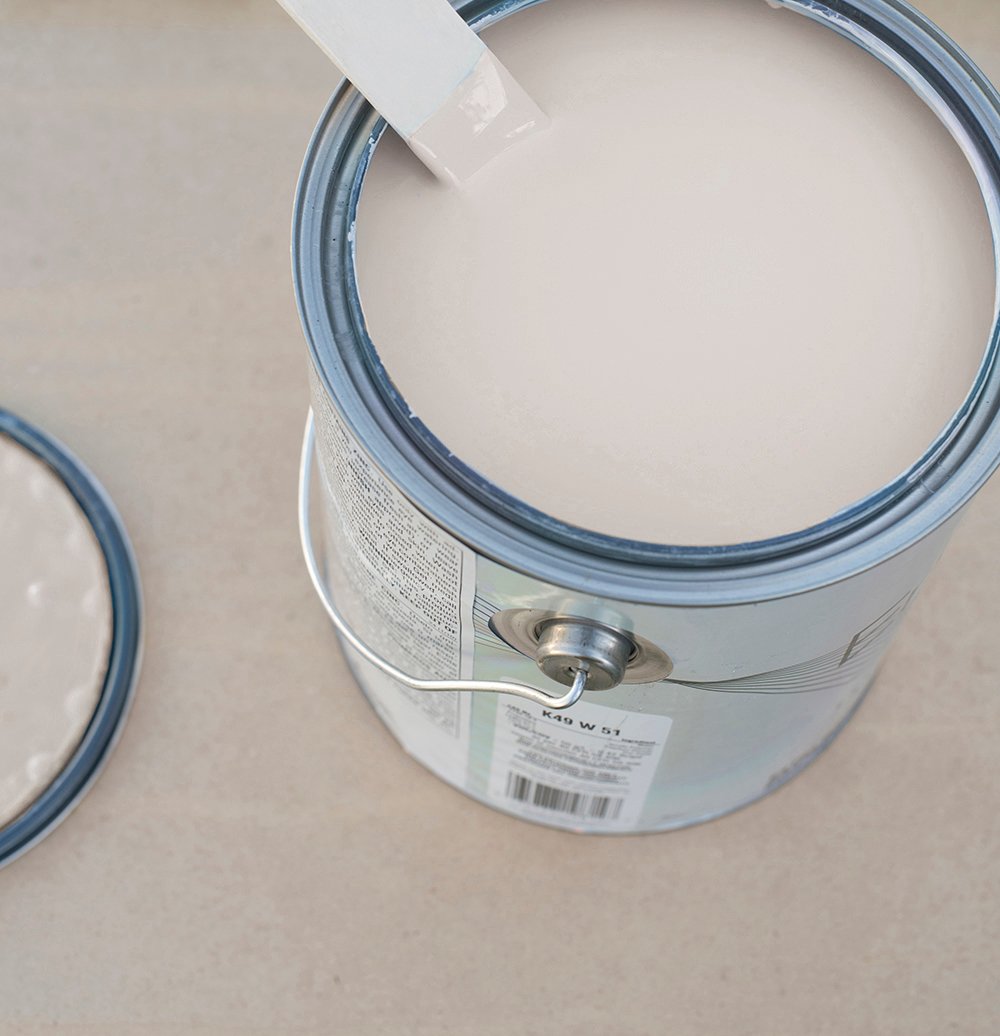
Speciality paint retailers (Sherwin-Williams, Benjamin Moore, Farrow & Ball, etc) will know exactly what you’re asking for. Choose your color and ask, “I’d like a gallon of Royal Silk at 125%.” Since percentages don’t have individual swatches, it’s very important to get a sample pot. I highly recommend testing paint before you fully commit!
FAQ
Check out this post for help on choosing the perfect paint color! I think it’s also important to remember a paint color that looks good in my home, will look totally different in yours. Don’t choose colors based on a swatch that looked good in someone else’s space. It can also vary from room to room. Paint absorbs, reflects, and changes depending on the lighting and its surroundings… that’s why swatching is super important!
Honestly, no… but I’d say it depends on where you were ordering the paint from. I’ve found specialty paint stores to be more knowledgable than big box home improvement retailers. If you’re ordering paint from Benjamin Moore or Sherwin-Williams, they’ll definitely know how to mix paint percentages. Whereas, I could see it being more of an anomaly at places like Lowe’s or Home Depot, depending on who is behind the paint counter.
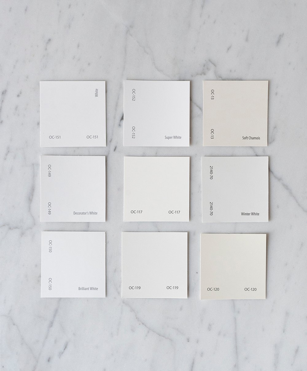
Designers and trade members (architects, builders, etc) have access to the larger fan decks, but you can usually find them online to buy from places like Amazon or Ebay. Some may be outdated by a year or so, but most of the colors remain the same and it’s a worthy investment. You can also grab loose swatches from your local paint store! Those are especially helpful when pulling together physical interior design mood boards.
I’d skim coat over it! Check out this post on how to achieve perfectly smooth walls, a skim coating tutorial. If that sounds like too much work, opt for a flat or eggshell finish as opposed to semigloss or gloss, which can reflect the texture and accentuate it.
Related
I’ve shared many posts on painting, choosing a color, and my favorite swatches… give the following a read, if you’ve missed any of these! I hope they’re equally as helpful.
- Favorite Benjamin Moore Paint Swatches
- Color Matching Our Kitchen Cabinets (+Painting Tips)
- 10 Painting Tips for Cutting In
- Tips for a Durable, Professional Looking Spray Paint Finish
- 10 Pro Painting Tips
- Timeless Paint Colors and Favorite Pairings
- How to Paint a Door
- Favorite Paint Swatches from the Sherwin-Williams Designer Deck
- Designer Trick : Choosing the Perfect Paint Color
- My Favorite Green Paint Colors
- The Best Spray Paint Colors
I hope this post answered all of your questions about how paint percentages work. Feel free to ask more questions in the comment section below- I’m here to help! I’m really looking forward to sharing our finished entryway renovation with you… it’s looking SO good! Have a great week, friends.
Good morning! I love Paint Talk. While I have never invested in an entire deck, I’ve certainly collected more than my fair share of individual paint swatches over the years. Most brands now seem to use single-color cards, but I remember cards used to contain 4 or 5 different colors. I assumed those were different values of the same hue…although they did boast different names. I’m not entirely confident that our local paint department could manage a paint percentage, but I appreciate knowing how it works! I can definitely imagine it being handy for contrast trim. As for testing paint samples, I can not imagine choosing a color without at least 3 swatches. I have friends who just gleefully look at a paint chip and buy a few gallons. Clutches pearls. Haha. That is not me. The entry sneak peeks are looking stellar! That space is going to be a showstopper. Cheers to another January week! Have a great one, Sarah!💜
Paint talk is my kind of talk! I have a basket of swatches, decks, and all the fun sample pots. It’s always fun to play with colors. I have definitely looked at a paint chipped and made an impulse purchase, but I think swatching is the way to go. It’s the best kind of reassurance (and it’s exciting). I’m excited to share more of the entryway- it’s looking so good!! Hope you’re having a super week.
Ahhh, thank you for this! Good morning Sarah- this was immensely helpful. I was searching paint for our kitchen and wanted to try a percentage of Adobe Sand by Behr. What they tried to give me was the next lightest color on the swatch card, so I ordered it the normal way. I’m glad I didn’t go with a percentage for that project, but SW happily obliged when I swatched for the front room. In the future, I know to simply color match at SW and go from there- learned the hard way on that one. Having fan decks has been super helpful, and I love that I no longer have to make a special trip just to pick up swatch cards. The colors you selected for the entryway are gorgeous, and I can’t wait to see the end result. It’s going to be such a beautiful backdrop. How has your experience been with the painters? It looked like they were moving along quickly, and super clean compared to other painters I’ve seen! It’s going to be such a dramatically different space when the stripes are finished- so exciting! Thank you for clarifying all of this information; this is immensely helpful. Cheers to a fresh week!
I’m so glad to hear that, Lauren! Also good to know about your paint experience at different retailers. The entryway colors really had me stumped for a couple of weeks. Now that the stripes are almost finished, I’m really happy with the colors, but whew- took me awhile to get there. I have LOVED our painters. They’re super nice, are doing an amazing shop, have been really respectful, and are detail oriented. Oh- and their price was more than fair. I feel really thankful we hired it out. They’ve been here for 7 days now, and are still not finished. It would have taken Emmett & I an eternity. Hope you’re having a good week!
Good morning!
I love a great paint discussion and the options of paint colors in a deck of paint chips is astounding. I’m not familiar with decreasing or increasing percentages of paint hue but it makes sense. I have painted enough in my day I have several paint decks but many paint retailers will let you borrow a set to take home which is incredibly helpful.
Sarah I’m super excited about your striped entryway. A Canadian blogger in Ontario painted her historic home entryway in stripes using two different colors ( like a white and beige tone) and it was so incredibly pretty. It’s the only time I’ve seen such a treatment but I’m sure your color selection will be stunning. You are so creative I’ve loved all the color blocking and color combo’s you have chosen. The maroon bedroom was so beautiful. You have such an eye for color pairings. The two tone cabinet treatment in your basement kitchen is another great example of your endless creativity with paint. Im simply bursting with excitement over the entryway. And of course the basement too!! Can’t wait 😜
Hi Colleen! Great tip on borrowing the paint decks- that’s another awesome option. I’m super excited about our entryway. I’m working on a blog post update for that right now. Things are really coming along. Thanks for your kind words- you made my day! I do love an interesting paint pairing though. Our house is in disarray, but all these projects feel so exciting. We’re about to leave for a ski trip, then it will be a mad dash to the finish line!
Yeah – the employee at my local Lowe’s had a bit of trouble wrapping her head around me wanting a fairly light color mixed at 25% but she finally understood when she looked at me and said “that’s going to look almost white” and I replied “that’s the whole point.”
Our house is relatively dark inside (small windows with porches shading the front & back) but I’m not really a fan of “white” paint. I usually want something with more color than any of the available shades of white but lighter than the lightest paint on a strip.
So far we have a creamy pale yellow in the basement (not a favorite color but the ugly yellow floor tile is in too good of shape to replace) and an almost white, pale pink in the office. The pink is going to be repeated in all the interconnected main living spaces and a similar pale peach will go in the master suite and hall bathroom. My next challenge will be to decide what to use in the combination guest & sewing room – I might actually use an actual white paint!
Yeah, I’ve heard similar stories at big box stories. I’ve never had an issue at a paint store, but I’m glad you were able to convey what you wanted. Sometimes a little tint is all you need! It sounds like a great fit for your house. Good luck with painting your guest & sewing room, Cheryl!
It was interesting to read that you need to specify the percentages. I’m quite used to seeing eighth, quarter, half, double and triple versions of some colours on the swatch cards at Resene (a NZ paint manufacturer) – they seem to especially do it for the whites and neutrals. Hadn’t ever thought of 125% or 150% though – that offers another level of flexibility (which would probably translate to another level of indecision on my part!!). Looking forward to seeing the grand reveal of the space :)
So interesting! I had no idea it varied so much from the US to NZ. Thanks for keeping up with my projects, Lauren! Hope you’re having a good week.
I would like to colour drench a room. Wanting to carry the same colour on the ceiling but wondering what paint colour percentage I should use. I want the overall intensity of the colour to go down for the ceiling. In other words I want to use the same paint colour and just adjust the lightness of the paint colour. What percentage is recommended? 75%, 50%, etc…for the ceiling.
It’s dependent on the color! I’d swatch 60% and see where that gets you. Hope that helps!
The percentage trick is clutch. I also have the store bump primer to a close tone for deep hues.