Trend Alert : Contrast Trim
 If you follow along on stories, you probably already know what color we painted the master bedroom. I haven’t shared the reveal yet, but…. spoiler alert– theres lots of beautiful contrast trim. It’s a paint trend I’ve been noticing more and more lately! Basically, the wall color and trim color are reversed- lighter walls with darker trim. It’s not for everyone, but it certainly makes a statement and showcases beautiful millwork, mouldings, and architectural features. I’m 100% on board. Click through for beautiful examples and lots of inspiration…
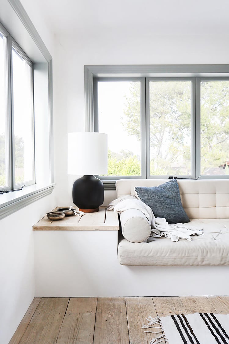
Contrast millwork certainly isn’t a new concept. It’s been around forever and is really quite classic! I love that we’re seeing more and more people stray from standard white trim and mouldings in their homes. I opted for a subtle color palette in my bedroom, but for those of you jumping on the high-contrast train, like the navy and white image below, you deserve mega bonus points. The risk seems to always pay off.
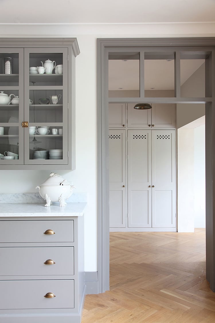
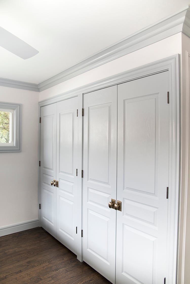
 You can also mix and match your painted trim. For instance, the image below features custom cabinetry, built-ins, door casings, and base board all painted the same gray, but did you notice the crown moulding? It’s white! I actually like that the crown was left white… it gives your eye a place to rest and makes the ceiling height appear a bit taller than it actually is. It all depends on the space!
 Whether you’re ready to try contrast trim that is light and subtle, or heavy and high-contrast, each look nods to the lines of your home.
 It’s funny, I was chatting with my sister on the phone (who is our number one fan when it comes to the renovation), and she confessed there is one thing she didn’t love that we have done so far. Any guesses? Yep, the contrast trim in the master. Like I said, it’s not for everyone, but I think these images are proof that it’s pretty gorgeous when done well! My sister and I have a pretty similar aesthetic, so I have a feeling she’ll come around. You can get a glimpse into the space she’s talking about below. If you’re interested on what’s behind those doors, find my closet here, and Emmett’s closet here.
 While we’re on the topic of trim, we used Metrie for our entire renovation and I couldn’t be happier! If you’re not sure where to start or which millwork style is appropriate for your home, they take the guesswork out of the equation, breaking their collections down by styles. I selected a ton of mouldings from the Fashion Forward Collection. The world of millwork is super vast, but it’s amazing how it instantly transforms a home. I completed a seminar on interior mouldings and my eyes were totally opened. Ever since, it’s been a huge priority during renovating or home updates- as opposed to an afterthought.
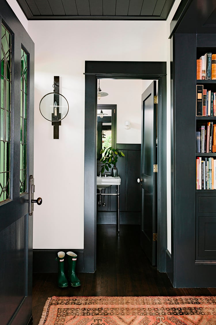
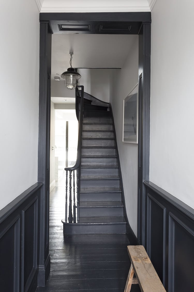
In my opinion, the best part of an old home is the character. To me, most of the character lies within the architecture. Millwork is a huge part of that! How charming is this charcoal and white hallway that leads up a spiral staircase? From the wainscoting to the stair rail, everything ties together nicely to tell a beautiful story and draws you up the staircase.
 What do you think? Are you guys loving this trend as much as I am? I almost hate to call it a trend because it’s really such a classic way of painting that has been around forever and will continue to withstand the test of time. I’m just glad it’s resurfacing! Thoughts? I’d love to hear them!
images: one | two | three | four | five (room for tuesday) | six
I’m drawn to some of the more drastic contrast trims, like black and dark grey, but I’d have to say my favorite contrast trim would be a dark stained wood against white walls! We almost went with that for our house, but in the interest of saving money, and the fact that I wanted my black windows to really stand out, we opted to keep it low contrast and do a paint grade trim in white :) but I agree, very classic. And your closets turned out very pretty!
Thank you so much!! Wood trim is also very beautiful! I should’ve added that to the roundup. xo
I LOVE IT!
Woohoo! One more vote for the contrast trim. Thanks, Leah! xo
They are all beautiful, Sarah. It would be difficult to choose one. Cheers, Ardith
I like the photo of the gray kitchen cabinets and door trim but the crown molding left white. In a case like this, what would you do the baseboard? Keep it white as well to match the crown? I have a living room with 3 windows and I am thinking of painting it white with gray trim around the windows only.
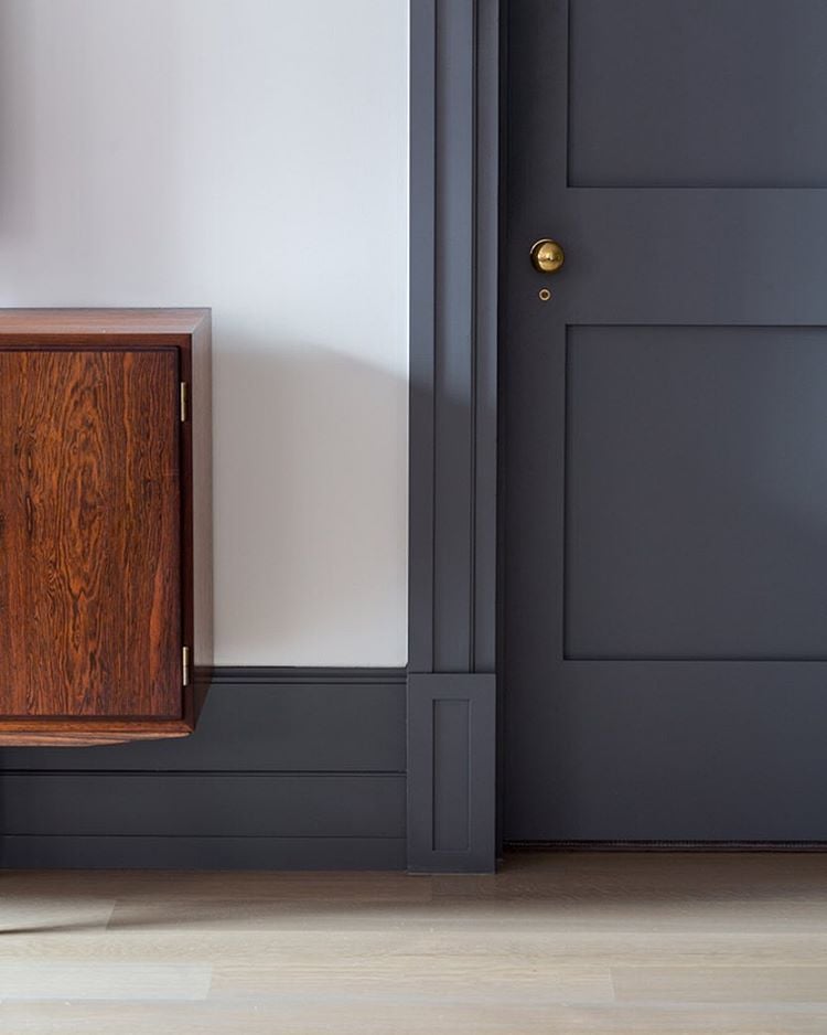
I’m dying to find the source for image #2. Any recollection of the designer or more info on that gorgeous paint?
Nevermind I found it!!
https://www.instagram.com/p/BEGZV0qLCLc/
Woohoo! I’ll update it. Thank you! xo
I have dark doors ( Benjamin Moore Wrought Iron) .. would it be appealing with grey trim instead of white?
What color paint was used hallway wainscoting and trim?
Just stunning! Wondering the source or paint color for the kitchen cabinets in image #3
Hi Sarah, I love a warm trim colour! We’re considering revere pewter trim with white dove walls. However, with a more traditional centre hall plan, I’m struggling with how far to take it. Would love to hear your thoughts!
Thanks, Heather
what paint finish do you recommend for trim?
Semi gloss!
I LOVE all the contrast trim! Hoping to see more of it.
Same! It’s so beautiful :)
I LOVE LOVE this idea! What do you do if you have Plantation shutters in your living room? Do you leave them light or have them painted the trim color as well? I just can’t figure out what to do with those.
It totally depends on what look you’re going for, Kristin! I prefer them to be painted the same color as the window, but you could also leave them white, if you’re doing contrast trim… either / or!
Hi Sarah, any ideas on what color the trim is in photo #2? It’s so pretty and I would love to try and find a color match.
Love this contrasted navy trim on pale floors! My question is, with this combo, if I wanted to avoid a white kitchen, what would you suggest for cabinetry color ideas? I like the dirty light brown stained cabinets with leathered black granite, but it might be too much wood everywhere if I have ceiling beams. So, give me your thoughts, love what you’ve done!
Natural wood or warmer colored wood would be beautiful- I treat navy like a neutral, so you really have lots of room to play when it comes to paint colors!