Favorite Paint Swatches From the SW Designer Deck
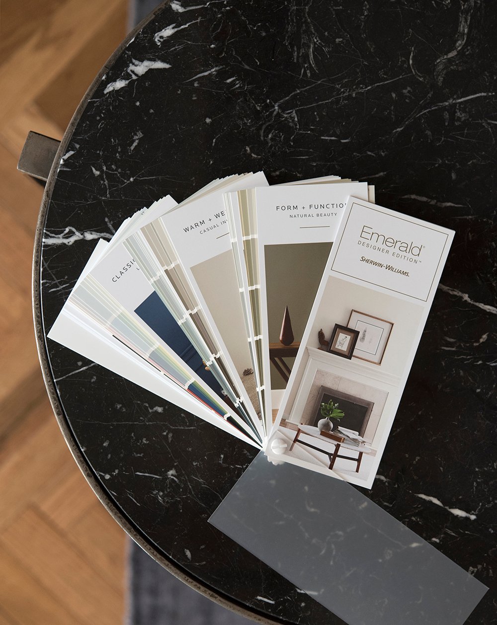 A few months ago, Sherwin-Williams launched a new paint collection called the Emerald Designer Edition. I just received my fan deck in the mail before leaving for vacation and wanted to share my favorite swatches from their newest paint line. FYI- this post is not sponsored… I just thought it would be helpful because I’m constantly asked about paint color recommendations! If you’re wondering how this new collection differs from their previous swatches… personally, I think the colors look a bit more desaturated (in a good way). The overall collection feels sophisticated and pared down, in regards to color and the amount of swatches. It’s a small collection that feels approachable and I feel like they definitely mixed these colors with designers in mind. If you’re on the hunt for some fresh paint colors, click through for my favorites from the deck!
 The first swatch in the deck was actually one of my favorites, pictured above. Photos don’t do these bright neutrals justice, but they’re really nice in person! My favorites include Oat Milk, Arrowroote, and Cold Foam. All are creamy neutrals that have plenty of depth and a nice light reflective value.
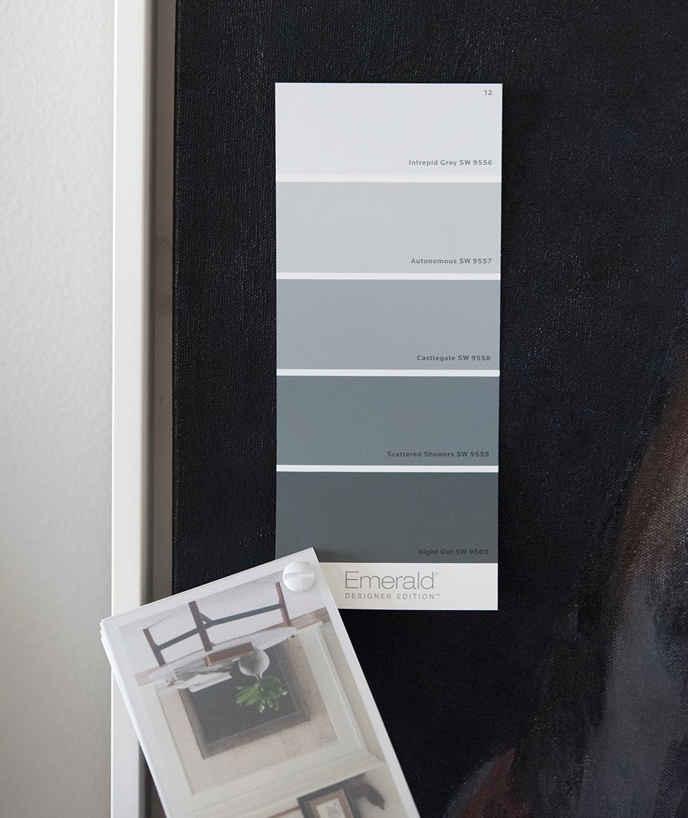 I was also very impressed with many blue and navy hues throughout the fan book, as you’ll notice in this post. These medium blues caught my attention and feel cooler and more blue in person than they look online. I would use any and all of the blues on this swatch- they’re stunning: Intrepid Grey, Autonomous, Castlegate, Scattered Showers, and Night Out. I actually ordered samples of Scattered Showers and Night Out for potential office paint.
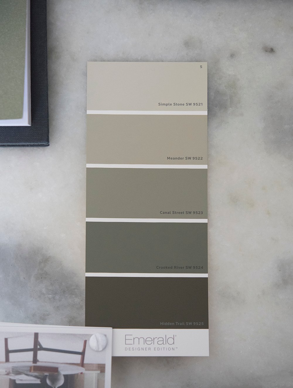 Next up- swatches with a nice green, neutral undertone. Crooked River and Canal Street were my immediate favorites. They feel a bit more green in person.
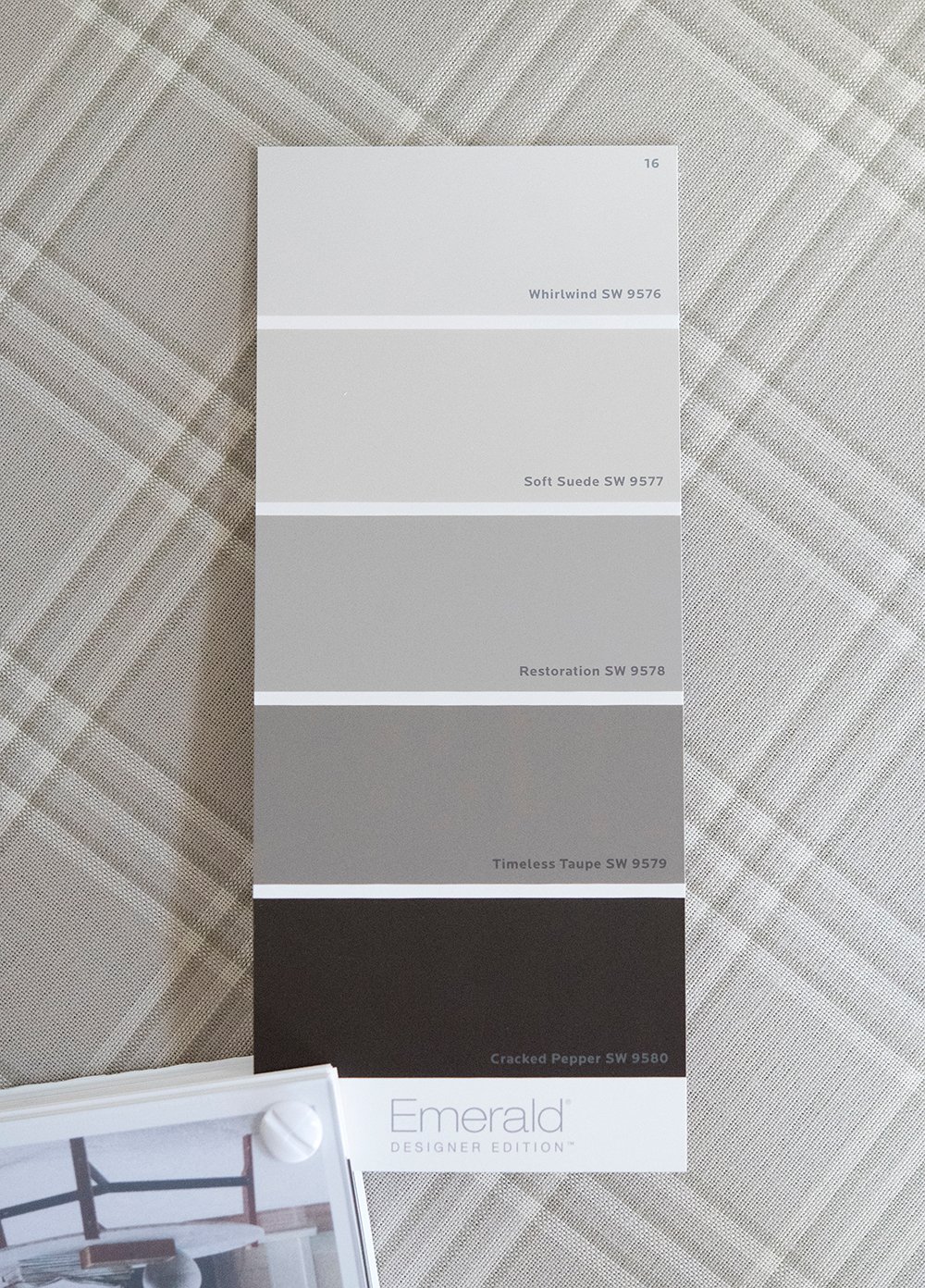 This palette felt really fresh to me! I’ve noticed more purple, plum, and burgundy or wine colors creeping into my feed lately, and I love them. These neutrals felt like an accessible way to get a similar look. Whirlwind and Restoration have an almost lavender undertone in person, while Cracked Pepper definitely has a nice red base, giving it tons of depth and moody character. Soft Suede is a perfect neutral that feels very balanced… not too cool or warm! It’s the type of color that goes with everything.
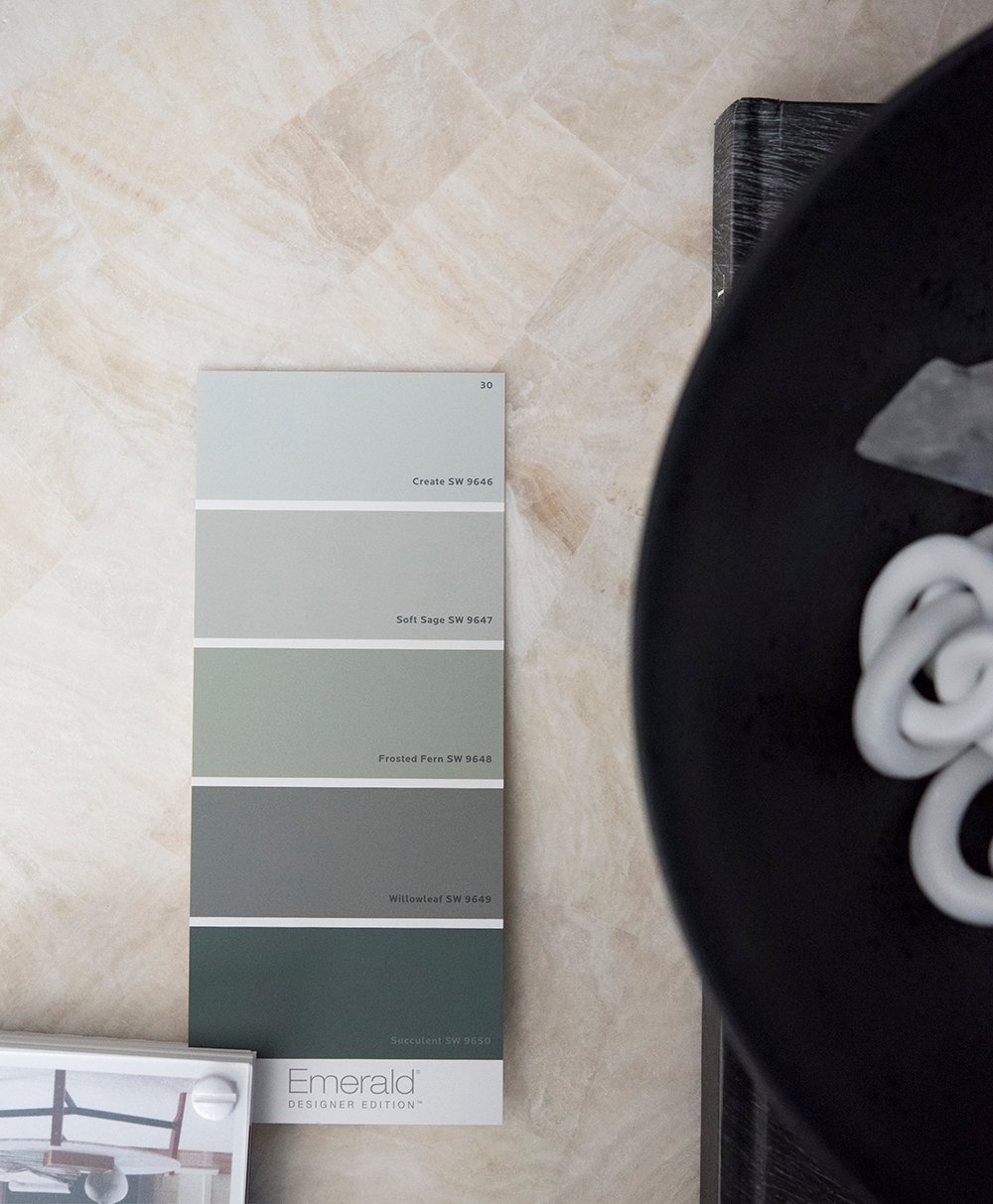 I really like every swatch from this page in the deck, but then again- you guys know I love my green paint! I ordered a sample of Willowleaf, which looks more saturated in person. I’ll link the others for you, too… they’re all so good: Create, Soft Sage, Frosted Fern, and Succulent.
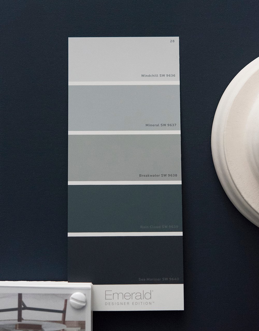 I probably sound like a broken record, but this entire page was also really good… I’d happily use any of these swatches: Windchill, Mineral, Breakwater, Rain Cloud, and Sea Mariner. These all look a bit more blue in person.
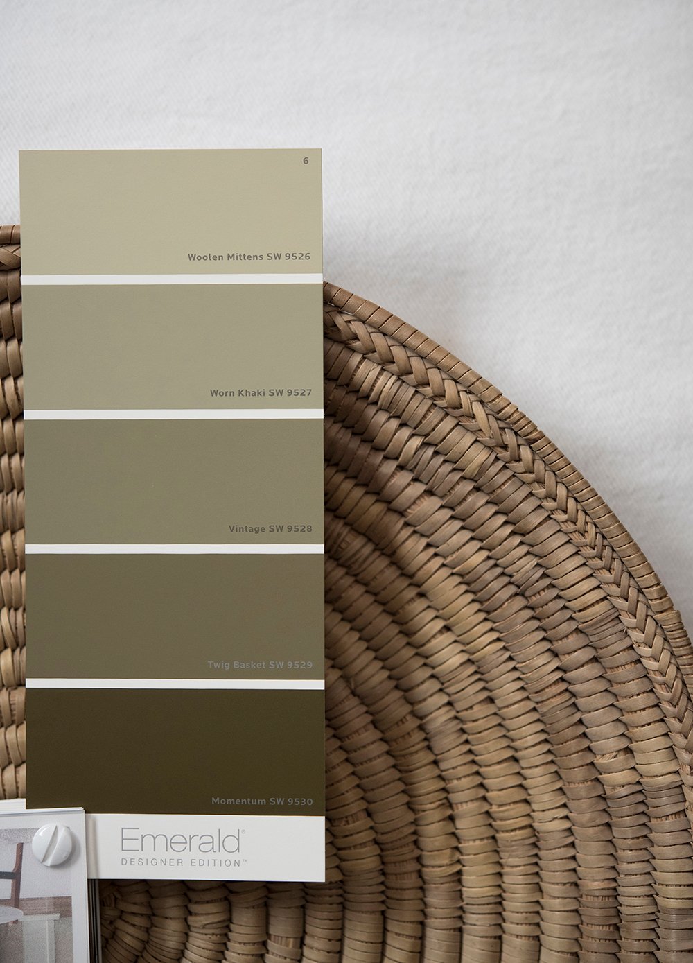 What intrigued me about this palette was the gold undertone found within each swatch- almost an ochre colored base. My favorites include: Woolen Mittens, Worn Khaki, and Vintage.
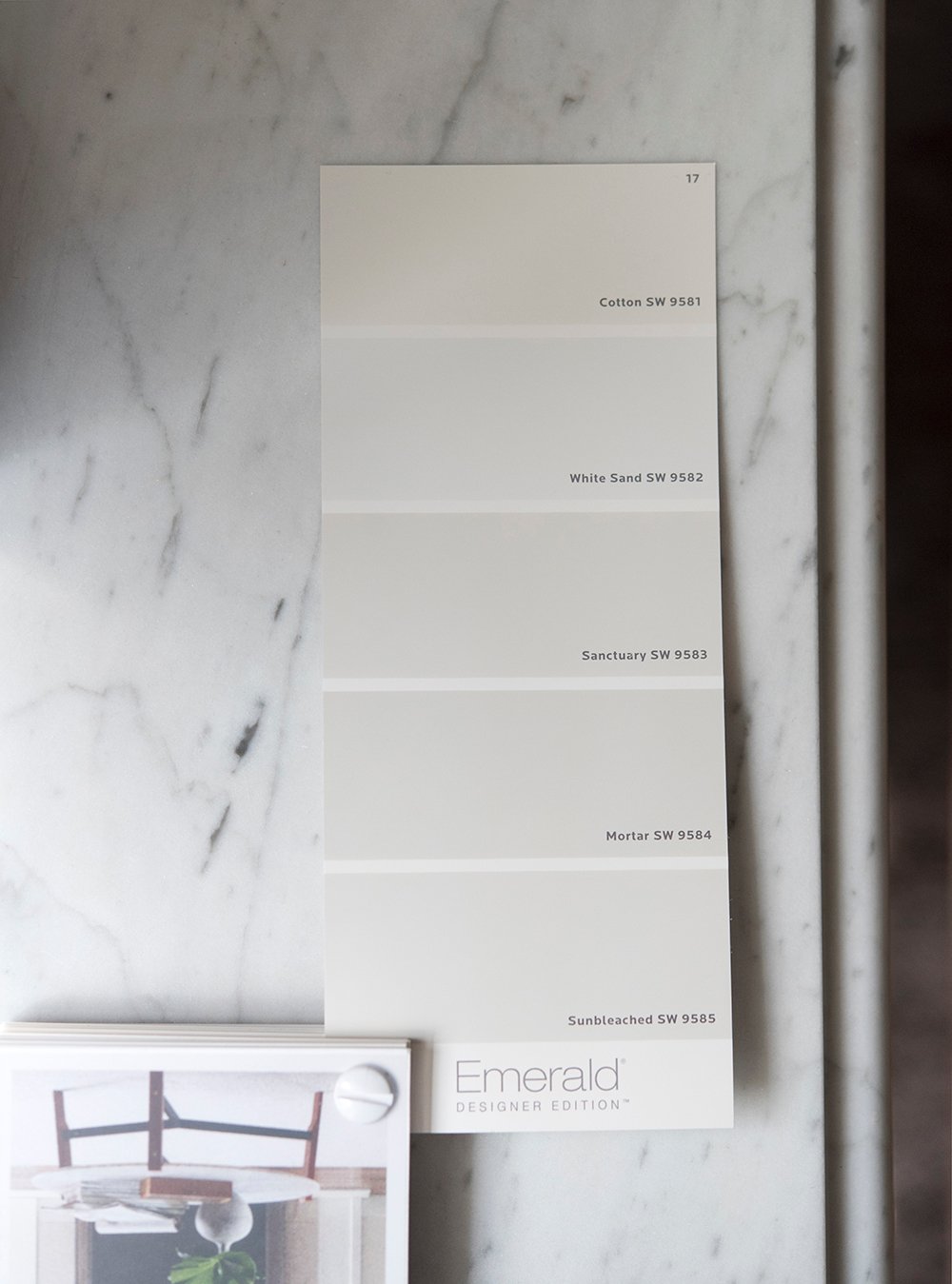
From the bright neutrals below, all of them were top notch! White Sand would make a great ceiling paint or clean trim color because it has a cooler base. Cotton, Sanctuary, Mortar, and Sunbleached are also versatile and I could see these as interior OR exterior paint colors that read “almost white”.
 I’ve said this hundreds of times before, but I’ll say it again… swatching paint is SO important. It is impossible to get an accurate read on a computer monitor because the colors are displayed in RGB (red, green, blue)… whereas, paint is mixed in a complex way, similar to a CMYK (cyan, magenta, yellow, black) printer, because it’s a physical, tangible product. Since many colors go into paint mixing and your eyes see it differently in person as opposed to a screen, I’d highly recommend ordering swatches before you commit. A paint color in my home might look totally different in yours, as it reflects its surroundings, the light, and many other factors come into play. Just a friendly tip!
Did you enjoy this paint color post? I can add more to the calendar if you’d like! It was pretty fun to comb through my new deck, order some new swatches, and dream about transforming spaces that could use a fresh coat of paint (like our office building, which is kind of a disaster… don’t worry I’m documenting it and will share). I hope you all have a great weekend. I’ll see you back here on Monday, friends!
Can looking at paint swatches be a hobby? I kind of love it. Although I think the selection at the big box stores could be much more curated, I do enjoy studying the subtle gradations. I am really drawn to all of the darkest colors on the swatches you featured. (feeling moody🤷♀️) The red undertone in Cracked Pepper definitely intrigues me, and Momentum almost looks like suede. Now we need a peak at the red/pink end of the spectrum I spy toward the back of that deck.😉 Happy almost Pizza Friday! Have a smashing and productive weekend.
Right? Me too. I also think it would be fun to have the job of naming all of those pretty paint swatches! I always thought choosing paint swatch names and nail polish names would be such a cool job. Ha! I’m also into the dark hues these days… Cracked Pepper quickly caught my attention. I will say this- there were only 2 red / pink swatch pages in the back of the deck and I wasn’t impressed with either of them (they all felt juvenile). I hoped for some dark burnt sienna or plum colors, but it didn’t really include any of those. Bummer! Cheers to pizza Friday tomorrow and a fun & productive weekend ahead! :)
I’d be interested in learning about low light rooms and paint sheen. Is flat the right finish? Is it just the color shade that makes it lifeless? (It is a grayish white.) My new house has a finish of paint I have honestly never seen before. If flatter than flat paint is a thing, that’s what I have. It’s like a vampire paint. It sucks the life out of you!
Great questions, Deb! I’ll work on an informative paint post that answers those types of questions. Finish is super important and can totally alter the look of a space. For example, a high gloss or shiny lacquer looks very glam. Tone on tone paint with highly contrasting finishes is a great way to add depth to a room while keeping it monochromatic. It just depends on what aesthetic you’re trying to achieve. Shade is also important!
I’m SO BAD at picking paint colors so these posts are very helpful, although I especially like the “use this color, it’s the best” comments from designers I admire (like you!) Any rules of thumb on how to choose a mixture of whites, like white walls but a different color white on trim, for example?
I’m really glad these types of posts are helpful, Amy! I’ll add more of them to the calendar and focus on some detailed recommendations for use. I’m more about pairing the same color, but in different finishes… or a color that is very close, just a shade or two darker / lighter. Look for more of these soon :)
That’s great advice! The walls are Ben Moore White Dove in eggshell so maybe I’ll take a look at the paint chip, and semi-gloss. Would you lean towards 1-2 shades darker or 1-2 shades lighter for trim?
If you like contrasting trim, go darker! Personally, if my goal is contrasting trim- I want it to be a high-contrast difference, so most of the the time (in regular spaces with non-contrasting trim), I’ll go lighter on the trim than the wall color. Hope this helps :)
Perfect! Problem solved. You’re the best :-)
Oh my gosh, I got this same paint deck from our local Sherwin Williams supplier a few weeks ago and I LOVE it! I have done several decorating consultations in the past few weeks and I have been taking it with me to show my clients. I just recommended oat milk for a brick wall that needed to be painted and it turned out Ah-mazing. My client and I both love it.
It’s really good isn’t it?! I’m impressed. I feel like Sherwin-Williams is known for their bright, saturated colors… but this new muted, moody side is my jam. So many beautiful options! I’m glad to hear you’re loving it, too. I definitely thought it was worthy of sharing on the blog. Have a great day, Kerri!
How the heck can I get one of these decks?? All of their colors are always so amazing! I’m lucky that my local Ace is close by and carries Sherwin Williams paint; otherwise I’d be driving quite a distance for one of their stores. I second Deb’s question above. You know well that I’m not a fan of the builders who built our house, nor am I a fan of the previous owners who chose terrible paint. Flatter than flat is the perfect description. I’m also certain they didn’t prime anything. Every wall sucks up paint as though it has been freshly textured! Seeing all this paint color goodness gets me excited to free this house of the ugly mustard yellow beige they chose (and it’s so ugly that this description sounds better than it is, hahah). I can’t wait to bring this entire house back to life! I have so many favorites: Oatmilk, Cold Foam, Autonomous, Meander, Canal Street; and the next five swatches after those? I’d gladly use any and all of those colors, especially the one featuring Cracked Pepper. SO SO GOOD!!! Thanks for sharing this Sarah! I’d definitely love to see more posts like this, and maybe some where you share a paint color or two and showcase how you would utilize it in a home, what other colors would work well in the room, textiles that would bring dimension…sometimes I find the textile thing to be the most difficult. I’m going to keep this tab open all day probably and just stare at my walls for a bit and dream. HaHa! Everyone has a hobby right?? :) Have an amazing day Sarah!
They’re really handy! I have their entire designer / to-the-trade kit (multiple fan decks, large swatches, portfolio, etc). I believe even if you’re not a designer or contractor, you’re still able to purchase a fan deck in store. You might have to ask an associate! Having an Ace close by is the best. We used to live close to one when we were in Ohio and it was really nice to have so many paint options. Luckily, SW isn’t far from us now. I love all of your choices! I’m ALWAYS amazed how transformative paint can be. I always tell people- if you have a small budget and the only thing you can “update” in your home is paint, do that. It’s the easiest way to get an entirely different look. I’ll try to work on more paint posts with room, finish, and application suggestions :) Maybe some pairings would be helpful? Hope you and your fam are having a great Thursday! We’re *almost* to the weekend!! xo
I’m such a geek about paint colours so I loved this post. I follow a paint blogger here on Vancouver island – yes! paint is the topic of every blog post! She is an invaluable resource for LRV and reviews of popular paint colours for anyone else who is overwhelmed by the choices out there. kylieminteriors.ca
Your blog is the first one I read everyday though :)
I’m fascinated by this, Karen! A paint blogger? Kylie is new to me, so thanks for the share. How fun! Also- thanks for reading everyday… I appreciate that so much :) Have a wonderful day! xo
Yes, yes, yes to everything everyone has already said. Love these paint posts, Sarah. Paint is such a simple thing and yet also quite a complex thing. Simple because it’s a wonderful, inexpensive (in most cases) way to completely change the feel of a space without changing one other thing in it. I’m one of those weirdos who *loves* painting walls (wish I could paint art like Laurie Anne, but I digress). I find the immediate change so gratifying. Complex in that there are an infinite number of paint colors, with different undertones and different sheens. What undertone is best in this light? What sheen is preferable in this space? It’s crazy! So I will take allllll the paint posts you’d like to give us, Sarah. And can I just say, thank you? Thank you for sharing your infinite knowledge, skills, passions, ideas, etc. with all of us, free of charge! I, like many, have learned so much from you and your openness and willingness to share is inspiring. Whenever I have a design “dilemma” or question, your site is the first one I go to. Even before Pinterest! ☺️ Most likely you’ve already done a blog post on whatever it is. 💗 For readers who may be looking for what color combinations go together, I just started using the Coolors app for coming up with my cookie color palettes. Have you used it or the desktop version? I’m very new to it, but so far, I like its potential. Perhaps a post looking at the difference design apps? There are so many! And, ummm…is it wrong, I often want to choose a paint color (or nail polish!) because of it’s name?! LOL! Cheers to the weekend!
Thank you, Anne! I can definitely work on more paint posts- I’ve noted your questions for future ones :) I so appreciate your kind words… truly made my day! I’m glad this has been a helpful resource for you. That’s always my goal and I love hearing that. I’ve used the Coolers desktop version in the past, but haven’t used it in a couple years. That’s another great resource I forget about (thanks for the reminder). I wish I knew about all the cool design apps, but I feel kind of behind the times in regards to that, haha! I’m the same way with color names… so fun! Hope you had a wonderful weekend and your week is off to a great start! xo
Thank you for this post.
I loved Restoration Hardware’s paint line. I miss it. Having 1,000 options (Benjamin Moore store, I’m looking at you) leads me to decide on nothing. RH had a small line of colors (used on their store walls) that I liked so my “choice” was really only flat or eggshell.
Your post reminds me of the RH methodology. You picked a limited number of classic and beautiful tones and pigments. You’ve helped me with my paint color dilemma. Thank you!
I’m so glad to hear that, Linda! I definitely think narrowing down a sea of options is helpful. I’m happy it was helpful! I’ll try to work more paint posts into the blog calendar :)
Hi Sarah! Can you get samples of the designer colors at a sherwin Williams store? Online, I can only see a gallon option.
Hi Allyson! Yes- you can get samples :) Ask them at the front desk.
Hi Sarah. Do you by any chance happen to know the ral code for the sage green?
Thanking you in advance. All the best.
I don’t, I’m sorry Alina!