
10 Ways to Make a Neutral Room Feel Interesting
I’ll admit it… I love a neutral room. Some people think a neutral paint color automatically means boring, but I couldn’t disagree more. In fact, I think designing with restraint is often harder than filling a room with color. When everything is subtle, every choice matters. Most of our home is built around warm neutrals, wood tones, soft textiles, organic finishes, and natural materials. That wasn’t an accident. I wanted rooms that would still feel beautiful ten or twenty years from now instead of chasing whatever trend happens to be popular. The challenge is creating a space that feels collected instead of flat. After designing homes for clients and renovating our own house over the past two decades, I’ve realized the rooms people remember aren’t about using the boldest paint color. They’re the ones with depth, warmth, personality, and thoughtful details. If you’ve ever looked around your neutral room and thought— something feels missing, these are the exact design tricks I use!
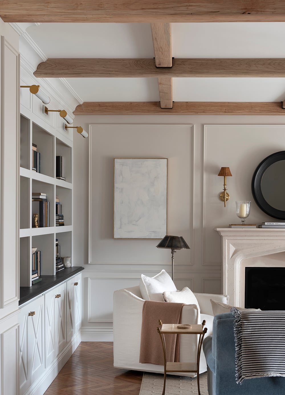
Why Your Neutral Room Feels Flat
Most people assume they need more color. Usually, that’s not the problem. A neutral room falls flat when everything has the same visual weight… similar textures, similar finishes, too similar scale or proportion, and materials that blend together. Instead of adding more color, I almost always add more contrast. Contrast doesn’t have to come from bright paint. It can come from texture, material, shape, finish, or proportion. That’s what keeps a space interesting. Here are my best suggestions for making your neutral room feel well designed…
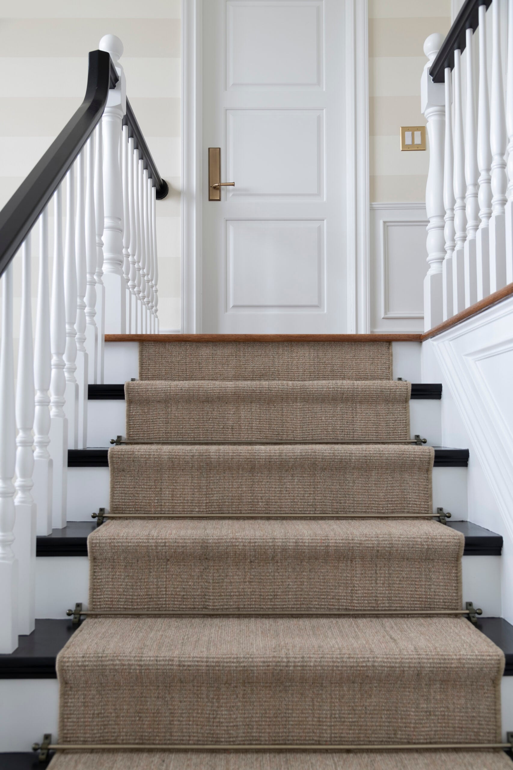
1. Layer Texture Before You Add Color
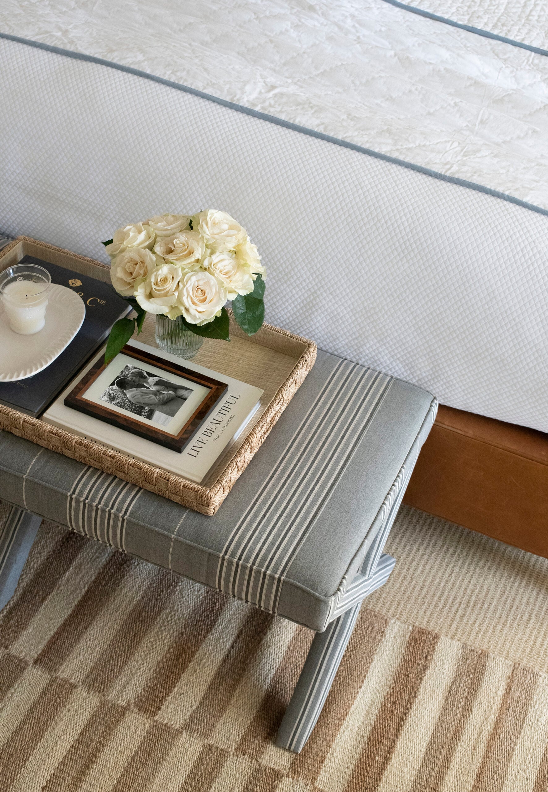
If I could only give one piece of advice, this would be it. Texture creates interest faster than almost anything else. When I’m designing a room, I’m constantly asking myself if every surface feels different from the one next to it. Think about combining smooth marble, aged brass, soft linen, warm oak, wool rugs, handmade pottery, woven shades, and vintage textiles. None of those are loud individually, but together they create a room with incredible depth.
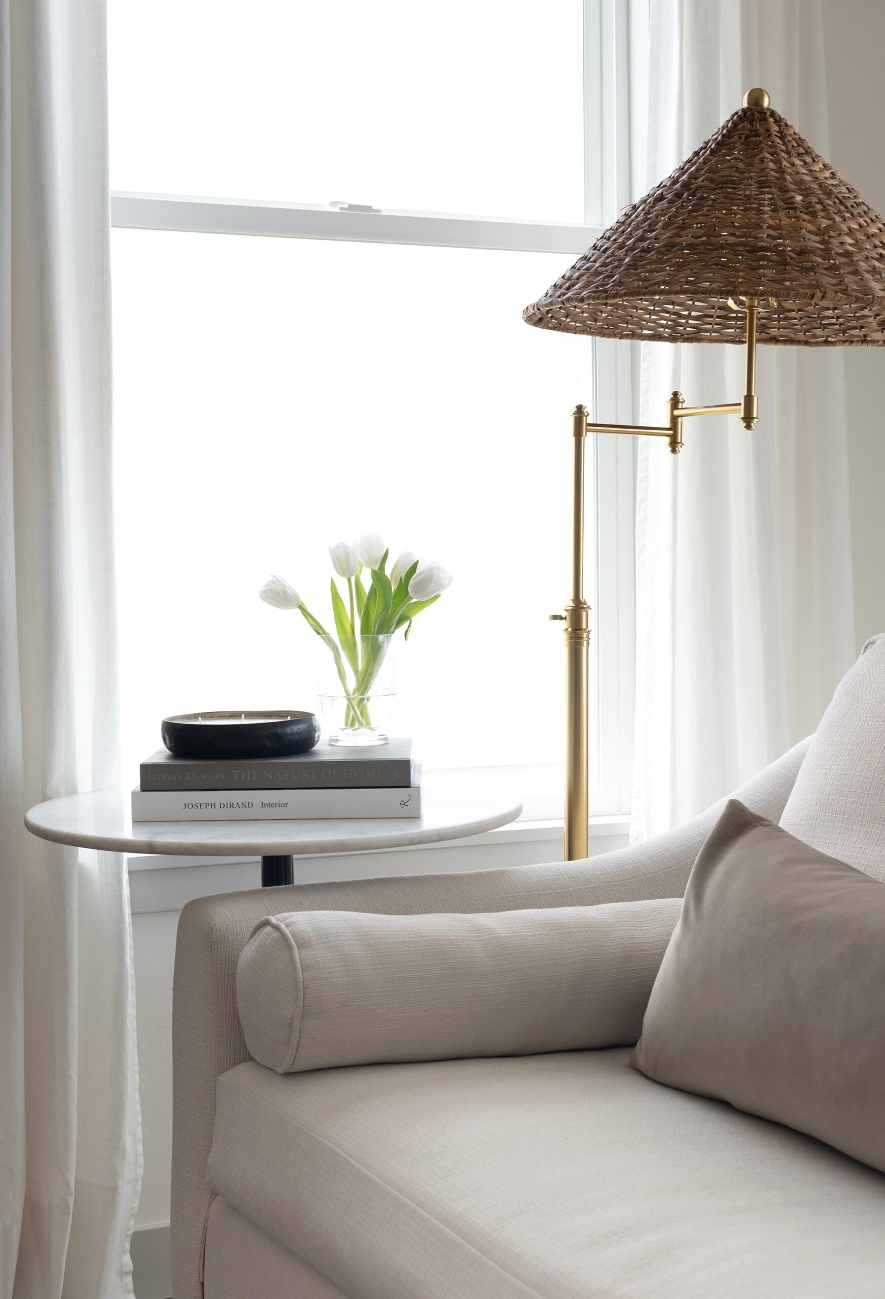
2. Mix Wood Tones Instead of Matching Everything
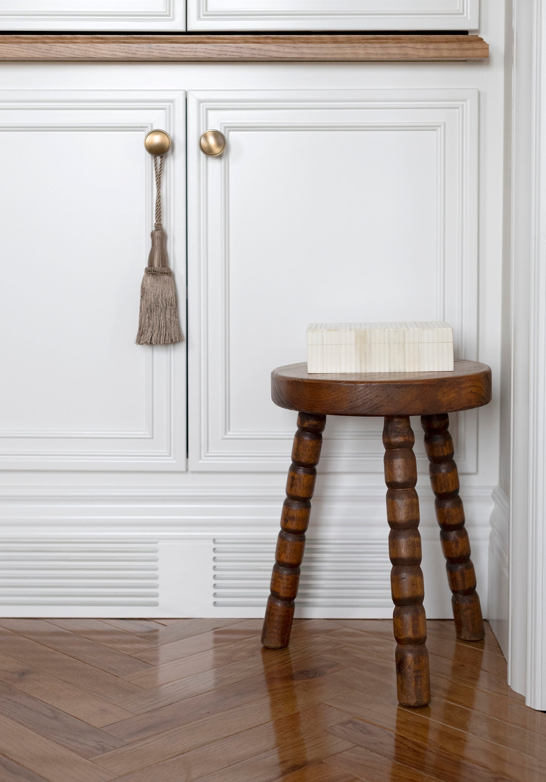
Matching every wood finish can make a room feel like a cheap furniture showroom. I almost always combine oak, walnut, pine, and antique wood pieces in the same room— regardless of their finish. As long as the undertones feel similar, mixing woods create a collected look that’s much more interesting and layered.
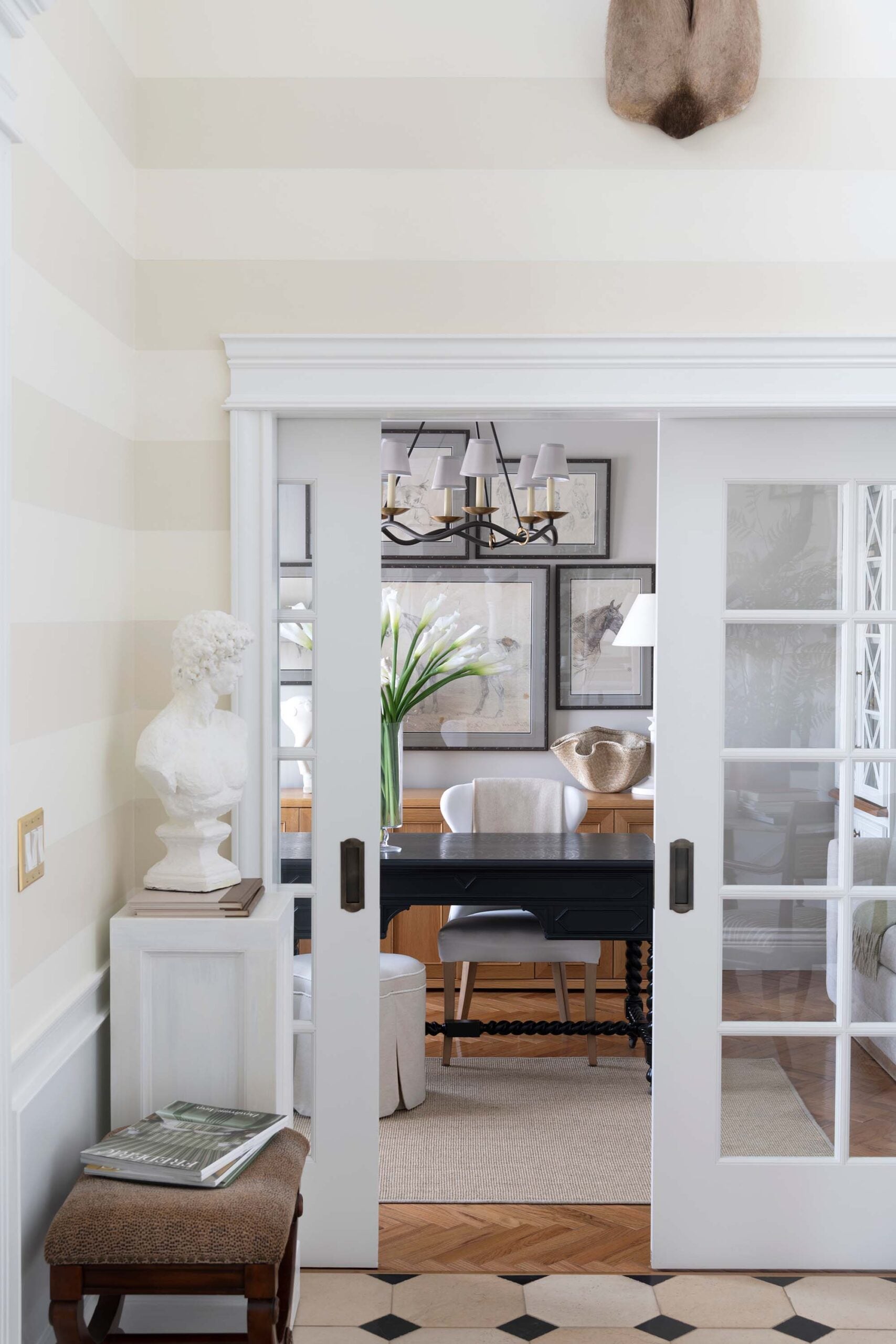
3. Layer Your Lighting
Lighting isn’t just functional. It’s part of the design. Instead of relying on recessed lights alone, layer table lamps, floor lamps, sconces, picture lights, and pendants. Once the sun goes down, lighting becomes the atmosphere of your home. I talk about this topic a lot, so be sure to give the following posts a read for more details on exactly how to nail your lighting design plan:
- How to Layer Lighting Like a Designer
- Flush Mount vs Semi Flush Lighting: When to Use Each
- How to Choose the Best Picture Light for Your Artwork
- Recessed Lighting Guide: Layout, Spacing & Design
- Designer Light Fixtures That Will Never Go Out of Style
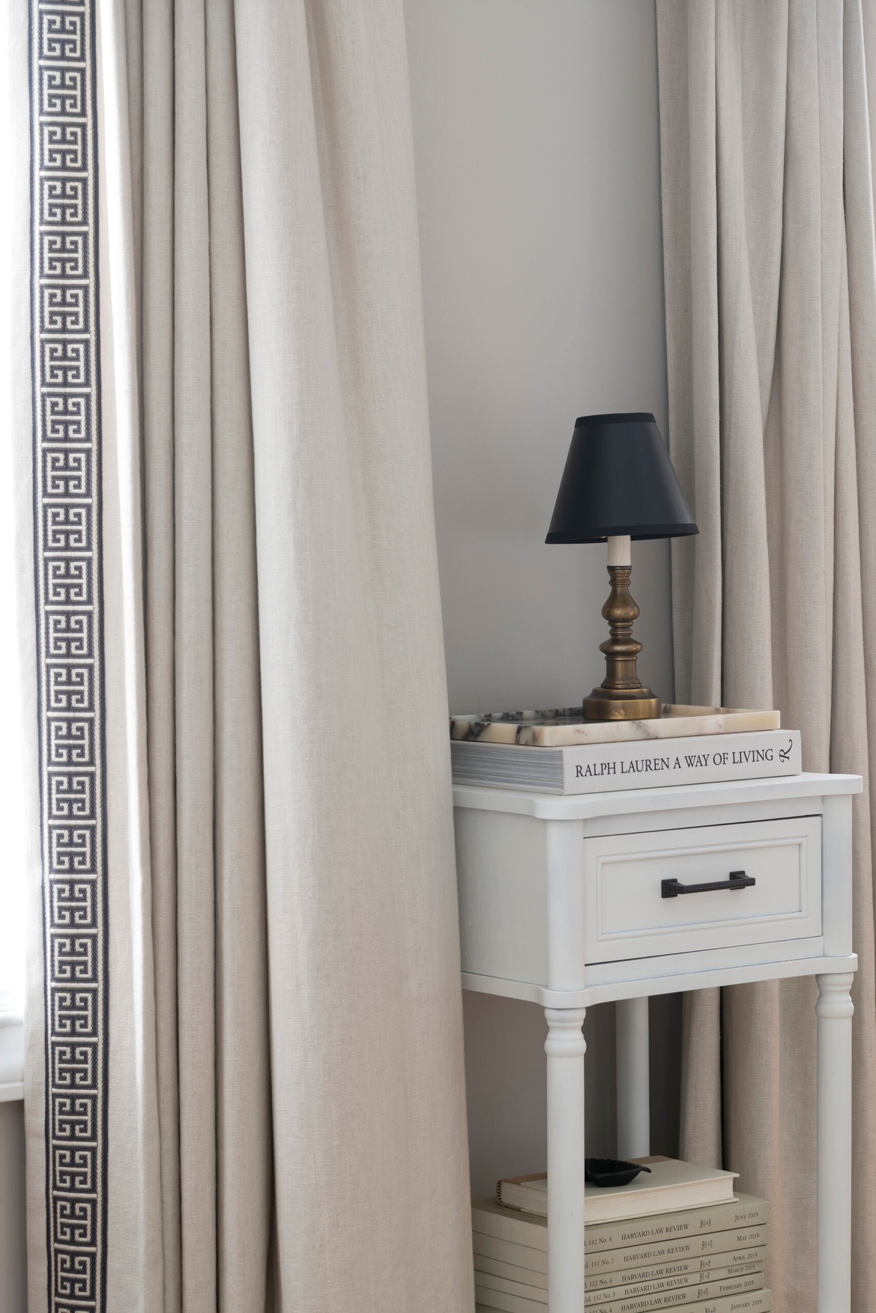
4. Decorate With Pieces That Tell a Story
Whenever I’m styling shelves, I ask myself one question. Could anyone else create this exact vignette? Vintage artwork, travel finds, old books, handmade pottery, and heirlooms instantly give a built-in, bookcase, or room personality that can’t be bought all at once. Collect pieces over time that speak to your personality and your home’s inhabitants. Check out my designer guide to styling built ins, here.
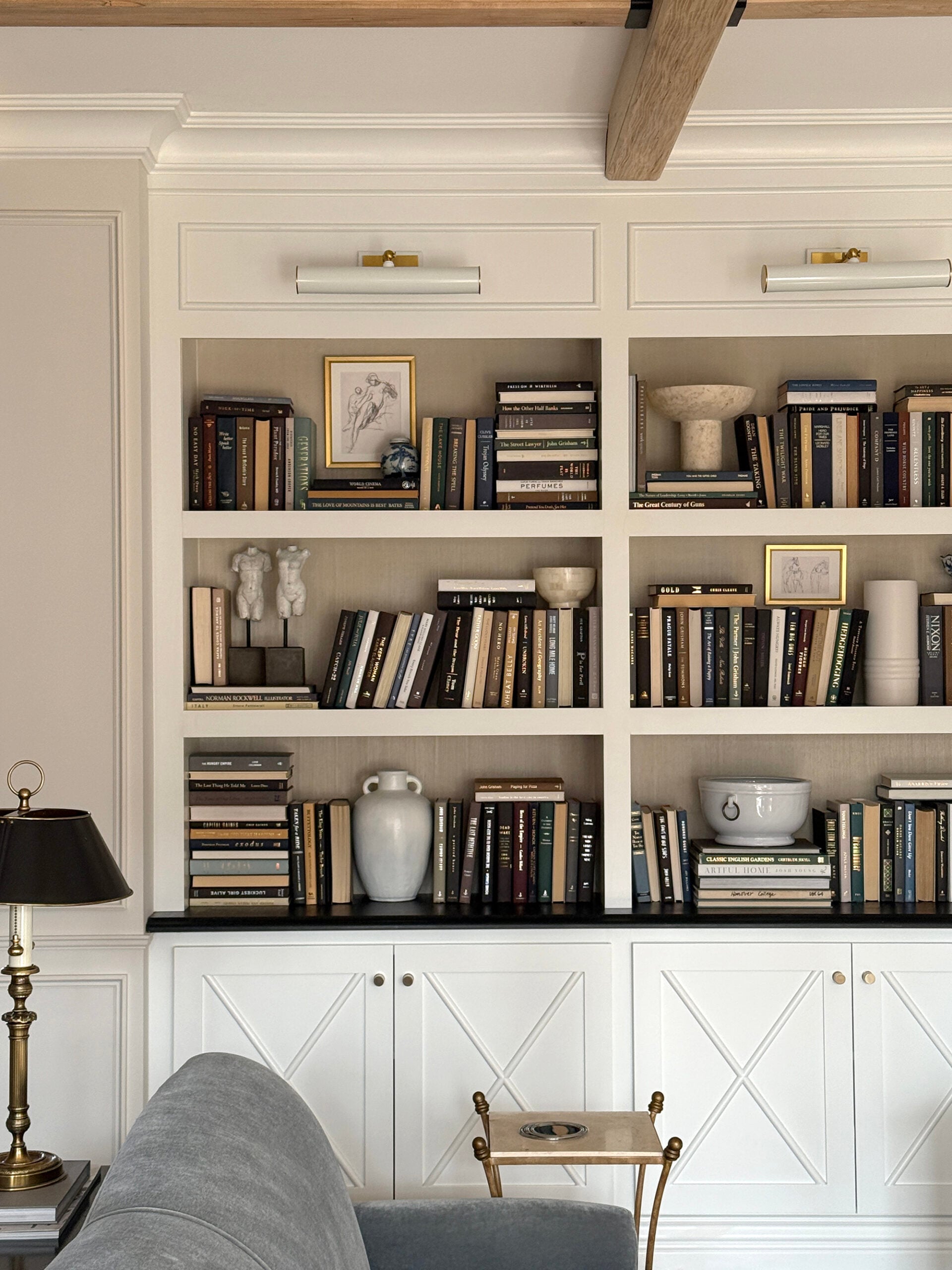
5. Vary Shape and Scale
If everything is the same size, nothing stands out. Pair oversized artwork with a petite lamp. Mix tall branches with low bowls. Combine chunky furniture with lighter pieces. Your eye naturally moves around the room when there’s variation… that juxtaposition is key!
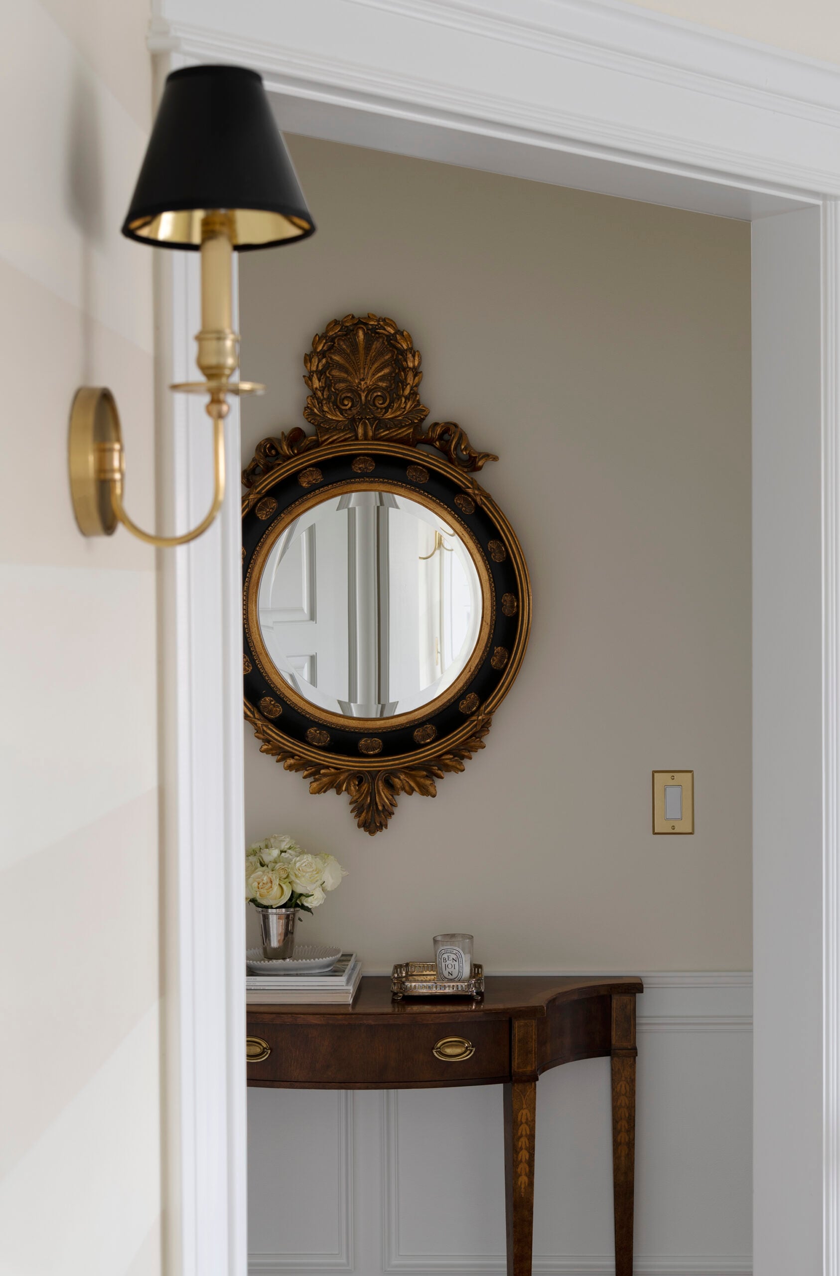
6. Add Contrast Instead of More Color
When people tell me their neutral room feels boring, they usually think they need bolder colors. Most of the time, they simply need more contrast. Dark wood furniture, aged bronze lighting, charcoal artwork, or a vintage rug with faded navy details can completely transform a neutral space without changing the palette. Don’t believe me? Add something black. Here are the top black paint colors designers always use… and why this trick for adding contrast never fails.
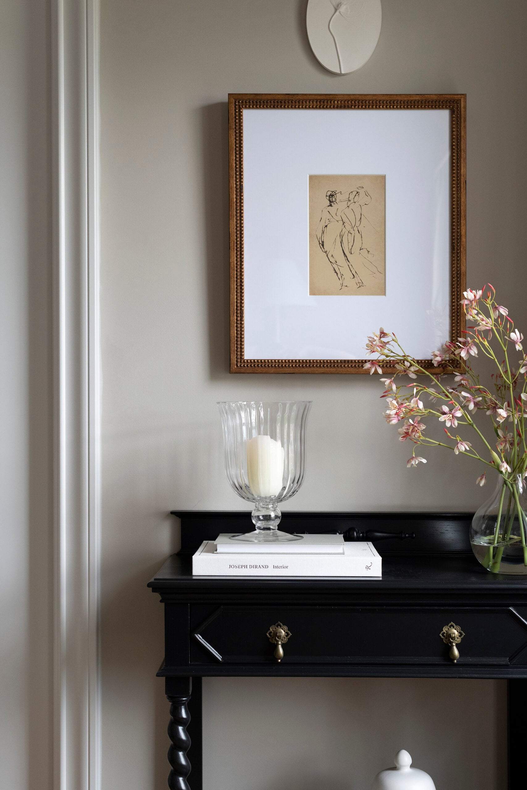
7. Don’t Buy Everything at Once
The most beautiful homes evolve over time. Some of my favorite pieces came from antique stores, estate sales, or trips we’ve taken over the years. That slow approach creates a home that feels authentic instead of overly designed. Along those same lines, avoid the urge to grab everything from your favorite big box retailer (ahem, Target). A piece here and there is fine, but those trendy items aren’t worth the investment. Check out my estate sale shopping guide, strategy, and etiquette post if you’re intrigued!
8. Repeat Materials Throughout the Room
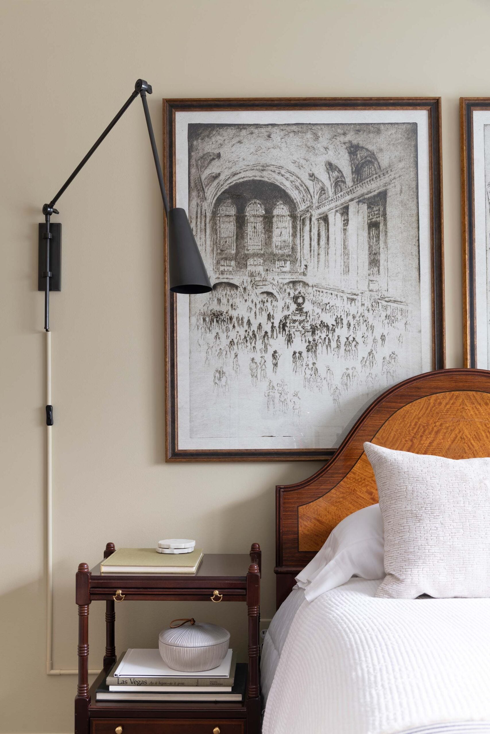
One trick I use is repeating the same material in several places throughout a room. If I introduce aged brass on a light fixture, I’ll usually bring it in again through cabinetry hardware, frames, or a small decorative object. Repeating materials creates cohesion without feeling repetitive. Here are 20 things that make a home feel expensive, this point being one of them.

9. Bring Nature Inside
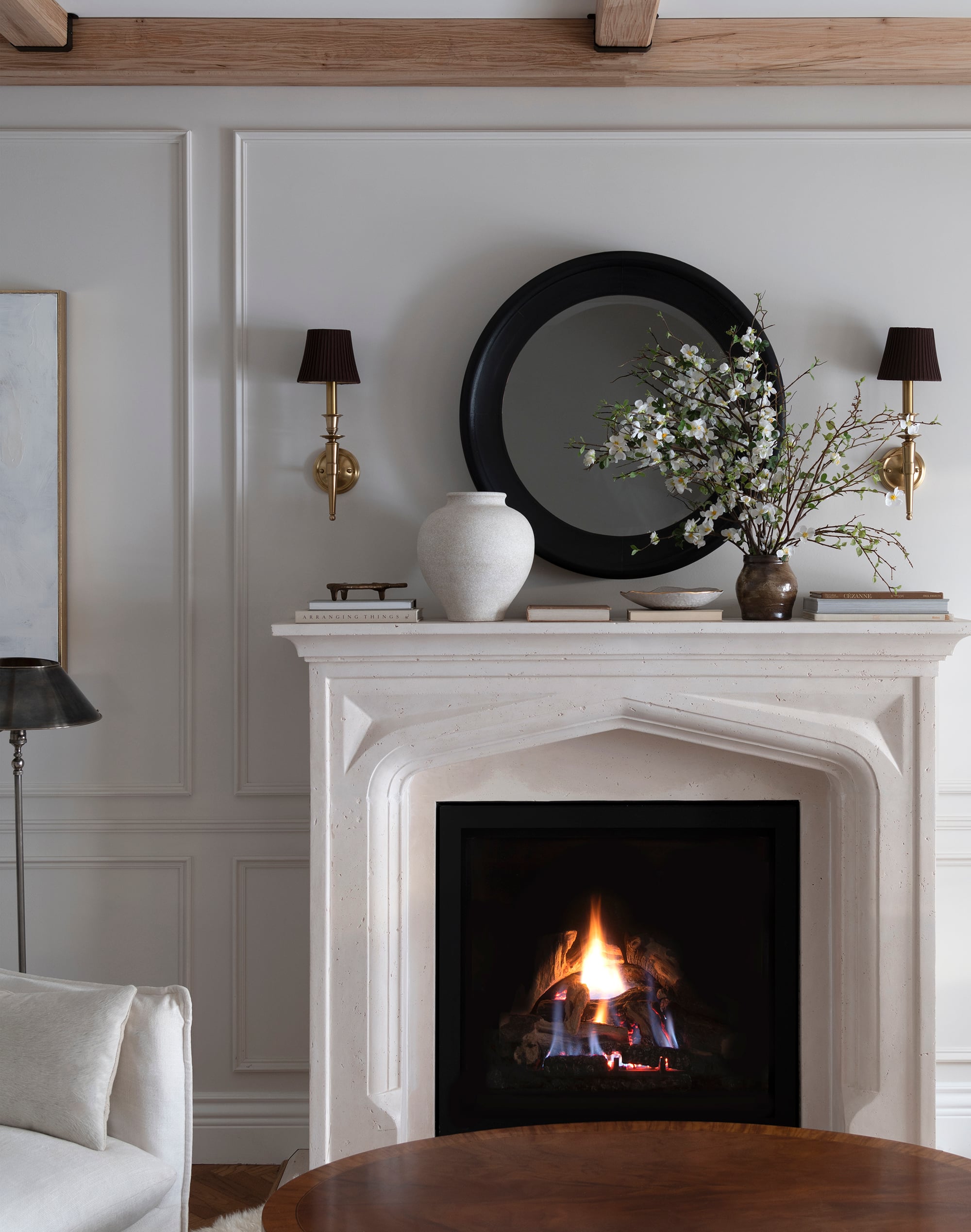
Natural materials keep a neutral room from feeling sterile. Oversized sculptural branches, greenery, florals, natural stone, linen, leather, woven baskets, and wood all add warmth and life. Even a single oversized arrangement can completely change how a room feels.
10. Make It Personal
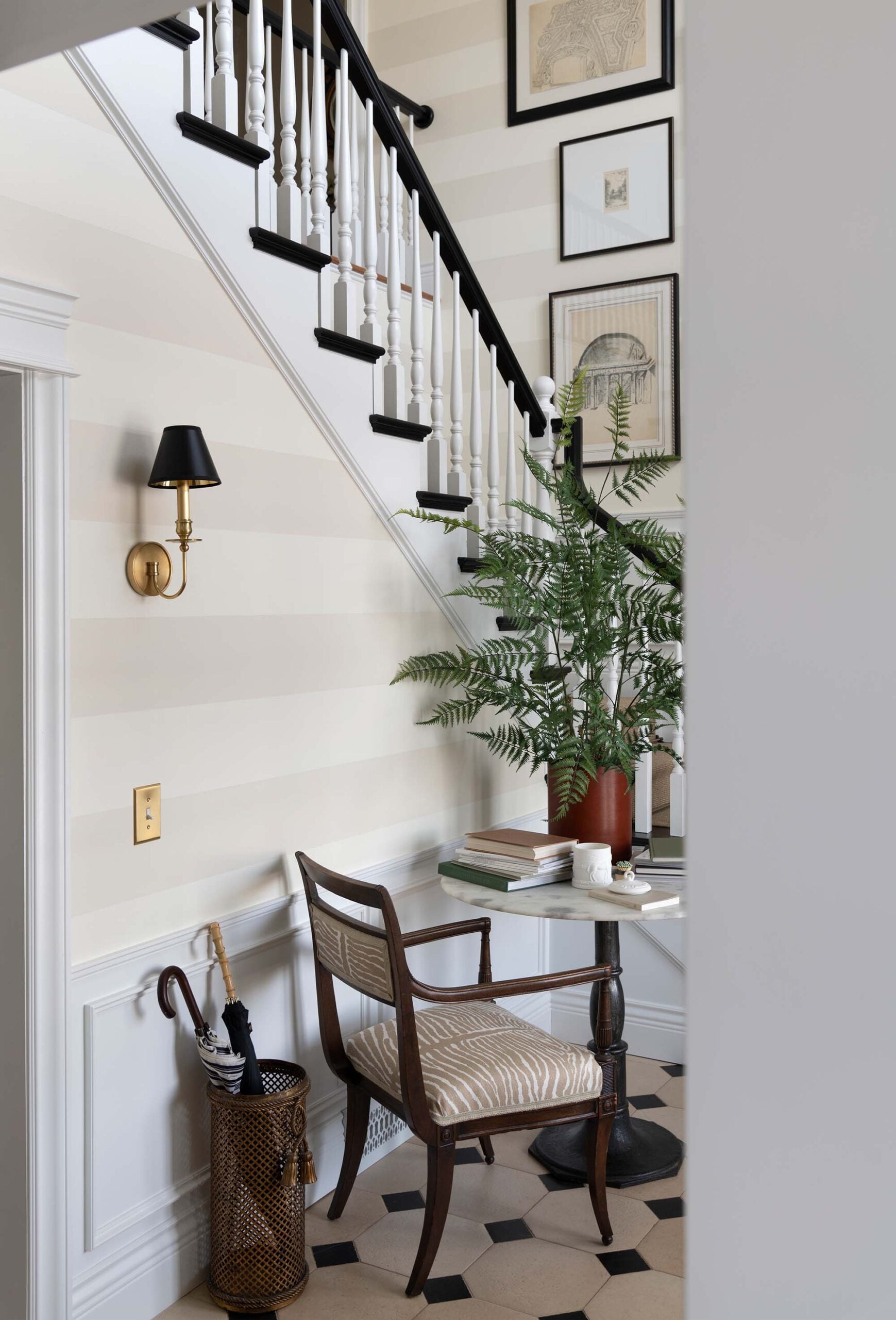
This is the step people skip most often. The most memorable rooms include pieces that reflect the people who live there… favorite books, collected artwork, handmade ceramics, vintage finds, and meaningful objects or photos are what make a home feel layered instead of staged. No designer can buy personality for you. That’s something you build over time. Don’t be afraid to make your home feel personal, eclectic, and a little weird.
My Designer Checklist for a Neutral Room
Whenever a room feels unfinished or flat, I mentally run through these questions before buying anything new. If I can answer yes to most of those questions, the room almost always feels complete:
- Does the room include at least five distinct textures?
- Have I included mixed wood tones?
- Is there something old alongside something new?
- Are my light fixtures and lamps layered throughout the room?
- Do I have enough contrast between light and dark finishes?
- Have I varied the height and scale of accessories?
- Is there at least one unexpected piece that feels personal?
- Would someone immediately know this room belongs to me?
Questions?
Focus on texture, layered lighting, natural materials, and soft textiles. Wool rugs, linen curtains, wood furniture, and warm lighting instantly make a neutral room feel more inviting.
Here are 24 of my favorite neutral (non-white) paint colors.
Whenever I’m styling a room, I focus on this order. Architecture first, furniture second, lighting third, textiles fourth, then collected accessories last. Decor should always feel like the finishing touch, not the starting point. I’ve found that following this formula creates rooms that feel intentional instead of over decorated.
No. I actually recommend mixing wood finishes! As long as the undertones feel complementary, a mix of woods creates depth and makes a room feel much more natural.
Related Posts
Looking for more posts on interior decorating or styling tips that make a big difference? I’m going to link some good ones for you below… give these a read:
- 10 Design Elements That Will Never Go Out of Style
- How to Find Your Home Design Style
- The Best Interior Design Books Designers Actually Use
- 10 Things Interior Designers Always Splurge On
- How to Choose the Perfect Rug for Any Room
- Common Home Decor Mistakes That Make Your Home Look Dated- And How to Fix Them
- 12 Designer Tips to Make Your Ceiling Look Taller
- Timeless Tips for a Bedroom Refresh Without Renovating
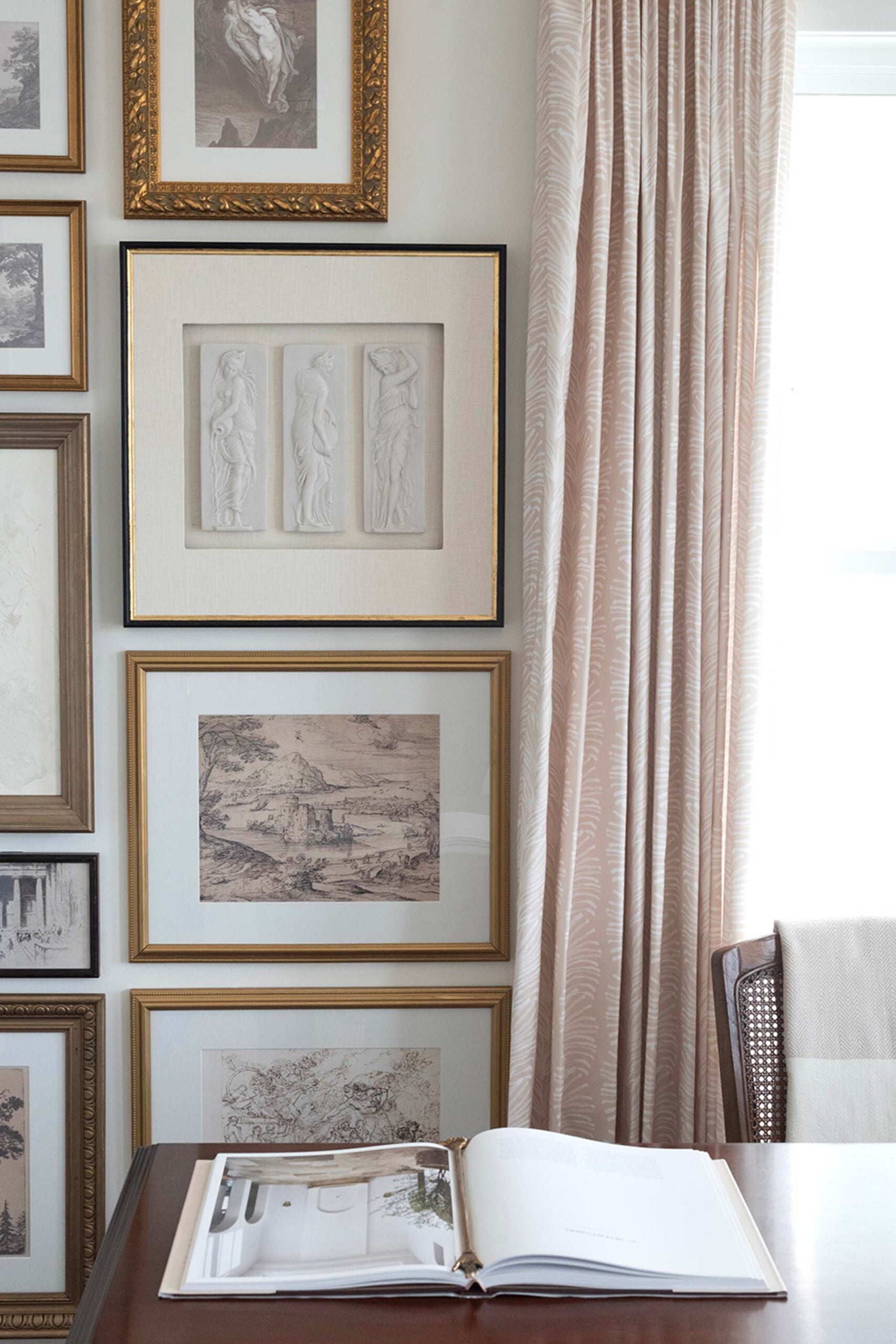
Some of my favorite homes are almost entirely neutral. Not because they’re simple, but because they’re layered. A beautiful neutral room isn’t about playing it safe. It’s about paying attention to every detail.
Texture replaces color. Contrast replaces clutter. Collected pieces replace trends. Those are the rooms that continue to feel relevant years later.
If there’s one thing I hope you take away, it’s this… don’t rush to add more color the next time a room feels unfinished. Try adding more texture, better lighting, or one meaningful piece with a story instead. More often than not, that’s exactly what the room was missing!
I love this thought process Sarah! What you said here resonates with the rooms in my home. It has been much more difficult to decorate and style the front room with the high white walls, than the kids rooms that feature deeper colors. The room is evolving slowly over time, which I don’t mind at all- because everything in this room feels like a choice that requires a more intentional approach. For every 10 pieces I see that I love, there’s really only one that would be a good addition. I pay far more attention to the texture and scale of an item than I do the color or style. The checklist you included is supremely helpful! I may need to utilize that to see what’s missing. I haven’t come to a true styling point yet, because so many larger elements still need adding. Your checklist might be helpful for the stack of art I’ve been hoarding, and maybe looking at it through your guidance will help me decide on something to put in the room. I love this take, because it feels like permission to continue as I have without pressuring myself to fill it with items that look gods, but don’t work. Thank you for sharing your thoughts!
I have some pale colors in my home (mostly) but I love a neutral palette. It’s restful and says home to me.