Timeless Paint Colors and Favorite Pairings
 Every January, I share my predicted paint colors for the year ahead. I have to say- last year I was pretty accurate for 2020, but this year… I decided to switch things up. Instead of making paint predictions, I thought it might be more helpful to share some of my favorite timeless paint swatches and a few pairings I’ve been liking. Since we’ve been talking about trends and longevity in design, I’m hoping this post will provide some inspiration if you’re on the hunt for a new palette! Click through to check it out…
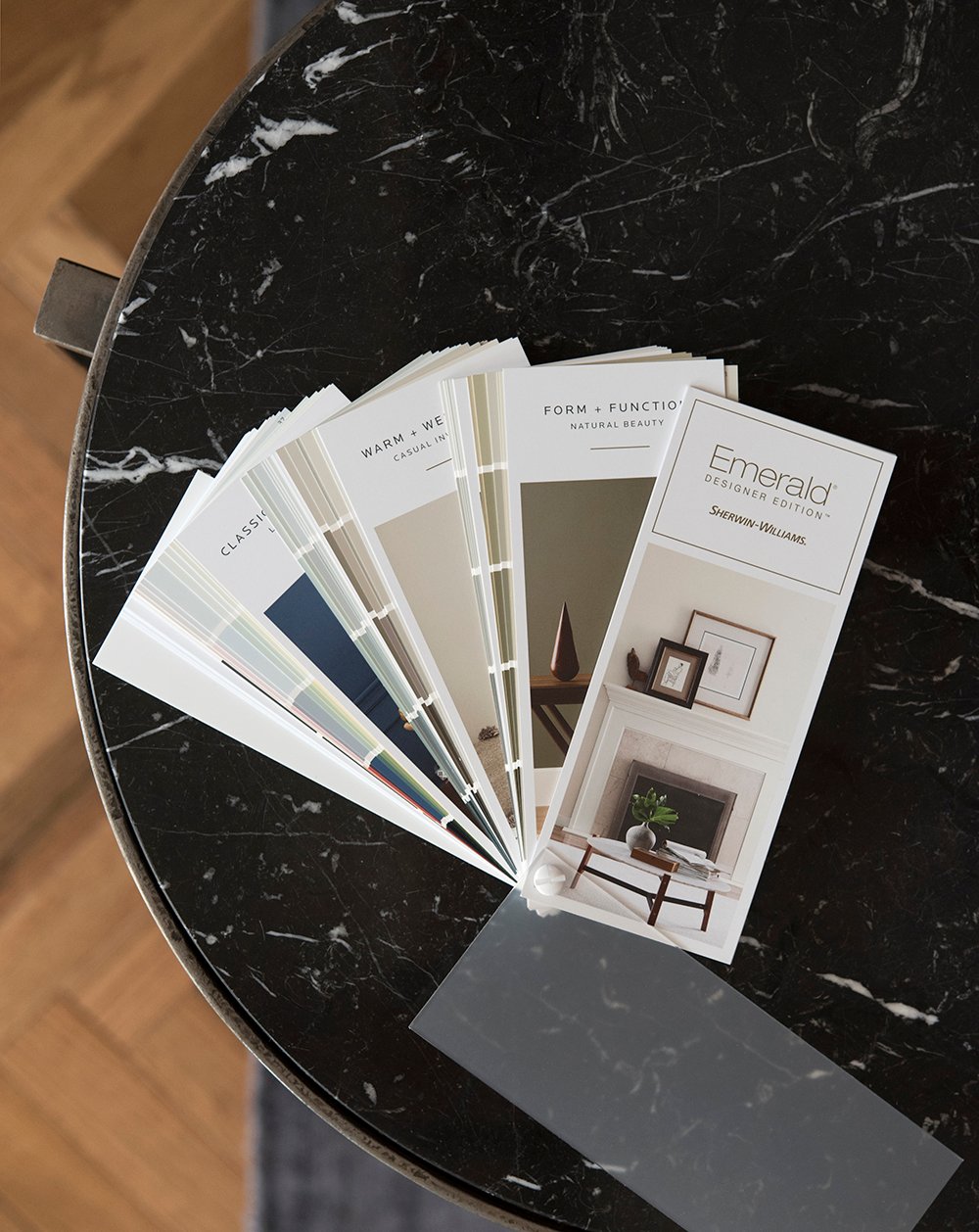
 All of these images came straight from my camera unedited, but it’s always best to swatch the paint in your home before moving forward. Paint colors and swatches reflect and absorb their surroundings, so it could look totally different in your space. Just a friendly reminder to swatch and test it out before committing! Oh- and I’m using Sherwin-Williams swatches because that’s just what I had on hand… but all of these could be color matched in your preferred brand.
Favorite Creamy Neutrals…
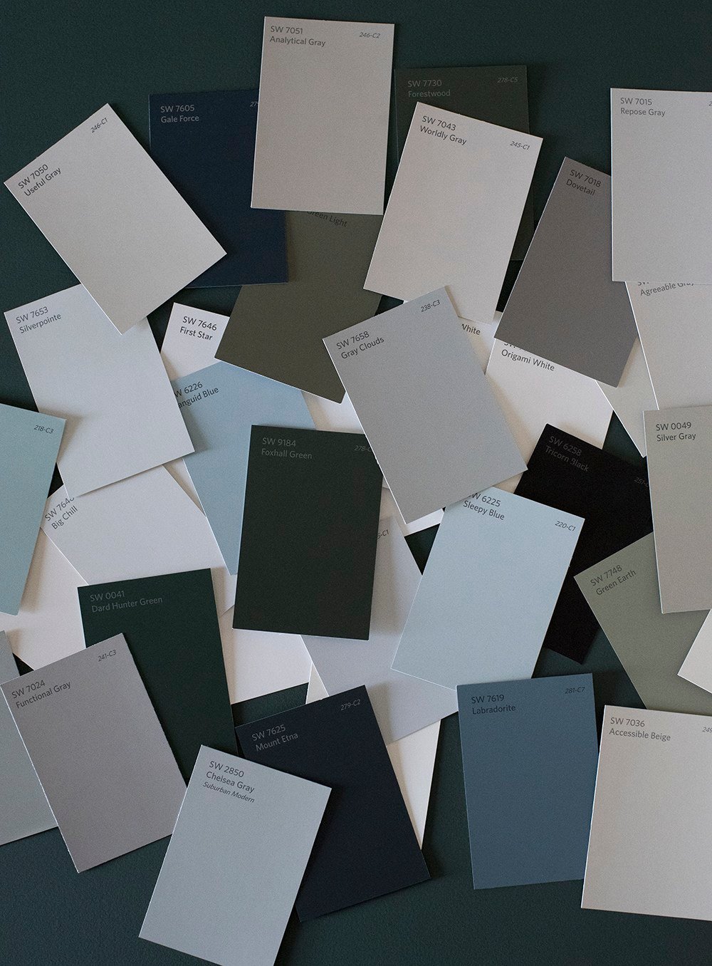
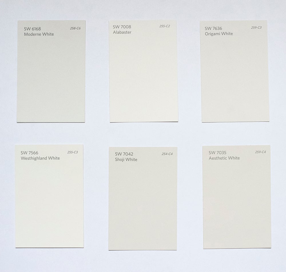 I’ve always been a big fan of creamy, white neutrals. They’re bright, inviting, and pretty much look good with any color in any space. They’re versatile and never really go out of style. I’ve used all of the swatches above.
Favorite Bright Whites…
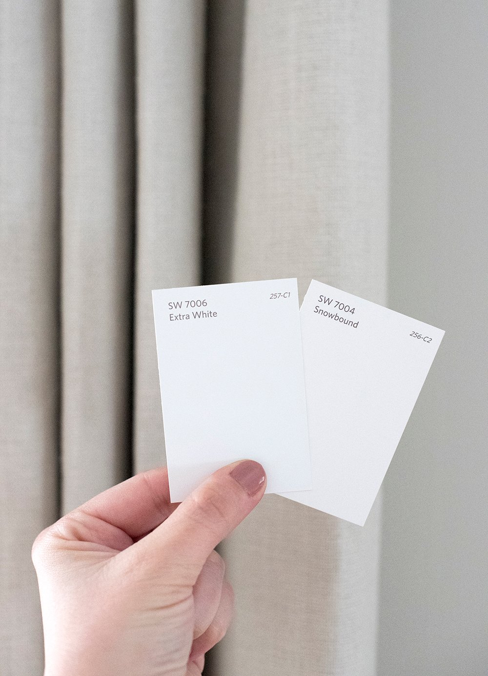 These are great true whites for trim or millwork. Rather than painting my entire wall these colors, I use them as crisp, contrasting accent colors. They’re wonderful for architectural details and provide a high contrast look! They don’t really skew warm or cool.
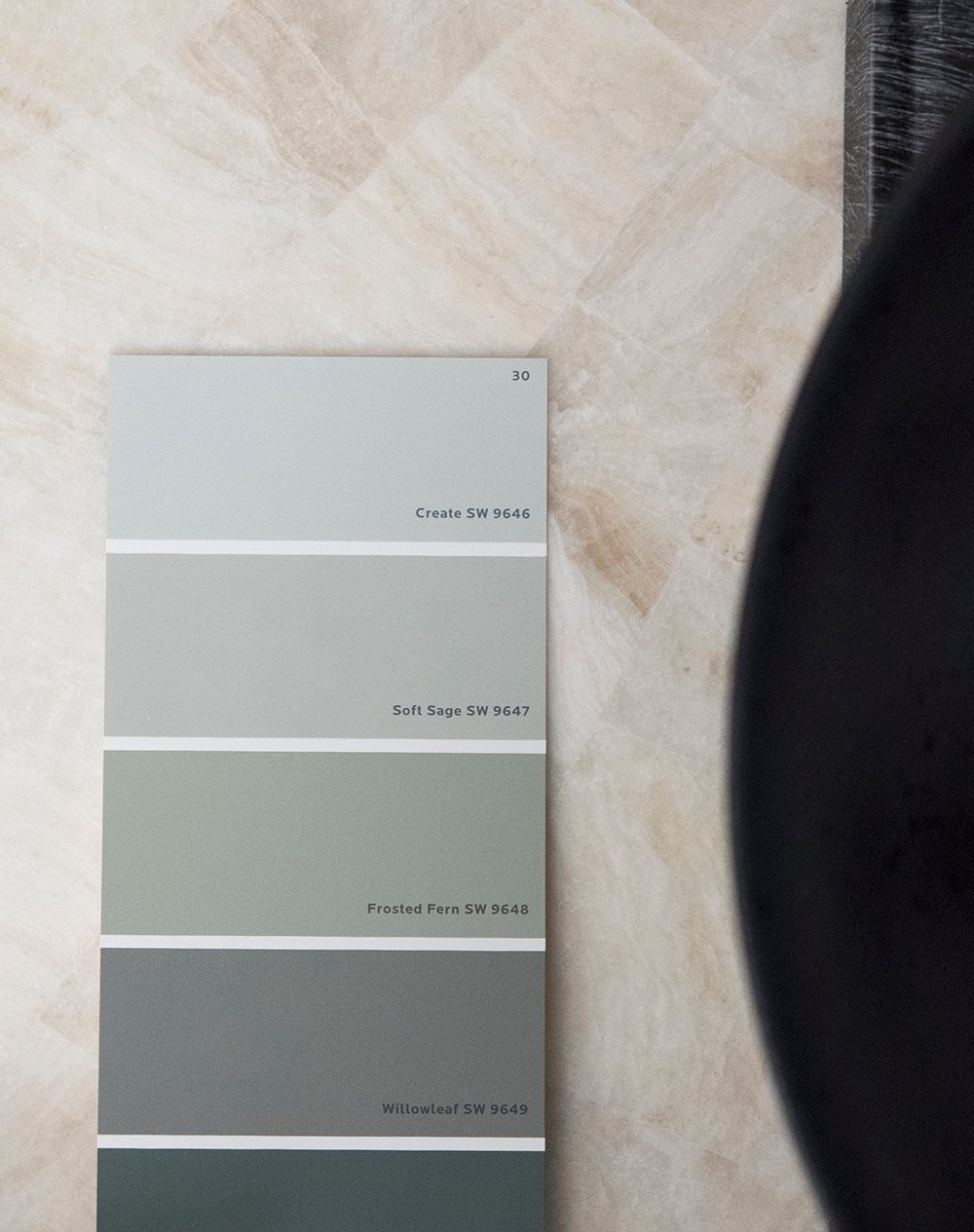
Favorite Dark Greens
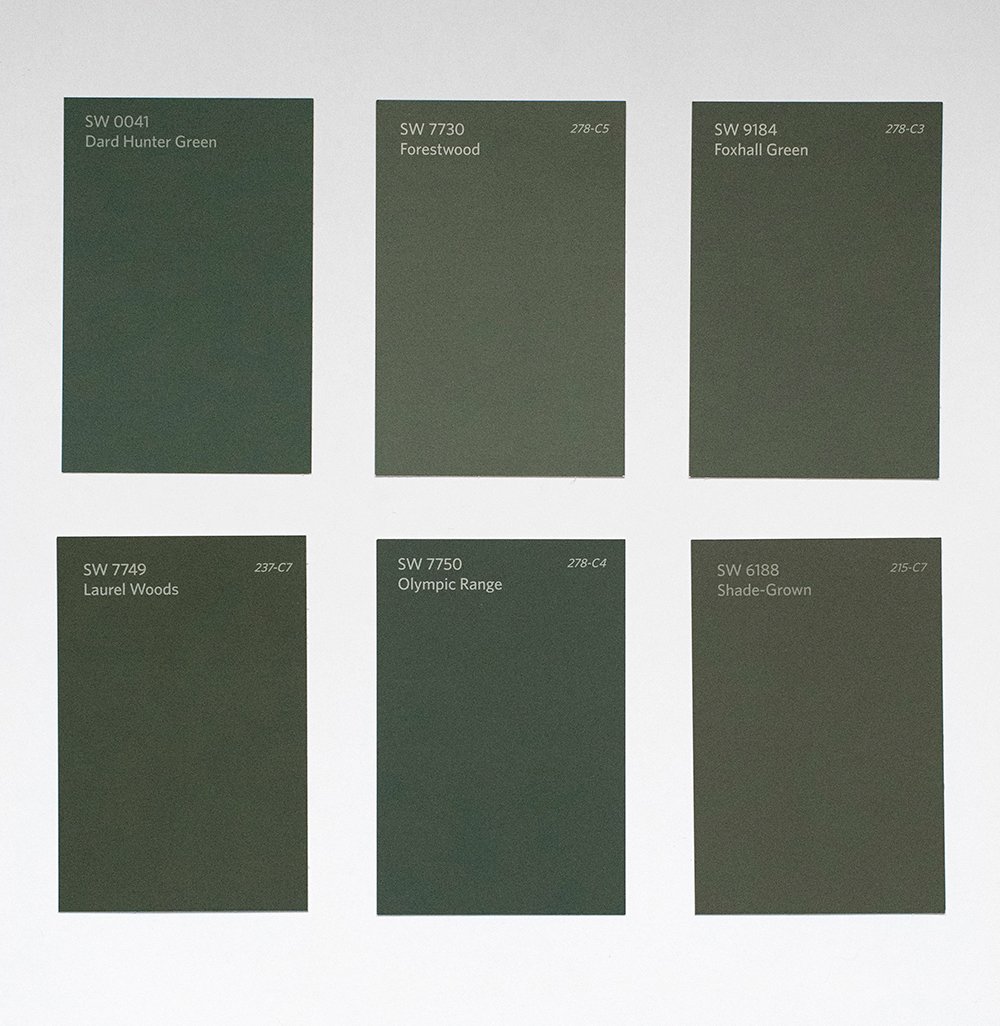 It’s no secret that I love a good deep green paint color! I’m honestly surprised we don’t have a room painted green in our current home yet. I know it will happen eventually! In the meantime, I’ve got my little bar cart.
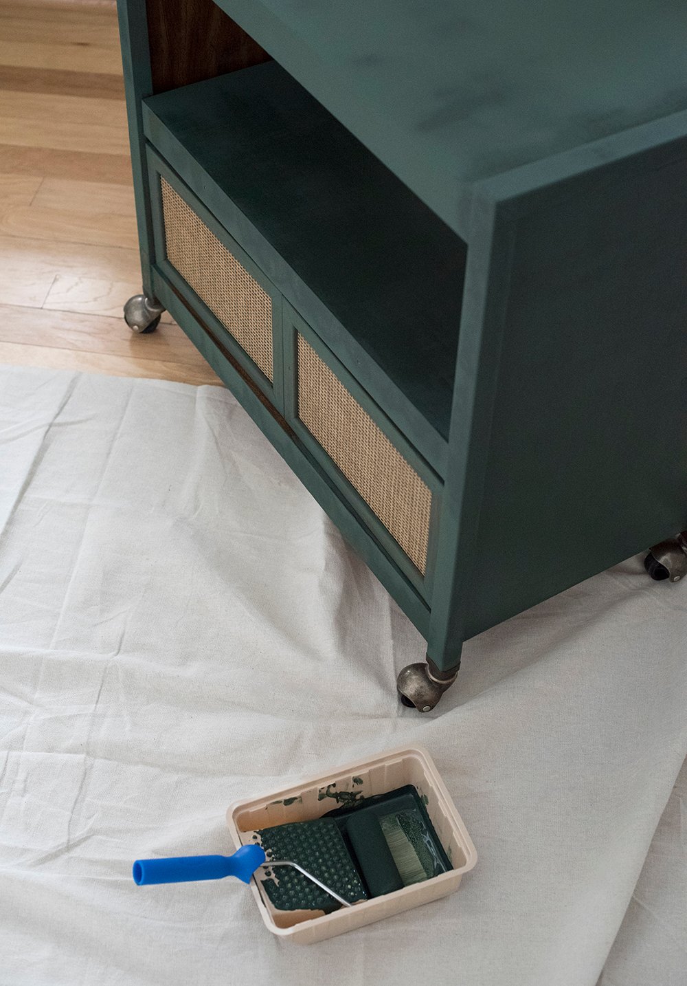 Green is one of those colors I’ll never tire of… on cabinetry, furniture, a wall, or the entire room- it’s my favorite color, so I’ll pretty much embrace it anywhere.
Favorite Navy Swatches…
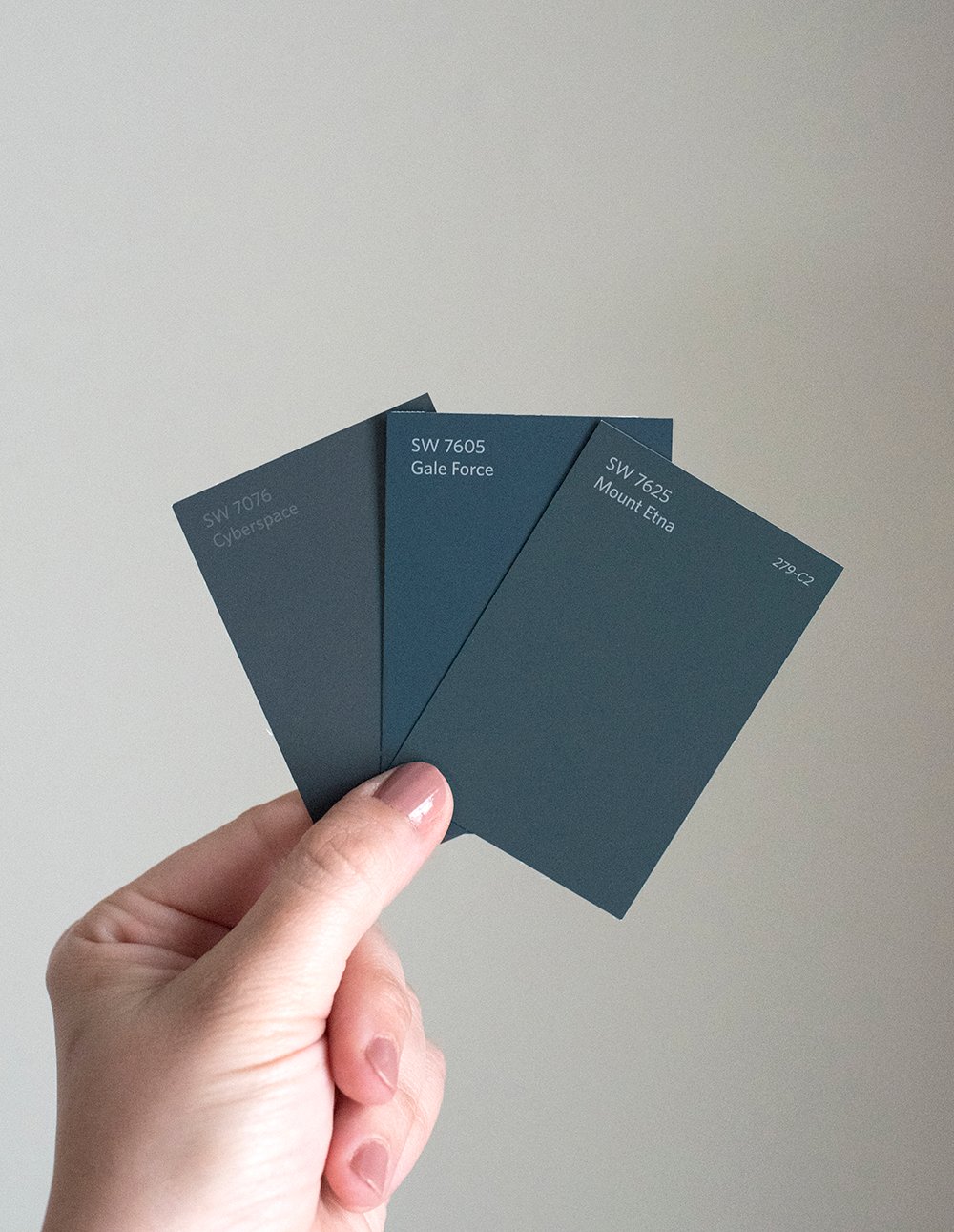 Much like green, navy and blue hues are another color that appear frequently throughout our home. It really doesn’t get more classic than blue. I often use blue and navy as a neutral, just because it feels comfortable and moody in the right way.
 Additionally, you can find similar navy and deep teal swatches in this post… I color matched our kitchen cabinetry with popular paint brands and swatched close hues!
Cool Hued Neutrals…
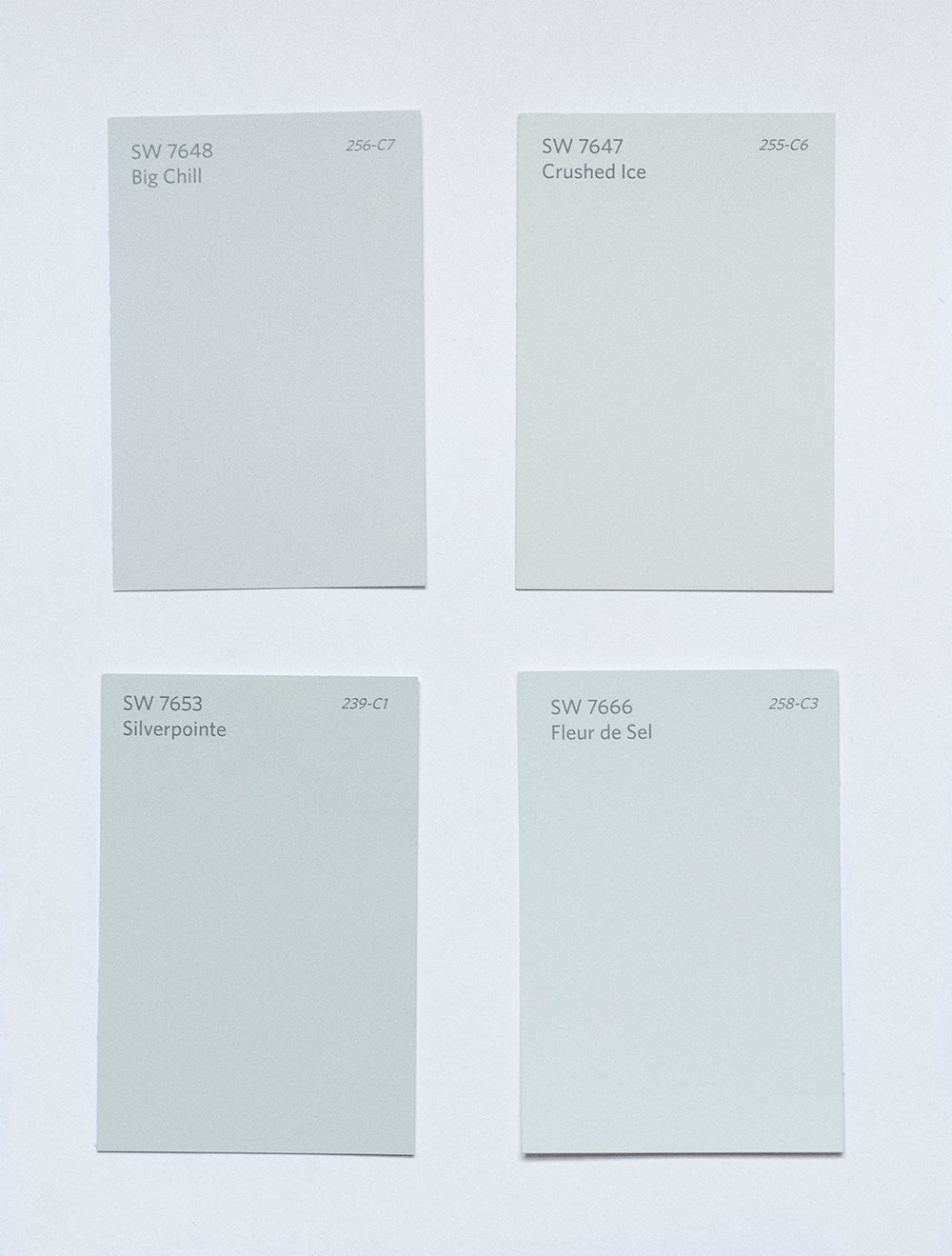 Our previous upper cabinets were a mix between Crushed Ice and Big Chill. These cool hues look great paired with warm, organic tones.
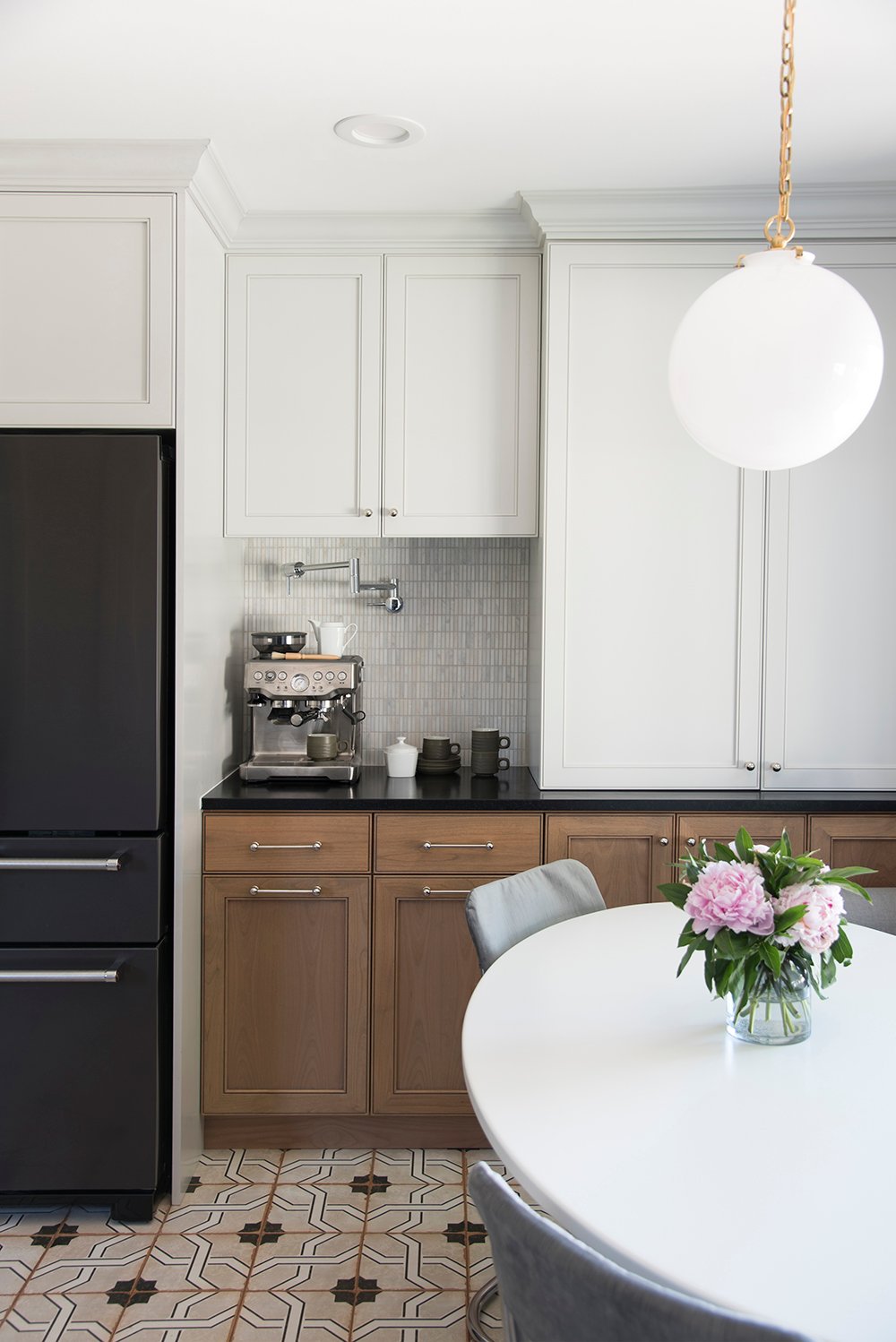 I loved the way our uppers looked with our alder wood lower cabinetry in our previous kitchen. A lot of these neutrals look brighter in person… again- swatching is very important to get an accurate read! Against the white printer paper I photographed the swatches against- they definitely look darker or more saturated than they actually are. Also take note of the ceiling in the above image because that’s the color we’re chatting about next…
My Favorite Ceiling Paint…
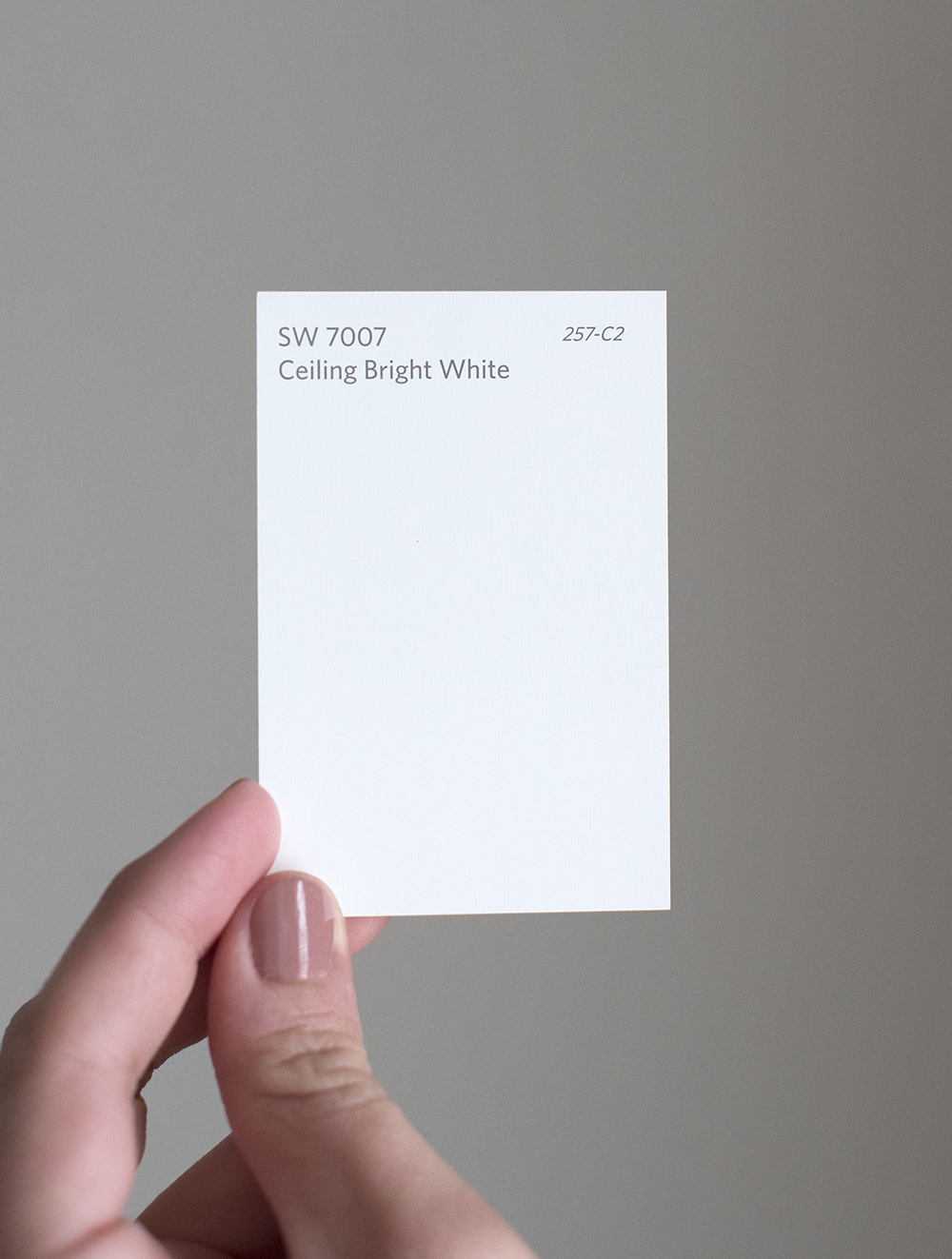 I get this question all the time and most people are surprised to hear the color I use 90% of the time on our ceilings. It’s pretty much always Ceiling Bright White 7007, unless I’m painting the ceiling an actual color. This swatch has a cool blue hue to it that works well on ceilings. I find that other colors cast shadows, look dirty, or accentuate texture. While predictable, this is the perfect paint color for the ceiling, which is appropriately named!
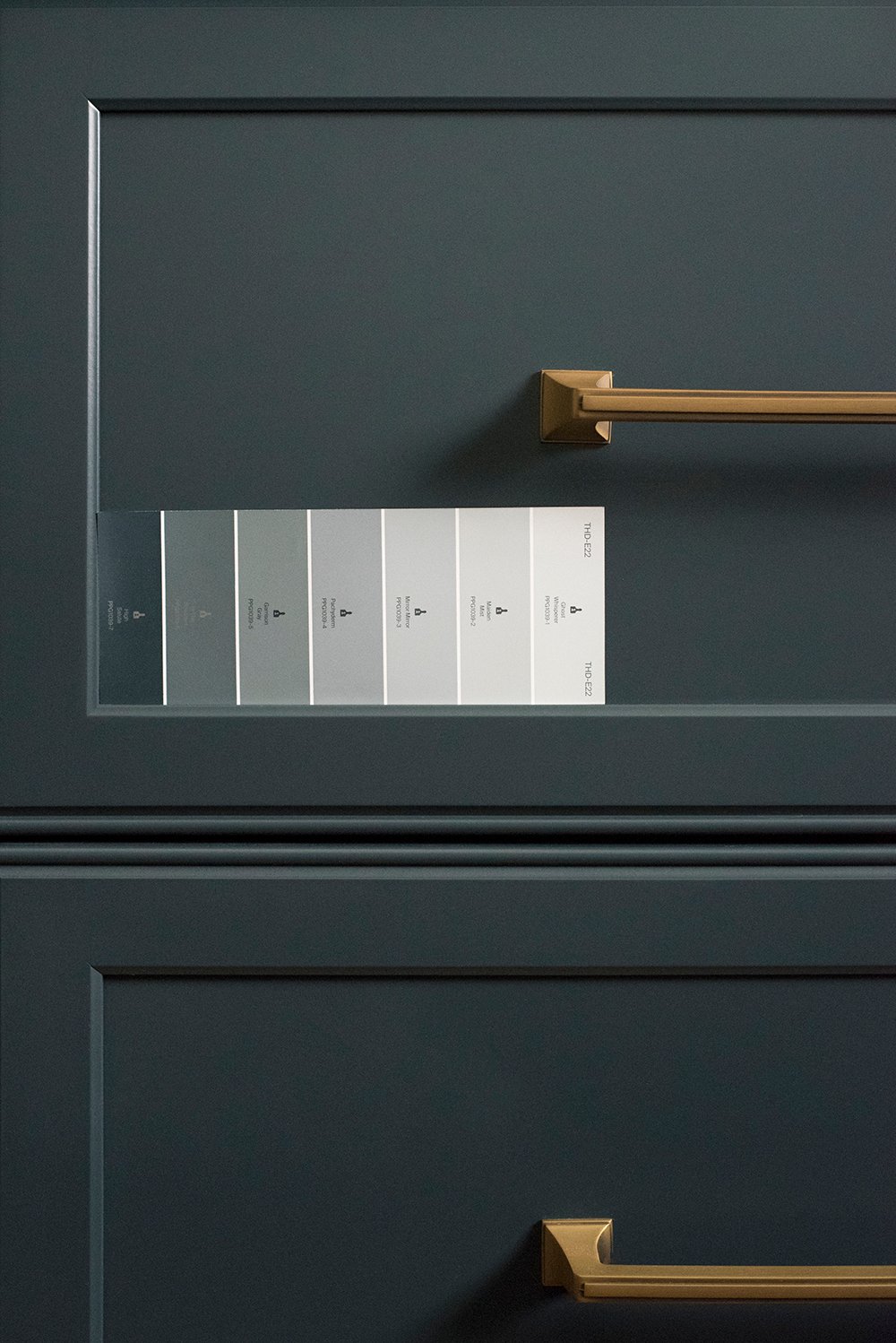
Some Color Combinations…
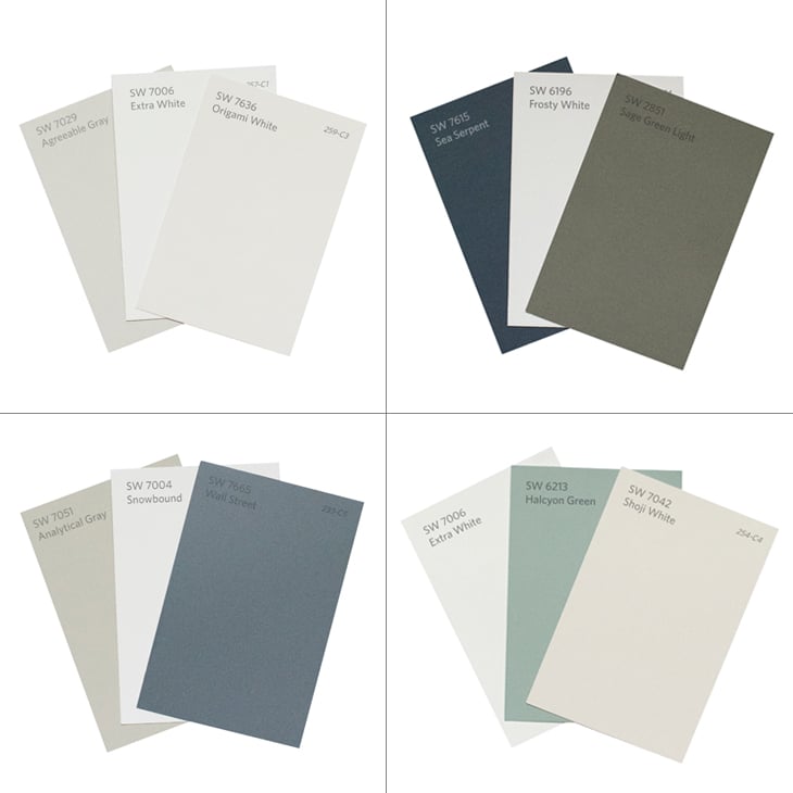 I’m always examining colors alongside each other. The lower right combination might look familiar, as I just shared that palette in our guest bedroom reveal. It’s also important to know which colors work well together! I like contrast, so I usually paint the trim and wall color contrasting colors.
 On the hunt for more paint swatch guidance and color-related posts? I’ll link some helpful posts from the past below…
- Favorite Paint Swatches from the SW Designer Deck
- Designer Trick : Choosing the Perfect Paint Color
- Favorite Paint Colors as Seen Throughout My Home
- Predicted Paint Colors for 2020
- Predicted Paint Colors for 2019
- Predicted Paint Colors for 2018
- Predicted Paint Colors for 2017
- My Favorite Green Paint Colors
- Best Spray Colors
- Color Matching Our Kitchen Cabinets
- My Favorite Readymade Cabinetry Colors
- How to Choose the Right Brush or Roller
 I used loose Sherwin-Williams swatches I had on hand for this post, and you all know I love cooler hues in our home, so I might have to do a follow-up post for those of you who would like to see some warmer colors and combinations. It’s not that I don’t like them, I just didn’t have any swatches in my desk for photographing! Let me know if that is of interest and I can make a trip to my local SW store to grab some additional paint chips. I haven’t been feeling very well this week, but once I’m on the mend- I’d be more than happy to run to the paint store. In other news, I have some really fun upcoming posts to share with you- window treatments in my office and new furniture in our living room! Things are looking VERY different around here- I just need to find time to grab my camera to document the current state of our house. Ha! Happy Tuesday, friends!
I could play with paint and fabric combinations all day! I love all the colors you featured; greens and blues are definitely favorites over here. Of course, we also love the pinks/purples/reds/oranges.🤣 I’m a little surprised you don’t include more warm tones because your wardrobe favors rust and ochres. New furniture?! That’s pretty exciting. And lovely, special drapes? Does this mean you’re honing in your office design? Can’t wait!
Sorry to hear you’re feeling under the weather! Take care, friend. 💜
Me too! When I used to work at a design studio we had an entire library filled with fabric, paint, and tile samples- it was heaven. I need to add some pinks, purples, reds, and oranges to my swatch collection. It’s so interesting that I wear all of those colors, but don’t have them in our house yet. It’s clearly not that I don’t like them. Haha! I’m not sure, but I’m ready to add some warm hues. We’ve been doing a furniture shuffle between our house and the office- and I set up Emmett a workspace as he has been working from home lately, so things have looked chaotic over here… but it’s finally coming together-ish. Ha! I need to grab my camera and share what’s going on. The drapery in my office is gorgeous- I can’t wait to show you!! I had a partnership opportunity I couldn’t pass up, so once I photograph the curtains this week, they’re actually coming back down (to a safe spot) while I move out of the office and we begin demo. Lots of exciting stuff on my to-do list. Thanks for the well wishes- today was a much better day :) Hope you’re having a good week! xox
Ah, man. I’m sorry to hear you’re not feeling well. I hope you don’t have the “hots” as my young son once said when he was trying to console his sister who had gotten sick. :) It was interesting that you pointed out that you tend to use more of the cooler shades of colors because your rooms always appear so cozy to me-which I would tend to think would come more from warmer colors. And I guess it’s everything else going on in a room that adds to the coziness factor. And I just have to say that I really appreciate you putting color names on here. Designers are always giving the disclaimer that you have to try it in your home first-results not guaranteed, so I have received the PSA ;) but it helps just having a starting point! Especially with whites. There are a million to choose from! The white colors I swatched and ultimately used were recommended by designers. I’m going to take a hard look at your greens for painting my son’s dresser. Maybe it’s a sciency question, but I’m just curious, what is it about the blue in the ceiling white that makes it work for ceilings? I hope you’re feeling much better soon!
Thanks, Brittany! The “hots” LOL!! Thanks for the laugh- that is so cute. Kids say the most adorable things. It really is interesting that we don’t have warm tones in our house (yet)! I think because I use a lot of natural wood and organic materials, it still reads as warm and inviting. At least I hope! Having the color name is definitely a great starting point. I’m always happy to share but will never make a recommendation for a certain space because of that (there are so many things to consider). Anyway, I hope it was helpful! There really are a million colors to choose from. Great question on the ceiling paint- I think the blue hued ceiling paint actually reads crisp white on a ceiling. It gives it a little extra oomph! I appreciate your well wishes :) today was a better day! xox
Under the weather and your radar for a perfectly timed post is still intact! I’m sorry to hear you’re not feeling up to snuff Sarah. Hopefully a little rest this week will get you feeling right as rain. This post couldn’t have come at a better time! Yesterday Jeff and I replaced all three toilets in the house. Our downstairs bath is pretty dated with the builder grade vanity top that has the banjo ledge. I didn’t tell Jeff until after the toilets were purchased, that he’d have to cut that banjo to fit it in the downstairs bath. A well played move on my part! I killed two birds with one stone: got the beautiful toilets I wanted and got rid of the ugly useless top. In the process I was able to prep for new paint while the old toilet was out. Would you believe that there was no caulking done in that bathroom?? With the exception of the shower surround-which they did a piss poor job on! However, I caulked everything, and primed the area behind the toilet. Now I just need to prime above the shower and behind the mirror. I’m heading down to SW this week to pick up chips and samples to test, and I’ve screen shot a few of your images. I’ll have to pick up quite a few supplies based on your post about the right brushes and rollers, but I’m looking forward to it! Completely nerding out and feeling inspired in the way of painting lately. Now that some of the prep work is done in the downstairs bath, you wouldn’t believe how much better it looks! We have an initial renovation plan for that bathroom that includes paint, new door and drawer fronts for the vanity with fresh paint, swapping the mirror, moving an outlet, removing the medicine cabinet and boxing in the hole, swapping out the plumbing fixtures, and the light fixture. Phase two will include replacing the vanity top completely, replacing the flooring (which we discovered has a layer of quite hideous linoleum underneath😖), and removing the shower surround and tiling the shower. I’m pretty stoked by our results so far, and I’m so pumped for paint! I know it’s going to look incredible once new paint goes up, even without the other work being done immediately. I’m pinning this post for reference later! Thank you for sharing Sarah! I hope you feel better as the week goes on. Happy Monday!
Haha, I love it! Today I felt a bit better :) thanks, Lauren! Luckily, my Covid test came back negative, so that’s a win. You replaced THREE toilets in one day?! You and Jeff are champs- especially since you had to cut to make it fit (well played, lol)! I am shocked that the builder or contractor didn’t use caulk or silicone in a bathroom. That’s a new one! I love that you’re feeling inspired and are in the mood to paint lately. Send me some of your motivation, please ;) I’m so excited for you. Amazing work on your renovation plan and getting the ball rolling. I took a shower in our basement bathroom for the second time ever last night, and it was fun to remember where that space started. You’re going to be thrilled once it’s all installed and looking beautiful. Keep up the incredible work!! xox
Great paint picks Sarah! I can attest to Aesthetic white, I have it in the majority of our home here and it’s so beautiful. It’s the perfect neutral in my opinion. To be honest this is the very first time I have ever lived with white walls. It’s our fifth house and I’ve always had color in each and every one so this is a first for us. We still have lots of color in our home just not on the walls. And we have extra white on all the trim and doors and it’s lovely too. I love all your paint picks and palettes and for me blue is a neutral. I inject blue always as it’s so soothing and calming.
At our little cottage I’m going to paint the kitchen cabinets blue I think and Mount Etna looks like a stunning shade of blue. I would love a new kitchen there but for now I’m going to refresh it with paint. With the cost of a new foundation, new front and back decks and a new well has deteriorated our budget for any Reno’s on the inside so paint is going to be my best friend on this project 😉 this post is much appreciated.
Feel better Sarah, and so excited to hear more about new window treatments and furniture 😍
So fun! When you are on the mend of course! Take care and have a restful day ❤️
Thank you, Colleen. I love that you are also an Aesthetic White fan… it’s such a beautiful color! It really is the perfect neutral. We also have it paired with Extra White and it’s a lovely combination. It feels clean and inviting- and gives us the opportunity to play around with color seasonally in accessories. I think it’s really versatile. I’m also in agreement on using lots of blue. It sounds like you and I love the same palette :) Haha! I can’t wait to see your blue cottage cabinets- that sounds dreamy. If we ever invested in a cabin or cottage, I would use a LOT of paint to transform it in a budget-friendly way. You’re doing all the right things and it’s going to be beautiful. Thanks again, Colleen! Hope you’re having a good week. xox
I love this color blue. What is it called ? Is it a Sheeran Williams paint ?