Favorite Paint Colors (As Seen Throughout My Home)
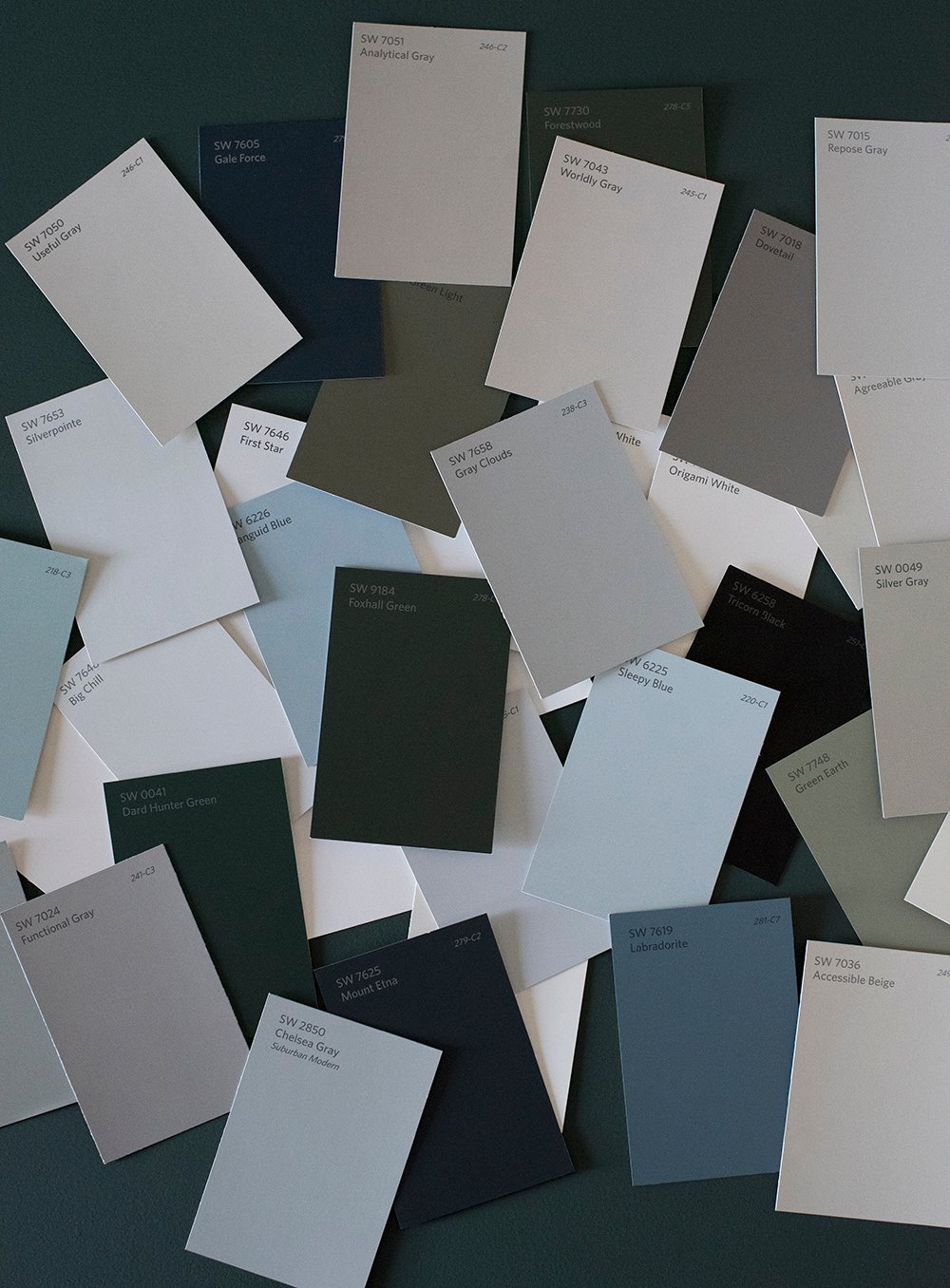 Happy Friday, friends! I get SO many questions about paint colors and while I firmly believe in testing a swatch in your own home prior to committing (because paint looks very different based on its surroundings), I thought I’d compile a big blog post with my favorite, most asked about, paint colors that you can find throughout my home- or previous homes, as the case may be. If you’re looking for swatches to test, definitely check out some of these that I’ve used and loved…
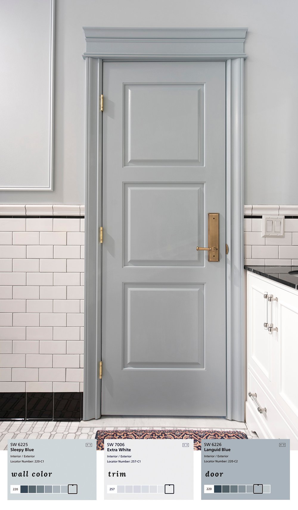 In our guest bathroom, I wanted to keep things classic, but also a little playful. I ended up pulling a light / medium cornflower blue color from the vintage rug and I love the way it applied to the millwork and walls. A tip? I selected slightly varying hues from my fan deck. Sleepy Blue and Languid Blue are in the same color family, they’re just one swatch different (lighter / darker).
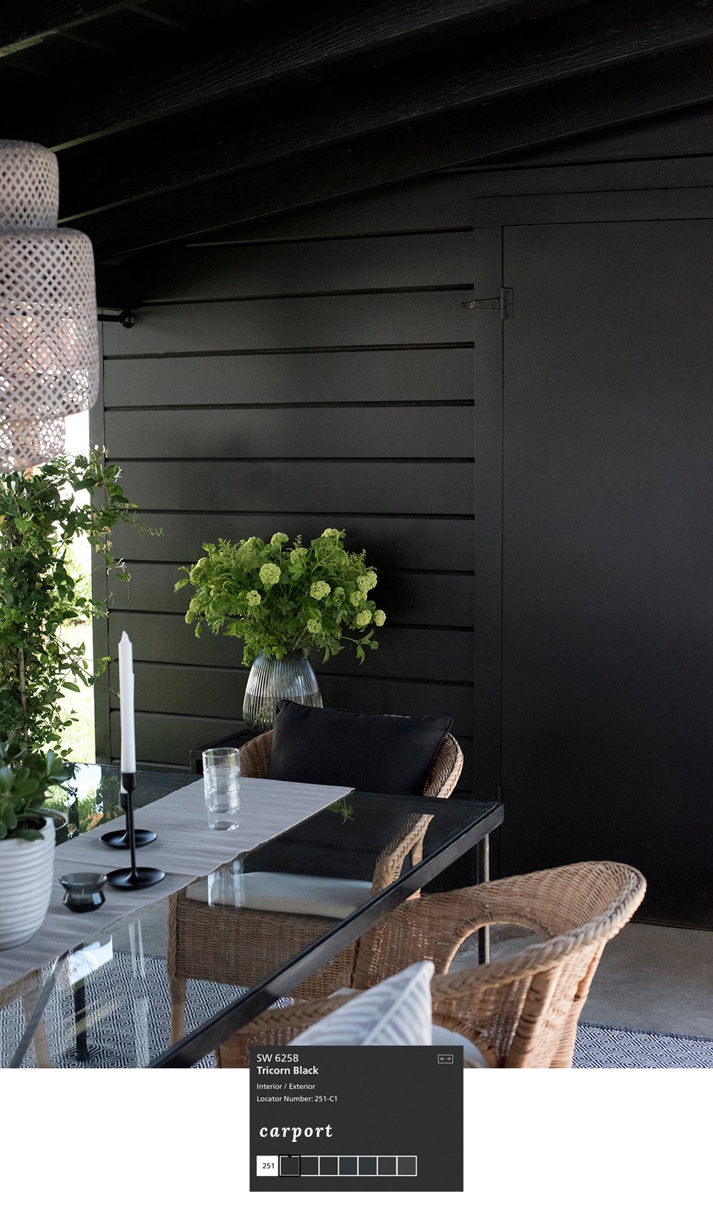 Remember that time I decided to transform our ugly brown carport into an al fresco dining area? If you missed it, check out the reveal here… it was a good one! I didn’t really do anything to the space other than paint and style it. The transformative power of paint continues to surprise me. Bold, black paint worked so well for this outdoor area. Want to see this color in an interior setting? My friend Ashley painted her master bedroom here.
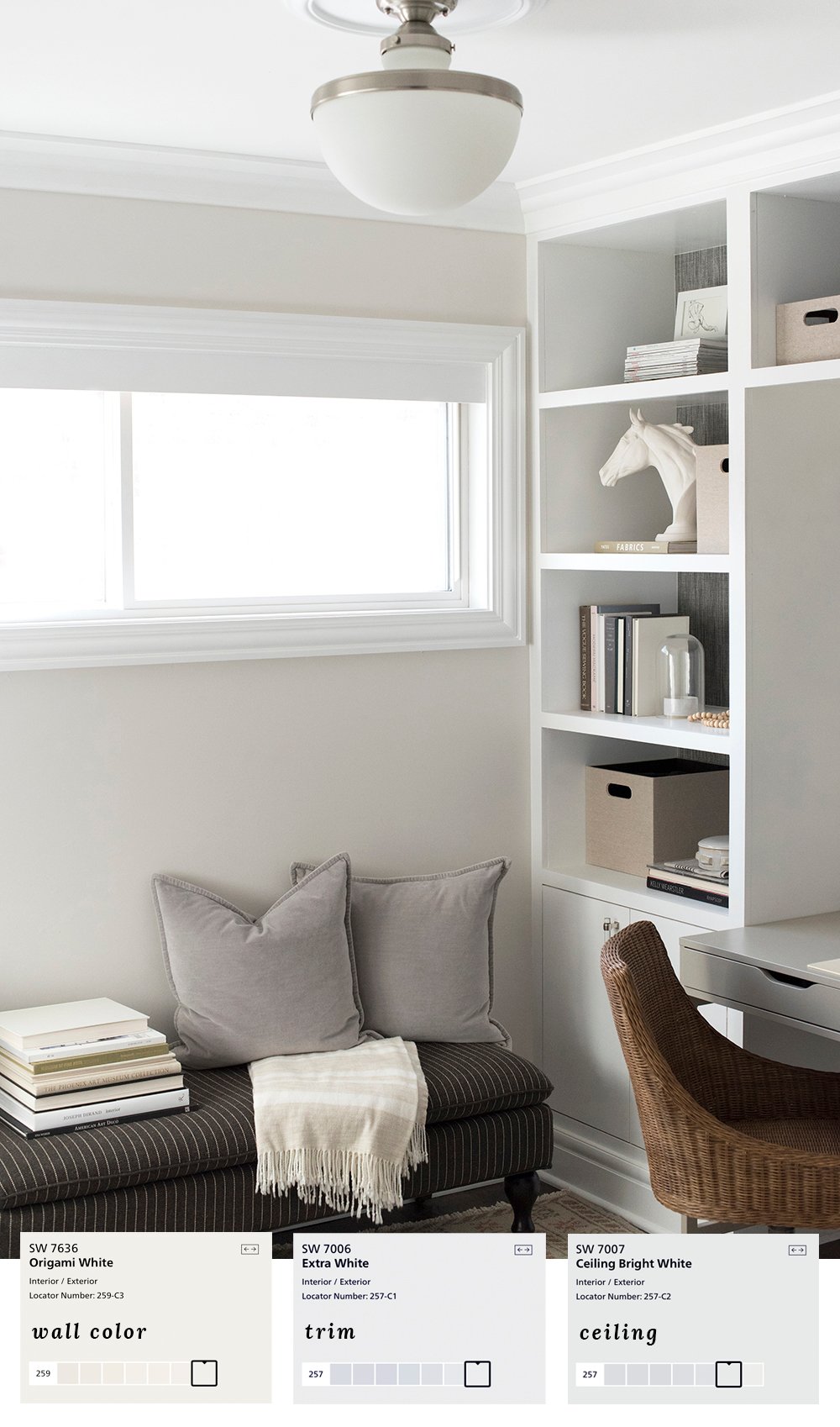 In my previous office (that we finished almost exactly a year ago!), I kept things neutral and bright. With textured built-ins, wallpaper, and a lot of other things going on in the space, I wanted to keep this room free of visual clutter. I like a calm, neutral workspace!
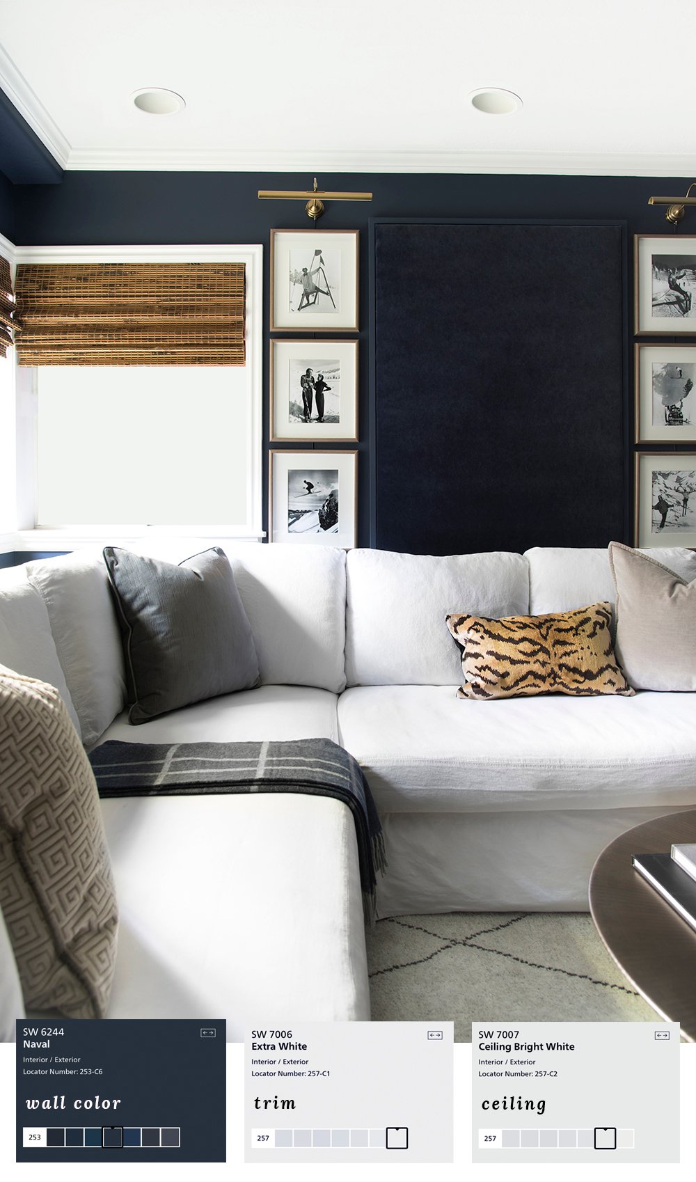 Our most recent project, the basement media room, is probably my favorite right now. We spend so much time lounging downstairs and the dark & moody navy paint is SO GOOD.
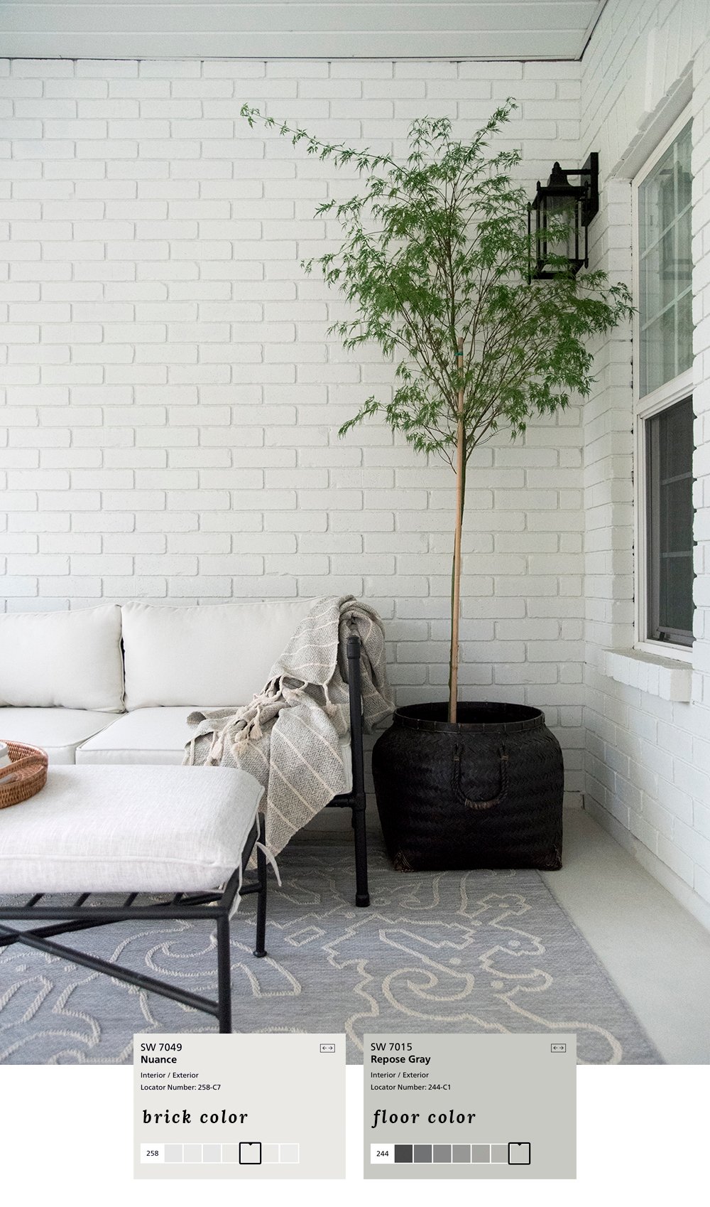 Over the summer, I tackled our bedroom balcony. I painted the brick (read more about that here), and brightened the deck in an effort to make it a place I actually enjoy hanging out. Mission accomplished- I spend time out here every single day!
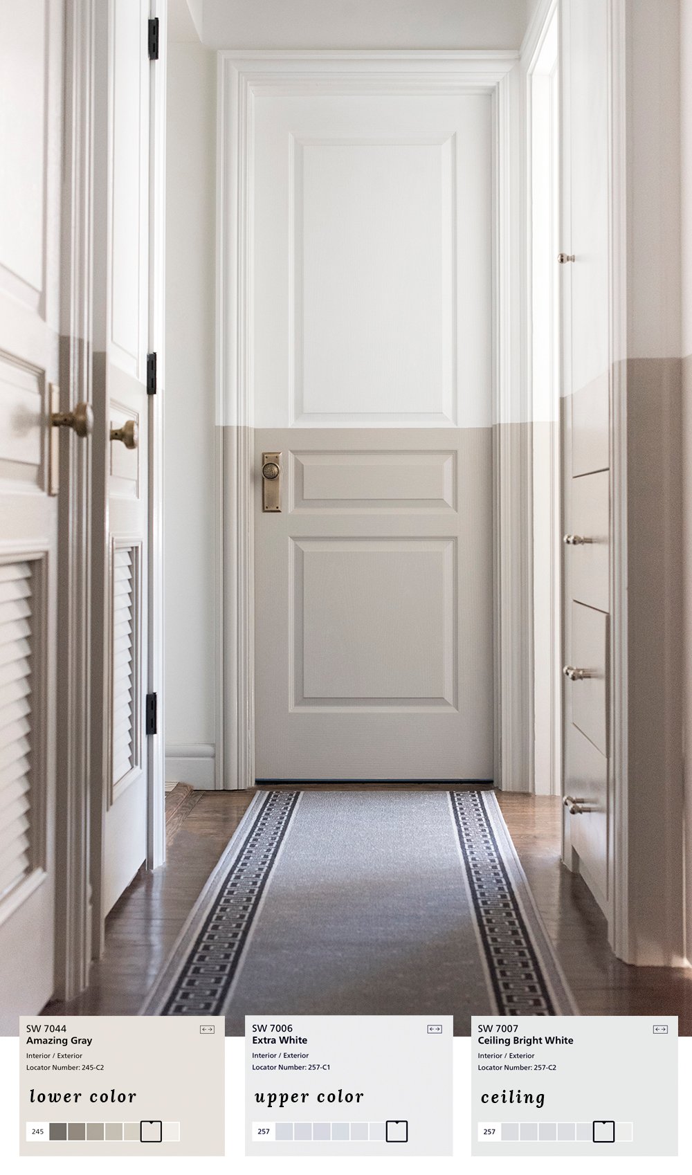 Oh whoa. EXACTLY a year ago, I shared our color blocked hallway renovation. How was that only a year ago?! It feels like longer in my head. This seemed like a wild idea, but I really adore the way it turned out. It’s weird in the best way! It just goes to show once again… that paint has magical transformative powers- especially if you think outside the box.
 The paint color I’m most often asked about? Our previous green fireplace! She was a beauty. Something about that green hue with the cool marble worked really well. Olive Grove still remains one of my very favorite medium green tones.
 I remember thinking I wanted to try contrast trim in our previous master bedroom, and it seemed risky to me at the time. It’s funny how something as simple as paint seemed like a huge decision. Ha! I’m really glad I went with my gut and painted the trim darker than the wall color. I’ve repeated that application multiple times since that bedroom.
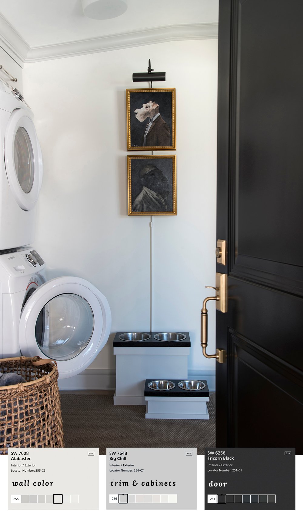 Ah, the laundry room… and more contrast trim! This was our previous One Room Challenge space and it was the happiest place to do laundry. I went for a high contrast look while keeping things bright.
 Do you remember last year’s Sherwin-Williams Color of the Year? I’m still determined to use it someplace in our new house! This photo was taken before I renovated my office. I painted an accent wall, just for fun.
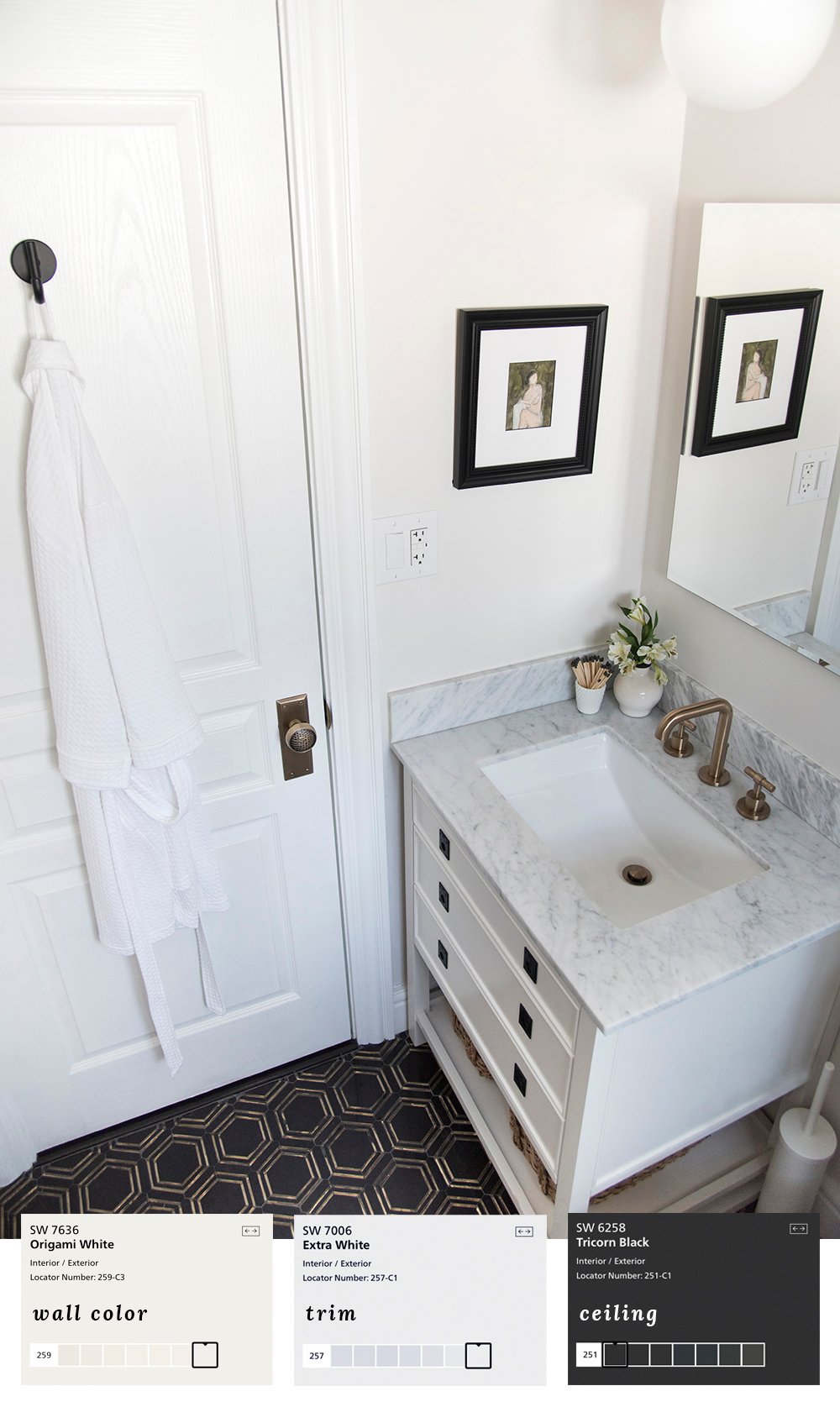 This bathroom was one of my favorite spaces to design. I packed a TON of function into that tiny room, as well as bold contrasting paint and a BLACK CEILING. Yes- I painted the ceiling black and it was the best decision ever.
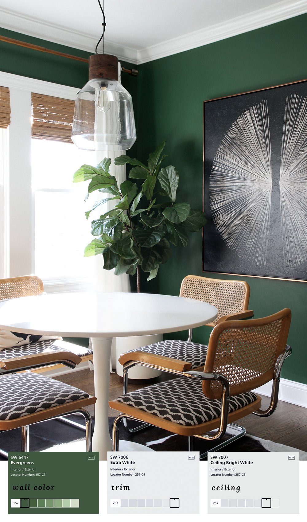 Let’s rewind wayyyy back to our first renovation. Who remembers this dining room? My love for dark green runs deep and I’ve been using hunter green hues since we bought our first home years ago. This space actually got published in HGTV magazine solely because of the awesome paint color. Check out the article here!
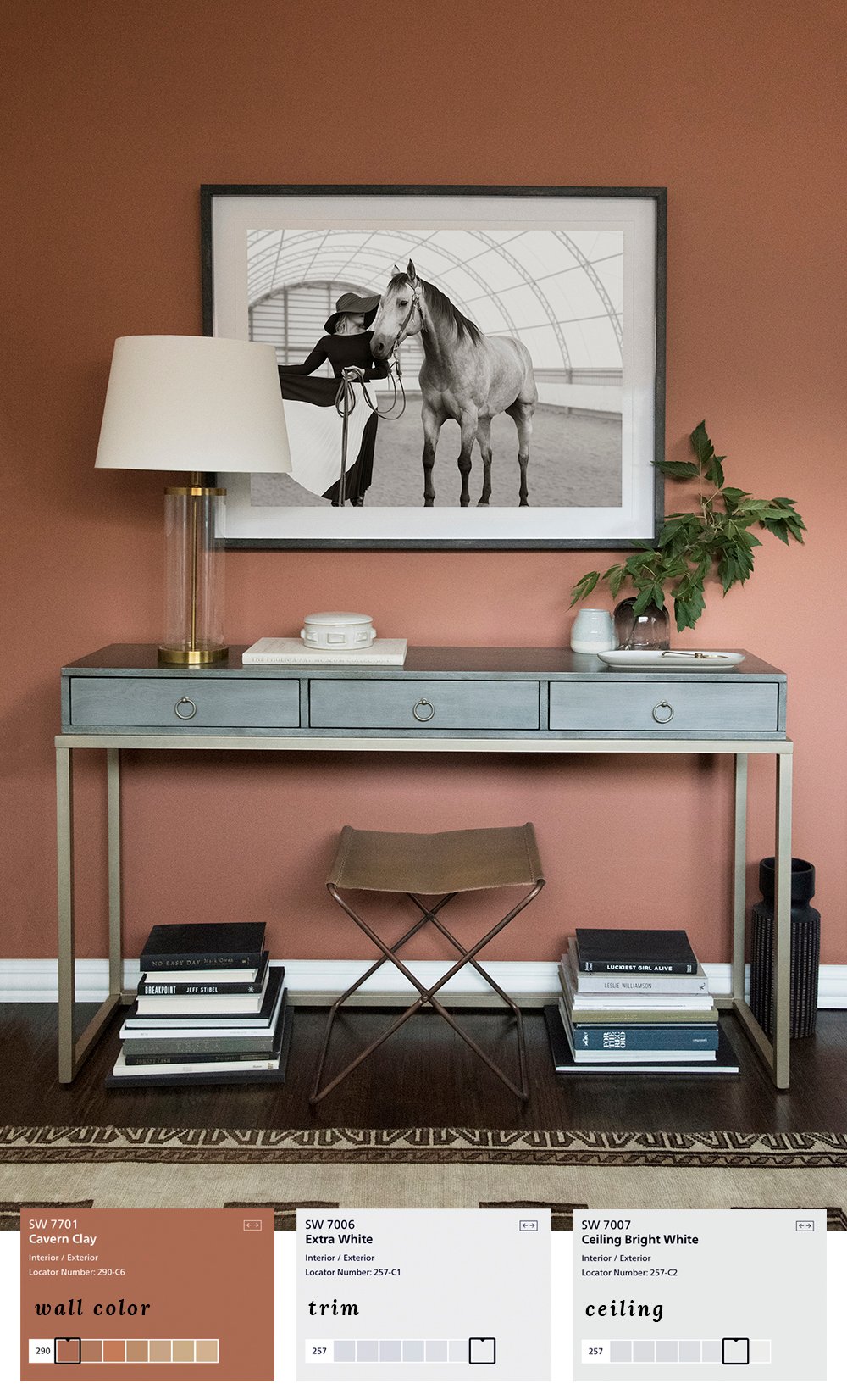
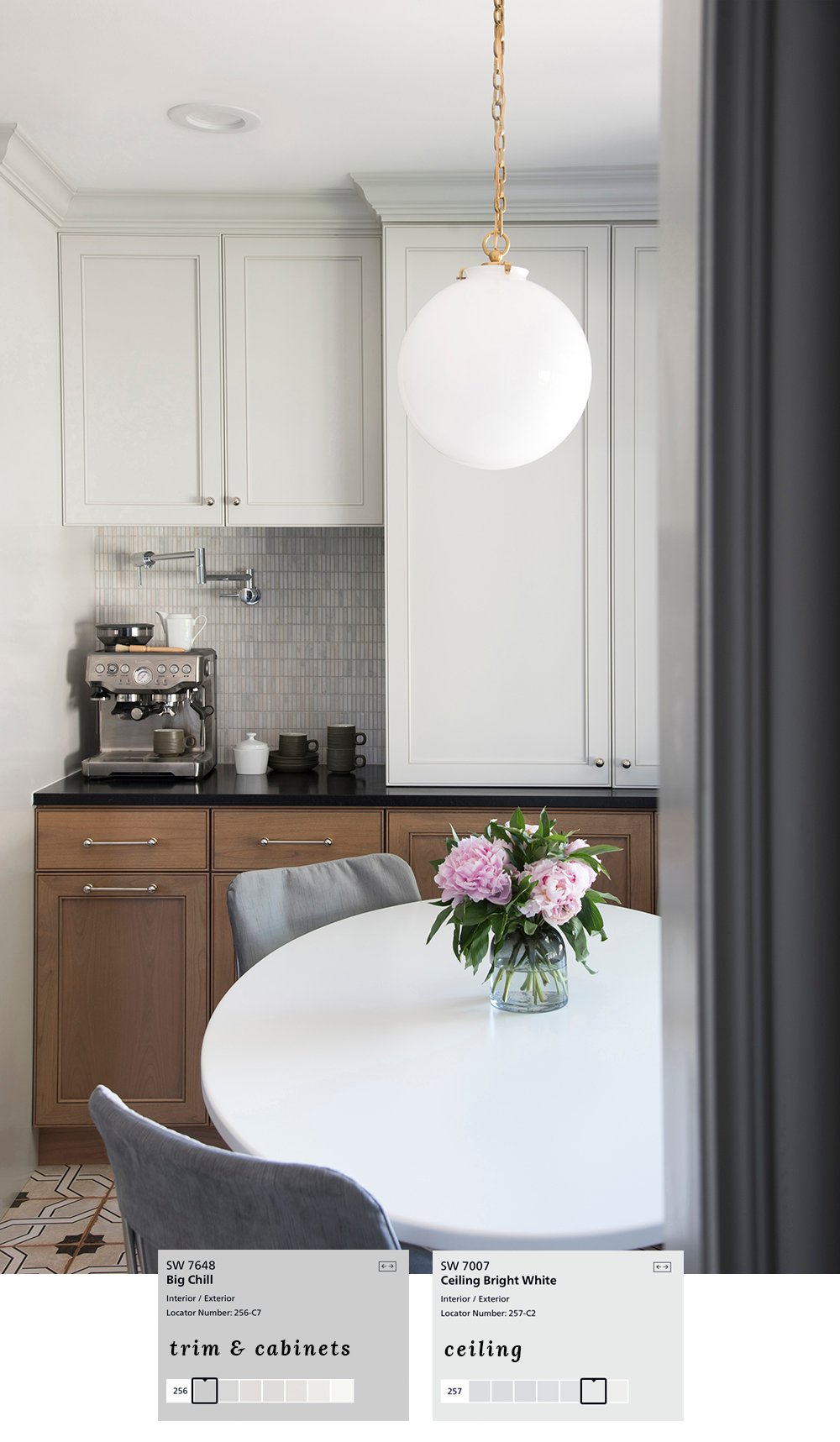 Next up, our previous kitchen and dining nook. Again- I went neutral because of the warm wood cabinetry, but that doesn’t make these colors any less awesome! Big Chill is really a chameleon color that changes from warm to cool at different times of the day.
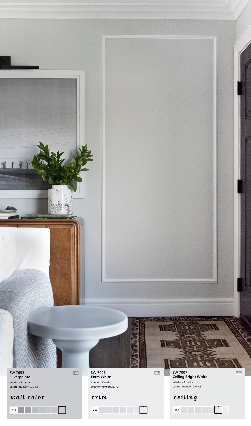 Confession- I painted our previous living room walls a not-so-great brown/gray color I thought was going to be cool. It backfired, and was most certainly not cool (even designers & pros mess up). I ran to the paint store, grabbed a couple gallons of Silverpointe (which is a cool gray / light blue hue), quickly painted before Emmett got home, and breathed a sigh of relief. Haha! I’ve never told that story, but this paint saved the day and was made for this room!
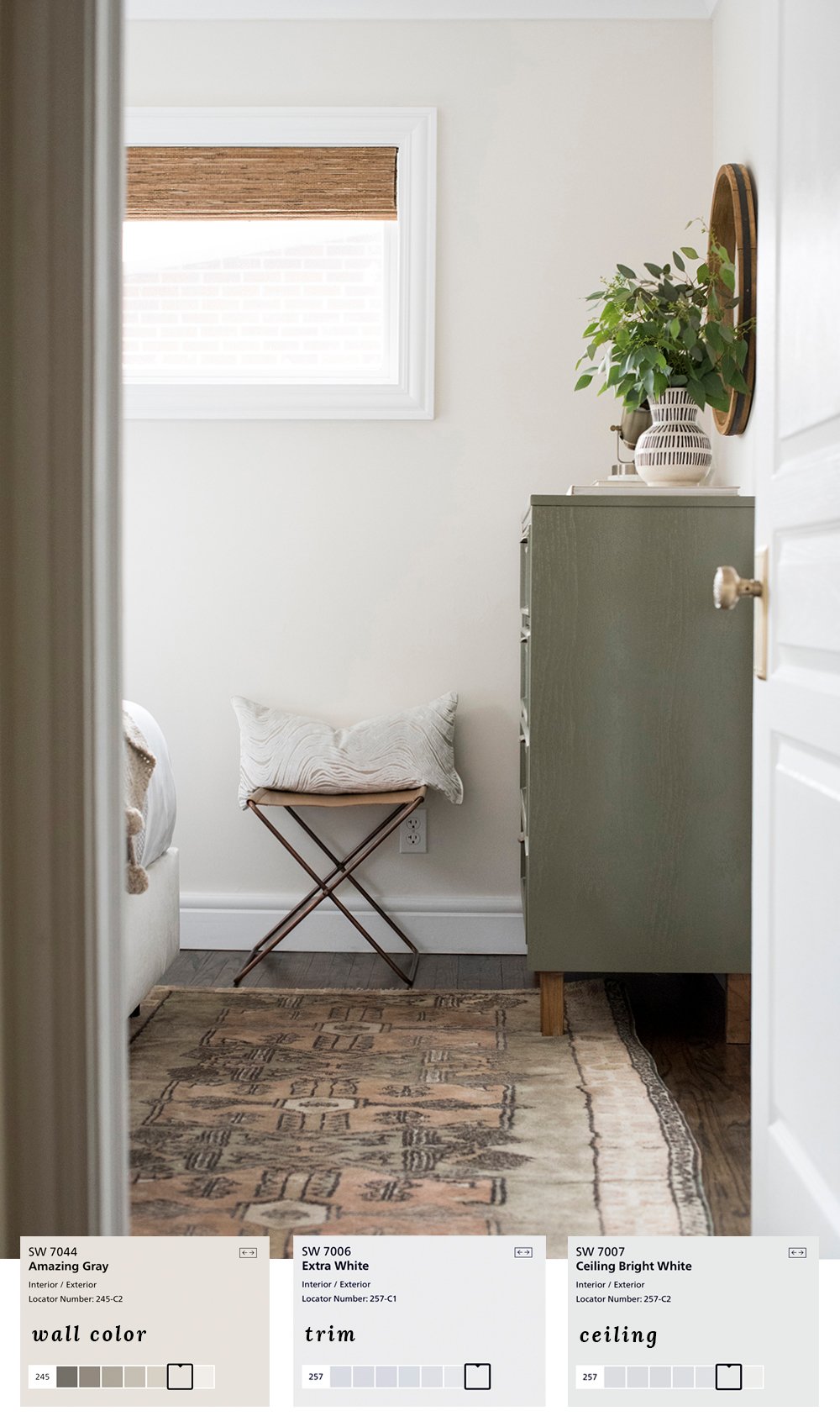 Lastly, another warm, inviting, and neutral space… the guest bedroom. I pulled some creamy neutral hues from the vintage rug… noticing a pattern with that trick? I love using textiles and art as color palette inspiration.
There you have it- some of my all-time favorite paint colors! Remember to experiment with swatches before committing- that’s the best way to get the right paint for your room. Have a great weekend!
Hahaha! Rushing to repaint the living room before Emmett got home! Thanks for the chuckle. But now, a serious question. I note you use the same white for trim (when you didn’t use a darker color) throughout your house. How does one white look great in every room with every wall color and light situation? I have used a couple of different whites for trim-because they looked better within the room-but now I have doorway/transition issues. I respect your love of trim and moulding, but painting it is THE worst. BTW, that opening shot of paint chips is dreamy!!
Hi Sarah!
I’ve been following for almost two years now and love your blog SO much! I’ve gotten so much inspiration from you and so so many ideas on how to transform our first home! I’m struggling with paint colors and I’m hoping you can provide guidance.
I absolutely love love LOVE your bathroom from your last house. And your office. Both are incredible spaces that I just could not wait to try to draw from as we decorate our house. However, I purchased Origami White (and five other colors) and swatched them on my walls, and Origami White pulls incredibly blue for me! I’m so disappointed. I was hoping for a warm, cozy neutral white and instead am utterly confused by what I’m seeing. We have soft white LED bulbs in our house, but even in the daylight we’re still seeing bluish tones.
Hoping you can recommend a color that will pull warmer or let me know what I’m doing wrong! Choosing a paint color is about a thousand times more stressful than I ever expected it to be!
Thanks in advance!
Hi Krystal! I love hearing that- thank you so much! I always tell people when it comes to paint colors- what looks amazing in my house might look terrible in yours (and vice versa). It’s the truth! Paint color pulls and reflects its surroundings- that’s why it’s so important to swatch test before committing! I’d try some other swatches in a similar, warmer color family (Dover White, Natural Tan, Accessible Beige, Egret White, etc). Back when I worked with interior design clients, I would never take on a paint consultation if I couldn’t see it in person. There are too many factors (lighting, surroundings, shadow, etc). Hope this helps :) xox
haha! Can’t believe that my comment posted twice. I thought my first hadn’t gone through! Thank you for the reply and for the suggestions :) I’ve always heard people say that paint colors change in different spaces, but I had no idea just HOW much they change! We have a skylight in an area that connects our dining room, entry way, and main living room, and color bouncing around in there must be a significant reason for the different color cast. Everything just shows up significantly more blue — I sent a photo to my friend comparing it to the online swatch / your photos, and we both just had to laugh because it is making me lose my mind! I wish I knew a designer in the Minneapolis area that consulted because at this point, I would happily pay someone to make all of my decisions for me.
Making a house feel like a home is a crazy process. You make it look effortless! Sincerely, again, thanks for being such an incredible inspiration! Btw, loved the fact that you couldn’t help yourself from styling the mantle in the ORC makeover before Emmett even finished laying the flooring. haha! It’s so exciting watching it all come together!!
It’s so true! I’ve even done that before- picked up paint thinking it would look incredible, only to paint our entire living room and realize… this does not look great in this space. Ha! It’s tricky. It’s all a process and one day (after you choose the perfect color), you’ll look back and laugh. Thank you so much for your kind words- I so appreciate you cheering us on :) xox
Hi Sarah!
Just want to give a quick shout-out to your blog overall — I’ve followed for almost two years and cannot tell you the number of times I’ve pinned something or saved it to an Instagram collection. You’re such an inspiration and I wish I could have you in Minneapolis to walk through my home and guide me through the initial decorating phase, because paint selection is KILLING ME.
Okay, now for a rant on paint differences on a swatch vs. on your walls (it’s insane) and a question for you — hopefully you can stick with me through this!
Our home is a 1958 one and a half story (weird, but the main entry / kitchen / dining room is on one level, then bedrooms a half level up and basement a half level down). Everything gets some amount of natural light, but the previous owners were in the 60s and loooove love loved beige and reds and yellowish whites and it all feels really dated. I went to Sherwin Williams and got samples of Alabaster, Gorgeous White, Agreeable Gray and Origami White (totally inspired by your previous home’s office and bathroom color looks — I freaking LOVE that bathroom). All of the colors pull super blue-toned for me on my walls! I went to Benjamin Moore to get a sample of White Dove and of Chantilly Lace, and both of those seem to be staying truer to the swatches, although both of those are pulling slightly blue.
Basically, I’m wondering if you have advice on warmer-toned whites / colors that will look like Origami White (that beautiful neutral) when painted in a north-facing room with what seems to be a universal supply of blue toned light.
Thanks!
Krystal
Hi Krystal :) THANK YOU!! I just sent a detailed reply. xo
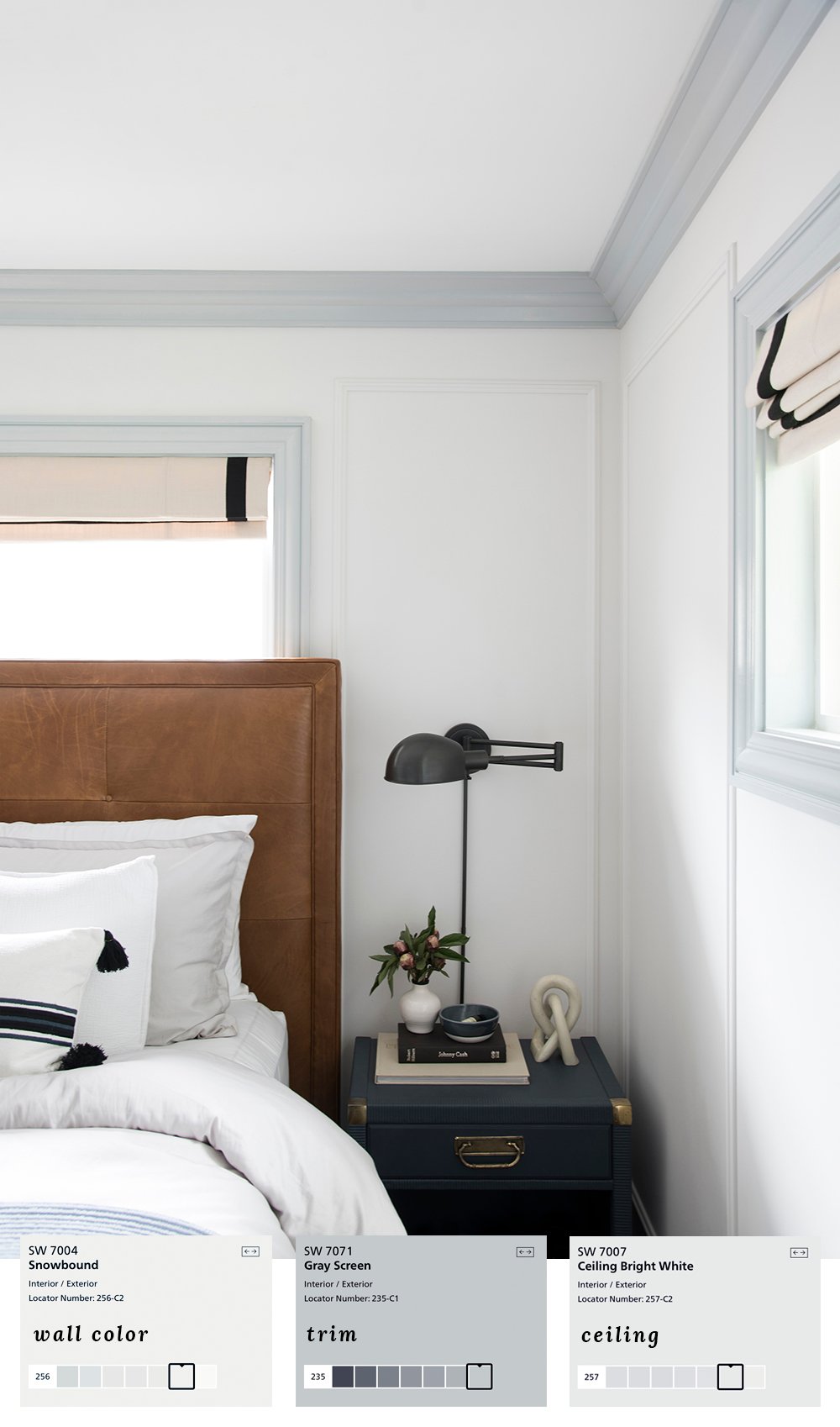
Hi! I have SW Snowbound white walls in my home and am thinking to use SW Ellie Gray on all my trim, including baseboards and crown molding. I already have Ellie Gray kitchen cabinets. I see you used Snowbound on walls in one of your photos, with Gray Screen on the trim.
How do you think Ellie Gray on trim would go with Snowbound walls? Or if I used Gray Screen on all the trim including the kitchen, would that go with Ellie Gray cabinets?
Thank you!
Hi Sarah, I love your bathroom photo, here. It looks almost like mine, and I want to go with Oragami White as well. I was curious to know if you have a window in your bathroom, and if that will make a big difference on the color? My bathroom does not have a window, and I am also currently looking at painting my cabinets a dark grey. The floor is whitish with some greyish marbling.
Thank you, Angela! We did have a window in that bathroom (we’ve since moved). I would definitely say that natural light makes a big difference in terms of the way a paint color looks. I’d be sure to swatch it first!
Hi Sarah,
When you are painting your interior doors with contrast trim in a bedroom and the hallway trim is a different color do you paint each side of the door a different color? Thanks!!
Hi Christina! Yes- exactly… each side would be different :)
Thank you so much – you have such a great eye!
Thank you, Stephanie :)