Guest Bedroom Reveal
 I wanted to kick off 2021 the best way I know how… with a room reveal! I know that is everyone’s favorite type of blog post and our guest bedroom has been a long time coming. We started this project last summer and took our time, as it wasn’t a huge priority on our renovation list. It took the back burner to more pressing projects, but I’m so happy to have finally finished this space. Click through for a big tour, before & after images, and of course all of the sources. Enjoy!!
*Some Annie Selke items were previously gifted for this makeover, but not all. Thank you for allowing me to support the brands & products we actually use & enjoy, and vice versa!
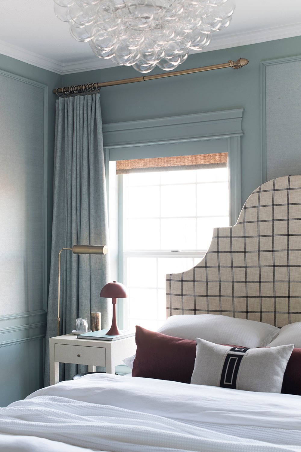
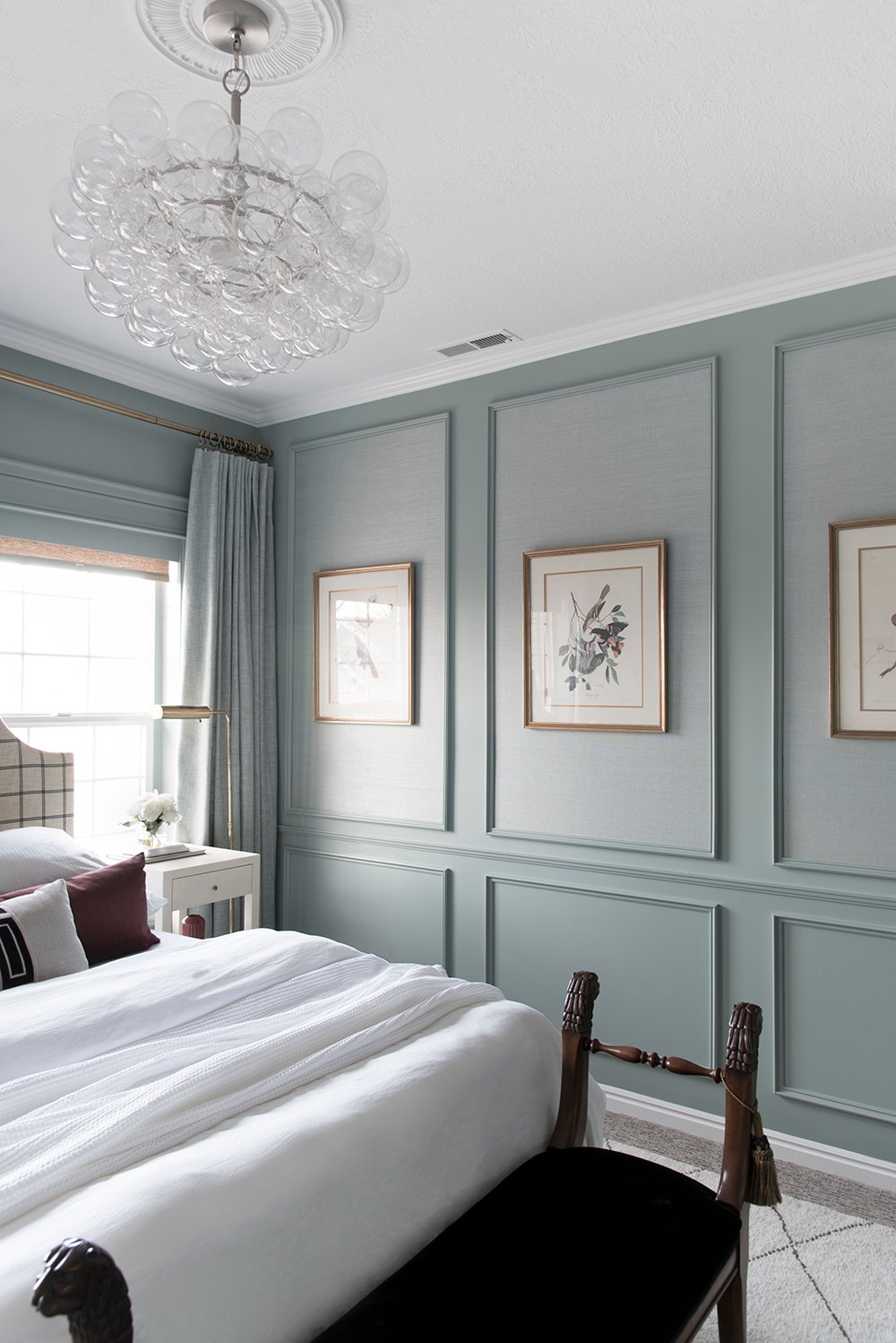
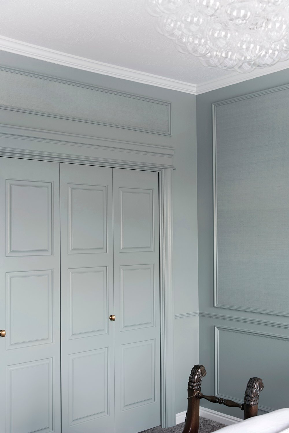
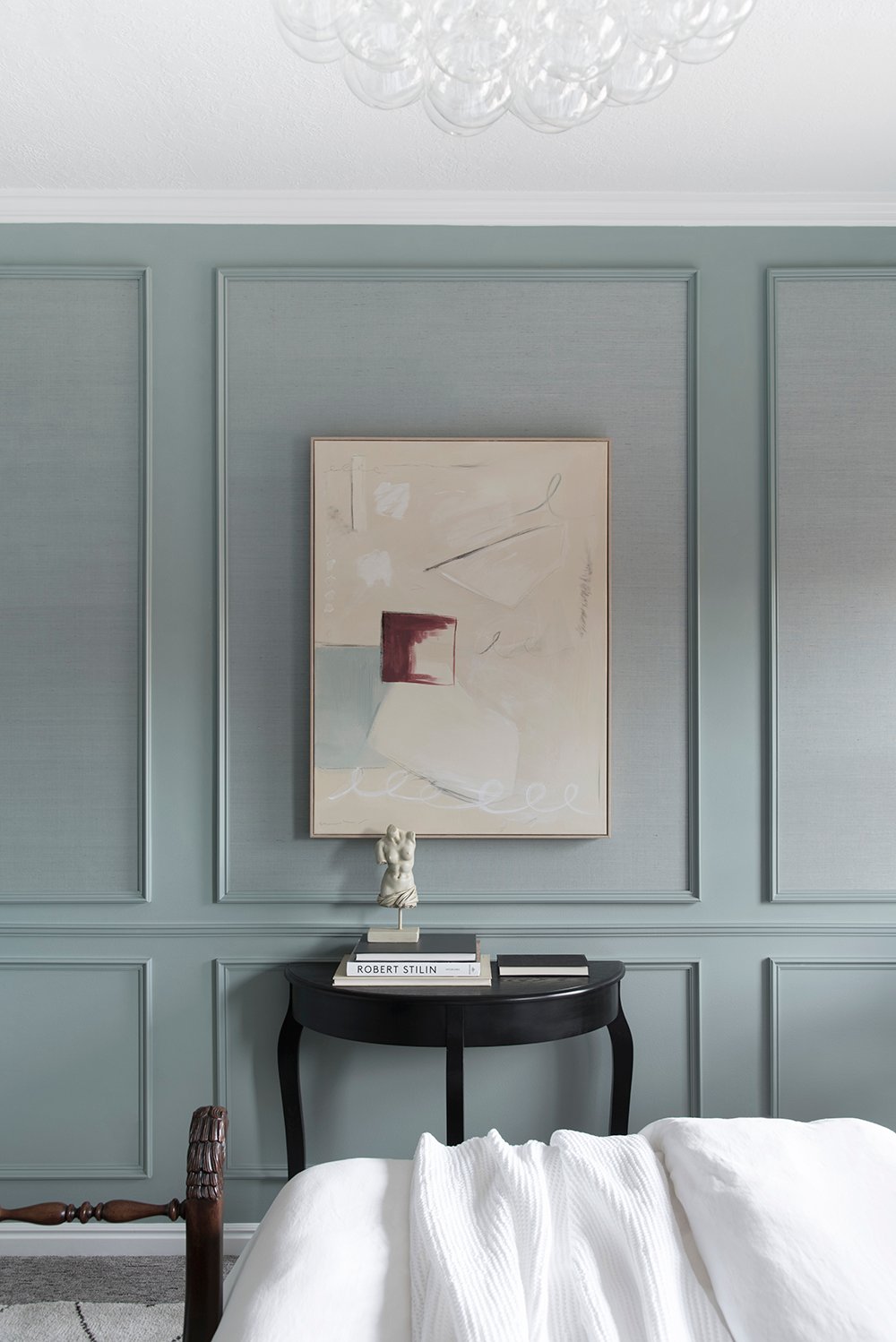
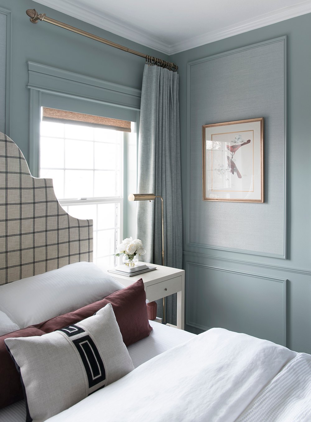
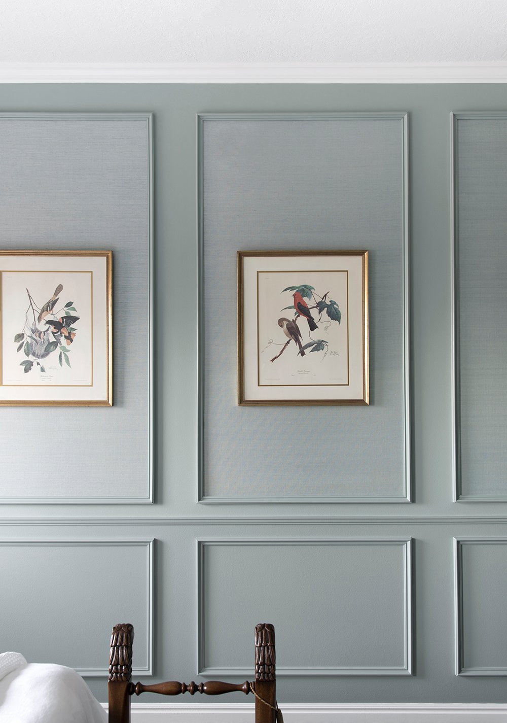 I know the most-asked question I’ll receive will be in regards to paint color, so I’ll go ahead and chat about that right off the bat. I used Halcyon Green by Sherwin-Williams in a couple different finishes: flat and semi gloss. This space was SO difficult to photograph because this is totally a chameleon color… it changes throughout the day with the light, and absorbs & reflects the colors around it. Depending on the weather, it could look totally different tomorrow. I honestly struggled to get evenly lit photos with an accurate depiction of the color. In this space, the color works really well though- and I actually landed on this paint because I wanted to color match my beautiful grasscloth wallpaper, for a monochromatic paneled look. Did you spy the grasscloth texture inside the paneling? Anyway, this is a gorgeous paint color- not too saturated, definitely not boring, and it has a nice elegant depth to it. I’d definitely recommend giving it a try with a swatch!
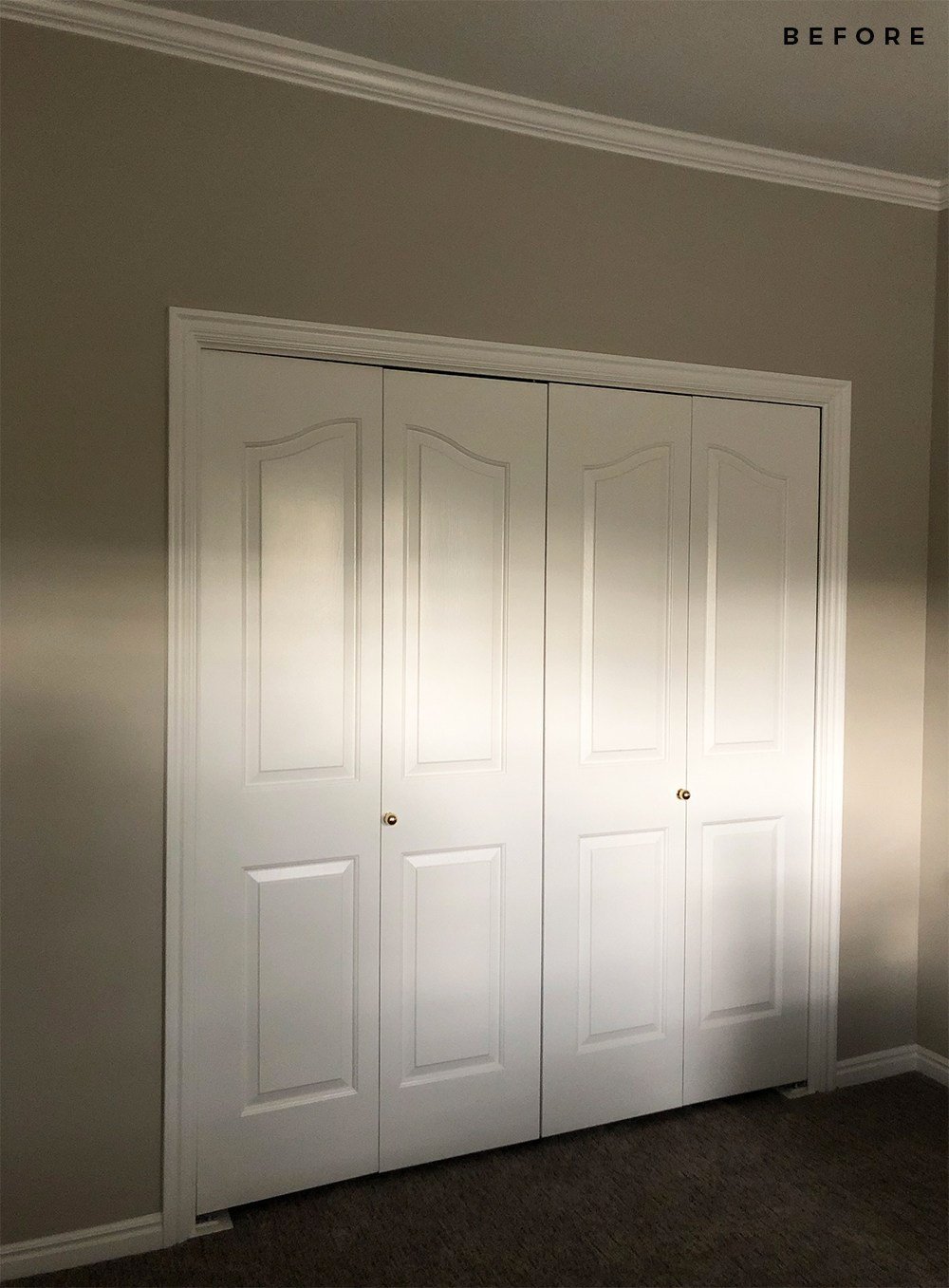
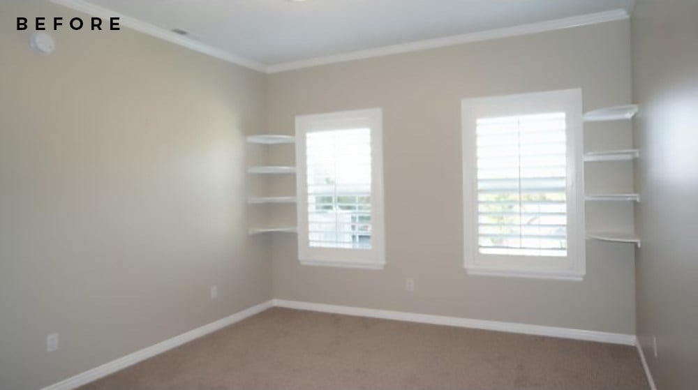
 Before we deep dive into the tour, I wanted to share what this space looked like before we renovated. Unfortunately, I did a terrible job taking before images of this particular room, but it was pretty basic. It had a ceiling fan, dated builder grade doors & hardware, and weird corner shelving with plantation shutter window treatments when we moved in. All of the bedrooms in our house have this same aesthetic…
 My plan was to replace the doors, hardware, light fixture, and upgrade the millwork. You can catch our panel moulding tutorial here. I photographed detailed instructions while we were working on the installation in this space.
 By updating the millwork and removing the dated finishes (and odd corner shelves), we were able to accentuate the ceiling height in this room and make it feel more architecturally interesting. I’m dropping one of the real estate listing photos below, so you can get another before visual…
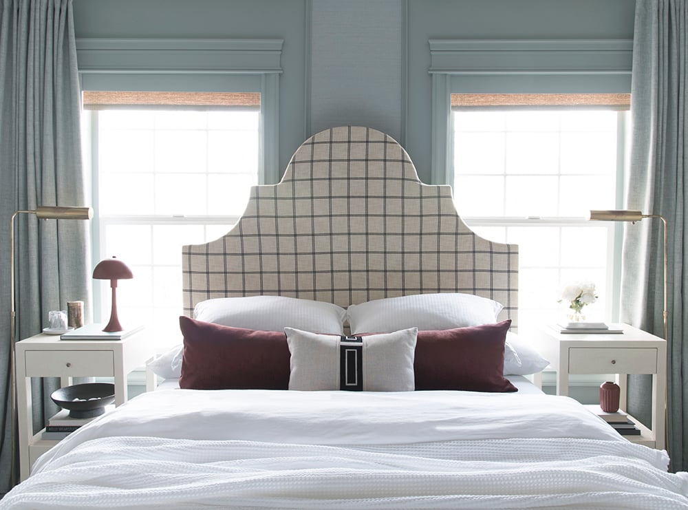
 Swapping the window treatments made a huge difference, allowing more light to flood into the room. Not only do the woven shades and drapery panels look more inviting, but they’re also more functional. When closed, the light is totally blacked out, which is optimal for friends & family who will stay in this space.
 We have multiple guest bedrooms in our home… this is actually the first of four(!) that we have renovated (plenty more bedroom makeovers to come!). I knew I wanted to have some fun with this space, in terms of design and creativity. Emmett and I always brainstorm how our home will look as it evolves, and we both envisioned our guest bedrooms taking on a comfortable boutique hotel aesthetic. I wanted to create a space that was a bit more eclectic and interesting, but still fit the architecture of our home, all while providing our guests with a beautiful escape.
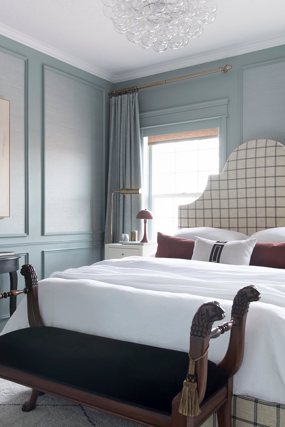 There are so many “modern meets traditional” moments that make me happy in this bedroom, and I think it’s working really well from a visual point-of-view.
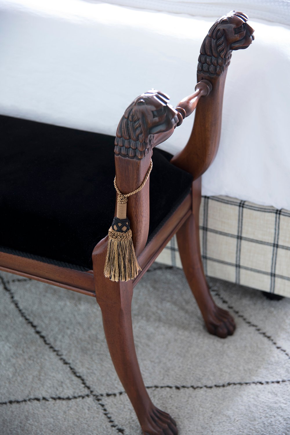 The vintage mohair Henredon bench I scored last year from FBMP is definitely one of my personal favorites! Since moving into our current home, it has been fun to have enough square footage to incorporate additional furniture in the bedrooms… a bench or ottomans at the foot of a bed, console tables, etc. It’s nice to have the space to play with a more elaborate floor plan. I’m finally getting used to having more room to design- our house feels large compared to our previous homes.
 Speaking of design (I know this next statement could be controversial), in my opinion…. designing bright, neutral spaces is easy. I wanted to challenge myself to use a more complex color palette in this bedroom- especially since it’s a guest space. I’m so glad I did! It’s sophisticated, unique, designerly, and bold. I’m really happy with how things came together. I’m guessing we’ll begin to see a bigger use of color in the coming year. I’m actually really excited for 2021 and the different aesthetics, design plans, colors, and floor plans we’ll begin to see as a result of last year. Onto better and bolder things, I hope!
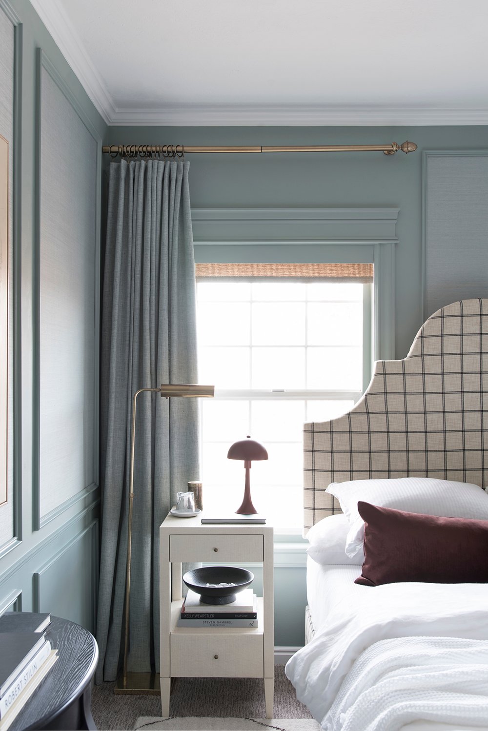
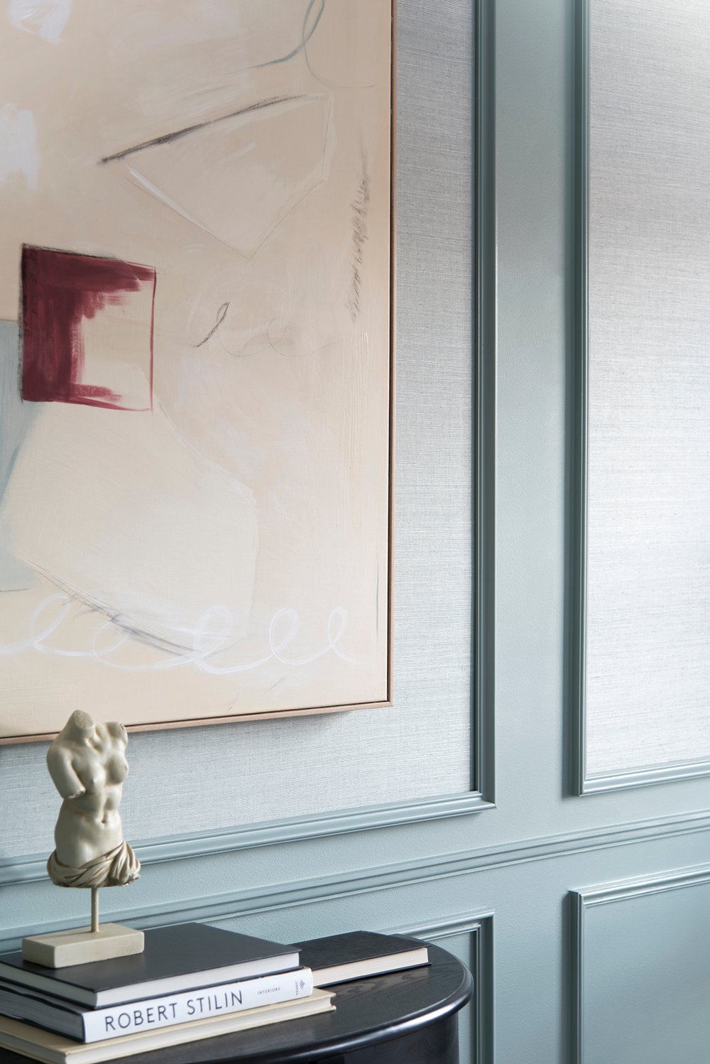 Texture also played a huge part in this bedroom renovation. The grasscloth wallpaper was really my jumping off point for the entire design of the space. Photos really don’t do it justice. I wish I could show you the finishes in person, and the way they capture the light.
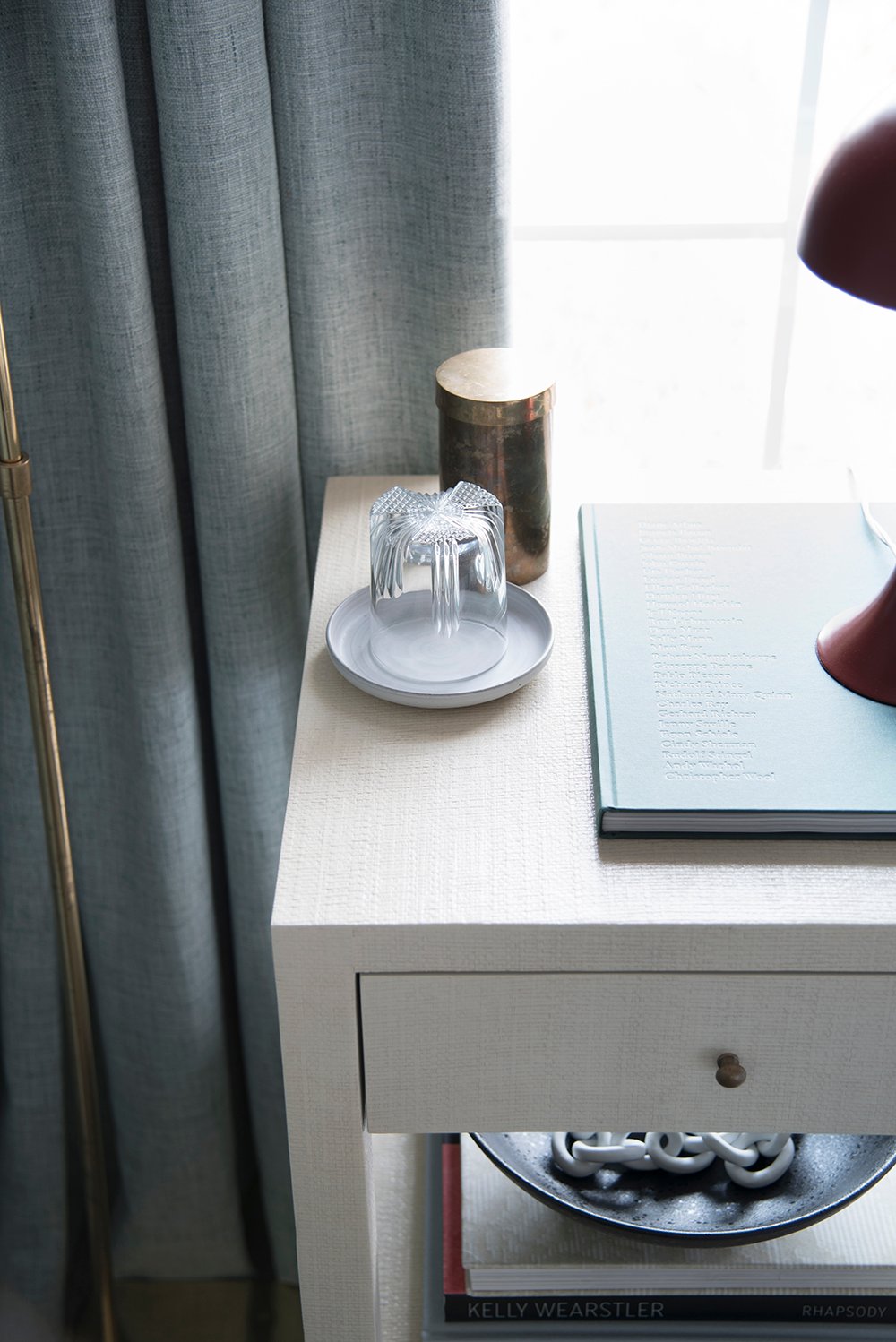 Texture can be found on every surface in the room… obviously the layered bed, the window treatments, the walls, the accessories (like the embossed book and crystal water glass), and even the nightstands. It all feels very layered and tactile, which was a big part of my design plan.
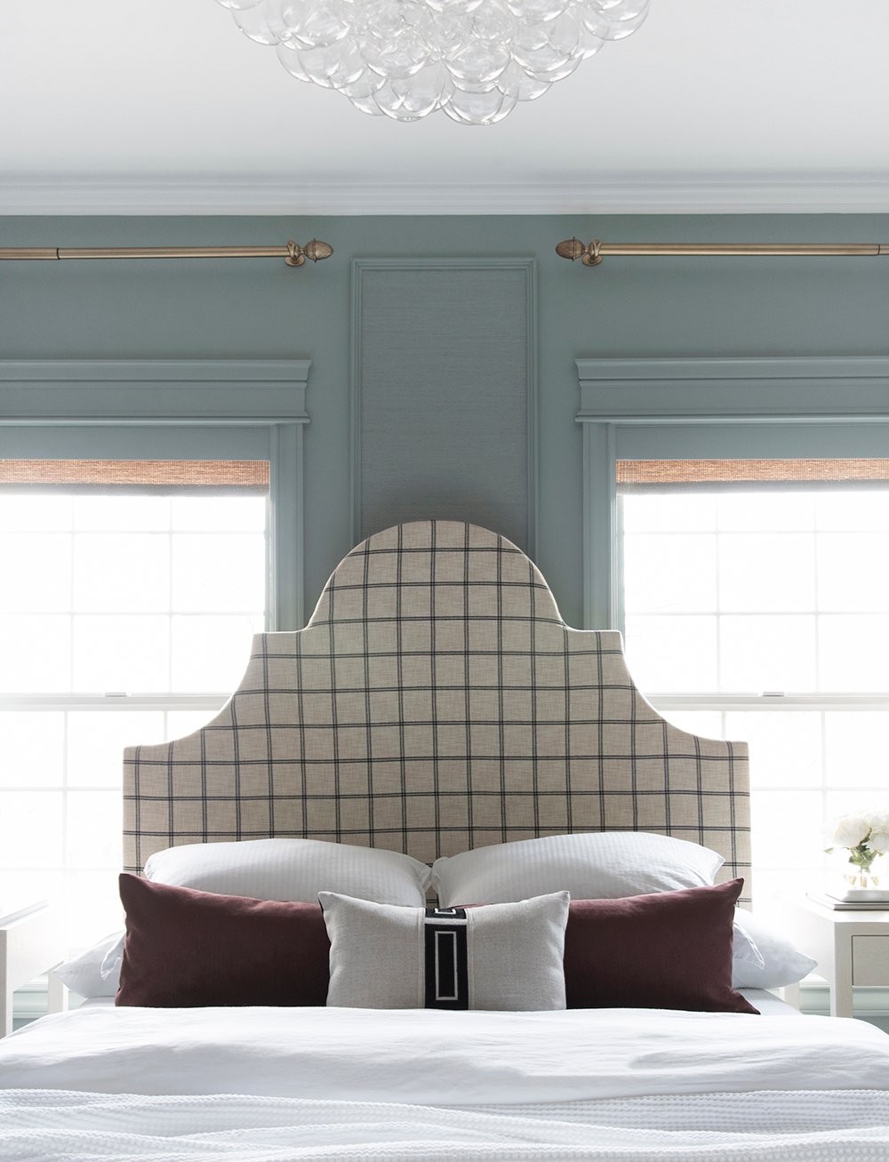
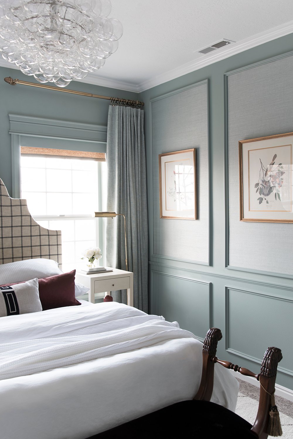 Don’t you just want to hop onto that bed?! I do. This might be my favorite bed I’ve ever styled. I kept it simple, comfortable, and functional. I always opt for white bedding in a guest space. When traveling, I appreciate being able to SEE clean sheets, and I know my guests are the same. Most of the bedding came from Annie Selke– the duvet, sheets, waffled throw, and matelasse. The two decorative pillows came from my shop, Tuesday Made.
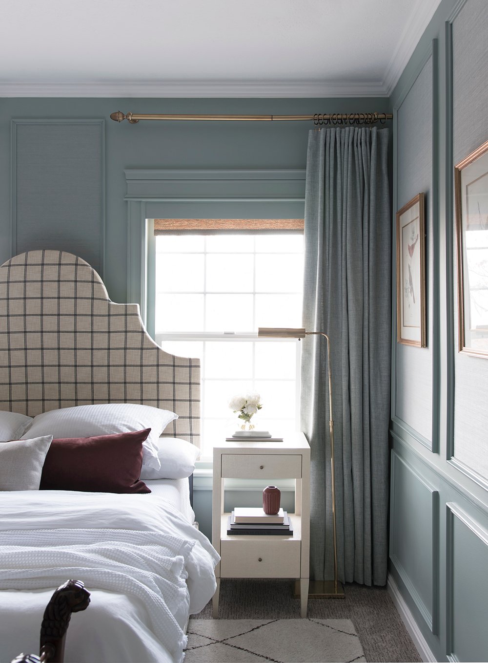 I’m all about easy bed making and tried to keep our future house guests in mind. I included a couple decorative pillows (two was my max in here), and two different sleeping pillows to choose from (four total). Our extra long lumbar is the easiest pillow for bed styling, if you have a queen or king-sized bed.
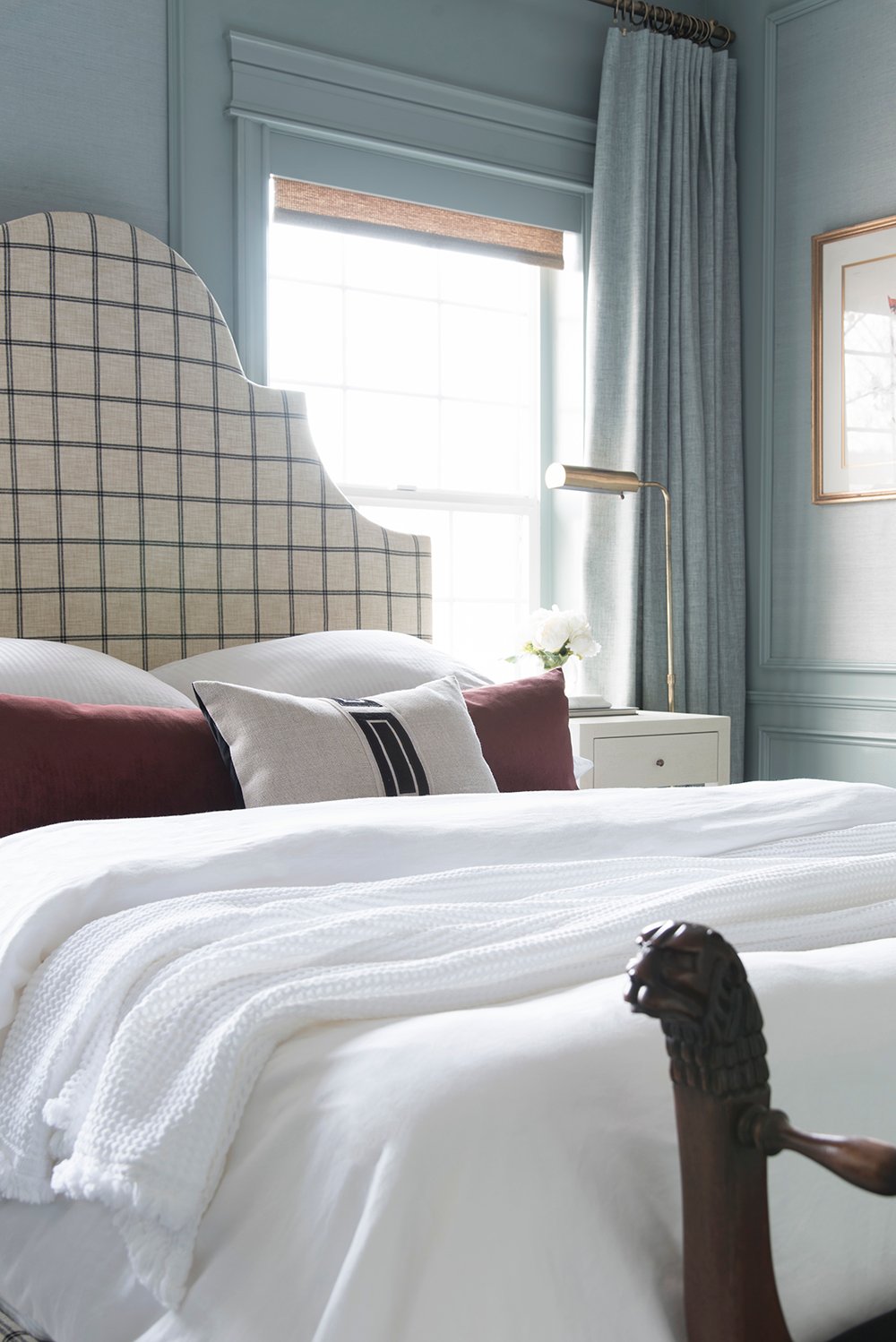 I design all of our pillows and my grandmother is our shop seamstress. I knew my merlot pillow would be perfect in here, since I was using that color as an accent throughout this room. It’s super soft and I like how it visually spans from one side of the bed to the other, making a perfect divider between the headboard and decorative pillow.
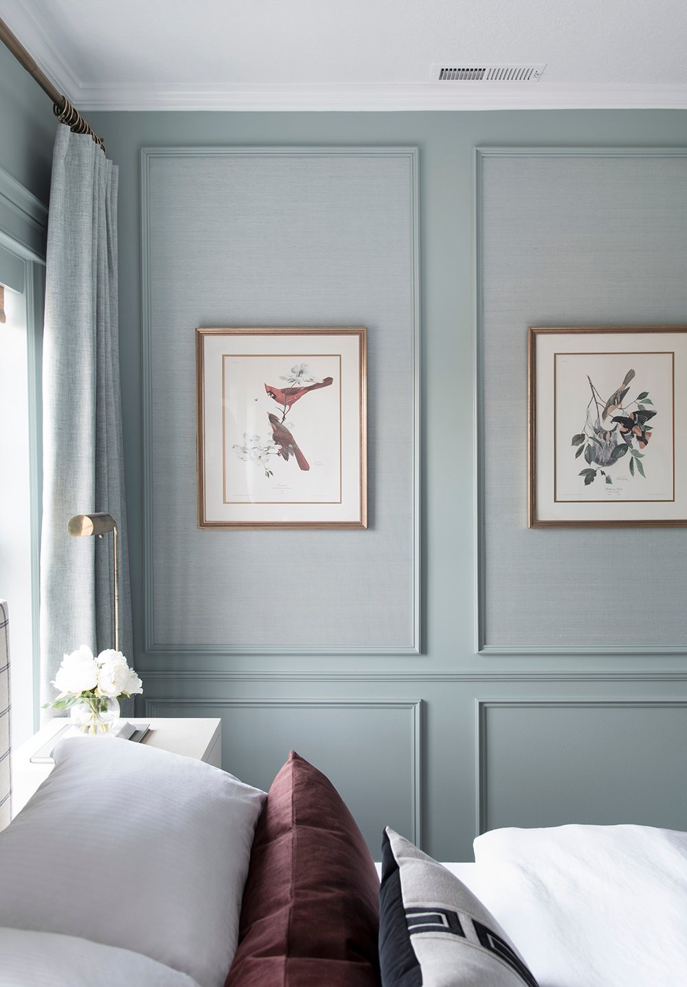 I thought about buying new art, but pulled these vintage (circa 1960’s) bird prints out of my prop closet and really liked them installed centered within the wall panels. They’re beautifully and professionally framed! An older lady gifted them to me while I was purchasing something else from her… dishes, I think. It was so thoughtful, we had the best conversation, and this set always makes me smile. It’s nice to finally see them grace the walls of our home.
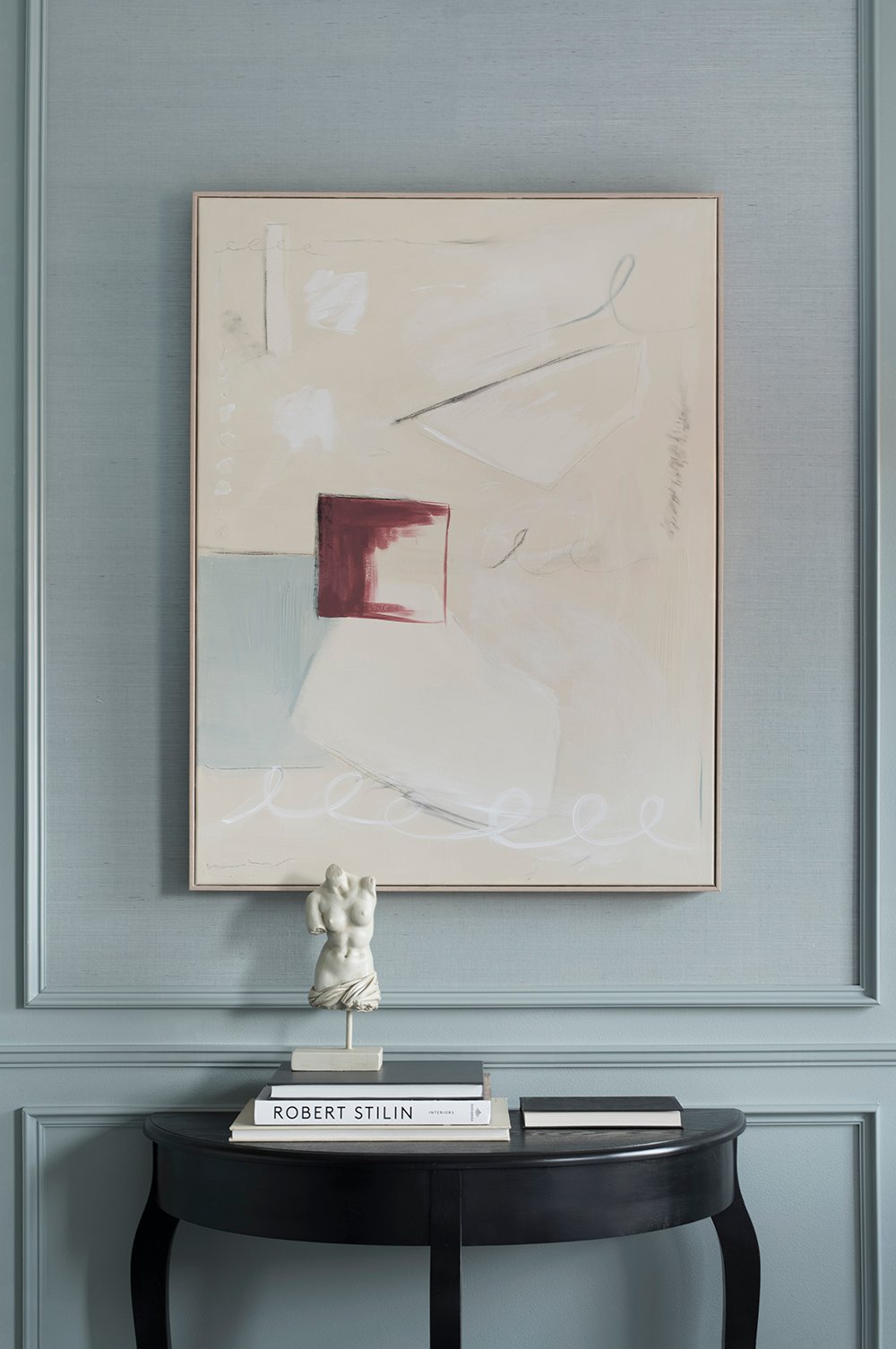 On the other side of the room, I went with an abstract piece that incorporates all of the colors found within the room… aka- it was a fast DIY, I painted myself. Speaking of “modern meets traditional” moments, I thought a classical bust would be perfect paired alongside the modern art. This console table used to live in my previous home office. I stole it from our hallway and used it to anchor this vignette. Now I’m on the hunt for a new hall table. Funny how that happens! I’m constantly scouring our house for things I need.
 I’ll admit, this room isn’t 100% finished (gasp!). Eventually, we’ll be replacing all of our carpet on the upper level of our home. This room is no exception and eventually, when the upstairs gets new carpet, the floor covering in this space will also get swapped. In the meantime, I think the area rug does a wonderful job disguising our carpet- which is in good shape, but doesn’t fit our aesthetic very well. Recognize the rug from our basement makeover? It came upstairs after we swapped rugs downstairs. Yeah, yeah… I’m constantly pulling switcharoos. Haha!
 Would you believe me if I told you, the bed in this space is the SAME exact bed in this room?! It is. It’s also kind of fun to see the guest room renovation in our previous home. My style has certainly evolved these past few years. I think a lot of that has to do with the architecture of each home. Anyway, we gave the bed quite the upholstery makeover. You can catch that tutorial here, and I also have it saved in video format here.
 As promised, I have sources for you! Use the numbered links below the collage to shop this space…
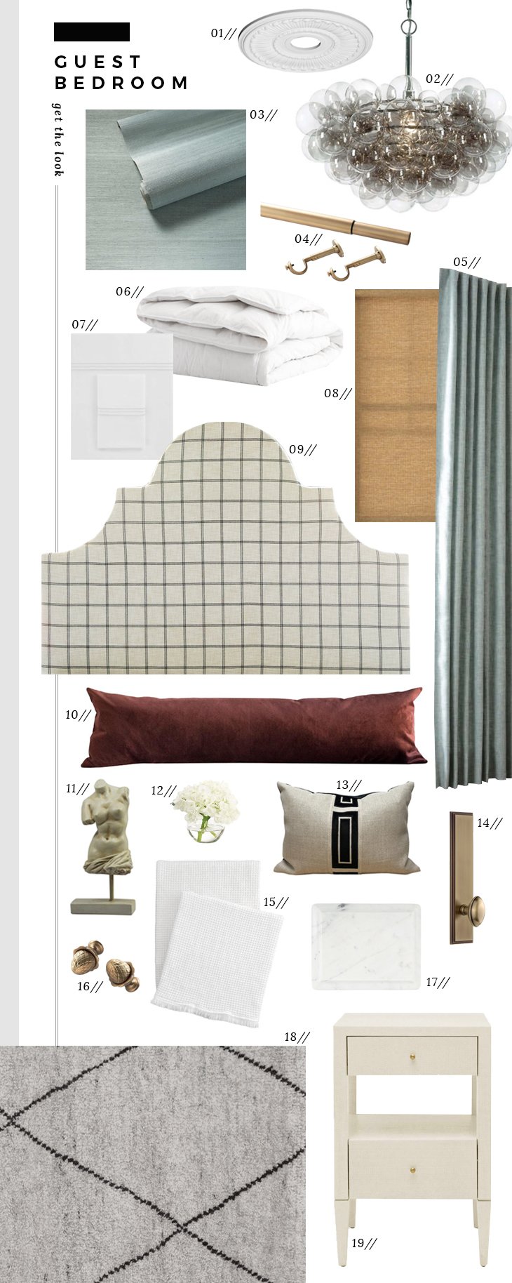 01: ceiling medallion + ceiling medallion installation tutorial // 02: bubbles chandelier // 03: grasscloth wallpaper // 04: brass curtain rod // 05: drapery panels // 06: duvet cover // 07: trio sheet set // 08: wicker roller shade // 09: windowpane DIY upholstered bed // 10: merlot lumbar pillow // 11: female torso bust // 12: bud vase hydrangea // 13: noir giorgio pillow // 14: door hardware // 15: bubble throw // 16: pineapple finials // 17: marble ogee pedestal // 18: numa area rug // 19: conrad nightstand // paint color: halcyon green by sherwin-williams // not pictured: modern table lamp DIY // white matelassé cover
If something isn’t linked, there is a good chance it’s either vintage or one-of-a-kind, but please let me know if you have questions about other sources and I can point you in the right direction.
 While I know this look probably isn’t for everyone, I hope you appreciate or find some inspiration in the details, the finishes, and the work we put into this space. Regardless of your personal aesthetic, I think there are many vignettes and architectural details here that can easily translate to a multitude of styles and color palettes…. the millwork, the hardware, the lighting, the layered bed, etc. I’m excited to hear your thoughts and chat about this one! I’m also looking forward to sharing our 2021 renovation to-do list. We’ve already gotten started on our first project and I’m itching to share. I know I said it would be the dining room, but we’ve changed our course. Details coming soon. Have an amazing first work week of the new year, my friends! I hope it’s going swimmingly so far and you’re feeling good about getting back into a nice routine. I sure am!
Very lovely! I appreciate your attention to detail and all the texture used in this room. It looks like a very calm, inviting room that I’m sure your guests (2021!) will enjoy.
Thank you so much, Teri! Here’s to hoping 2021 will bring house guests again… maybe toward the end of the year :) I sure do miss hosting friends & family!
Did I miss the calendar function for booking?😉
I love, love love it! That green color is going in my must-use file; the depth and complexity is dazzling. The monochromatic layers with the grasscloth and the drapes is so sophisticated. I can’t believe those drapes are indoor/outdoor fabric?! Speaking of the windows, every detail nailed! The architrave and the panel moulding really add oomph, and the way the drapery rods originate from the wall…pure genius. Oh the lighting! That bubble chandelier has been on my lust list for ages. Sigh. The vintage brass floor lamps fit the space to a T, and I’d be aghast if your paint makeover on that little mushroom lamp didn’t have it flying off the shelves! (Did I already say genius?) What could top that upholstered bed diy? Stunning. I’m dying to smoosh that luscious lumbar! I just know it’s super smooshable. Eek! The lion head bench. And we did get to see the canvas you were working on this weekend! A surprise touch of modern to contrast the bust and bird art. Yes! The geometry, the textures, the palette…that’s one dreamy guest room. Bravo!
And what’s this you say about a change in the reno docket??? Is our girl finally getting her office?! Oooh, or are we talking main bathroom? The suspense! Can’t wait to see what’s in store. Happy first Monday of the year!💜
Come on over, Peggi!! Well, maybe post pandemic. Haha! Just make sure you bring those cute fluffy dogs of yours. That paint color is one of my new favorites. You made my day by noticing the window treatment details. Those were a challenge to figure out, in terms of design. I didn’t realize the woven shades were roller shades, so we had to build valences to hide the roller. Emmett thought I was crazy for dead-ending the rod into the wall, but it works in this space since the curtains draw toward the wall. I didn’t want to see a second finial squeezed tight looking awkward crammed in the corner. The floor lamps were a happy addition to the room that I really didn’t plan on. After snagging those at an estate sale for cheap, I wasn’t sure where they would live in our house, but they work well in here and I like the repetition of brass. The lumbar is definitely smooshable :) I LOVE that!! It’s down and the fabric is performance microsuede, so it’s very cuddly and soft. In fact, before I had a chance to photograph this room, I caught Cash snuggled into the pillows, messing it up, so I had to redo it before setting up my camera. Haha! I was a bad blogger and didn’t share my art, but a.) I wasn’t sure how it would turn out (lol), and b.) I was totally embracing being signed out over the holidays. Next time! Speaking of next… we’re currently working on my office! Ahhhhh, I’m super excited! The built-ins are underway (as in, I’ve emailed the plan to Emmett and it’s out of my hands now, ha). Happy first Monday of the year, my friend! xo
The millwork is incredible. It makes the room look so elegant and yet it also looks clean and approachable. Would love to stay here! Also love the color combination of blue, merlot, and cream – definitely inspired! Great post to kick off the new year!
Thanks so much, Hannah! I’m really digging the color palette. So happy you enjoyed the post, and I hope your year is off to a wonderful start :) xo
Really beautiful! I love the paint color and the mill work.
Thank you, Kristin! :)
I love the mill work too. I’d love to know if you get your door frame pieces from Lowe’s? They looks so strong in the space and are such architectural beauties!
Thanks, Katie! All of the doors came from Lowe’s- the closet doors and the interior door leading into the bedroom. Check out more on that topic and get source links for those in this post: https://roomfortuesday.com/selecting-interior-doors-hardware-style/ As for the millwork (the door casing), that’s all linked in this post: https://roomfortuesday.com/how-to-select-millwork-profiles-the-trim-i-chose/
I love it! I mean, LOVE IT!!! It is better than any 5 star hotel room. Love the color of the walls especially. In fact, I think it is so beautiful that you have me so inspired to try panel molding (and wallpaper inserts?) myself.
Thank you, Arli!! That is music to my ears. I appreciate your kind words and am so excited you feel inspired to try panel moulding with wallpaper :)
Wow, really beautiful space!! Lighting is always my absolute favorite part of any room and you really nailed it with this one. I love the bubble chandelier which adds a touch of fun and the brass floors lamps over the nightstands – love that! I have a functional sort of question – but how do you decide what type of pillow insert to use in a guest room? I always struggle with that one (I’m talking actual bed pillow – not decorative). Firm, on the more softer side? It’s hard for me to know since guests will have different preferences. Help please!
Thanks, Amanda! I also love lighting. I’ve been wanting to use that chandelier for such a long time, and the brass floor lamps are vintage from an estate sale. I snagged those over the summer. The room really has a nice, evenly lit glow in the evenings. Great question on the guest pillow… I typically style four sleeping pillows on the bed in guest rooms: two soft, two firm. I like four sleeping pillows (for aesthetic purposes), and it allows your house guests to have a couple options :) In this room, I used two kingsize sleeping pillows (the softer option), and two queen size pillows (the firm option). Hope that helps!
This is very helpful! I’ll definitely be implementing that. Thanks!
Oh my goodness gracious. I don’t know that I have the words to express just how excited I am to finally see this room reveal – and as always, you went above and beyond what I was hoping for. I don’t even know where to begin.
I absolutely adore the walls. The grass cloth panels have just the right texture, Emmett’s millwork looks incredible, and that paint color is pure perfection! I wish I could see it in person, I love the subtle differences in the shade that gets picked up in the photos. The window treatments are just perfect… those windows look so much bigger now! It’s a very sophisticated color palette and I for one am incredibly happy that you decided to challenge yourself with something more than another light and neutral space. Color makes me happy, and you pick the best ones. I’ll definitely be coming back to this post for inspiration! Happy Monday and what a great start to the new year!
Thank you so much, Melissa! I’m equally as excited to finally share and cross this one off our list :) It has been a long time coming… or at least it feels that way to me. Emmett did an incredible job with the millwork. The windows really do appear larger now that we’ve framed with out with different treatments. I hope your new year is also off to a wonderful start! xox
This room is absolutely beautiful! I love the subtle texture of the wallpapered panels.
Question about your curtain rods if you are able to share – I have similar windows that are close to a wall on one side. Did you cap the ends of the wall side of curtain rod or attach the rod to the wall somehow? Thank you!
Ohmygoodness, I don’t think words will suffice to describe the beauty in this room. You absolutely knocked this out of the park, Sarah. I love how you described this as a “comfortable boutique hotel aesthetic” because that’s exactly the vibe I’m seeing. I know that there was a ton of hard work put into this room, but all together you make it look so effortless. The mixing of new and vintage, the scale of the high bed with the smaller nightstands, modern and traditional art… it’s perfection! And thank you for writing such a thoughtful post to go with such a beautiful reveal. I feel like I learned a lot and I hope to be able to take some of the knowledge into designing my own space. I hope you can look at this project with pride – you deserve it!
Really a stunning bedroom, be it for guests or as a master. Love the mix of textures throughout and the use of subdued color. Always a pleasure to see what you create and how you mix and match styles, etc.
Thank you, Traci! I appreciate that :) I hope your year is going well so far! xo
It is so chic and sophisticated! You totally nailed the boutique hotel vibe. I love the story behind the bird prints! I think they are a bit unexpected and look great in the room.
Thanks, Brittany! I love hearing that. My initial plan was to use figure drawings or some sort of charcoal pieces in place of the bird prints, but after pulling those out of the closet, they felt right for the space :) I’m happy they ended up working. It saved us money and I think they have lots of character!
I love the use of vintage art work. We have few pieces that on their own certainly look “dated”, but put in a room add just the right amount of tension. I would never have thought about using the indoor/outdoor drapes in a bedroom. Such a clever use of the perfect color drape. I love that you really took time to let this room happen – it works so well.
Great job.
Thank you, Paige! Indoor / outdoor drapery is amazing because it’s so durable. This room gets quite a bit of light, and I won’t have to worry about those fading… which is a big concern since they’re color matched to the walls and grasscloth wallpaper. We renovate in real time over here and this was one of our longest spanning projects. Sometimes that happens! Life happens, other projects happen, and that’s all part of improving your home and taking the time to do it :) I think it was worth the wait. Happy new year!
I’m obsessed with this room! Just beautiful- the layers and textures of that fabulous color, the modern light- the use of floor lamps with the nightstands, just perfect! I’m so inspired now to work through my guest room….or maybe my master!
Thanks, Cyreesa! I love hearing that :) It was a fun space to design. I’m looking forward to renovating our main bedroom someday, too… or perhaps a little bedding makeover would be nice in the meantime.
Hold the phone!! Girl you SLAYED this guest bedroom beyond belief!! I started reading this post about two hours ago (hello children of the corn), but wowza! I took this one slow to soak in every element. I’m hoping by some rare version of osmosis I’ll be able to channel the inspiration in this room and put it to use on our primary bedroom. (Yes…still toiling🤣😂). Where do I begin? The contrasting finishes in the paint, paired with the grass cloth, and the amazing millwork…you guys stun me every time. It’s a perfect fit, and that paint color is a definite save for later! I love paint colors that have the chameleon affect, and this one is lovely! Next up for me is the drapery. I love the way the brass pops against the paint, and the texture of the drapery matches the texture on the grass cloth. I just want to spend an hour touching the drapery; you can find me next to Peggi smushing your pillow.🤣😂 I’d love to know more about how you assembled/installed the curtain rods to originate from the wall. We have flanking windows in our primary, and I’ve always wanted to do that, but I’ve never known how (and your girl is not patient about problem solving). Moving on to the finishing touches-I noticed the symmetry of the books on the nightstand-two with the spines out on one, and two with the pages out on the other-gotta say how much I love that, and how something so subtle adds that extra textural element. I love the touch of practical and decorative with the glass on the nightstand-that little pedestal gives a coaster for when it’s full, and a resting place to keep the glass clean when not in use…genius! The lions head bench is probably now in a tie with the giant hand as my favorite piece from your home-it’s stunning, and works so well with the room. I forget if this was reupholstered or not? Either way it completes the space! The pops of brick red throughout the space really anchor your color palette in the most subtle way, and I love it! I’m sitting here just in awe, and dreaming up ideas for our bed and bath…and now you’ve got me rethinking my original plan, but in the best way possible!
Please tell me you’re getting an office? You hinted at built-in design in stories, but you also previously hinted at another bathroom renovation in 2021. I predict an order of operations here: office, primary bath, primary bedroom, and possibly the home gym area? All spaces you’ve discussed in the past year in one way or another, and all very necessary for full enjoyment. I can’t wait to see what makes the cut! Have an amazing first work week of the year; I’m off to rid my house of Christmas decor, and clear out my kitchen to make way for new dishes! Xo
Haha!! Thank you, Lauren! :) And thanks for taking the time to read on your busy Monday morning. I’m sure corralling the kids and getting back into the swing of school has made for an interesting Monday morning. Ha! The paint color is one of my new favorites. I’m so happy with how it turned out- definitely one to save. It really is a room to touch because there is so much texture. Lol! You and Peggi are cracking me up. The curtain installation was so easy. Just install the rods like normal and position on bracket close to the wall (so it’s nice and sturdy). It will just dead-end into the wall (no finial), and then the other side will get a finial or finishing cap / end of some sort. The curtains themselves are just hanging from the ring clips. They’re not pleated or hooked- just clipped. Super easy! Probably the easiest and best-looking non custom drapery I’ve ever installed. That bench was such a lucky find. It was listed on FBMP as velvet, and it’s definitely mohair. I couldn’t believe it! It was in perfect condition and the only thing I had to do was clean it. The office is happening next and I’m pumped! I just hit send on emailing Emmett the built-in plans. I hope you have a wonderful first week of the year, too. Happy de-Christmas decorating. New dishes sound awesome!! Happy Monday, Lauren. xo
Oh, my gosh, Lauren, you and Peggi are so cracking me up! I can just picture you both (even though I have no idea what you look like – maybe 2021 will be the year for a RFT meetup🤞) smooshing and caressing all the gorgeous fabrics! Thanks for the Monday morning laugh!!
Hahah!! That would make my day to have a RFT meetup- SO fun!
❤️❤️❤️
Puts a new meaning to “all the feels” doesn’t it?? 😂🤣 Crossing my fingers that 2021 is our year ladies! So happy I could bring a smile to your face Anne! Xo
So beautiful and sophisticated. You seem to instinctively understand how to take design to the next level with your use texture and color. (What a surprise to see the stunning grass cloth framed by the molding) I love love that this is based in traditional design but with modern elements as it’s a wonderful way to rejuvenate treasures new and collected. And thank you as always for generously sharing your sources; I am constantly learning from you!
Thank you so much, Pam! Really nice of you to say. I appreciate it! The grasscloth is one of my favorite elements in the room, and was really my starting point for the space :) Have a wonderful week! xo
Wow Sarah, the guest bedroom is so gorgeous 😍 I love everything, the bed of course is the star of the show but I love every single detail. The wall color, grass cloth, all of Emmetts fabulous millwork, artwork ( your DIY is beautiful) and the bird works of art are stunning. It’s all so harmonious, inviting, luxurious, and an amazing guest bedroom. Your guests are the luckiest people on earth ☺️ And may never leave 🤣 😉 Just outstanding as always 💗
You certainly got this year off to a smashing inspirational start 🥳
Happy New Year!
Thank you, Colleen! I’m so glad we were able to reupholster our old bed- it definitely turned out better than I expected :) Haha! Here’s to hoping 2021 will bring a few house guests. It was so weird not hosting friends or family in 2020. I’m excited for what’s to come and am ready to move onto another room to renovate… next up is my office! Happy first week of the year, my friend!! xo
this is so beautiful and you are so talented. I love to see the rooms, etc. that you create. Wish I could see them in person.
Thank you so much, Wenda! I appreciate that :) I wish you could see them in person, too!
Stunning! Bold yet so soothing. You do traditional-meets-modern so well! Every room that you finish becomes my new favorite, but I think this is my favoritest of all :) And with so many details to savor and get inspiration from, I know this is the post I will be coming back to often. Well done!!
Thank you, Izabela! I really appreciate that. This has been such a fun house to design and lends itself well to that modern meets traditional aesthetic. We have LOTS of spaces left to tackle- including 3 more guest rooms. Haha! It feels like a big challenge, but each time we cross a room off the list, I feel proud. I’m glad this one turned out nicely. I’m really happy you liked it! xox
If color could be licked like ice cream, I would this one! It’s a beautiful room! Can’t decide what is my favorite the vintage reading lights or vintage bench (you have the best luck at finding things). The merlot lumbar pillow is beautiful and one I have been thinking about since you opened your store..love it! You must let us in on how you disguised the rolling shades, please! You both did a great job on ever aspect of this room. Your guests are so lucky.
Look forward to more gorgeous spaces this year!
I love that! Thank you, Danna! I have to say, I really did luck out with the vintage items in this space. I had no intentions of a bench or those lights, but they work so well and were great finds. Ah, yes… the roller shades! My solution was a simple one: we installed a flat piece of poplar in front of the roller to hide the mechanical part of the shade. It’s just like a mini valence that blends with the window casing (I painted it to match). Thanks so much for your sweet words :) I hope the first Monday of the new year was a good one for you! xo
I have been waiting for this reveal! I have loved watching it come together. It’s so beautiful. I’m always inspired by people who can chooses pieces/elements that I would not have chosen myself, and then pull them together in a way that I love — you did that here. Nice job!
Thanks for sticking with me, Abby! I know it took us awhile and I didn’t do the best job documenting. I’m really happy with how it turned out though :) I truly appreciate your kind words. Hope you’re having a happy new year so far! xo
So so smart how you incorporated the very pricey grasscloth! Have been waiting for this post since Thanks giving and it did not disappoint :).
Thank you so much! I’m really glad to hear that :) Hope your new year is off to an awesome start! xo
I think I literally let out an audible sigh when first looking at your post this am! I believe I shall call you Guest Bedroom Whisperer from now on. 😂 Seriously though, your guests are SO lucky! The room is wonderfully relaxing, welcoming and cozy. You find THE best paint colors, too, lady!
I also would have thought that the botanical bird prints would look too dated, but they look like they were made for that beautiful moulding and grass cloth. Speaking of the moulding, E did an amazing job and and even more amazing job of making it all look easy in the tutorial. And that painting – a quick DIY – really?! That’s incredible, Sarah. Would love to see more of your artwork in the shop someday.
It also feels like a great mix of masculine and feminine. Thank you for sharing (& for taking your time with the room – definitely paid off) and I cannot wait to see how your next project (your office?!? squeal!) takes shape.
Haha! Thank you, Anne :) I hope your new year is off to an amazing start. I’m so happy to have this space finished and crossed off the list. It feels good going into a new year with fresh projects. I do love that paint color! The bird artwork works surprisingly well in here and the size is perfect for the panels. Emmett says thank you for noticing the millwork! It took him forever to install all of that, but I think it was well worth the effort. I’m always trying to find that balance between masculine and feminine- I’m glad this room has a bit of both. I was hoping it wouldn’t skew too feminine. Onto the next! I am thrilled to be tackling the office next. Woohoo!!! This year is already looking brighter. xo
I. Am. Obsessed. This is exactly the vibe I was going for in our guest room, but kicked up 100 notches *heart eyes*. I’m with Peggi; where’s the calendar for booking? I’ve been waiting for this reveal and it’s better than I could ever have imagined! Amazing work you two!
Thank you, Carly! I wish you could all come stay and see it in person :) Thanks for your patience while we took forever to finish this room. Haha! It kept getting put on the back burner, but I’m happy we have officially crossed it off! Hope your year is off to an awesome start. xo
Sarah, you are so talented! Thank you for all the care and work you put into everything you do. You are a very generous person. I have a different design aesthetic than you, but you are still one of my favorites to follow because of all of the above. I truly appreciate all you do and how you share your life and talents! Everything you create is impeccable and beautiful!
Aw, thank you so much Melissa! I truly appreciate that. Your comment made my day! My goal is always to share, inspire, and hopefully make lots of wonderful friends here on the blog and my social channels. I’m so happy you’ve enjoyed connecting and feel my channels have been beneficial. Hope you’re having a great week so far :) xo
So beautiful! Did I miss where you mention where the bird paintings are from? I absolutely love them!
Thank you, Kristin! The bird prints are vintage… from 1963 :)
Absolutely beautiful work Sarah. I’ve been waiting for this reveal ever since you teased us with those beautiful textural cream nightstands months ago. The mix of vintage and new makes this space feel very special. You 100% achieved the boutique hotel vibe, and can’t wait to see what you do in the future with your other 4 guestrooms!
I’ve loved following along (since Ohio), and your work on this home has been truly inspiring. The main reason I love your blog is that you design spaces that are true to your aesthetic, you never simply follow trends or (eye roll) do a cut-and-paste DIY of someone else’s designs. Because of this, your spaces feel so much more authentic and timeless.
Keep up the great work, Sarah and Emmett!
Thanks so much, Lauren! I’m really glad to hear that. We truly appreciate you following along all these years :) It has been such a fun journey and I’m looking forward to seeing what the future holds for our current home. It’s a lot of house to renovate, but it has been really creatively fulfilling. We just love it here and I anticipate living here for years to come! Thank you again for your kind words. I feel like the best thing you can be is yourself. I’m glad that translate in our home and on the blog. Best compliment! Have a great week! xox
Thank you for the info on moulding. I wasn’t certain where to begin, even after reading several articles. Was so excited to see your take on it, since I follow your blog!
Now to just teleport you to my home so you can help with every other area I need to address!
Thanks for your insight. Sure enjoy your expertise and style.
I’m so happy it was helpful, Emily! I love hearing that. Thank you! If only teleporting were an option ;) Hope you have a great week!
Sarah — I’ve scoured the comments hoping that you would share more about the picture frame moulding. Emmitt did a fabulous job. But how do you determine the size of the picture frame and was it sourced at Lowe’s, too?
Please….more details on picture frame moulding!
Thanks, Jodi! The size really depends on the scale of the room and isn’t a one size fits all type of solution… it really depends on your home and what look you’re going for. I know that isn’t super helpful! Check out this post for more info on millwork, along with some resources for figuring out the math. The materials were sources from Metrie (linked in this post)! You might also find this post helpful: https://roomfortuesday.com/your-millwork-questions-answered-a-qa/
This is an absolutely stunning guest bedroom! Love it! I looked through all the comments and was hoping to find more detail on the paint finishes you used through out the room. You mentioned you used the same color on different surfaces in the room. Are the doors semi gloss the walls flat? Would love to find out. I’m the process of painting my bedroom and you inspired me to use a similar technique. Thanks and great job with the room!
Thank you so much, Ginny! I’m happy to share the finish details. The doors are semi gloss, the walls are flat!
Thank you for responding!
Love this whole room! The colors are fantastic, could you tell me where you purchased the curtains? Thanks!
Thanks, Nikki! They’re linked in the post :)
The wall color, the trim work, the Ray Harm prints (I have about a dozen), and the whole aesthetic is so fresh. I am in love with this room. So good!
Thank you so much, Amanda! I love that you also have a nice collection of Ray Harm prints- they’re beautiful!
Hi Sarah, I just found your guest room here and it is truly stunning. The link for the drapery panels comes up with an error, can you please tell me the source? Thanks very much.
Thank you so much, Susan! Unfortunately, the drapery panels are no longer being sold. They were from Annie Selke. I’m sorry!
Hi! Beautiful! Beautiful! Beautiful! I love this room and will serve as inspiration for my own guest room we are updating. The link to the bubbles chandelier is not working. Can you provide the source? Thanks
Thank you, Vanjul! Sorry about the link. It’s available here: https://rstyle.me/+DqLvG33-u20UwlYDC5CQgQ
Hi Sarah! LOVE LOVE LOVE this space, this wall color is just to die for and love how complimentary it is with the red vine colored pillows!!! I tried to click on most of the items that you’ve linked but was unable to pull anything up, any chance you have updated links somewhere? Would love to know the chandelier and drapery hardware sources! <3
Thank you so much, Rose-Marie! So sorry that the links have expired. This project was from awhile ago, but I try to keep the most updated links here (including the chandelier and drapery hardware): https://roomfortuesday.com/shop-my-current-house/ If there is something specific you’re looking for, let me know and I can try to track it down. Sadly a lot of the items are no longer available. Hope you’re having a great week!
I love this design! Do you know the color of the drapes?
Hi Sarah – This is a beautiful room! Do you recall if the drapery panels you installed are the Greylock soft blue panels from Annie Selke? Thanks much!
Thank you so much, Sarah! I believe the color I have has been discontinued (Celadon)- I’m so sorry! I do know- they’re starting their cyber sale tomorrow though (if you want another color)!
Hi! I love this!!! I was trying to find the link to draperies but it goes to a dead page. Any chance you could give me the link for those?
Breath taking transformation!!!!!! The attention to detail and bringing everything together……Simply…. very beautiful! Would you use this colour in a living room for wainscot?
What color is the paint?
Halcyon Green by Sherwin-Williams
I absolutely love this look! I have two questions: 1.) You mentioned you used Halcyon Green paint in a couple different finishes: flat and semi gloss. Does this mean you painted some areas with a flat sheen and others with semi gloss (e.g., walls flat and bottom squares semi gloss)? Or does it mean you mixed the two? 2.) In all your photos, the color looks more blue than green. I know you said it’s a chameleon, but would you say that you most often see this bluish color? In all the photos of Halcyon green from the Sherwin Williams website, it looks a lot more “green.” Thank you for the tips!!
Thank you, Sarah! I used the two finish in different areas… semi gloss for trim and millwork and flat for the walls. I think the color depends on the surroundings, natural light, etc. Sometimes it can look more blue, while other times it looks green. I’d definitely recommend swatching it first! Hope that helps!
Question for you (maybe an obvious one) – We are totally in love with this guestroom and will use the same color on our walls. Did you use the flat color on the wall and the semi gloss on the trim? Thanks :)
Thanks Victoria! That’s exactly right :)
The wallpaper and the curtains are no longer linking to the product. Can you tell me the color or manufacturer so I can find them? Love the room!
Sadly, I think both have been discontinued. Sorry, Brooke! I just checked. They were both from Annie Selke.
Hi! This is so beautiful! The link for the curtains seems to have expired- are they the color soft blue? https://www.annieselke.com/products/greylock-soft-blue-curtain-panel?variant=48334364770360&query_id=33359e3b1858750101f9c650833a8749
I think since sharing this post, they’ve reworked their products and colors. It doesn’t look exactly like the ones I purchased and the color name has changed. I’m thinking it’s different / discontinued. Sorry, Alexandra!
Love! Is there any way to still purchase the pillows? They aren’t on your website anymore.
Hi Jill! Those specific pillows have sold out, I’m sorry. They won’t be restocked.
Hi Sarah! Do you know what shade / color the curtains you used in this room were? I love the monochrome look but it looks like Annie Selke no longer sells this exact curtain. I do see that they have one called Greylock Soft Blue Curtain Panel. Is this possibly the one you used? Thanks in advance for the help!!
Hi Madison! Sadly, they stopped making this exact color… they updated the product and the color isn’t quite the same. I’m sorry!