Sherwin-Williams Color of the Year
To say I’m excited to help Sherwin-Williams® announce their Color of the Year for 2019 would be a vast understatement! I feel pretty honored to work with a brand I’ve loved and used for years, and it feels even more surreal that they like my design work enough that they’d ask me to help announce their biggest news of the year. Yep… I’m feeling pretty humbled, not to mention eager for what the year ahead holds for interior design: COLOR. Sure, bright white neutral spaces are lovely and will always hold a place in my neutral-loving heart, but they’re not incredibly challenging to design. They don’t really push my creative limits, make a bold statement, and they’re abundant in the wonderful world of Pinterest. I for one, am ready for something different and am happy to see a switch to deeper colors, earthy organic tones, and hues inspired by nature. Click through for the name of the Color of the Year, to see how I used the color as an accent wall, and to get tips for applying it to your own home!
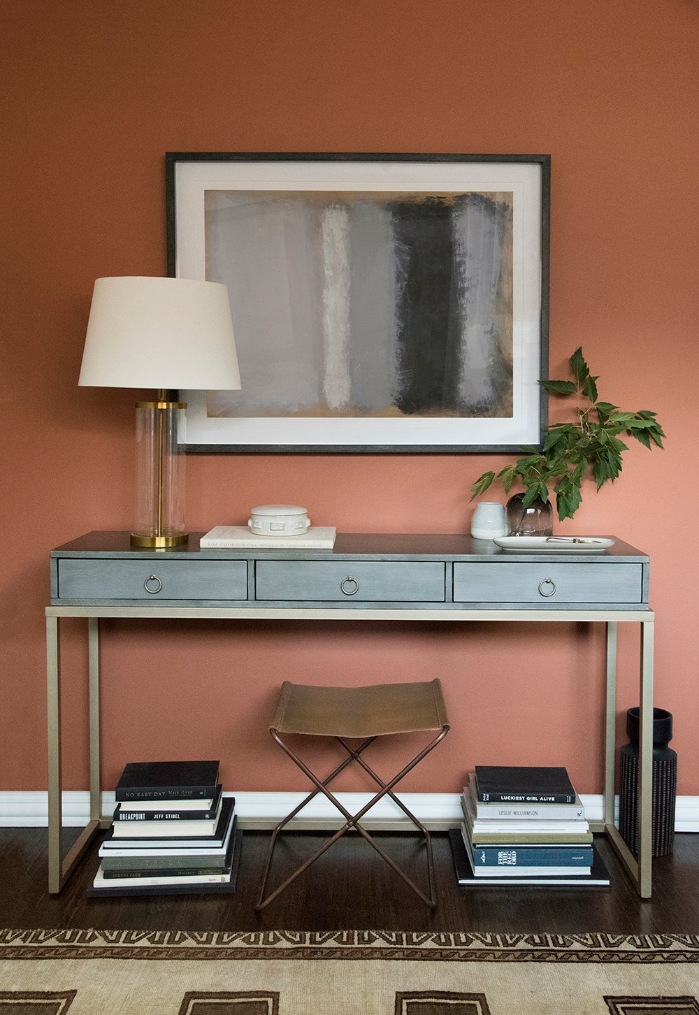
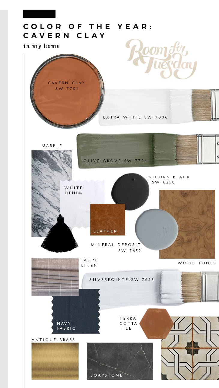
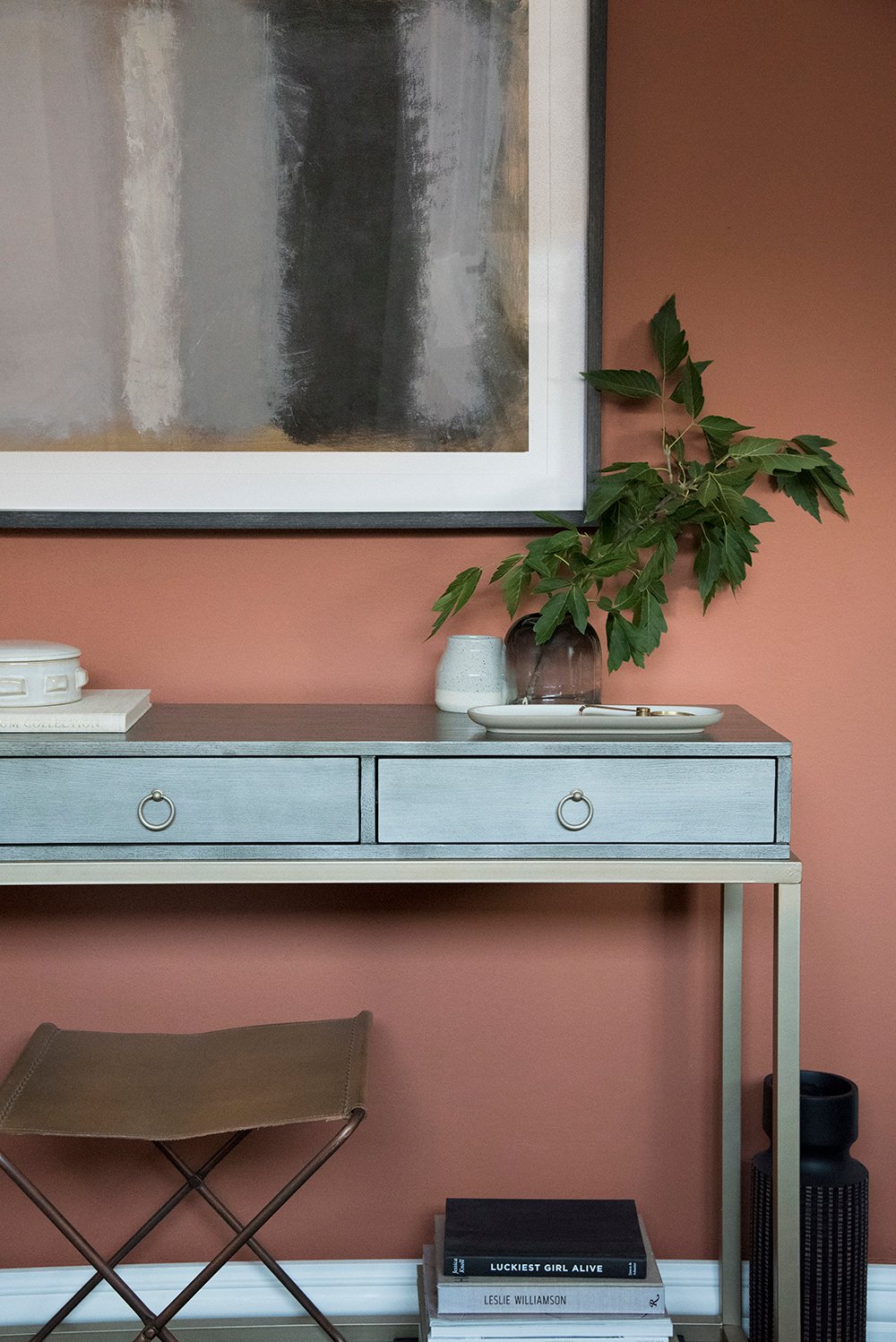
Drumroll please……. isn’t it a pretty hue? Allow me to introduce Cavern Clay SW 7701. It’s warm, elegant, inviting, bold, and super versatile. Just for fun, I put together a mood board of colors and materials found throughout my house (shown below) that depicts how it works well with pretty much everything I like! It plays really nicely with all of the colors I’ve used in our Utah home over the past couple years… dark green, navy, blue, gray, neutrals, taupe, white- it’s just really an easy color to implement. See for yourself:
The color kind of has a 70s vibe, is reminiscent of terracotta, nods to the American west (it honestly reminds me of Utah in the best way), has a desert modern look, but also would be great styled amongst traditional decor for a very Ralph Lauren Home aesthetic.
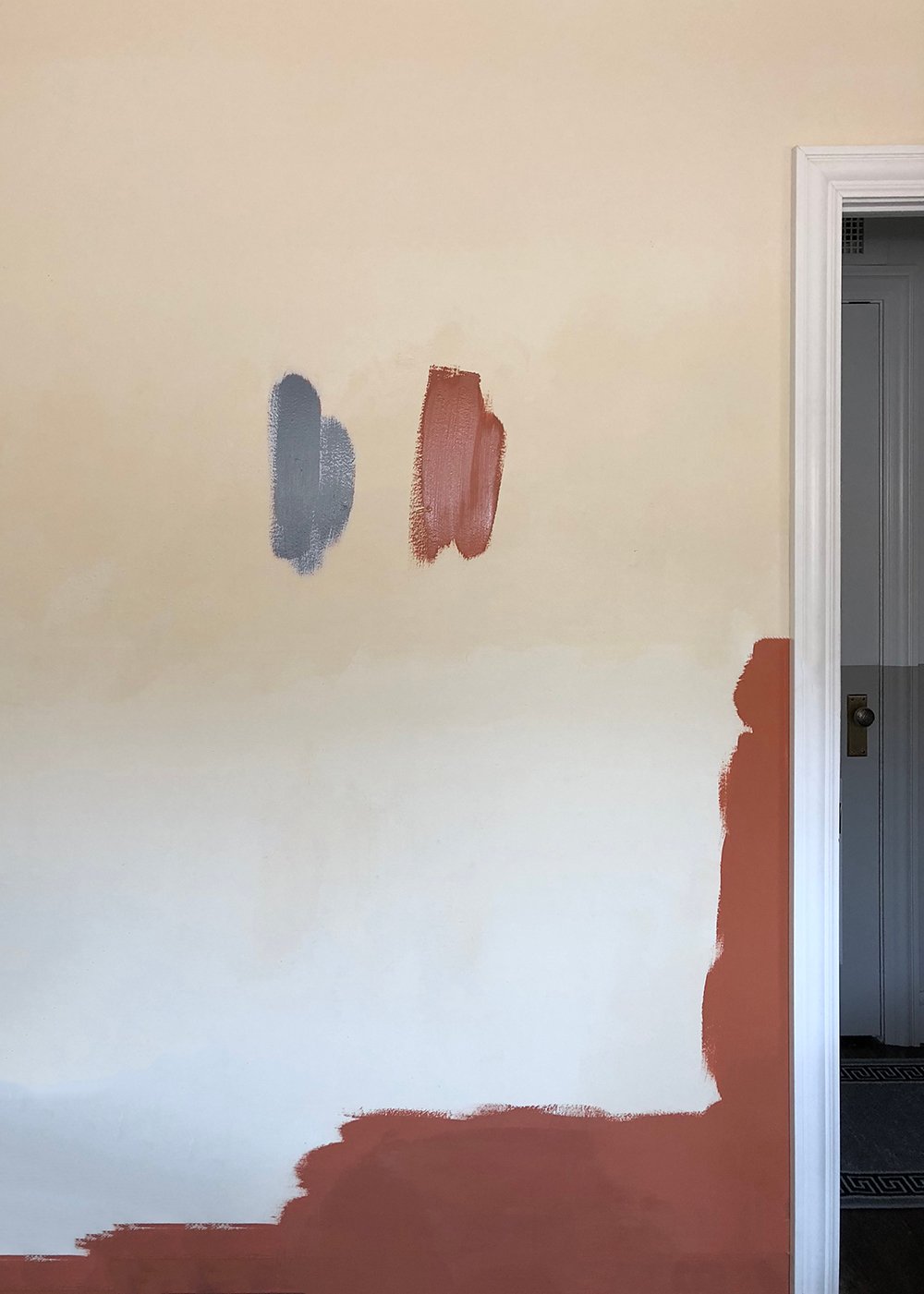
Prior to painting, I did a color study in my office (which we have yet to tackle). Ignore the yucky yellowish wall that looked just like that the day we moved in and focus on the two swatches I painted. They were both for different projects, but they actually work really nicely together. This was just as I was starting to paint the accent wall…
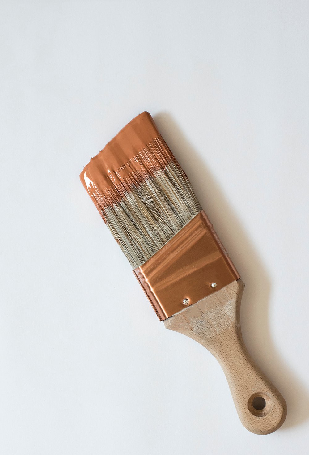
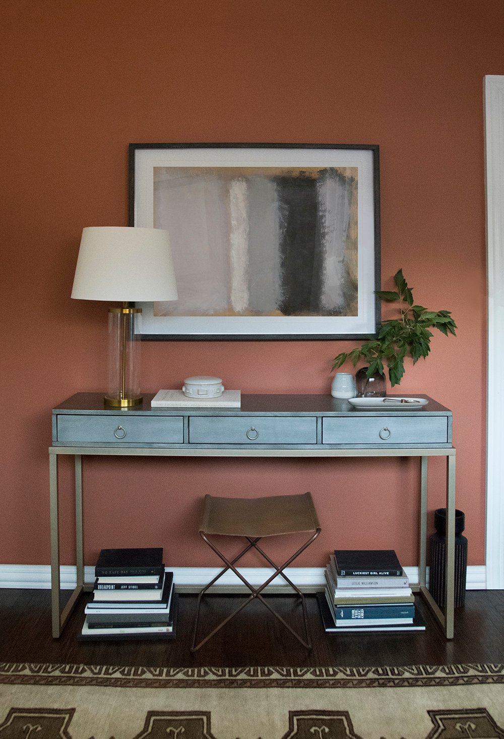
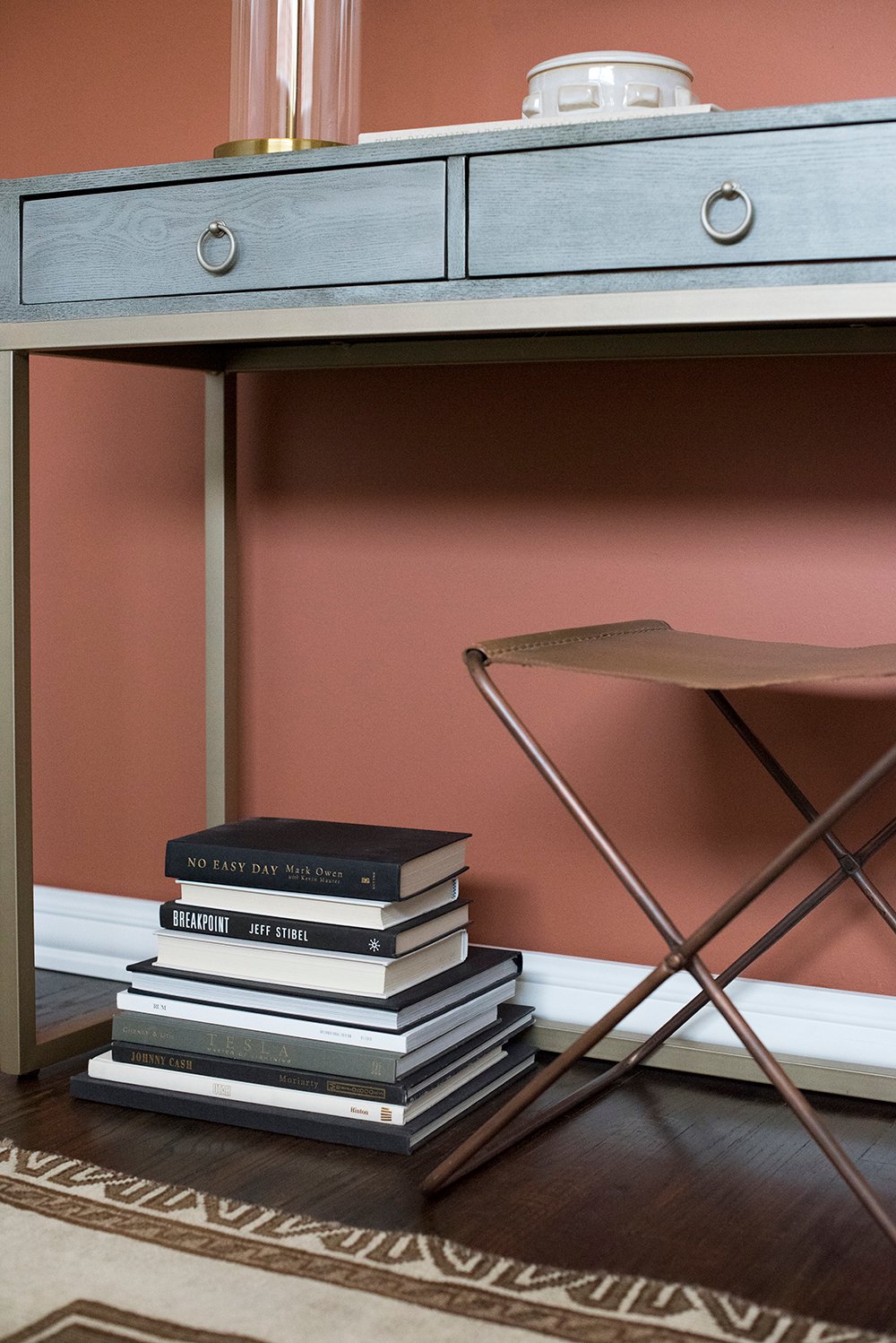
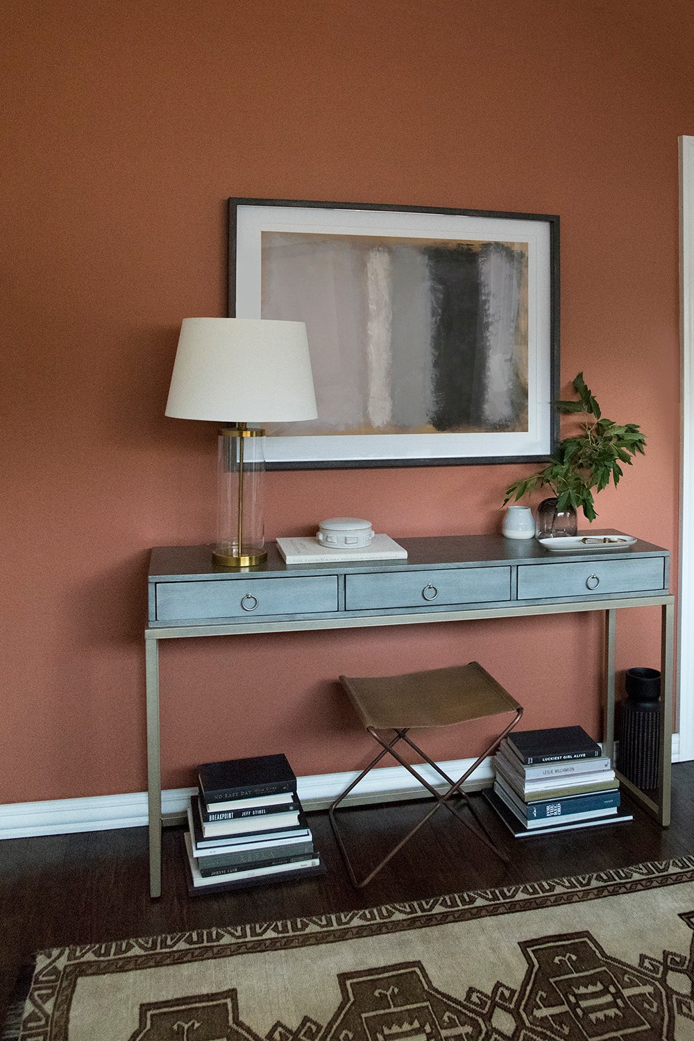
I think you’ll be pleasantly surprised how simple it is to create a statement wall in your home. It’s all about selecting deep, sophisticated tones that aren’t overly saturated or bright. That’s a sure way to end up with an accent wall that will withstand the test of time. Here’s how my wall ended up after I was finished styling!
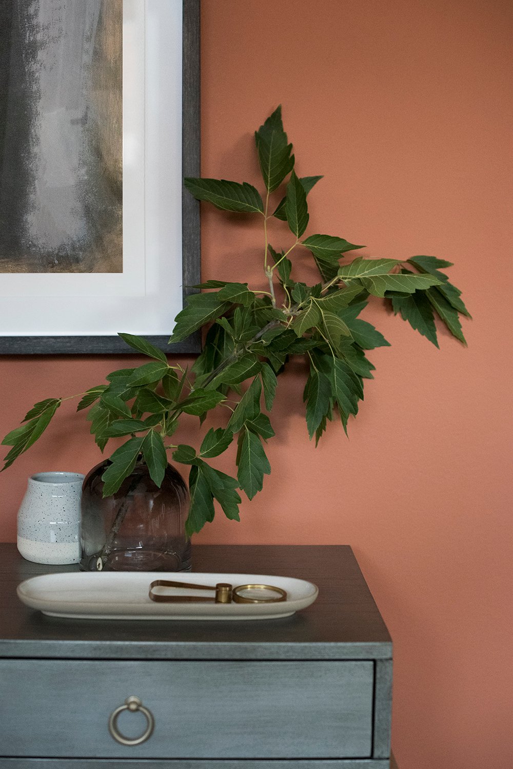
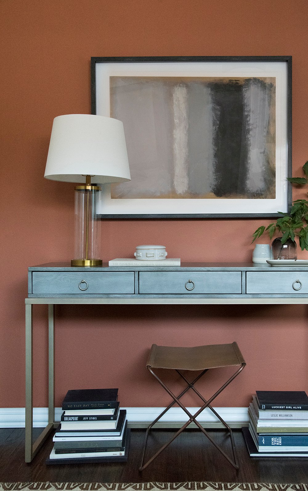
I’m convinced I should be adding more of this color to my home. I love the contrast it creates with the clean white millwork, and how it feels very rich and tonal, all while having a ton of depth. It’s nice, right?
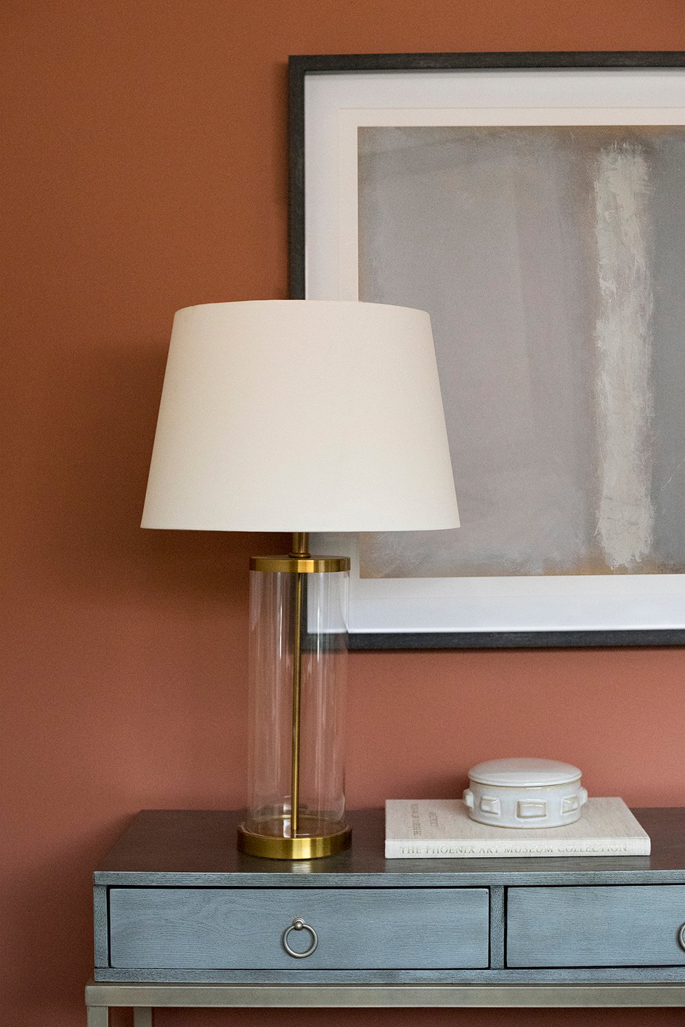
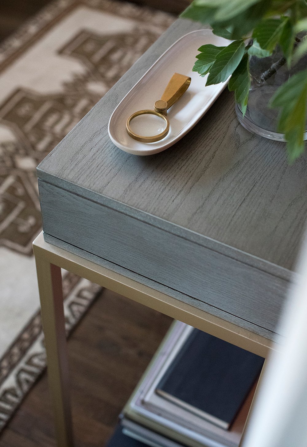
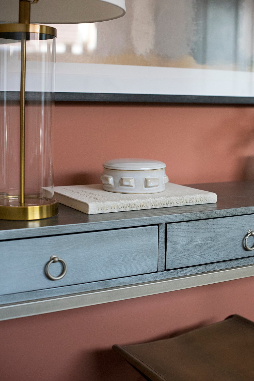
Cavern Clay really has a worldly, organic feeling to it, and I have to say I’m digging the 2019 Color of the Year. Not only does it work alongside antique brass and silver tones, but also vintage textiles, luxe leather, and glossy ceramics. I could easily see it applied in both modern and traditional settings.
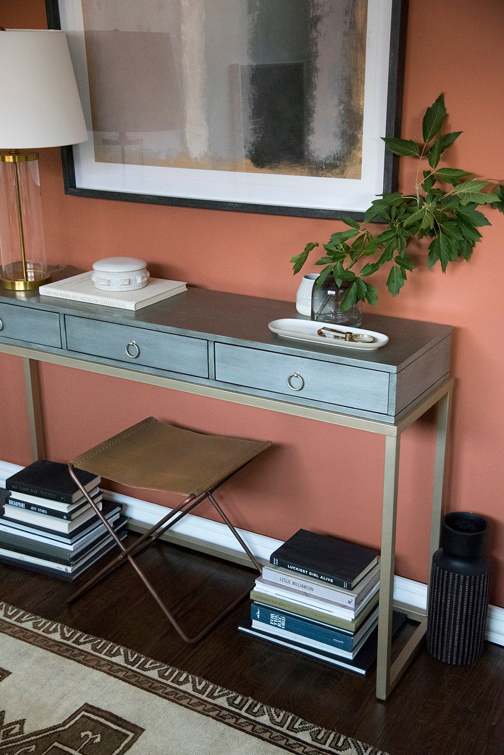
I paired a Turkish rug, fresh cut greenery, and modern ceramics with the console table to create a collected look against the Cavern Clay backdrop.
I’m really happy with the end result and it’s making me wish we had a mudroom or large entryway to recreate this look in- after all, it would be a really nice first view when walking into our home!
Again, I’m using the same palette and materials that reoccur throughout my home and despite the color difference, it still looks very cohesive!
To sum things up, I hope you feel more confident executing an accent wall or have been inspired by this coming year’s paint color! Whether you implement it in an entire room, use it as an accent wall, or bring it in with smaller accessories, I think it’s safe to say we’ll definitely be seeing more of this palette in the near future.
I’d love to hear your thoughts on Cavern Clay as well as my newly styled vignette / accent wall! Share in the comments below…
*This post is sponsored by Sherwin-Williams®. All content, ideas, and words are my own. Thank you for supporting the brands that allow us to create unique content while featuring products we actually use & enjoy!
Looks awesome. Would love a “get the look” for things like the leather stool and accessories.
I should’ve included that! Sorry, Tracy. The leather stool has been discontinued, but you can find a similar version here: http://bit.ly/2p2Dj11 xox
soooooooo pretty!
Thanks girlfriend! I’m really into the color!! Maybe we style a little bit into your kitchen? Ooohhh the possibilities!
I love the console! Can you provide the source?
It actually came from my local HomeGoods!
Mmm! Finally a color of the year I can get behind! Lol I love anything g with burnt or orange tones, it’s my favore color! ❤️
Yessss!!!!
It looks absolutely lovely! Would you mind sharing your source for the console table? Thank you!
Thank you! The console table came from my local HomeGoods… it was very affordable!
Looveee! Already thinking about which room I should paint this color!
Yay!!! It really is a great color. xo
I love the rug ! Can you tell me where it was purchased?
Thanks, Rachel! It’s vintage from Zartiques. xox
I love the tile you pictured in the mood board. Can you tell me where I can snatch it up?
Thanks Sarah! All of the resources in my home can be found here: https://roomfortuesday.com/shop-my-house/
Hey there! The link to tile goes to Wayfair 😞 I know at this point this is several years old and might be gone! But j love it and figured reaching out was worth a shot. Any idea name or brand?
Thank you!
It’s gone- I’m sorry, Katie! It got discontinued awhile ago. Wish I could be of more help!
Hi! Where is the tile from? Love your inspiration board!
Thanks,
Anna
Thank you! You can find all of the resources here: https://roomfortuesday.com/shop-my-house/
So nice! What is the “other” color swatch on the wall? It looks a bit blue and does go nicely with Cavern Clay.
Thanks Rachel! It’s Slate Tile 7624 (also by Sherwin-Williams). xo
Many years ago I used this very similar color on two accent walls, one which is the front entrance inside the entry way and the other is one wall of the living room. I was toying with what color to make the rest of the room which is an open design? Currently it’s called clam shell, kind of light pink. The flooring is now Red oak Natural that replaced the original light colored carpeting. I think I have too much earth tones.
Love the color! Would it work in a small kitchen? Top half of wall. If so, what color for bottom half that is beadboard? Trim and cabinets are white
I definitely think it could work in a kitchen, Sharon! I love the idea of pairing it with white. I’d maybe keep the beadboard a white or lighter color as well, like light gray. If you go with white, using a different finish could create a nice textural difference. Hope this helps!
White or light taupe for beadboard? And texture paint for beadboard?? Example?1
I like the color I just wish Sherwin Williams would show pics of rooms that have oak wood trim. My whole house has 4 to 5 inch baseboard ,all doors tried in Oak, ceiling molding is 4 inch oak. Every pic I see is painted trim. Makes it hard for us that prefer wood trims. Can’t tell if 5hese color would go with my molding
Love the look! Classy, yet comfortable. You just confirmed my decision to use it on my kitchen accent wall! Thank you 😁
Hi! What color is that table? Sometimes it looks gray and sometimes it looks a little pale green. I love my cavern clay wall and I tried a gray green color to go along side it called, Ethereal Mood SW7639. My main walls are Tres Naturale, SW 9101. What do you think of these together?
Hi! I am redoing a La Quinta (Palm Springs) Condo we just purchased. I am thinking about using it in my small kitchen because the cabinets are light and have a slightly pink undertone. I don’t usually do color, but I feel this cookie cutter condo needs something to add some interest and design. I love the color! Thanks for the blog
Hi, thank you for your post. I have been looking for a cement tile like the one in the pic with the clay and blue colors together. Where could I get this one you have pictured? thanks so much
Just asked the same thing! Any luck finding it? It’ll look so good in my bathroom redo!
Hey Sarah. Does this color go well with oak floors? I painted my dining room “subdued sienna” another sherwin Williams color, abt year ago before cavern clay was out. I like cavern clay better. It’s more the color I was looking for. My other walls are beige, light tan which I dislike greatly!! Can you help with another light color that will go with cavern clay. I’m not a fan of grey., although my light fixtures are flat silver/grey and backsplash is grey tile. Stainless steel appliances. I was thinking maybe a light taupe on my primary walls. Need your help. My kitchen also has oak cabinets, white moulding and white shutters on windows, black granite counter tops and we recently painted it Humble gold SW6380. I tend to lean towards yellows, golds, corals, burnt oranges. Also like blues, greens. Pls help!!
I’m going to be painting my front door this colour and your blog gave me the idea to welcome my friends and family home with this stunning Cavern Clay paint colour!
Oooh!! I love hearing that Kate. It’s going to be gorgeous :) xo
I love this color and how you used it, beautiful space! Could you tell me where the tile shown in the Pinterest main image came from? I’ve searched all over after seeing it and can’t find any info.
Thanks Jessica! Sorry about the tile, I’m not sure where I pulled that image from. It has been a few years since compiling this post.
I’m about to pull the trigger on painting the vanity in our master bath Cavern Clay and the walls BM Paper White.
I see from other posts that we have very similar styles…..I painted my kitchen cabinets Mt Etna (close Maritime cousin) and have the same inset style doors, but went with a darker antique brass pull, the the shape is dead on. Would you say that Cavern Clay has more of an orangey-ness to it, or winks at the coral more? This is a West facing bath with only one window for light. The vanity top is cream with white sinks. I’m looking for the vibe to feel craftsmen, and classic….Hopefully you can give your two cents on the undertone. Love your images and have pinned them all on Cavern Clay!
I would say Cavern Clay has more of an orange / burnt sienna undertone than pink or coral. Hope that’s helpful, Carrie :) Thanks for your kind words!! xo
Thanks so much! I have gone back and forth and back and forth, I’m sure you know the feeling all too well. And, let’s be honest, even a decision made here is likely to change when I hit the paint store! ha! :)
Hi Sarah, I love your kitchen! I tried looking up the floor tile in the kitchen, but it just sends me to a generic wayfair website. Do you happen to know the name of that tile?!
Thanks so much, Cat! Unfortunately the floor tile was discontinued a few years ago. I’m sorry!