Basement & Media Room Makeover
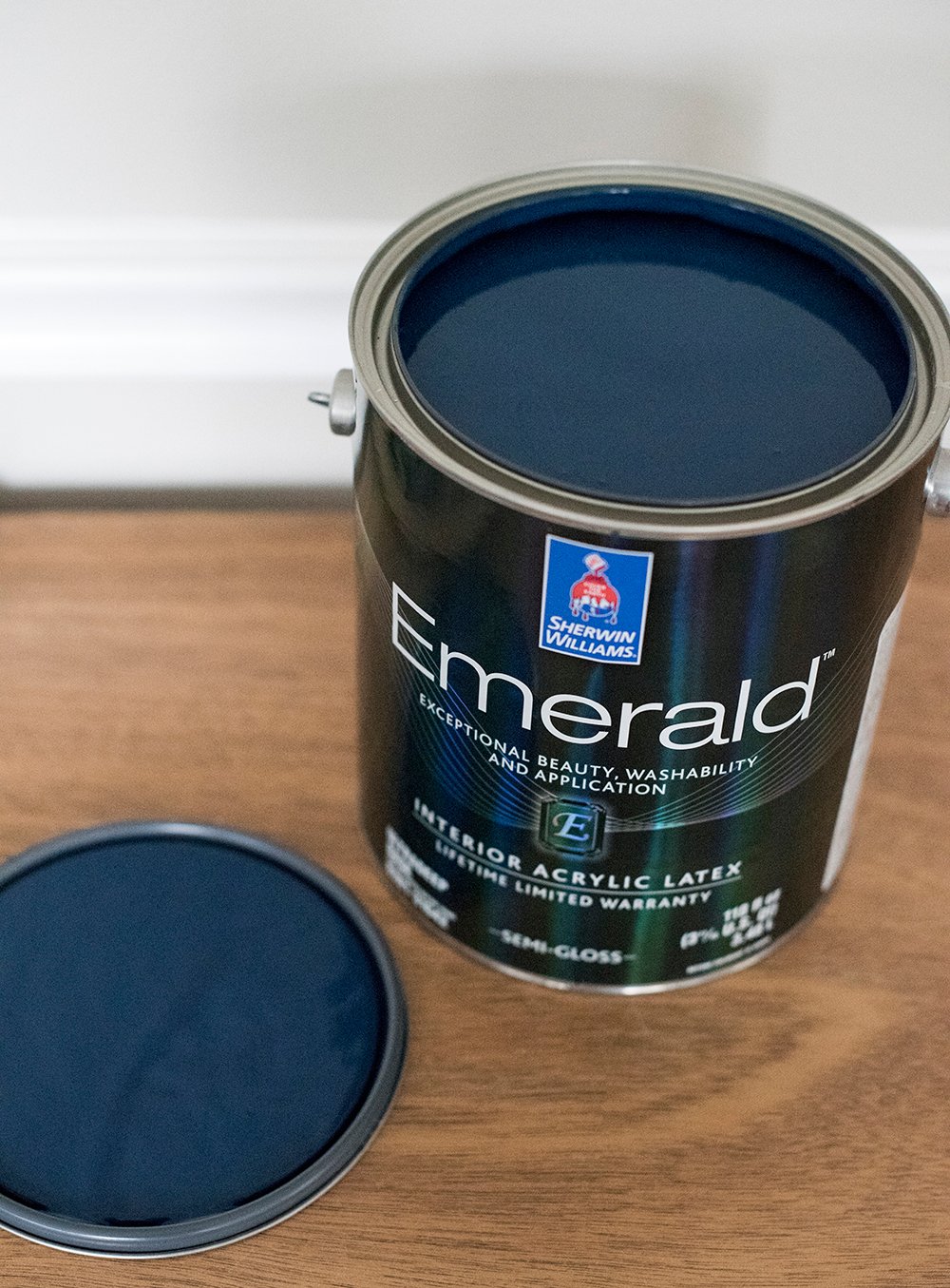
 Guess what?! I have the privilege of helping Sherwin-Williams announce the Color of the Year once again. Remember last year when I revealed gorgeous Cavern Clay SW 7701 as the 2019 color? Well for 2020, you guys are in for a real treat! It’s one of my all-time favorite navy hues from Sherwin-Williams. Drumroll please… Naval SW 6244! When deciding where to incorporate this beautiful paint into our home, the space that called out for this color was definitely the basement. Most people are intimidated to paint their basement or a low light room a dark color, but believe me when I tell you- that’s the perfect area to experiment with saturated or moody hues. Click through to read all about our basement & media room makeover painted in this stunning shade. I’m explaining why it works so well and the inspiration behind it.
*This post is sponsored by Sherwin-Williams. All content, ideas, and words are my own. Thank you for supporting the brands that allow us to create unique content while featuring products we actually use & enjoy!
 I’ll begin by saying, this is really phase one of our basement “renovation” Eventually, we’d like to demo the walls, shift around the layout, and really transform the space architecturally… but until then- I wanted to create a cozy space that is more representative of our aesthetic, because who knows when we’ll be able to fully renovate down here.
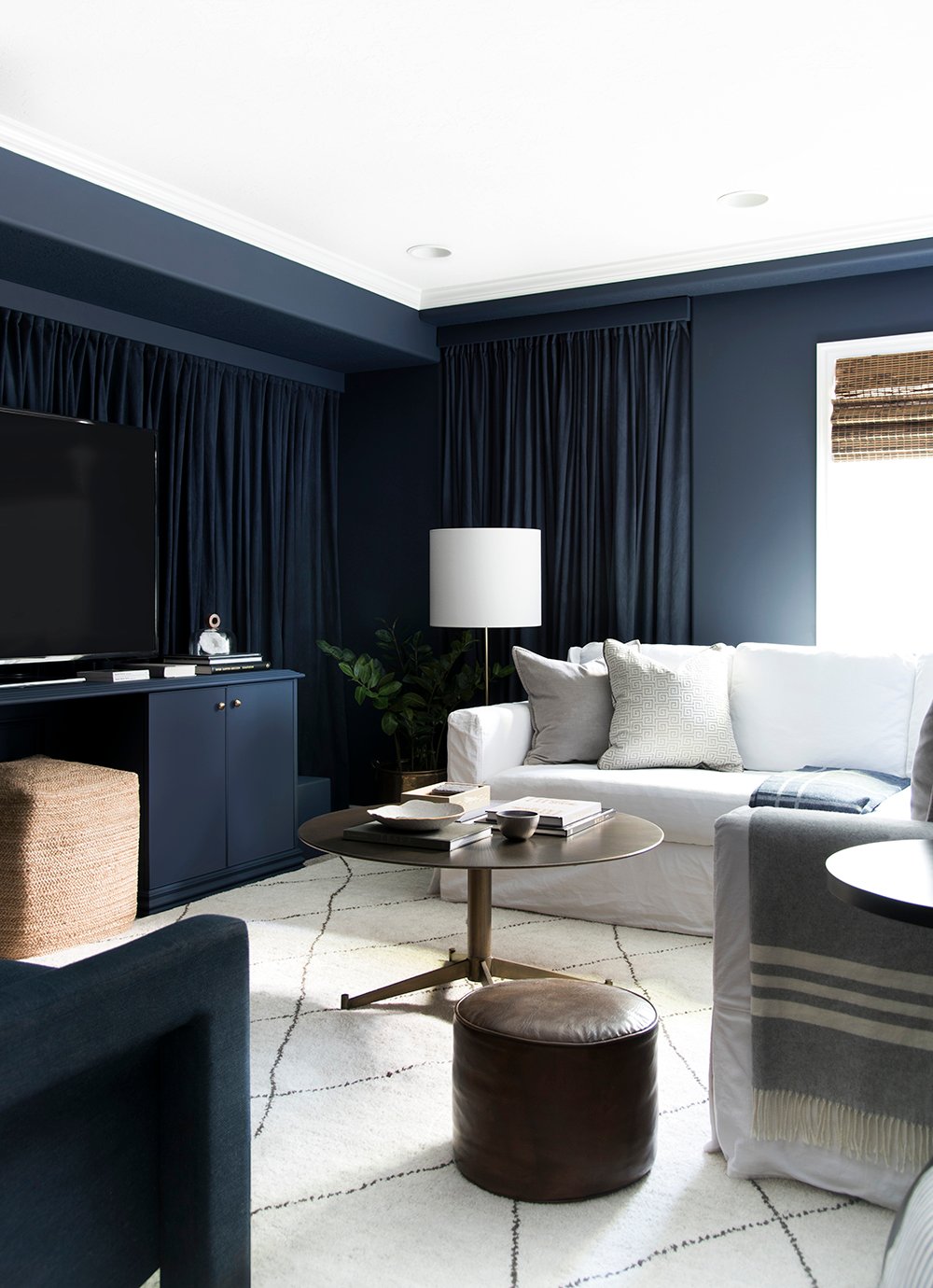
 The name of the game for this space was high style on a mega budget. It’s incredible how paint alone can truly transform the look of a room. In addition to a fresh coat of Emerald Interior in the Color of the Year, Naval SW 6244, we purchased window treatments and picture lights. Everything else in the space we previously owned. It’s funny how it’s basically our old living room, yet it looks totally different with the updated color! Ready for a before and after?
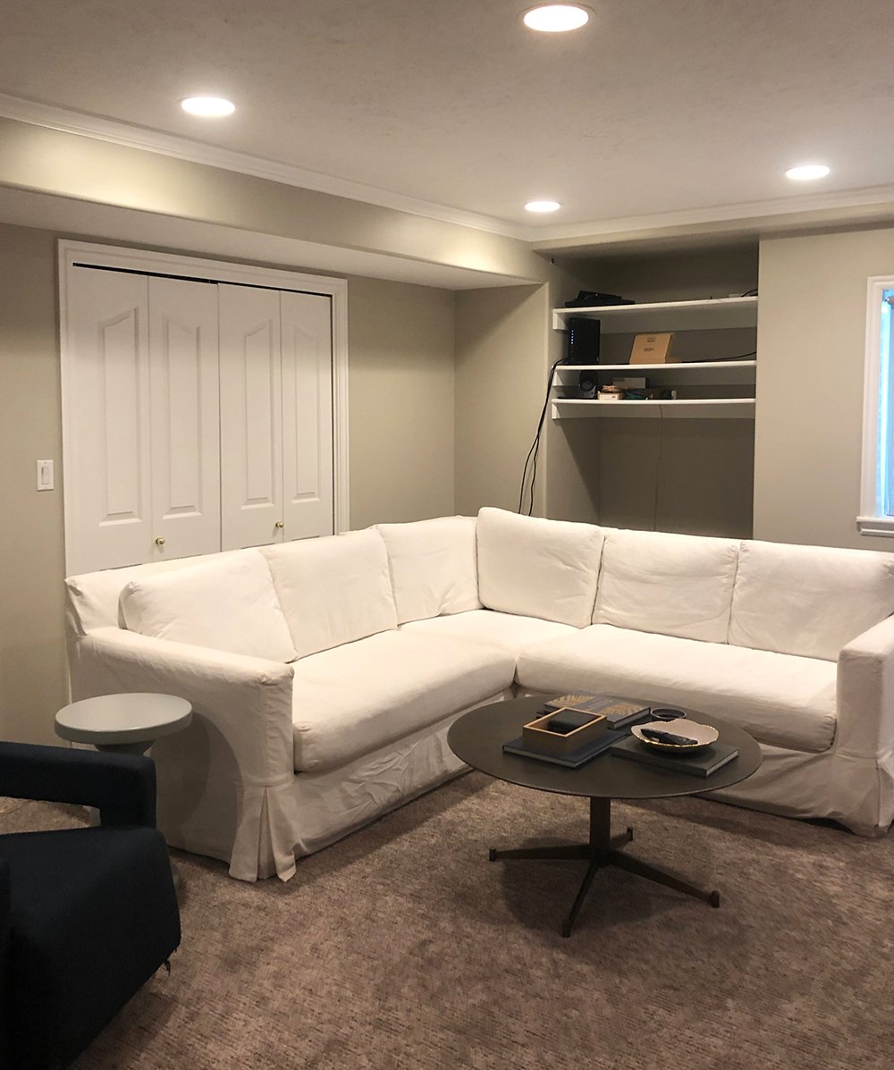 We really didn’t touch this space upon moving in. We basically carried our furniture down the stairs from the moving truck and didn’t even make an effort to floor plan or style it. It basically has stayed where we dropped it for the past seven months. Although that’s a little embarrassing, I knew we needed to freshen this room, hide cords, and better plan the space because we use it all the time. We’re constantly down here lounging, watching movies, and snuggling the dogs. It’s truly our favorite room to unwind at the end of the day. It deserved better!
 Let’s do another one… check out this before image:
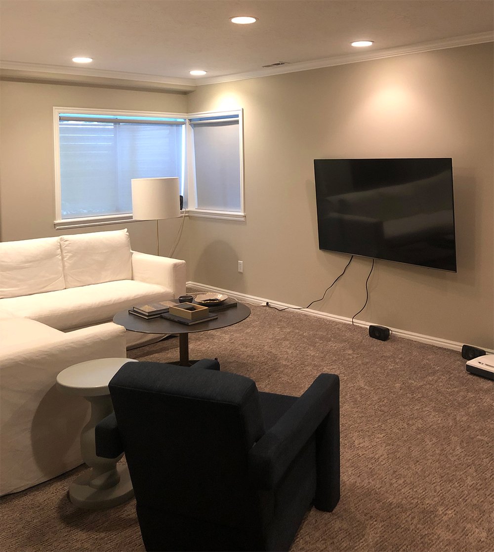 It really just looked like a grey / beige blob. The monochromatic colors weren’t doing anything good for this space. The TV on the opposing wall also didn’t have a sense of purpose. It was awkwardly floating and the speaker wires were impossible to hide. It just felt very blah.
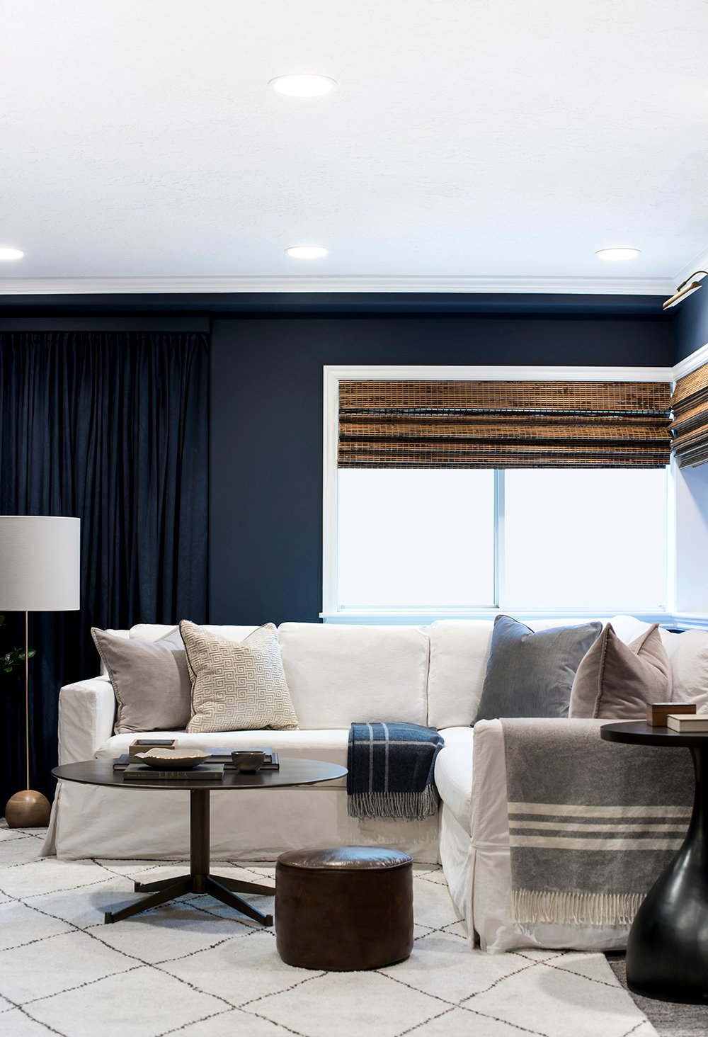
 By switching up the floor plan, we were able to create better balance, function, and we even gained some space by placing the sofa on a longer wall. However, the thing that is most transformative, in my opinion, is the bold color. It really helped to break up the boring gray tones and works much better with our existing carpet and furniture.
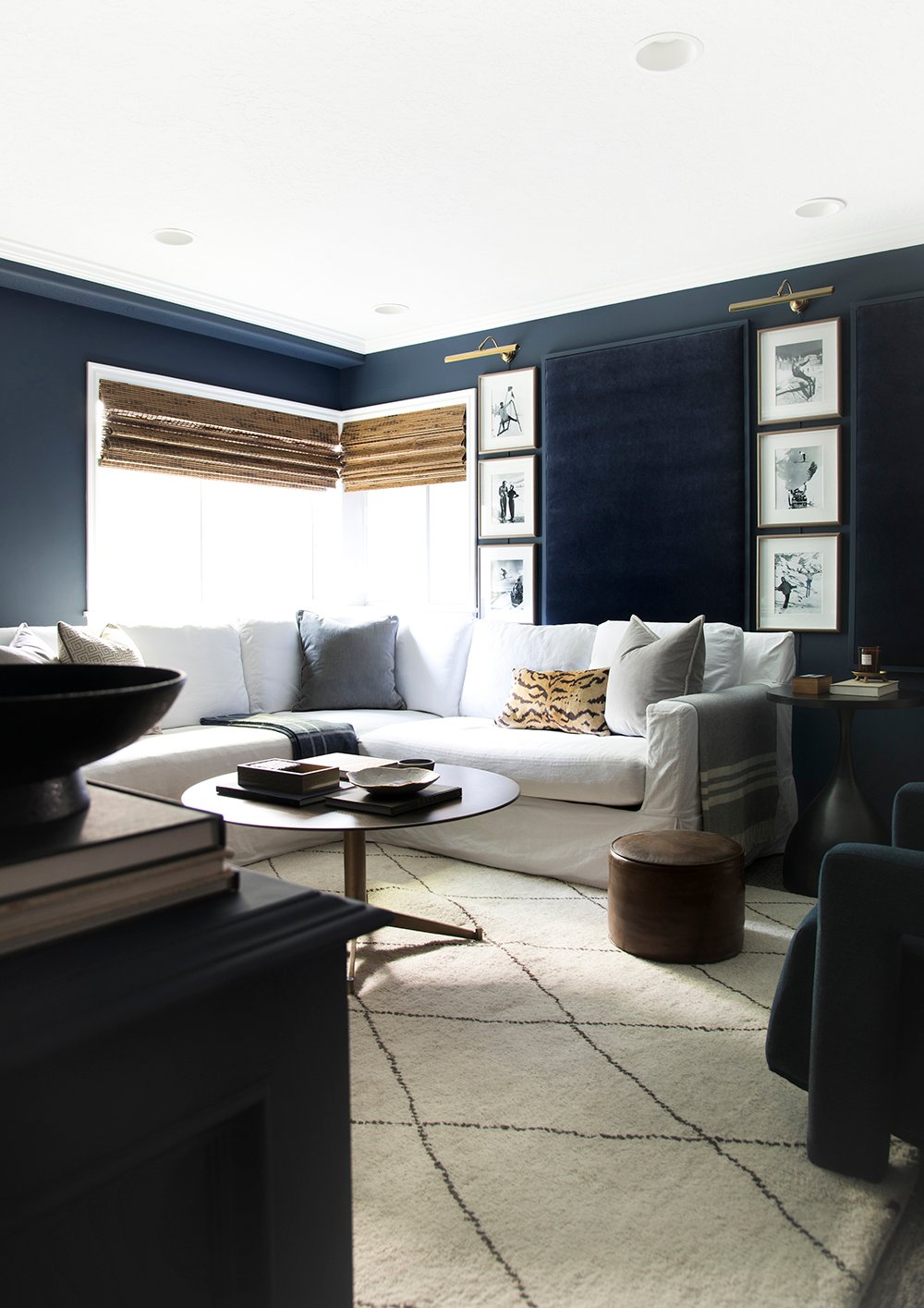
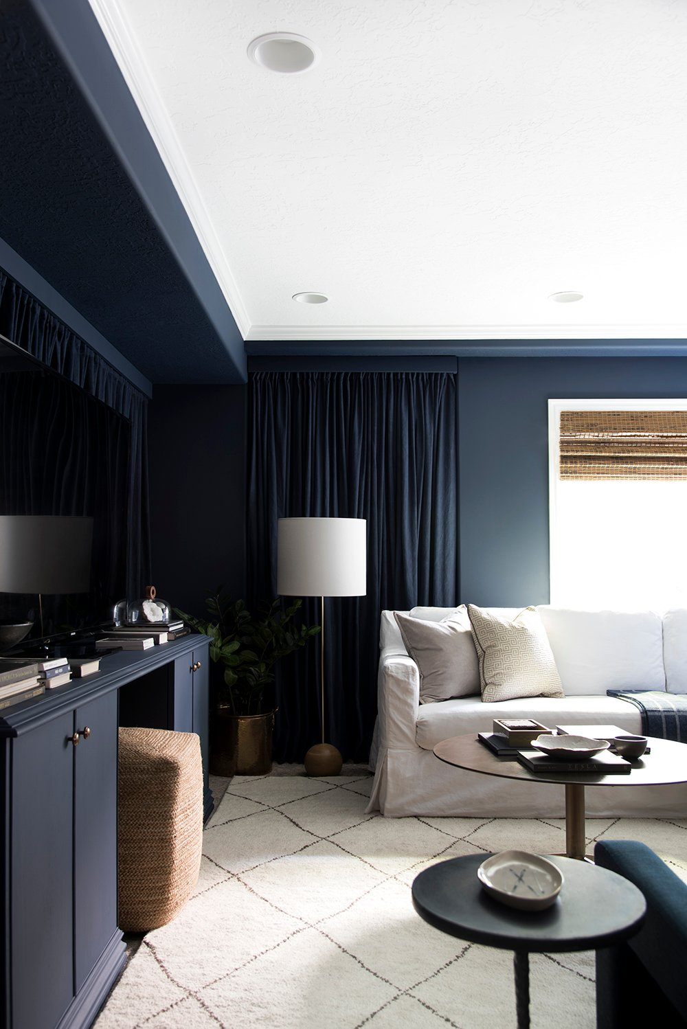
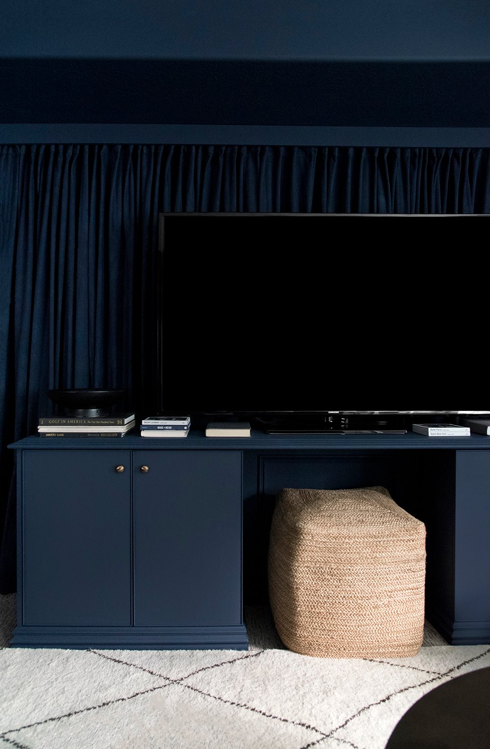 I spent forever dying curtain panels to hide the exposed shelves and bifold doors. If you’re interested in that tutorial, check out this post! The doors behind the TV are utility doors. Our hot water heater actually lives behind them and we very seldom need to access it, but in the event we do- we’ll just move the media stand out of the way for relatively easy access. It was worth the tradeoff for the updated floor plan, which makes far more sense in the basement. But back to the curtains… they really soften the space and make it feel more like a theater or movie room. They also help the odd soffit and hidden ductwork look more intentional. Not to mention, painting the soffit “ceiling” Naval SW 6244 really helped to disguise the ugly texture.
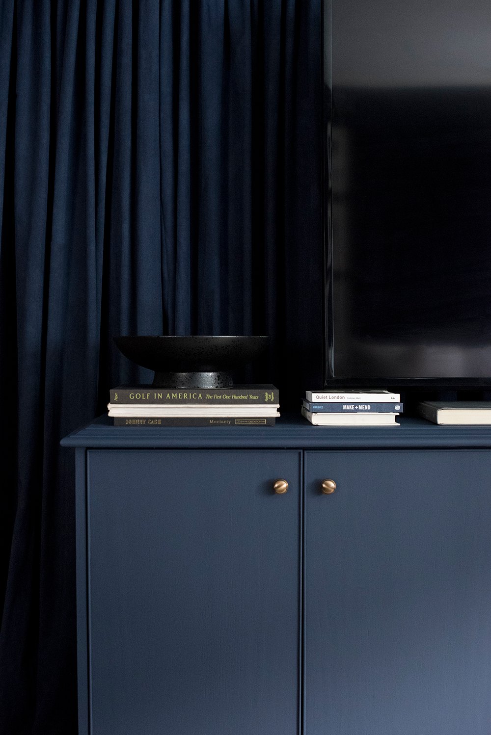
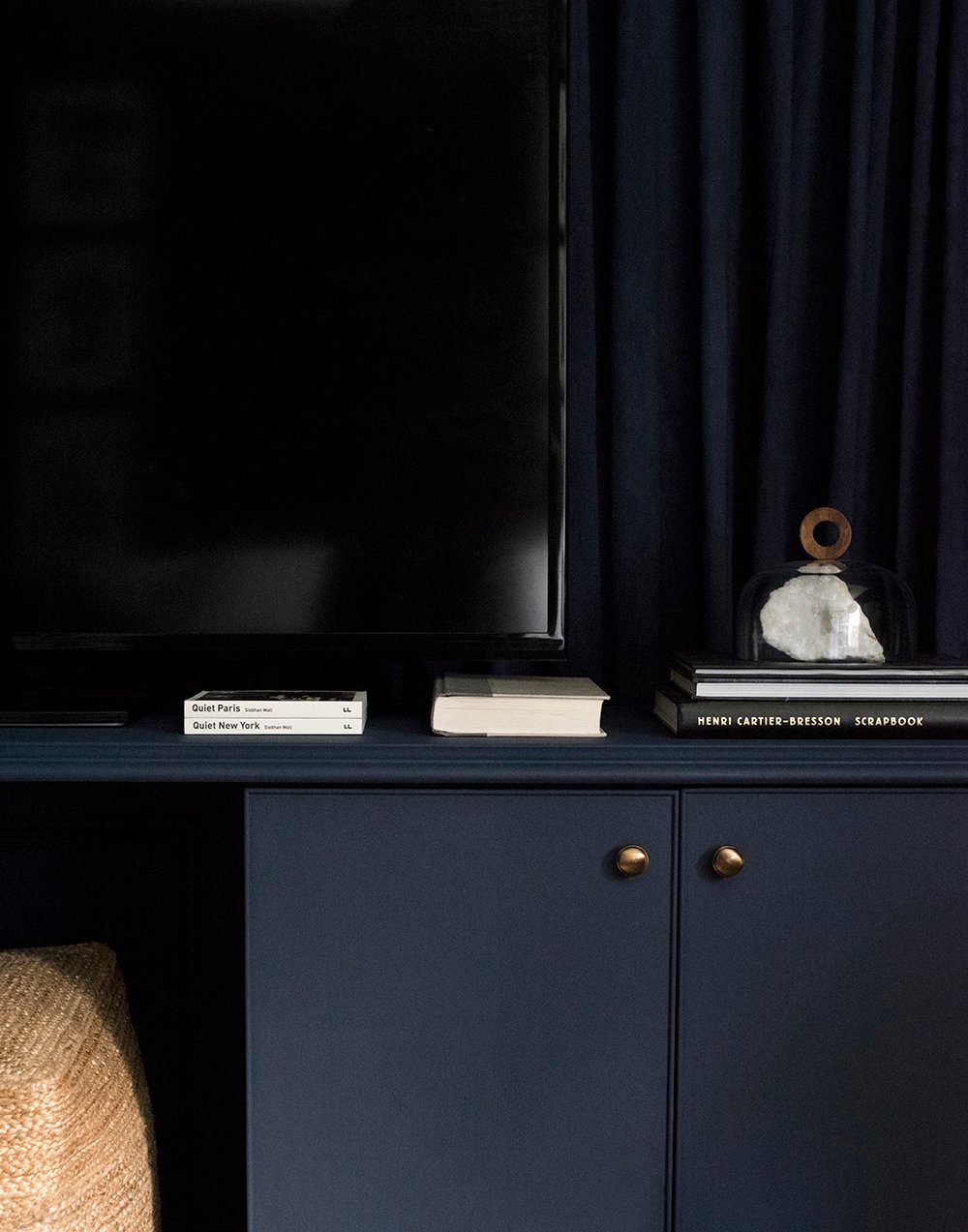 The media stand is “new”, but was free. Emmett’s workplace is being remodeled and during demo this giant dude was sitting beside the dumpster ready to toss it into a landfill. I made him save it, he brought it home, then I painted it the same shade as the walls (Naval SW 6244). The piece itself is a little outdated, as it was built in the 80’s, but I liked the lines and you know I can’t pass up free “vintage” furniture. Haha!
 Painting it, swapping the hardware, and styling really helped bring the entertainment unit to the times. It’s perfect until we renovate someday or find something better.
 Emmett also brought home five of these solid wood pedestals that were being thrown out at his work. I’m certain his boss thinks I’m a nut for wanting these, but I loved the idea of floating them around the room… and again- monochromatic paint did the trick for sprucing them up! I’m probably going to sprinkle the remaining three throughout upcoming renovations- so keep an eye out for more and how I style them.
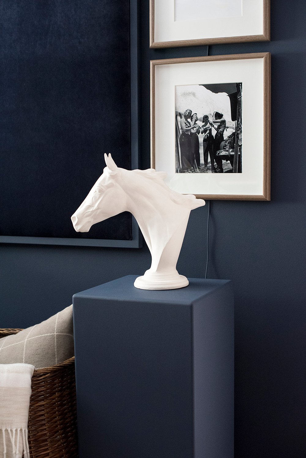 I used the pedestal pictured above for hiding cords and surround sound attachments. It felt like a fun architectural touch since the room is pretty basic and boring in terms of millwork.
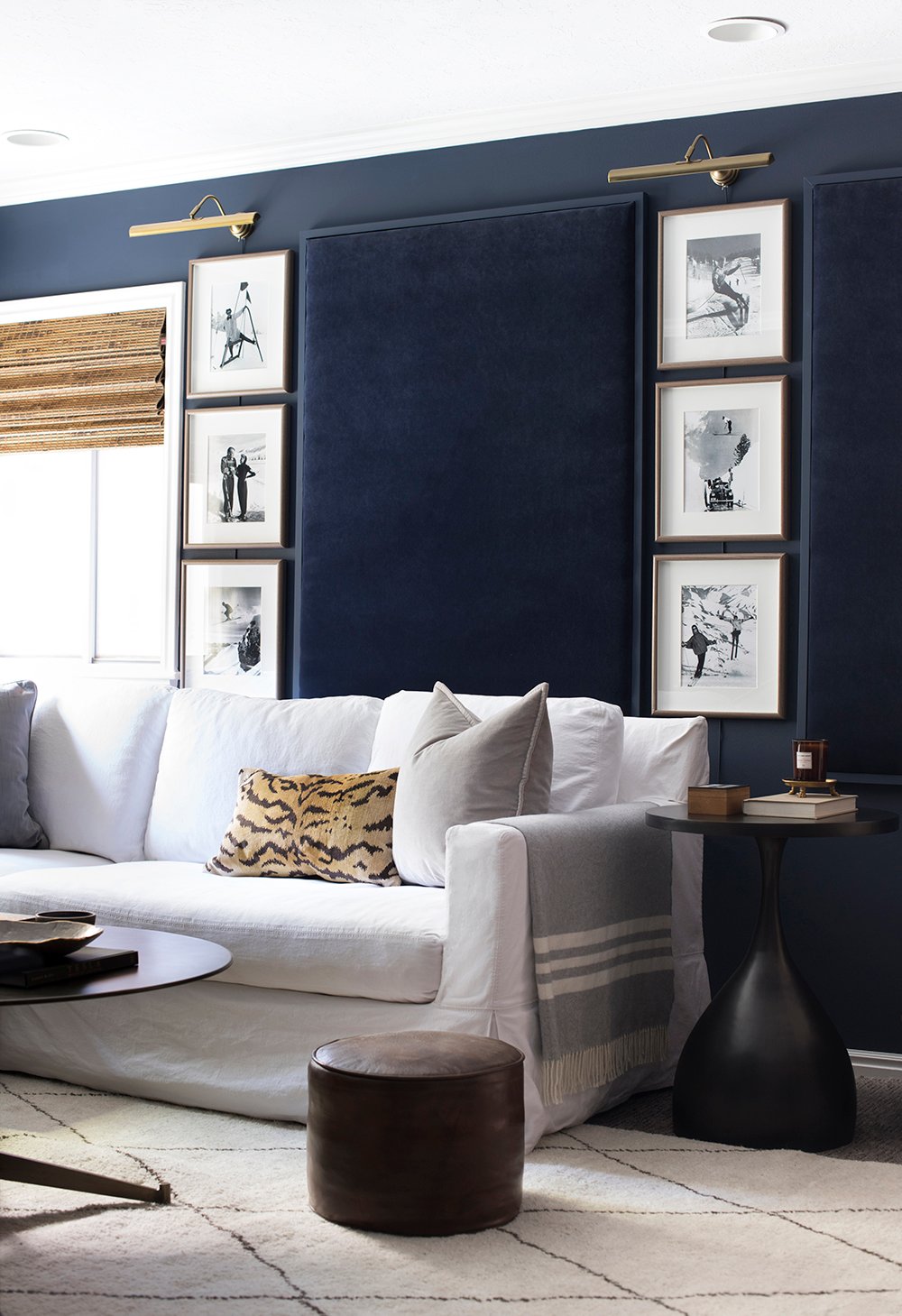
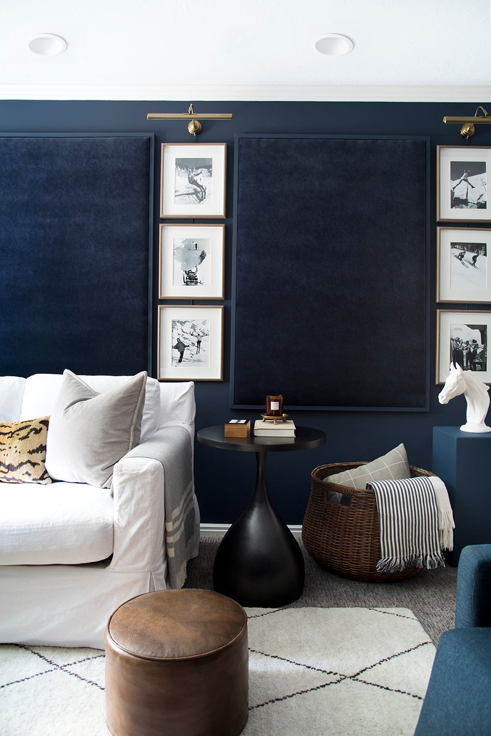
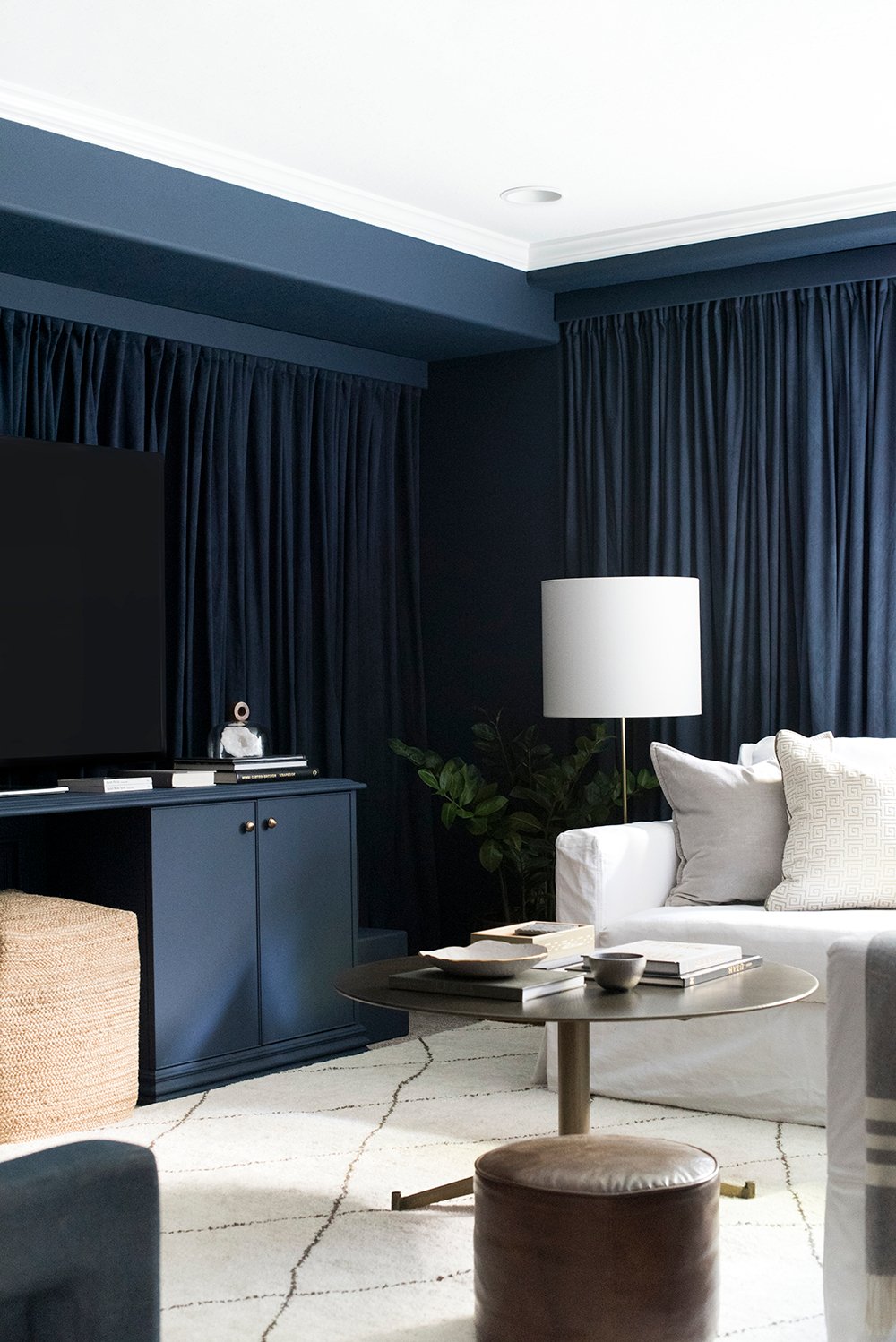 As for inspiration and color, I really wanted the basement media area or living room to feel like a soft and textural, high-end space where you can totally let go and relax. In fact, Sherwin-Williams Color of the Year is focused on relaxation and mindfulness. This year has been all about work life balance for me. This was my goal at the beginning of the year, as I’ve been focusing on well-being. I immediately knew a dark color would be perfect in this area. When we’re snuggled up under cozy throws, watching our favorite movie with a big bucket of popcorn (or cocktails), I prefer a dark and moody lounge type of environment… like a theater.
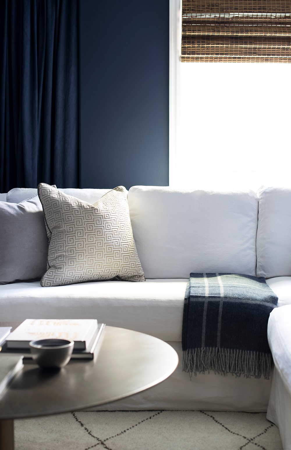
 The color Naval SW 6244 really played well with our existing white sofa, brass accents, leather pieces, and luxe textiles. It feels dark, but still happy and sophisticated. It’s a calming hue that reminds me to check out and allow arbitrary worries of the workday to slip away.
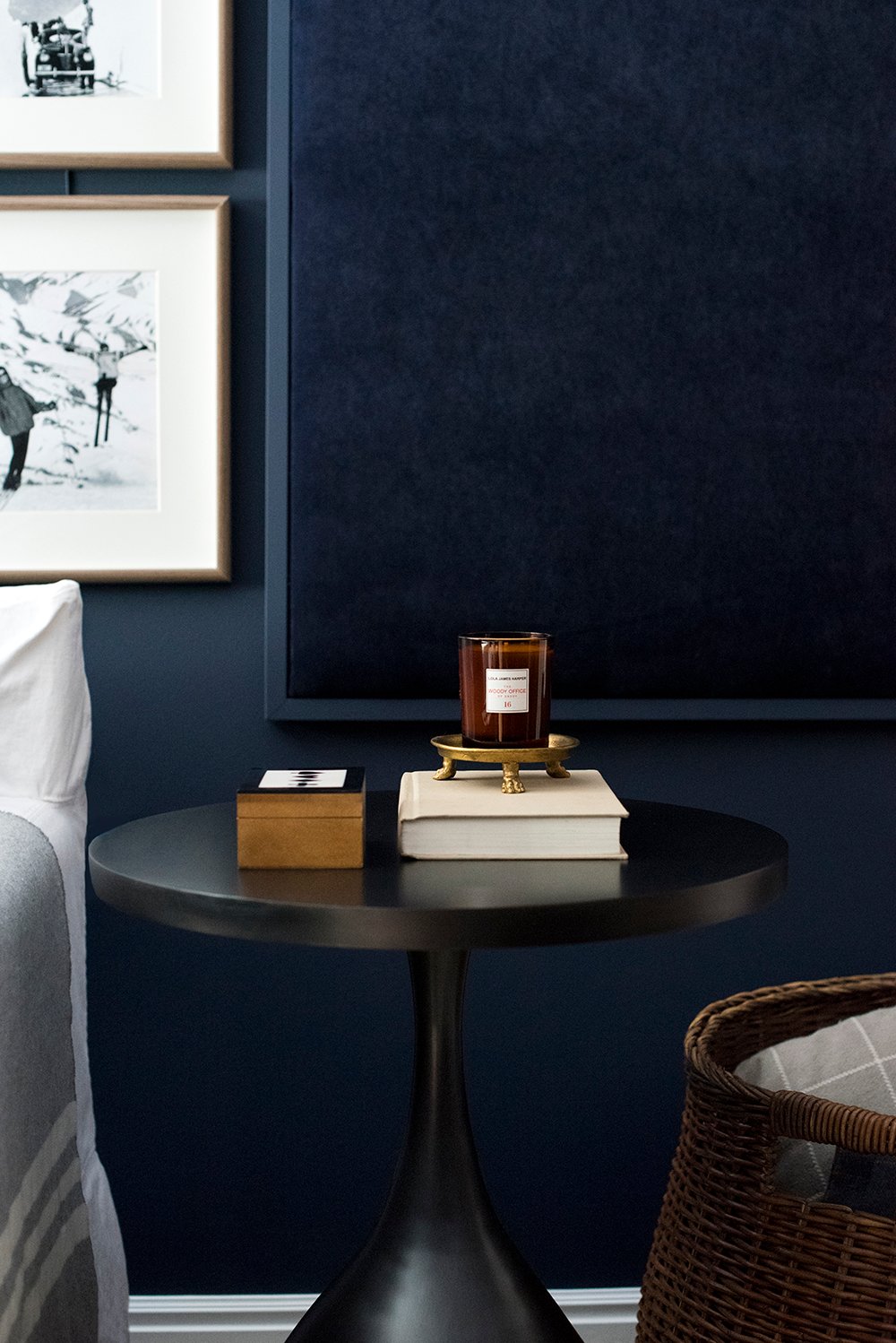
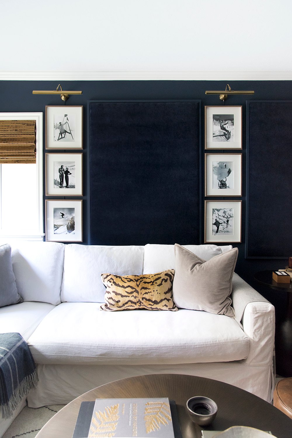
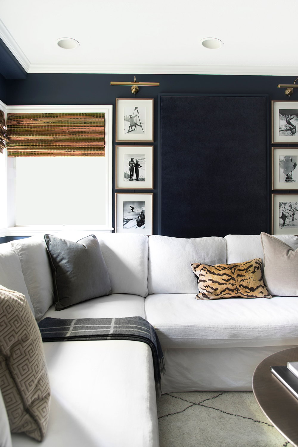 Aside from the wall color, I dug out our vintage ski prints from our previous gallery wall. Remember that from our old master bedroom? I knew I wanted to create some acoustic wall panels to help with the surround sound situation… and let’s be real- I’ve also REALLY wanted to upholster a wall treatment in velvet for the longest time. This felt like the perfect opportunity and gave me another chance to insert navy. I laid out the grid on the carpet prior to installation, then ran to IKEA for quick gallery lights at the last minute. They really complete that wall and I love the dim light they add during evening hours. The brass really pops against the dark paint color!
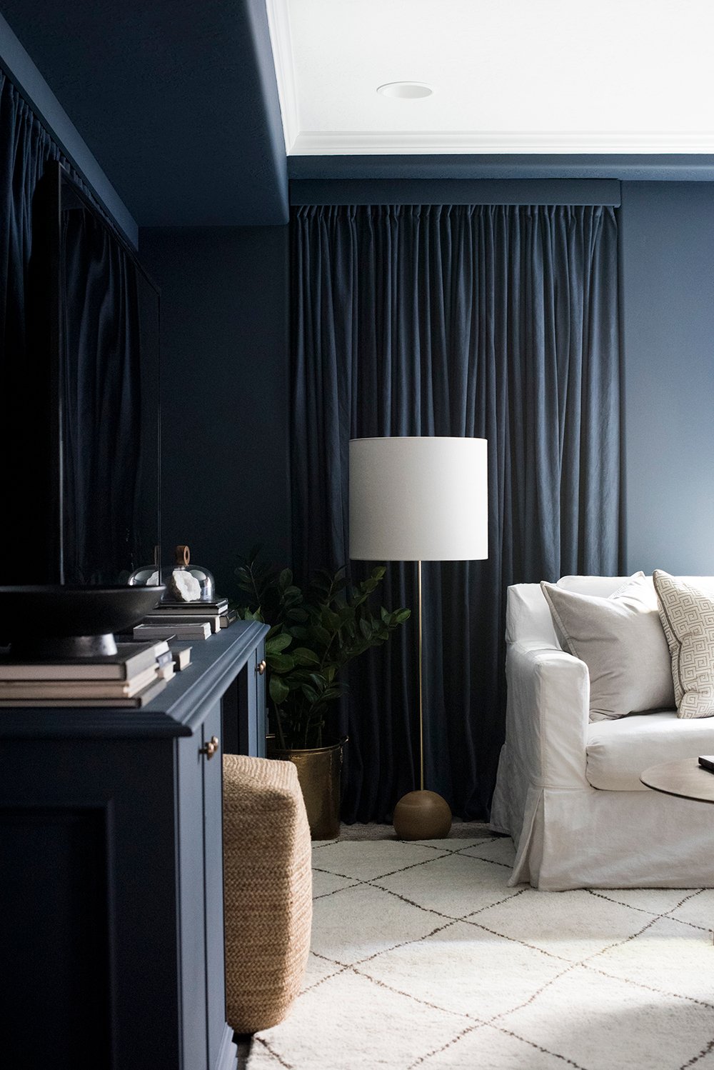 Although we have plenty of recessed can lights, we really only use the picture lights and a floor lamp at night. I’m a fan of soft, ambient light- especially in a media room setting. The overheads can sometimes feel too bright or harsh during evening hours.
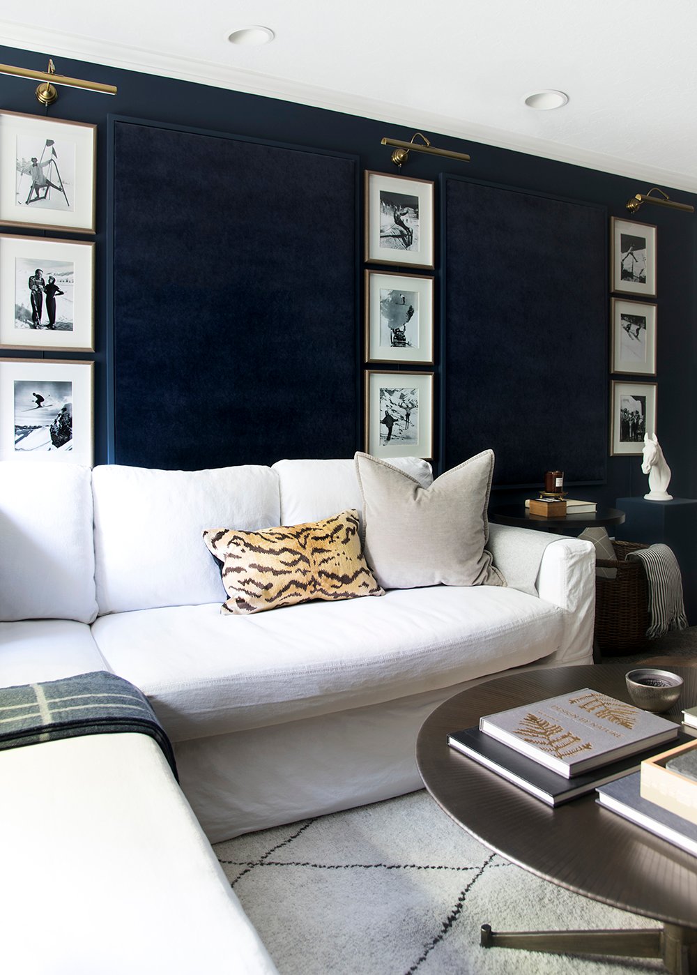 If it’s not obvious already, texture was another big part of making this space feel less clinical and boring. I crammed in as many textiles as I possibly could: pillows, throws, wall panels, blankets, and even an area rug layered over top of the carpet. The entire room feels very plush and cozy. It’s definitely a space that makes you want to kick your socks off and slip into your pajamas or comfy clothes and simply LOUNGE.
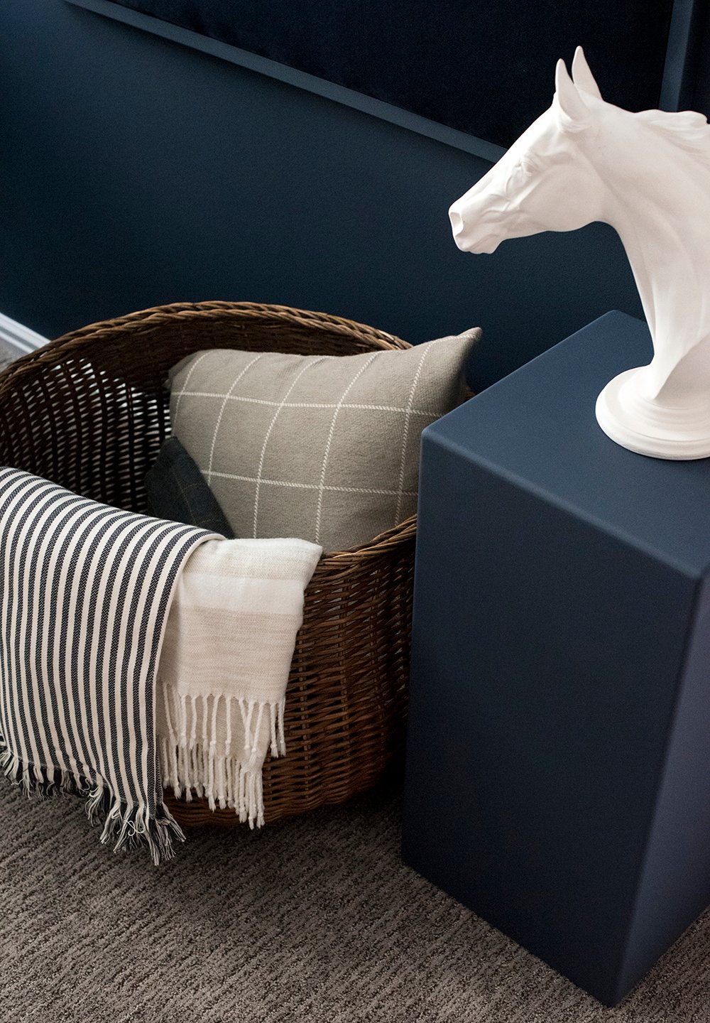 Given there is so much blue in the space, I knew bringing in some wood tones would help to achieve a nice warm contrast. I added some woven wood materials like the window treatments, baskets, and woven furniture- like the ottoman.
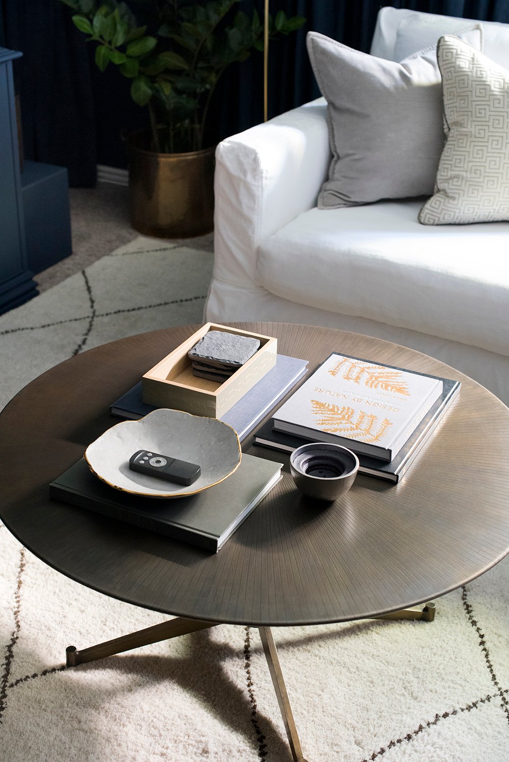
 As I previously mentioned, brass is another finish that works impeccably well with Naval SW 6244. In addition to the picture lights, you can also find our coffee table, floor lamp, and accessories that help add some metallic pizazz to the space.
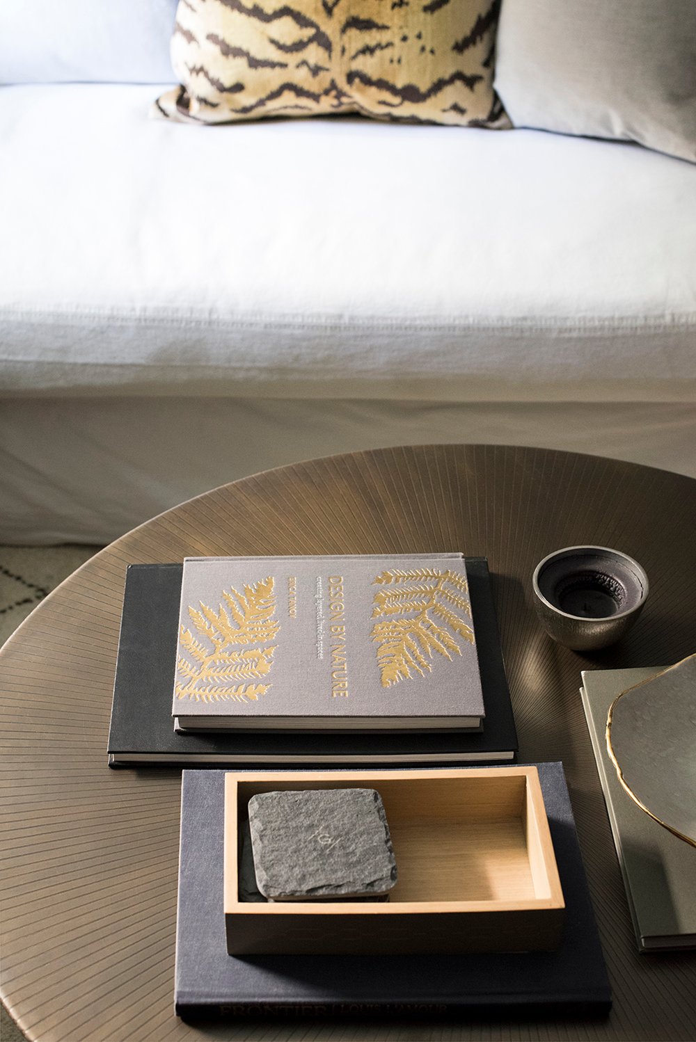 I kept the coffee table styling pretty minimal. My general formula is books, coasters, a tray or bowl for holding the remotes, and a candle. We’re the type of family that likes to kick our feet up onto the table, so I tried not to over style it.
 Our slipcovered sofa is still in great shape and looks wonderful in this room. Eventually, we’d like to get a larger sofa for this area since the space is sizably larger than our previous living room, but for now- it totally works and I really love the look of it.
 If you’re interested in sources, I’ll link everything below! Click directly on the items- or use the numbered source links at the bottom of the collage to shop.

01: Naval SW 6244 in Emerald Interior // 02: art light // 03: ski art // 04: floor lamp // 05: slipcovered sectional // 06: faux plant // 07: side table // 08: brass coffee table // 09: monogrammed slate coasters // 10: navy cashmere throw // 11: horse bust // 12: large basket // 13: gray velvet pillow // 14: candle // 15: candle pedestal // 16: pewter pillow // 17: black & white throw // 18: navy chair // 19: pedestal bowl // 20: curtains // 21: leather pouf // 22: woven ottoman // 23: tiger pillow cover // 24: greek key pillow // 25: soapstone bowl // 26: striped wool throw // 28: area rug // 29: drink table // 30: plaid throw
 When combining navy, white, and brass (a popular palette), it’s easy to end up with an overly preppy, predictable, or cookie cutter space, but I think I did a good job of making this media room in our basement feel unique and interesting. Would you agree?
 I’d love to hear your thoughts on the space and the 2020 Color of the Year in the comment section below! I’m loving the subtle fall feel down here and it’s making me very happy to have a cozy and casual living room where we can relax. It’s pretty traditional, with a tiny bit of modern mixed in. I’m digging it! Anyone else? How do you feel about Naval SW 6244 being the Color of the Year? I. Am. So. On. Board.

Looks so good, Sarah! Where are the woven shades from?
Thank you Tara! Sorry, I forgot to link the shades. They’re from Lowe’s. You can find them here!
Wow! This is incredible!! What a stunning makeover. You really transformed this space!
xo Michael
Thanks so much Michael :)
Its just gorgeous! I love Navy. I love your designs.
I also love navy… what a PERFECT Color of the Year Choice for Sherwin-Williams :) I’m so excited I got to be apart of it.
Aw thanks Linda! xox
This is gorgeous! Makes me want to make every room in my house monochromatic and moody.
Meeee too! I want all the dark color right now :)
Wow!! This is hands down one of my favorite spaces you’ve ever done, but I’m biased since navy blue is my favorite color. My favorite part is the velvet acoustic wall panels, love the texture it adds!
Really?! I’m so happy to hear that Jasmine! It’s funny… sometimes the spaces with a low (or nonexistent) budget force me to be the most creative. I’m so glad you liked this one! xo
Hi. new here! I also love the acoustic wall panels. How did you make them and get them the same color?
Hi Paula! They’re saved in an IG highlight, if you’re curious about the process :) I just upholstered them like I would a piece of furniture and installed a frame. They were really easy!
The space is hardly recognizable. Great job!
Thank you Marit!
You just amaze me every time! Yes, very unique and interesting! Can’t stop looking at it! So gifted! I have never really liked blue in my home but you have transformed me! I want to incorporate blue in our house!
This weekend, my husband and I went to a couple of model homes and one was decorated in all white and navy. While it looked clean, it felt cold…not much warmth! You have made this room soooo cozy!
Thank you so much Danna!! That’s the best compliment… I really appreciate it. We definitely want all of the spaces in our home to feel like “us”- cozy, inviting, and livable. That’s the name of the game around here :) xox
oh my goodness, I love love love this space!
I love how you aren’t afraid to bring in bold paint colors. It’s a great reminder to people like me who love to play it safe with grays and browns. This is stunning and sophisticated and cozy all at the same time–what a combination!
Thank you so much, Emily!! I vote give it a try :) xox
Wow Sarah! What you did here with SW Naval is gorgeous. The paint, the drapes, the accessories!!
Thank you Liz! xo
So gorgeous!
Thanks so much, Elizabeth! :)
So so good. This is so sumptuous and unique. Really wish I had a space on my house to do this with. Love it.
Thank you so much, Elle!
This is just so pretty – as usual, you have done a fantastic job!
Thank you, Monica! xo
Wow! It looks great!
Thanks so much, Melissa! xo
I love it!!!!! Please share how you made the upholstery wall panels!!
I shared the entire process in IG stories- and saved it to a highlight for future reference :) Check it out there and let me know if you have any questions! xox
I am blown away! This transformation is unreal! It looks like a totally different room even though many of the furnishings remain the same! Such a “basic” color palette, but yet so fresh!!
Aw thanks Jessica!! :)
A question about the salt or vinegar. I haven’t used dye from the bottles before. Is that in the directions or is it your experience with textile dying textiles? Also, great idea hiding the utilities door behind the entertainment unit. I’m really hoping you and Emmet installed a leak sensor just for peace of mind! Love the results.
It’s actually in the instructions, but I used to use vinegar or soda ash during my time at art school- you definitely need one of those things to help the dye take! We do have a leak sensor :) I can also squeeze back there without moving the credenza, but should we need to move it- the two of us just lift it over and sneak behind the curtains. That was definitely something we checked before committing to the floor plan- especially since our water softener is back there and we have to add salt every month or two!
I love this – you could have been sharing a before photo from our basement (currently revere pewter) and I have been thinking about going bold/dark but thought it might make it look like a black hole down there! We don’t have as much natural light as you do but now I am thinking it still might work and I should stop trying to fight the size and embrace the cozy.
I vote go dark! It’s funny… intuition tells us if a space is dark and dreary, we should paint it light- but in actuality… I think darker paint is better suited. Embrace the cozy!! :)
PS… this paint actually made our space look a lot bigger too! Win / win.
This and Chris Loves Julia’s kitchen transformation are my favorites right now! Both used primarily paint and relocation to achieve a “phase 1” makeover.
I love this navy color! I also love your monochromatic textile look. What a cozy feel, even in pictures! I’m sure it’s better irl.
This post was worth the wait!
Aw thanks Jennifer! What an honor to be grouped with Chris & Julia- two incredibly talented friends! I so appreciate your compliment. I also really enjoyed following their kitchen makeover. I wish I could’ve shared the makeover sooner, but since it was featuring the Color of the Year- I had to wait for the big announcement :) xo
Beauuuutiful! Makes me want to paint our basement dark ASAP!
When I was on my phone, the pictures looked much darker than they do on my computer. When they posted their kitchen, chrislovesjulia said that their blog software automatically changed the brightness for photos on the mobile sites & she had to upload the pictures a different way. Was wondering if you’re having the same happen with these? It did help when I turned my brightness up all the way, but they’re still not as bright. On the computer I can really see the textures and its SO cozy. Well done.
Thanks so much, Lindsey! So weird about the images… I’ll definitely look into that! Thanks for letting me know! I do know different devices and screen resolution / RGB quality can also effect color.
So beautiful in so many ways! Now I want a navy blue room 🥰
This is gorgeous! I live how warm and inviting it feels! Do you mind sharing where you found the vintage ski art prints?
Thank you Kenzie! Warm and inviting was definitely the goal down here. I found the vintage ski prints online- find more info in this post: https://roomfortuesday.com/your-guide-to-creating-the-perfect-grid-gallery-wall/ xox
I love Navy! I have used SW Naval in several places in my house including an accent wall in my basement. It really is the best navy color because it works well with warm and cool tones as well as black and white. I seriously just want to move into your house I love all your choices!
It’s such a versatile color, Katie! I’m happy you love it too :) xox
This looks amazing!
Thank you!!
Wow! I love love love it!!! I love that you used what you already had but with some elbow grease you made it completely different!
Thank you so much, Lena! :)
You are a master! Love, love it! I’m dying to paint my kitchen cabinets navy and maybe Naval is the one.
For those afraid for going dark, it helps to consider the mood/use of the room. If the room is primarily used at night (dining room, TV watching, bedroom) it almost makes sense to go dark.
Thanks Melissa! oooohhhh- kitchen cabinets would be gorgeous in this color! You’ll have to let me know if you try it! Great point on going dark and considering the function for each space- it does make perfect sense in a media room / space for TV watching. xox
You made it look so easy! Did you sand, prime, and paint the credenza?
Thanks Laura! I didn’t do anything to the credenza… just cleaned it and went to town painting. Haha! We’ll see how it holds up, but I’ve done that before and it’s amazing what the power of good paint will do.
The textural monochromatic style is delicious! It looks so luxe, honestly. Paint = magic, but you went above and beyond with the velvet, the drapes, the picture lights, the painted furniture pieces. So so good (and it’s totally budget friendly)!
I love how your basement turned out! Great job! I painted my living room using Naval on New Years Day 2018 with my sister who was visiting. It is an incredible color that I’m so happy with. I may change up my current curtains to the shades you put in. The warm accent they add makes the room cozy :)
Thank you, Wendy! It’s such a great color and you’re way ahead of the trend ;) Let me know if you try the curtains! xox
Gorgeous!!! I am LOVING your navy, moody space! Great job on the makeover!
Thank you so much, Ginny!
Sarah, this is so gorgeous — very luxe and cozy at the same time. I love love love that SW Naval — and everything you chose to go with it. This space is so inviting!!! What a great (doesn’t feel very “mini”) makeover!!
Thank you so much, Kim! We’re really enjoying our basement now :) Amazing what some paint and styling will do! xo
I will admit I do love this! That rug really pulls together the room. Since the post is about decorating on a “budget,” I looked up the price of the rug. WOW – not sure how this could be budget-friendly when it’s thousands of dollars. Your design is great, but I will have to search elsewhere for actual budget-friendly styles.
I actually chose Naval to paint the exterior of my brand new home 8 years ago! At the time, my neighbors were shocked…..now, EVERYONE that builds in my area are literally copying my house! I’m actually quite flattered.
It’s the prettiest blue! No wonder your neighbors are copying your exterior color palette :)
Hi Sarah! This room looks incredible. Would you mind sharing how you hung the curtains under the soffit? I have a similar ceiling/soffit in my basement guest bedroom and would love to do curtain panels behind the bed, but I can’t figure out how to hang them!
Love this lux basement space! So speakeasy worthy! I’m interested in a tutorial on the velvet wall panels featured between the vintage ski photos. Love that they soften sound and add a plush look. Thanks!
Thanks Andrea! I have the velvet wall panel tutorial saved in a highlight on my Instagram account: https://www.instagram.com/roomfortuesday/ … as for the ski prints- you can find more info about those in this post: https://roomfortuesday.com/your-guide-to-creating-the-perfect-grid-gallery-wall/
Great! Thank you so much for the info!
Hi! Do you have a tutorial for the wall panels?
Yes! It’s saved on my basement media room Instagram highlight!
Hi Sarah – hoping you get this message. I am in the process of redoing a dining room. I saw this color noted as 2020 favorite color and fell in love with it. I see that you used the Emerald selection, can you tell me what sheen you used – was it the Flat or the Matte
Hi Rita! It’s so beautiful in person… you’ll love it! I used Flat.
This room is gorgeous! Could you please share what color you’ve painted the ceiling? Thanks!
Thank you Kerri! The ceiling is Ceiling White by Sherwin-Williams.
My goodness what a creatively freshened up space! Love it!
Thank you, Lisa!
Can you share more about how you hung these curtains like this? is there a rod under there or where did you get the box? Also, did you make those large velvet looking art pieces? Gorgeous!
Hi – where did you get the Blue acoustic panels that match the paint color?
I made those!