A Surprise Color Consultation & Kitchen Design Plan
 Two of our (newly engaged on our French vacation) friends just bought their first home and were eager to make it their own. The only problem? Their move-in ready house was covered in BRIGHT paint… and I do mean bright. Don’t get me wrong- I love bold paint, but none of the colors in this home were doing it any favors or working together in a cohesive way. Luckily, both he and she are real estate agents and could easily look past the nutty color palette to envision the potential of the place they wanted to call home. Immediately after they moved in, they asked if I could help them select some new swatches. As a little engagement gift, I did an in-home paint consultation for them and thought it might be fun to share it with you guys. I’m glad I was able to help them choose new paint swatches to cover the crazy wall colors they were dealing with to start their new chapter on the right foot. Paint is an easy, inexpensive fix that makes the biggest impact on a space! It was just a matter of choosing the best swatches for this neutral-loving couple. A few weeks later, they’re feeling more at home than ever! Click through to read all about it and see the design plan & rendering I put together for their kitchen…
*Although this post is not sponsored, I am a Sherwin-Williams brand ambassador and received complimentary paint to help my friends with this project. All content, ideas, and words are my own.
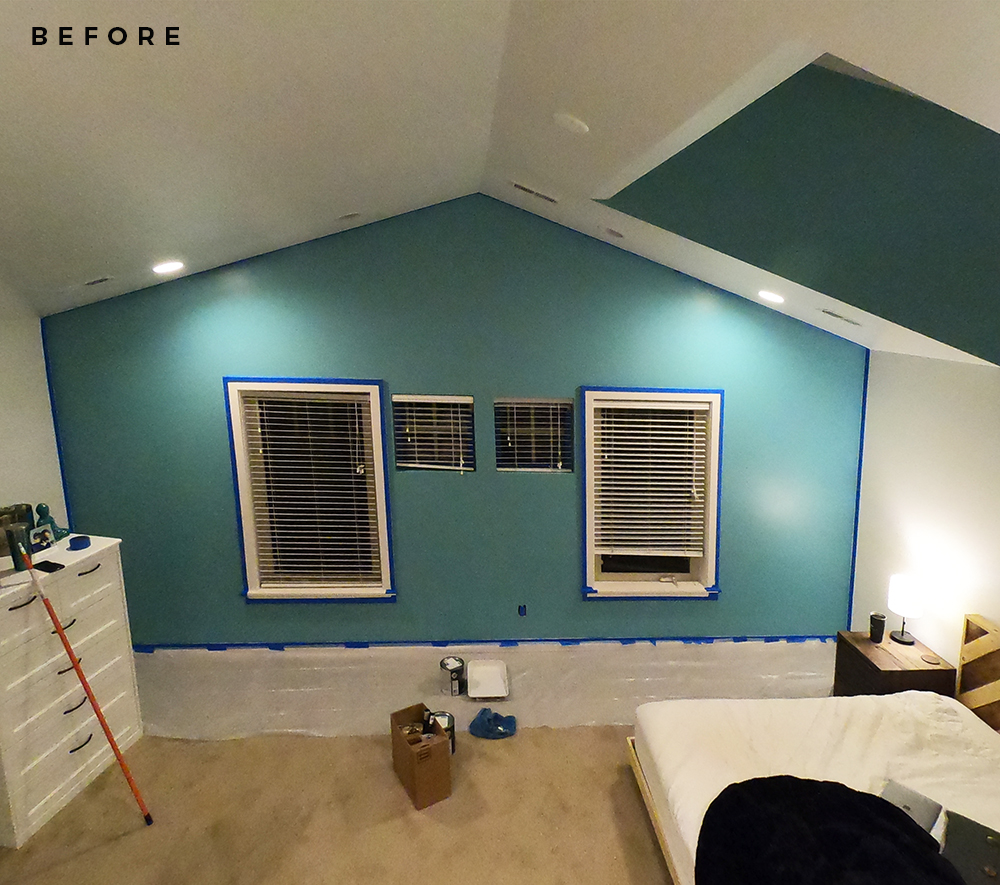
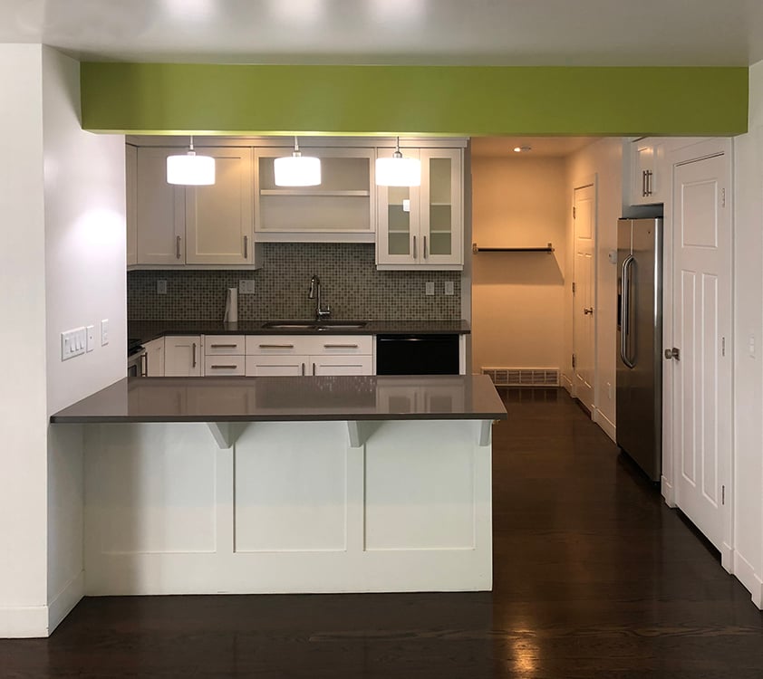
Let’s start with some before images, shall we? I wasn’t lying when I said the existing color palette throughout the entire house was bright. This is what they were working with in nearly every single room in the home…
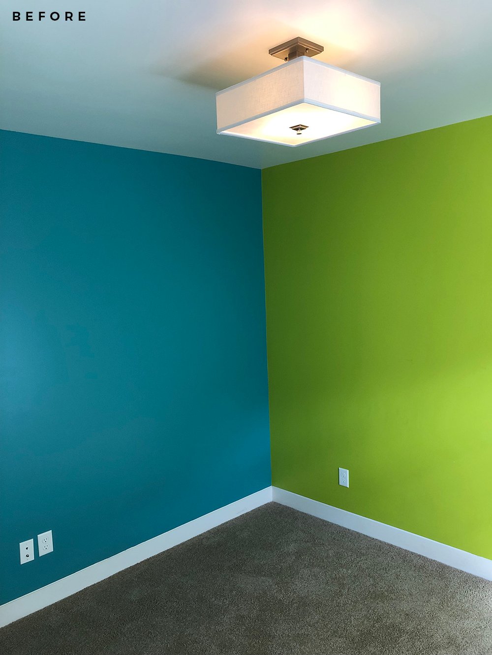 Rooms weren’t consistent in terms of color either- in some bedrooms, there was a different color on every single wall. It felt pretty chaotic and vibrant, to say the least.
 The lime green and bright blue seemed to be the reoccurring theme in most spaces and was carried throughout the house. Trust me when I say- our friends have a very neutral aesthetic. They love gray, white, tan, lots of warm wood tones, and the occasional pop of dark green or black. I can only imagine how overwhelming these vibrant colors must’ve felt for them.
 Luckily, paint is an easy fix and when I showed up with some to get them going- they went straight to work (and of course were super appreciative)! Below you’ll find the colors I selected for their home after having a mini in-home consultation with them…
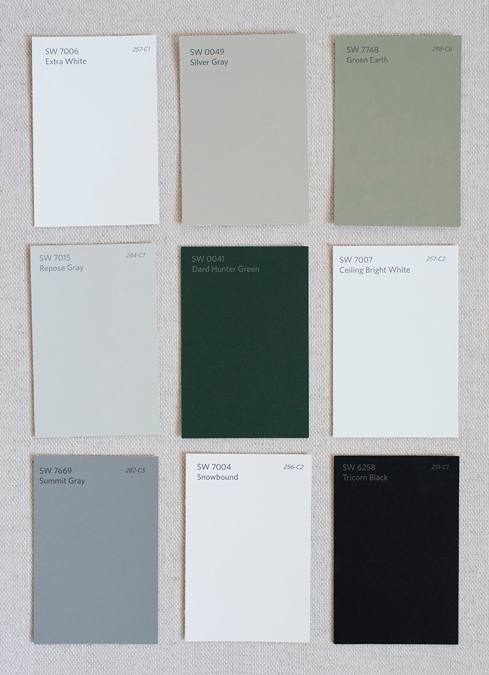 top row // extra white SW 7006 | silver gray SW 0049 | green earth SW 7748 …. middle row // repose gray SW 7015 | dard hunter green SW 0041 | ceiling bright white SW 7007…. bottom row // summit gray SW 7660 | snowbound SW 7004 | tricorn black SW 6258
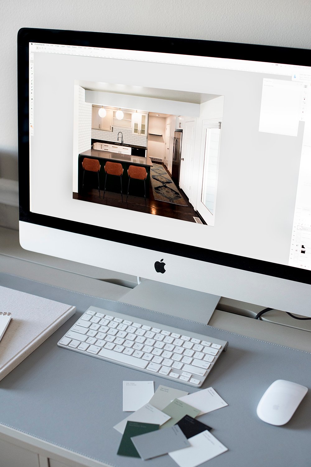
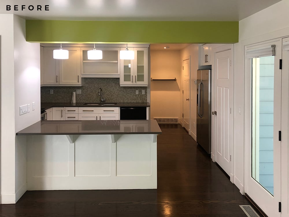
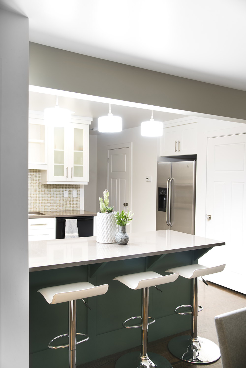
They agreed this felt more like their personality and the look they were trying to achieve. Now for the fun part… the next space they wanted to address was the kitchen. It’s in the heart of the home and these two LOVE entertaining. They’ve already hosted four dinner parties within a month of moving in. They asked me to put together a budget-friendly kitchen design plan for them before they started painting. This is what I came up with…
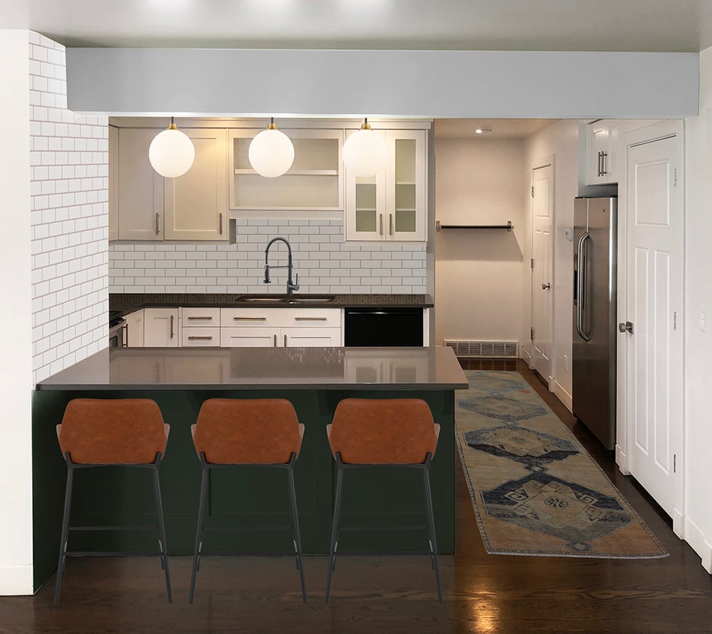 I’ll drop the before image below so you can see the visual difference. I thought the island would be the perfect place to insert Dard Hunter Green SW 0041 and add some deep color!
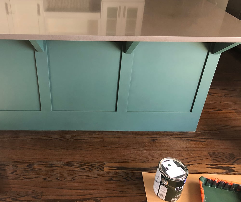
 After painting the beam, they moved to the island and sent this in-progress shot of the paint drying (pictured below). I think they’ll be so much happier with a darker island. There is always someone sitting at this kitchen bar in the counter stools and the white was getting noticeably dirty with shoe marks. Of course, I also love the color. Remember my bar cart makeover? I used the same exact swatch for that… Dard Hunter Green SW 0041.
 It’s amazing how paint can totally influence an entire room or home. After covering vibrant colors with sophisticated neutrals, this house took on a totally different look. A few quick tips for choosing neutrals…
- Mix up the value // To create a consistent and classic color palette, use swatches that range from light to dark. This will add depth!
- Throw in a dark neutral // In this case, it was the hunter green that made the white and greige tones sing.
- Skip the accent walls // Previously, the house had multiple accent walls in each room. Stick to a consistent paint color or limit accent walls to one or two (I’m honestly not a fan of accent walls at all)… this will keep things visually flowing and won’t look as compartmentalized.
So far, they’ve addressed the paint and plan to tackle the rest of the design plan a little at a time (that’s the best way to do it, friends!). We gave them our leftover subway tile from the guest bathroom renovation, and they should have plenty to tile their backsplash! Other items on their to-do list (besides planning a wedding) include: swapping the pendant lights, trading the faucet, switching the bar stools, and finding a vintage rug runner- but it already looks much better with a fresh coat of paint in the toned down palette. This is what it currently looks like…
 If you’re wondering about any sources in my quick design plan for them, I’ll link everything below. Aside from paint, making these changes would cost around $500, and it really changes the way the entire kitchen looks! Pretty awesome, right?
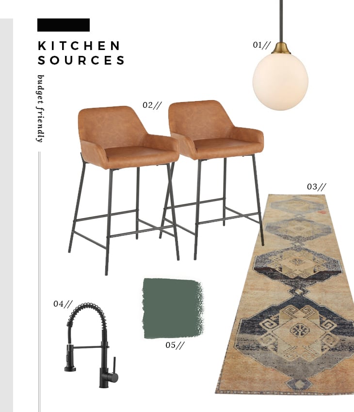 01: pendant light // 02: counter stools // 03: vintage runner // 04: industrial faucet // 05: Dard Hunter Green SW 0041
Was this one relatable for any of you? Do you like the design plan? Have you had to cover crazy paint colors? In our first home, we covered all sorts of strange colors that weren’t to our liking (yellow, pink, etc). I feel so lucky to have been able to help our friends with the generosity of Sherwin-Williams. Giant thank you to them for spreading the love, and to our friends for trusting my design eye!
Speaking of… I get a lot of “potential client” questions and emails. Sadly- I don’t have time to take on client projects anymore. It has been a couple years since I stopped doing freelance and e-design to focus solely on our own home and the blog, but I do love surprising friends and readers like this from time-to-time. Maybe I could squeeze in a few of these each year for you guys! Are you into that idea? Let me know what you think or how that might look. Hope you all are having a wonderful week!
Did you paint just that side of the island, or the whole thing? I have an area like that but not sure if I continue the color around the side and onto the front?
I have the same question!
I had her paint the back and side… the front part (facing the interior of the kitchen) is a bank of cabinets- so those were left white to match the interior cabinetry. Hope that helps! xo
I love this palette! Most of my house has been repainted, but the master bedroom is next on my list. It is north-facing and I would love to paint it white but am worried about not having enough natural light. Do you have a favorite white for low light areas?
Thanks Tracy! I honestly don’t love recommending paint colors online because they look sooooo different based on the house, room, the lighting, the surroundings, the decor. I’d recommend grabbing some swatches :) There are just too many variables. Check out this post for general favorites and maybe narrow it down from there?
Phew! What a relief. You know I adore color, but-zowy. And, friends don’t let friends do accent walls. You created a beautiful palette and how generous of Sherwin Williams! I have wondered if you still did client work. Do you miss it?
I would never say no to seeing one of your design plans. A contest would be fun, but also probably a ton of work. What if you just chose the occasional project that got you excited? Something with a challenge or aesthetic that stretched you? I think anything that got your creativity flowing would be worth reading! (Maybe someone out there needs help designing a cabin or a beach house!😉)
Right?! I felt the same way. Honestly, I don’t miss client work at all. I feel like I have finally found what I truly love and am passionate about. I get to do a little bit of everything: renovate, style, photograph, write copy, share, etc. No two days are the same :) I love your idea of helping with projects that excite me. I think that would help avoid burnout- which has happened with client projects in the past. I STILL want to tackle a beach house and mountain cabin. You know me well!!
Bold colors indeed! Wow. I’m always amazed when people factor in existing wall paint color when buying a house – aside from removing the current owners’ stuff, painting is one of the easiest changes to make! Our last house came with burgundy walls in the living room, forest green in the kitchen, and a salmon-colored textured wall treatment in the master bedroom….paint saved the day on that one.
And HECK YEAH to the occasional, because-it-sparked-your-interest design collab with friends and readers! I think in general we love this type of content because it’s relatable, and possibly applicable to our own situation. In fact, on the topic of paint, we renovated not too long ago, and I went with white. Well, I’ve been thinking for a while now how I could bring in some color, and (dare I suggest?!) even a wall-papered accent wall – WAIT! It’s a nook-wall, not an accent wall. Does that pass? :) Anyways, for my nook wall I was thinking a art-deco geometric pattern, or large-scale vintage floral……but alas, I’m plagued by thank-you-internet-for-granting-me-access-to-10million-options-on-everything-which-ovewhelms-and-paralyzes-me-and-then-I-can’t-decide-so-I-walk-away syndrome. Anyone else have that?
Anywho, I noticed Sherwin Williams has an online program you can use to help visualize their paint color in your space, by uploading your pictures. I just have to wait for the right day (weekend when I’m home to capture good daylight), and clear the space from my kids’ stuff (which is every where!). This has inspired me to DO IT!
PS: Did Peggi receive the goodie you mailed her??
I know, Karen… it’s the easiest thing to change. I’m so happy you liked this post :) It was a fun one! I vote yes to bringing in some color- or even wallpaper! You’re speaking my language. A nook wall passes, haha. I love your ideas. I let Peggi know I haven’t had a chance to drop off her box at the post office yet. Argh! It has been a week over here. I’ve been running around to orthopedic doctor appointments and it’s looking like surgery is in my future. Womp womp! My plan is to get it mailed out to her ASAP (or see if Emmett can drop it by USPS for me, ha). xo
I really love a great mini-makeover, it’s a wonderful way to refresh a space on a budget. I like the design Sarah and impressed with the impact of the island color changing. I would definitely be interested in seeing more of these 👍
Oops I forgot to ask why no accent wall colors in a neutral room? I saw an entry/living room Refresh on the ORC and one wall was accented with black in a pretty neutral space and it added some pizzaz and it looked awesome. It was a beautiful backdrop for furniture and art. Maybe it’s a personal preference thing? Just wondering…….
Great question! I just don’t love how they compartmentalize or make a room feel choppy. It feels like a dated trend to me. I’ll have to look for that ORC space :) I think sometimes they can be done in a cool way. It totally depends!
Yeah you should check out this blogger/interior decorator I really like her style and designs. I think you might too. The blog is decor happy http://www.vanessafrancis.com/blog/
I loved what she did with her living room/entry way/dining and she has a really cute pup too ☺️ She was guest participant number 34
Oooohh Vanessa! We’re actually friends in real life :) We went on a trip together. Haha! She’s amazing. I feel that is an accent wall done right- great example Colleen! Thanks so much for sharing. I’m still making my way through the One Room Challenge spaces, since we’re still finishing our own. Ha! Bad blogger over here. She also helped convince Emmett and I to get Crosby (a doodle). xo
Wow! That’s so cool that you know her 😊 She lives in my neck of the woods and I found her on the ORC and totally love her style too! I’m so glad you love the way she completed her accent wall cause I thought it was really dramatic and super fantastic!!
Yes!! I love hearing that :)
Me too Colleen! Thanks so much :) Hope you’re having a great day! xo
Great color choices and I love the kitchen rendering. I think this is very helpful and relatable. I hate picking paint colors. Why is it so hard? I had accumulated so many sample pots/quarts that I them mixed all together (they were similar pale family) and painted our dingy garage.
Karen, I too suffer from internet paralysis syndrome.
Thanks Melissa! I love that you mixed them all together :) ha! I never would’ve thought to do that.
Lucky friends to get your help on picking colors. It can be daunting! I really like the neutral colors and the dark green.
Have a great day!
Thanks Danna! It really can be a little overwhelming. I’m happy they’re happy :)
I love it! And I love the idea of you doing mini-makeovers with or for friends or readers. Although the huge projects and massive before-and-after reveals are amazing in the blog world, I would love to see more real-life/budget friendly makeovers like the kitchen one above!
I think it would be fun to tackle a few of these each year! I’m glad you all think it would be cool too :) xo
Love the mini makeover! We don’t have any renovation projects in the works, so tackling something that can be done w/just paint and new furniture etc. is most relatable for me right now.
Love the palette, Sarah! You have such a great eye for color.
A bit off-topic, but I’d love to know if you have any tips for decluttering/cleaning. (I know this isn’t your home—but your spaces always look so tidy, even in the middle of construction. How do you do it?!)
Thank you Madeline! I’m kind of a clean freak. If I’m being honest- I was diagnosed with OCD and actually take a daily medication (sometimes it’s not a good thing). I like to keep things in place, as clean as possible (in a construction zone), and my type-a personality craves organization. I’m learning to let things be, but often- I follow Emmett around and tidy. Sometimes I wish I didn’t because it’s kind of annoying, but that’s probably why things look the way they do- as an outsider looking in at our workspace. It’s a blessing and a curse. Haha! For cleaning- check out this post (I also love lists): https://roomfortuesday.com/my-deep-spring-clean-checklist/ Have a great weekend! xo
Thank you so much for your honesty and transparency, Sarah! I appreciate you sharing that. Have a great weekend too :)
Love it!! :) So much depth, yet so simple. What program did you use to do their mock up of the kitchen! It looks perfect!!
Thanks Whitney! I used Photoshop for that :)