Design Discussion : Furniture Arranged Against a Wall
 I hope you all had a lovely weekend! I’m kicking off the week with a new Design Discussion post! Who is ready for another controversial chat about interior design? If you missed any of the past posts in the series, you can find my thoughts on installing a TV over a fireplace, my take on installing hardwood flooring in the kitchen, and my preference on stacking laundry units. Our topic for today?! Arranging furniture flush or tight against a wall. When is it ok? Is it ever ok? Does the size of the room impact this rule? Why is it always labeled a faux pas? Can certain furniture pieces live tight to a wall, while others can’t? I’m breaking it down in this post. People tend to be very opinionated on pushing furniture tight against a wall- myself included. Click through to see where I stand and weigh in on the debate!
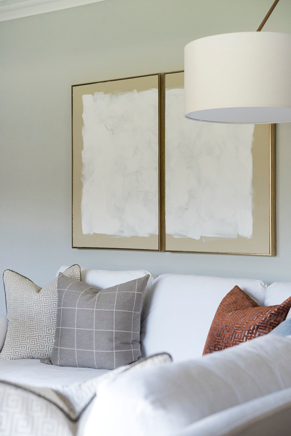
Many designers say NEVER ever push furniture tight to a wall. As a designer, my response would be, “ehhh… it’s a blurry line.” If I could rewrite the rule, I think it’s more important to get specific- pushing upholstery tight to a wall typically isn’t ideal. How tight are we talking? I don’t like any furniture to physically touch a wall, but a console table floated an inch in front? I love that look! In my opinion, I’d probably disagree with the design rule, “furniture, in general, should never be installed tight to a wall.”
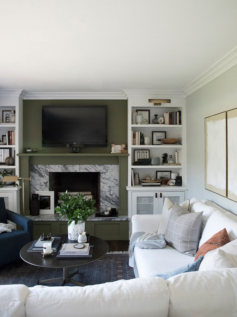
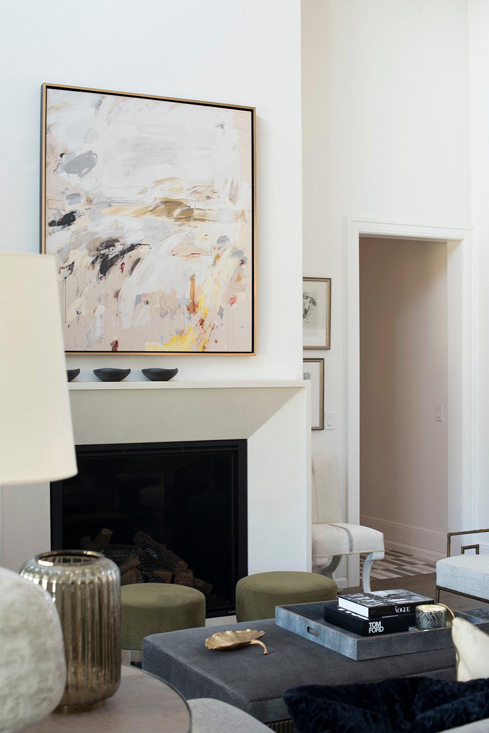
 Let’s use my newly renovated formal living room as an example. The console table and ottoman tucked beneath it looks great styled against the wall. I think that totally works.
 On the contrary, I prefer my upholstered pieces to float as a group and create a more conversational floor plan. Grouping sofas, chairs, and tables to create an organized cluster that promotes conversation and can be used functionally is always the goal.
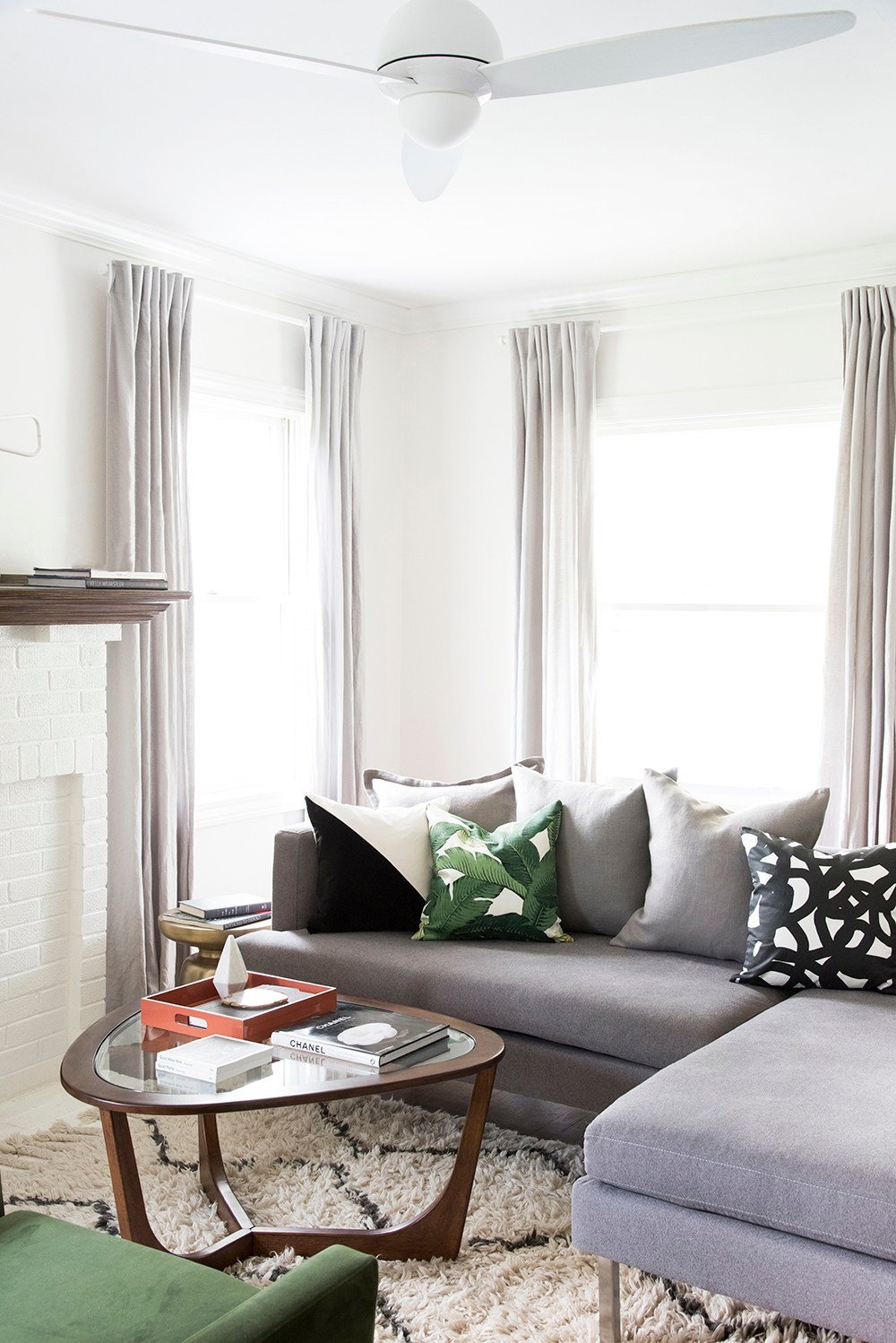 I sometimes feel like furniture placement is easier when you have a lot of architectural elements along the perimeter of the room to work around. It forces you to float your furniture toward the center of the space. In our first home- we had a fireplace, windows, and doors on every single wall in our living room (pictured above). I made sure to create a traffic path around the entire seating area. It felt more intimate and intentional pulling the furniture away from the walls.
 I also realize sometimes it is literally impossible to pull your furniture off of the walls, due to limited space. In our previous home, Emmett really wanted a sectional so we could both sit comfortably while lounging and watching TV at the end of the day. A sectional also made sense for our tiny living room to maximize seating. With a giant window on one wall and a wall of built-ins with a fireplace on the other… the only functional floor plan was to install the sectional against the wall. I will say- you’ll notice it’s not touching the wall (it’s pulled out an inch or so), but I’d definitely consider it “against the wall” when reading the floor plan.
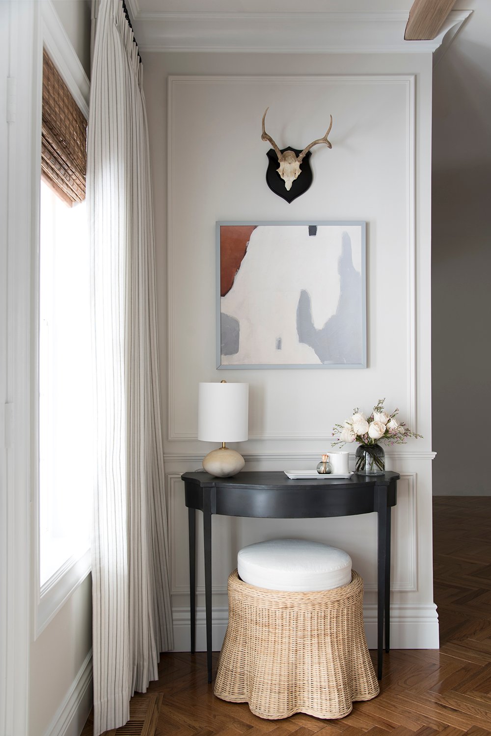
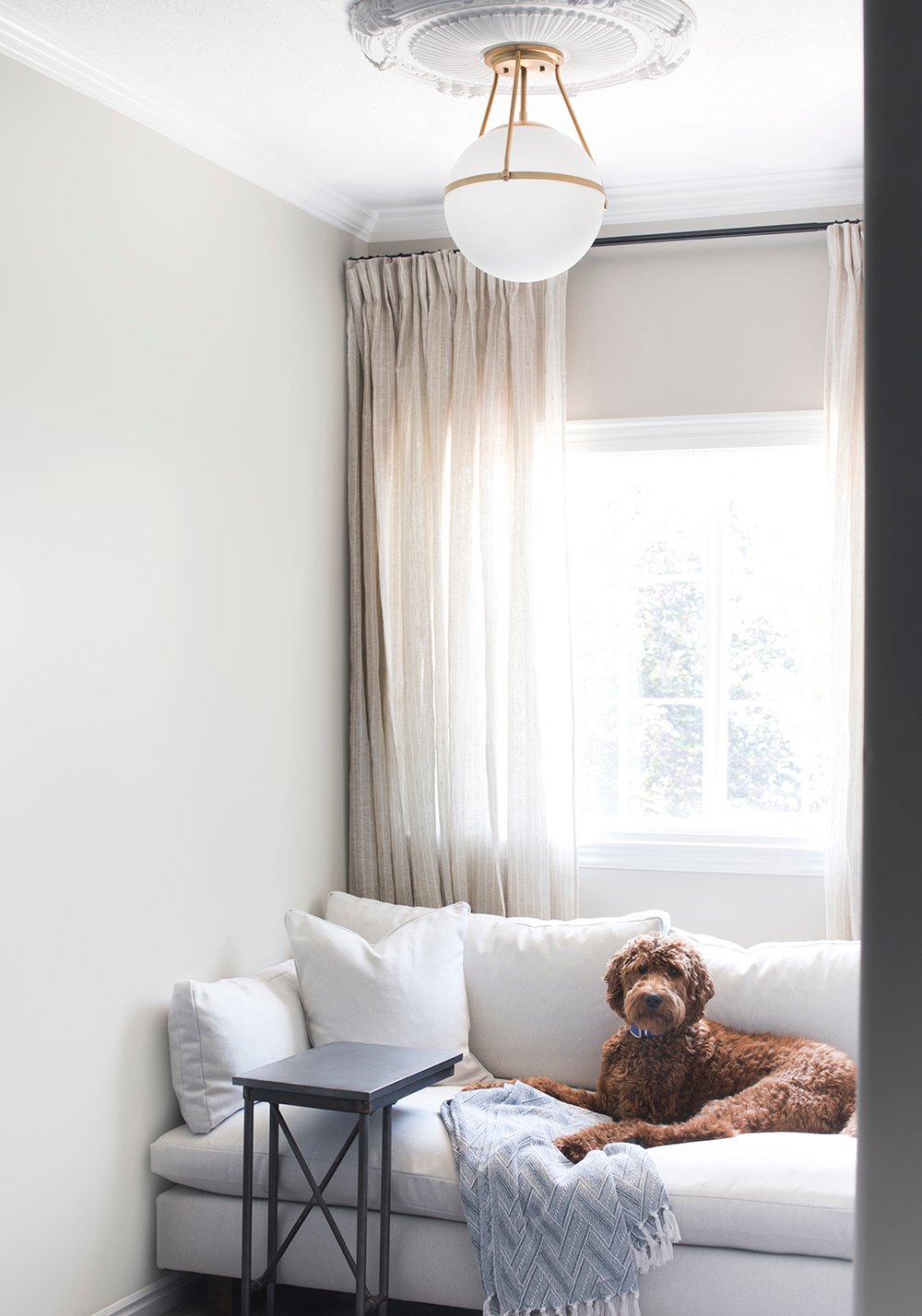 In addition to tables, there have been other times I’ve intentionally installed upholstery against a wall. Take our guest room window nook for example… it took me forever to find an armless sofa that fit tight wall-to-wall. This was one instance I actually wanted a sofa to physically touch both side walls to appear more custom and built-in. I think that’s a good example of “some rules were meant to be broken.” Sometimes it takes getting creative with your space, thinking outside-the-box, and doing what works best for your family in terms of functionality and style.
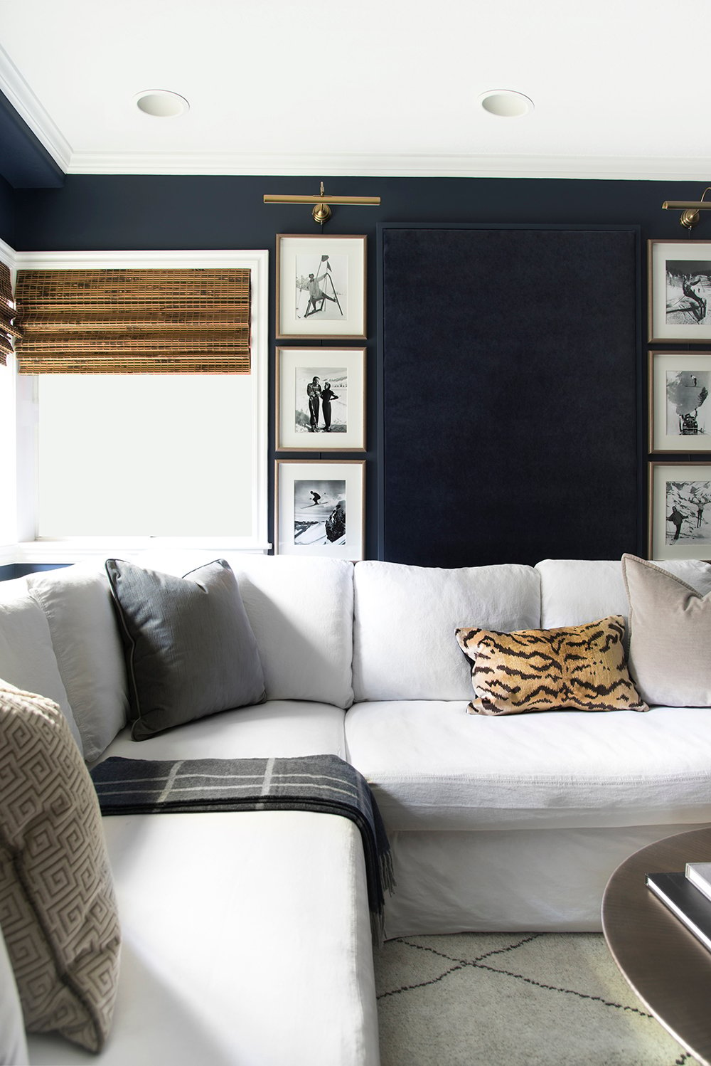 Our basement media room is another example of blurring the line. Our sofa sits about eight inches off the wall. It’s not enough for a traffic path, but it’s not touching the wall either.
 In the end, I’ll say this- I think furniture pulled closer to the center of the room adds depth, encourages better traffic flow, looks best aesthetically speaking, and is the ideal situation when floor planning.
 Ultimately, you have to do what is best for your home- so remember… some design rules were meant to be broken. I photographed the above image at the Alice Lane show home and think the chair pushed against the wall to the right of the fireplace is an awesome example of breaking the rules in a good away. Upholstery pushed against a wall… and it looks balanced and amazing! Soooo, that leads me to the poll. Where do you stand on furniture floor planning?
[Total_Soft_Poll id=”2″]
Let me know if the poll works for you guys this time. I coded a new version since the previous polls have been faulty for some of you! I’d also love your help thinking of topics for our next Design Discussion. My friend Chloe just shared a helpful post on how to shop for furniture like an interior designer, if you’re interested in that. Just another related topic, I thought I’d share. Please elaborate or weigh in below using the comment section! I’d really appreciate it. Everyone have a wonderful week!
I definitely prefer the look of floating groups, but sometimes there really is no other option room size-wise. We have a living room that I struggle with as it opens with double doors to a conservatory which is at the opposite end of the room to the room door – add in a fireplace wall and a medium rather than large size and it ends up feeling like a passageway…
I 100% agree, Sally… on both accounts- your preference and the fact that it depends on the space. Double doors to a conservatory?! And a fireplace? Can I move in? That sounds DREAMY!!
I also agree with you on the blurry line. I do prefer a floating arrangement to let furniture what I like to call it “breathe”, but sometimes it’s not possible and that’s okay. A great designer figures out an arrangement around client’s existing furniture and the space – because not everyone has the budget to purchase new furniture or move. I think you have the right idea, Sarah.
Thank you! Loved all of these points :) spot on.
Good discussion! Every single example you provide makes perfect sense. For instance, aren’t demilune tables designed to fit against a wall? (PS Still adore that vignette from your LR.) I think the problem revolves more around seating. People perceive space behind a sofa to be “wasted”. Also, maybe in larger rooms folks envision one big grouping instead of separate areas; this also requires more furniture! Our living room is fairly long, so I broke it into three zones. This idea definitely caused some consternation…until my SO could see that it actually worked.😉 Then, of course, add in the required traffic patterns in some rooms, and maybe it’s understandable why people resort to pushing everything against the wall! See? Floor planning is tough. Happy first Monday of March!☘️
Thanks Peggi! Such a good point- they ARE designed to fit against a wall. I feel like when designers are interviewed for “pet peeve” articles and say NEVER to do this, they’re probably referring to seating- or sofas, in specific… but I think it totally depends on the space. Your living room sounds like it works really well. Breaking it into sections was super smart for a long space! Floor planning really is a tricky task. Happy first Monday of March :) Have an awesome week! xo
I personally have done both. When space allows for flow I like furniture to be away from wall and centered around a focal point such as a fireplace or Tv. But I’ve also lived in very small spaces that does not allow for this type of arrangement and have had to put furniture very close to wall too. I think it really depends on the size of room and furniture selection. So I totally agree with you Sarah on this fun topic!
Happy Monday
Same! Our previous homes have been very small and this is the first house we’ve had the luxury of floating furniture and floor planning more intentionally. It definitely depends on the space! Happy Monday, Colleen! Have an awesome week :) xo
Oh I neglected to mention the voting poll worked for me today whereas it hasn’t worked on previous posts :)
Woohoo!! Thanks for letting me know, Colleen :)
My husband wants everything pushed up right against the wall…for me I agree that some things were meant to live with a big, and some things require more space. I love the look of seating being floated in the center of a room, and so far have not had enough house to do that, but when I do, that’s the dream! Great post, great examples, and the poll worked! One topic idea that I’ve seen some differing opinions on lately: rigs in a bathroom. There seems to be a divide on bare flooring versus styling around rugs that serve function. I would love your take!
Emmett is the same way- it drives me crazy. I feel like if you have the space- pull things toward the center, but if not- get creative with ways to make it look intentional pushed closer to the wall. Thanks for the topic idea! I love that one :)
I have my sectional in the living corner and am struggling so much as to what to put above it on those 2 corner walls… anyone has any good ideas?
Sconces and art?
I do love the idea of sconces and art (per my previous living room and basement media room). It helps to balance the vignette.
Thanks, ladies! I thought about it too but then do I put both art and scones on both walls? Again it is the corner so there is really no accent wall..
Yes, the poll worked!
This is a fun topic and discussion, and one that is definitely space-dependent. In our home, we have the sectional floating off the wall about 12”, and we hide TV trays back there! Hidden storage for the win!
Yay! So glad to hear that, Jennifer. I agree… totally a space dependent discussion, which is why I’m sometimes confused when designer say, “NEVER push furniture against a wall” or list that as a pet peeve in design articles. Hidden storage for the win, most definitely! Sounds like your living room is ideal for more than one reason :) xo
Some things are meant to be against a wall and would look peculiar otherwise. Think upright pianos, china cabinets, chest of drawers, etc. Other things are meant to be away from the wall, like coffee tables, rocking chairs, ottomans. It’s the other stuff that can cause a decorating dilemma. I like to float upholstered furniture in the room and often use a sofa as a divider between areas, or to delineate a passageway.
Floating upholstered furniture in the center of a room presents the problem of where to plug in lamps. It’s really helpful to have planned floor outlets ahead of time. Or just grit your teeth and pay someone to install a few floor outlets once you’ve settled on your furniture layout. You really don’t want to live with taped down electrical cords.
Such great points, Ann!! I agree on all fronts. We were lucky to have planned floor outlets for our formal living room, so we ran the electrical but have yet to cut the holes and hook them up. Life with cords has been annoying. I can’t wait to cross that pesky item off the to-do list soon!
We have a bowling alley type of dining/living space. Our sectional sofa acts as a zone divider (with the upright piano back to back with the divider section of it!) and the other section is 6″ from the wall, just enough to allow the curtains to hang nicely behind it. Not enough width in the room to bring it any farther away. But because it’s such a long space, I have at least three feet behind the accent chair & table that faces the sectional. Nothing there but a huge fiddle leaf and another set of windows! I love the clear area because I put down the blinds on those southwest windows nearly every day and I don’t have to lean around furniture to do it. Plus it just helps the room breathe.
Our formal living room and dining room will be very similar (once the dining room is furniture). They’re open concept to each other, so I definitely will use furniture to divide and create more separation between the two rooms. Your home sounds lovely!
Thanks for This beautiful post!
It’s really helpful to have planned floor outlets ahead of time. Or just grit your teeth and pay someone to install a few floor outlets once you’ve settled on your furniture layout.
Thanks so much for showing an armless sofa against a wall – this is exactly what I needed to see to ensure that my idea could work aesthetically. I have just finished a “tiny” cottage … the armless sofa will be additional sleeping space when needed but during most of the time it needs to be a comfy place to rest too, so being able to move it against the wall on at least one side and propping that side up with comfy pillows will create the atmosphere I am hoping for. Your brown doodle was the icing on the cake :)
Congrats on finishing your tiny cottage, Jeanette! I’m so glad this post was helpful. We’re dog lovers around here :)