
How to Choose the Best Warm White Paint Color
Hands down, the question I’m most asked… “What color is that?” Especially when it’s the perfect neutral or a warm white paint color. Choosing white paint seems easy until you have six nearly identical swatches taped to the wall and suddenly every single one looks wrong. I’ve specified a lot of paint colors over the years, and white is still one of the trickiest to get right. I typically gravitate toward warmer, creamier whites because they feel softer and more inviting while giving you that timeless look. The secret is finding the right white for your room. Lighting, undertones, LRV, surrounding finishes, and even paint sheen can completely change how white paint reads. Click through to see how I narrow down the options, and to bookmark my favorites!
This post is sponsored by BEHR. All content, ideas, and words are my own. Thank you for supporting the brands that allow me to create unique content while featuring products we actually use & enjoy!
We just finished the first bedroom in the cabin, and I have to say… I think I nailed the paint color (BEHR Cottage White 13). It’s a new favorite I’ll definitely use again! Here’s how I narrow it down.
What Makes a White Paint Feel Warm?
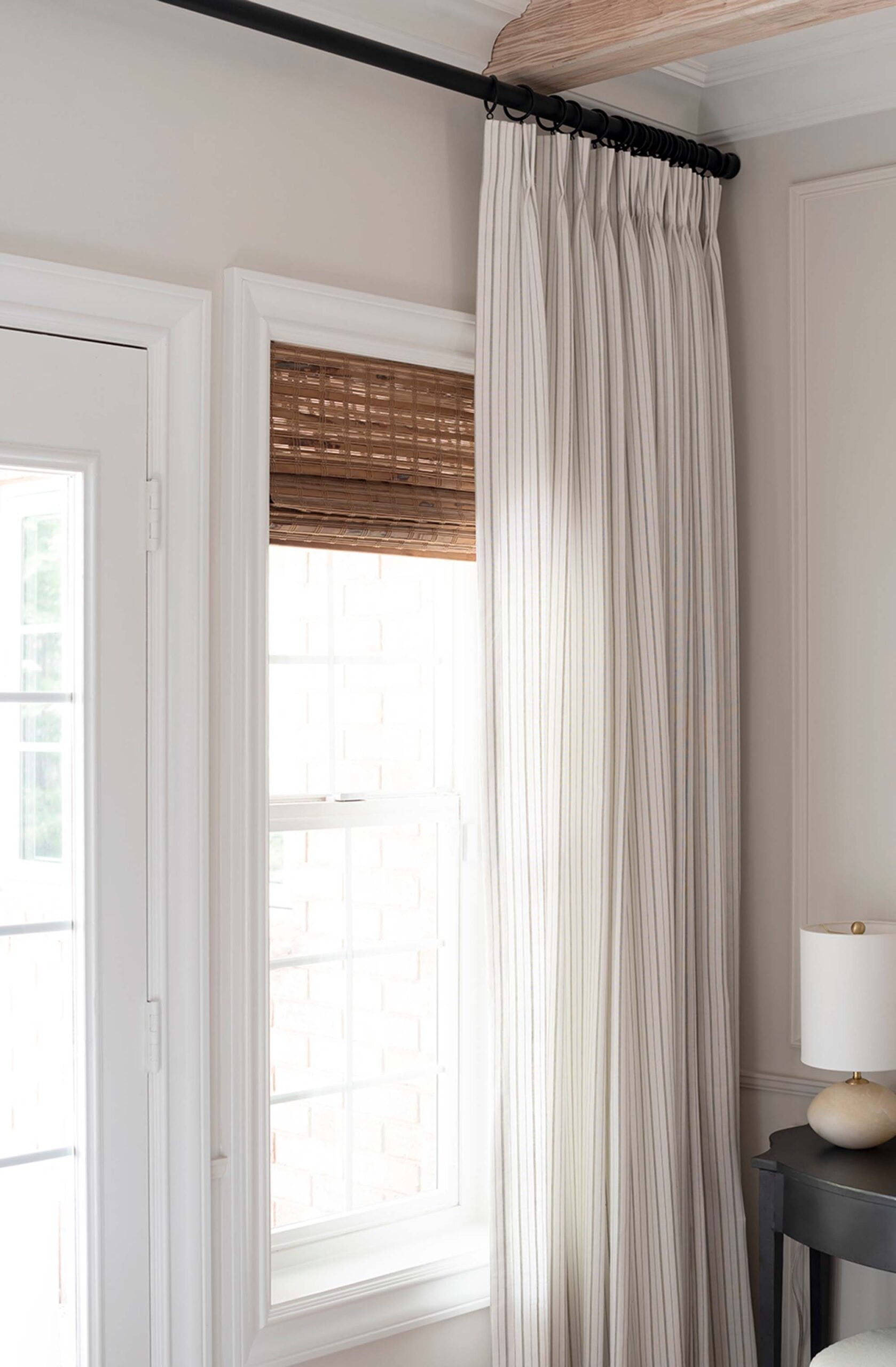
Warm white paint colors have subtle warm undertones, usually cream, beige, yellow, red, or a combination of those. That doesn’t mean your walls should actually look yellow or beige. My favorite warm whites still read as white once they’re on the wall. They just have enough warmth to keep a room from feeling stark or clinical. Think about the difference between bright white printer paper and natural linen. One feels crisp and cool, while the other has a softer quality. We’re going for the soft look! Here’s a peek of the cabin bedroom and a better look at BEHR Cottage White 13, pictured below.
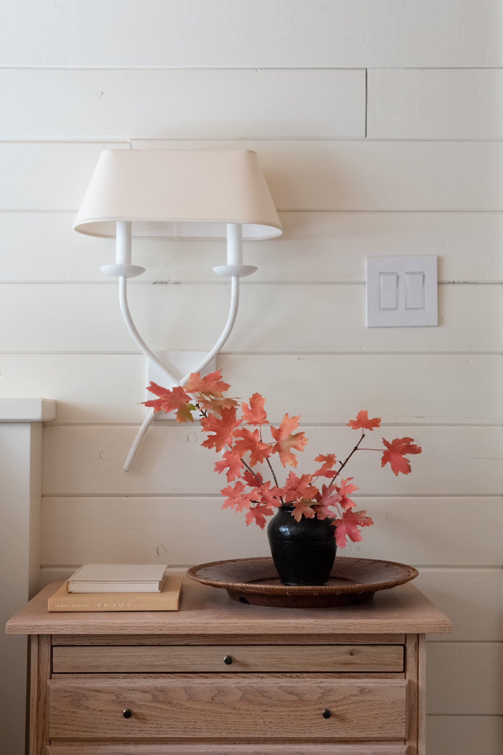
I especially love creamy white paint colors alongside materials like natural wood, stone, aged metals, woven textures, and vintage pieces. They tend to complement those finishes rather than compete with them.
How Lighting Changes White Paint
Natural light has a huge impact on paint. North facing rooms typically receive cooler light, which can make white paint appear grayer or cooler. South facing rooms receive warmer light, which can make creamy undertones much more noticeable. The color can also change throughout the day. A white you love at 10 a.m. might look completely different once the sun goes down and your lamps are on. How do you test this? Swatch it.
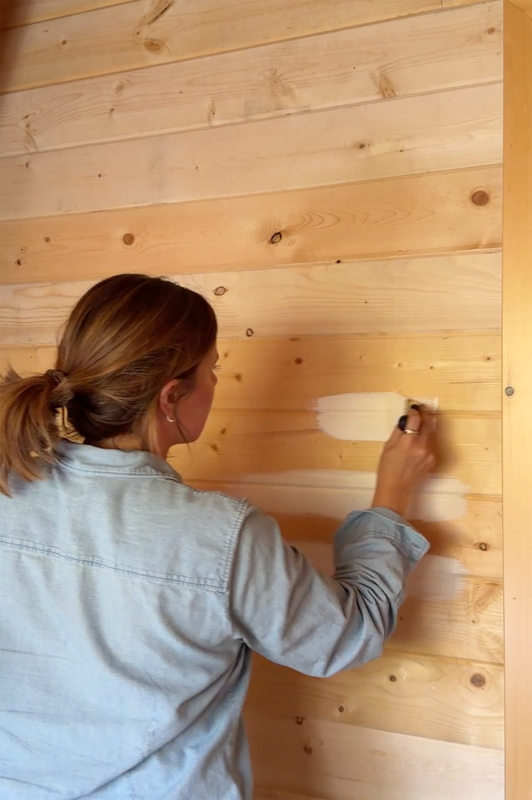
If you take one thing away from this post, let it be this: never choose a white paint color without testing it in the actual room.
My 5 Step Test for Choosing White Paint
I use a pretty simple process when narrowing down warm white paint colors. It saves me from overthinking the decision.
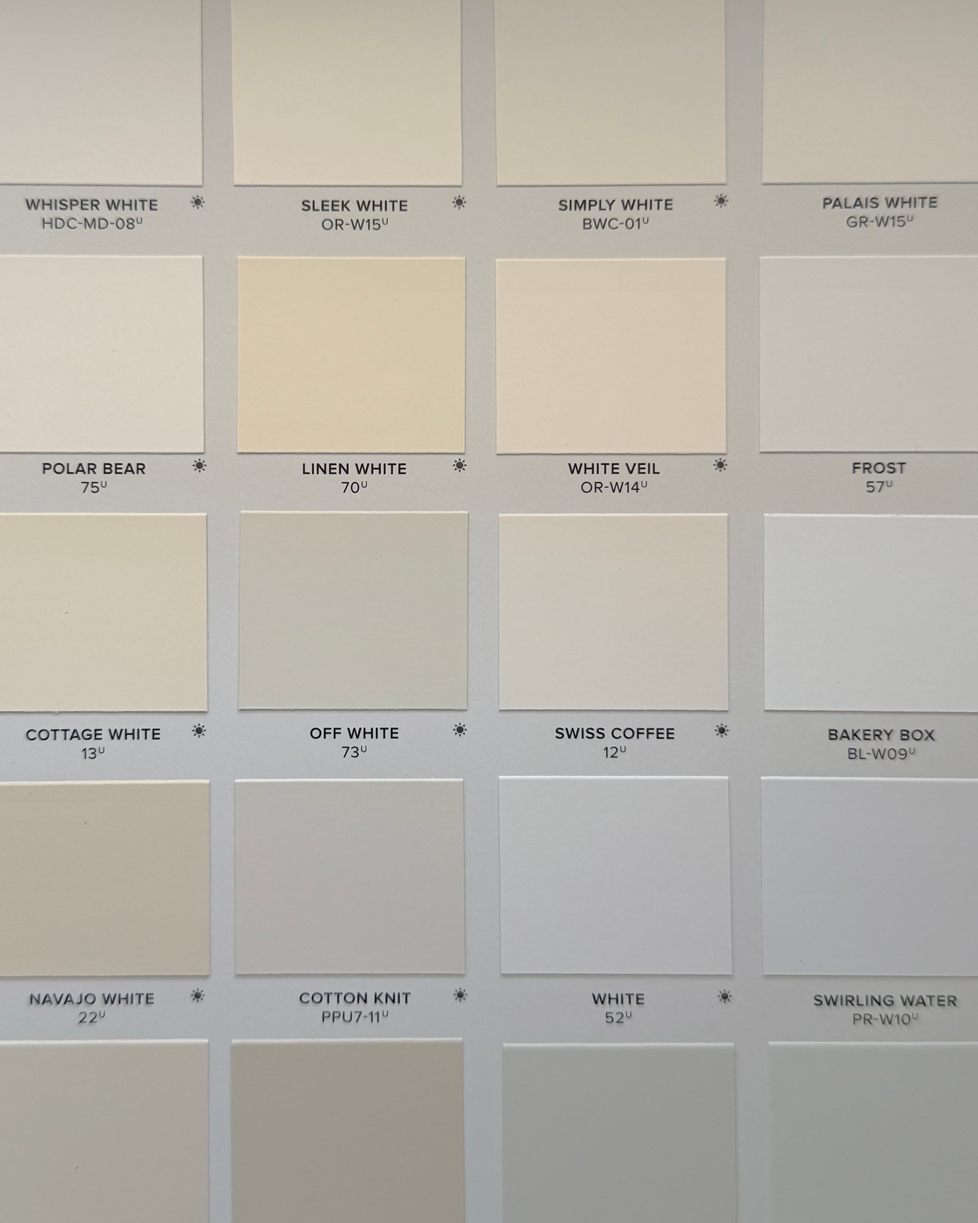
1. Compare several whites side by side
Undertones are much easier to identify when you can see the colors next to one another. In the below image, you can easily see which swatches skew more yellow, pink, or blue… while others appear more neutral or balanced.
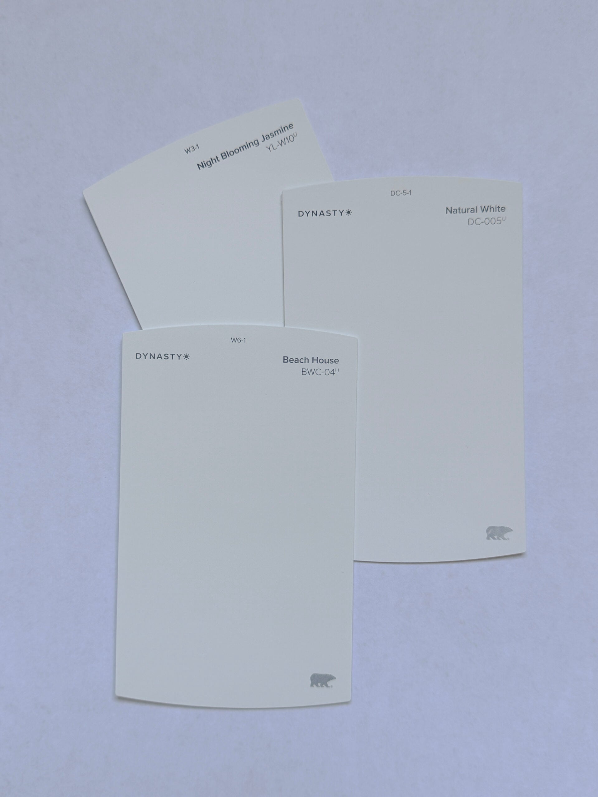
2. Try the white paper trick.
Look at your swatches against plain white printer paper. Suddenly, those subtle cream, beige, yellow, or gray undertones become much easier to see. White paper can look super stark or almost blue— so don’t let this scare you away from your intended swatch. It just intensifies the temperature because printer paper isn’t neutral, but it definitely helps you identify the undertone.
3. Look at your permanent finishes.
Compare the paint against flooring, countertops, cabinetry, tile, lighting, and stone… anything permanent in your space. These materials matter more than whatever is trending.

4. Test a large sample.
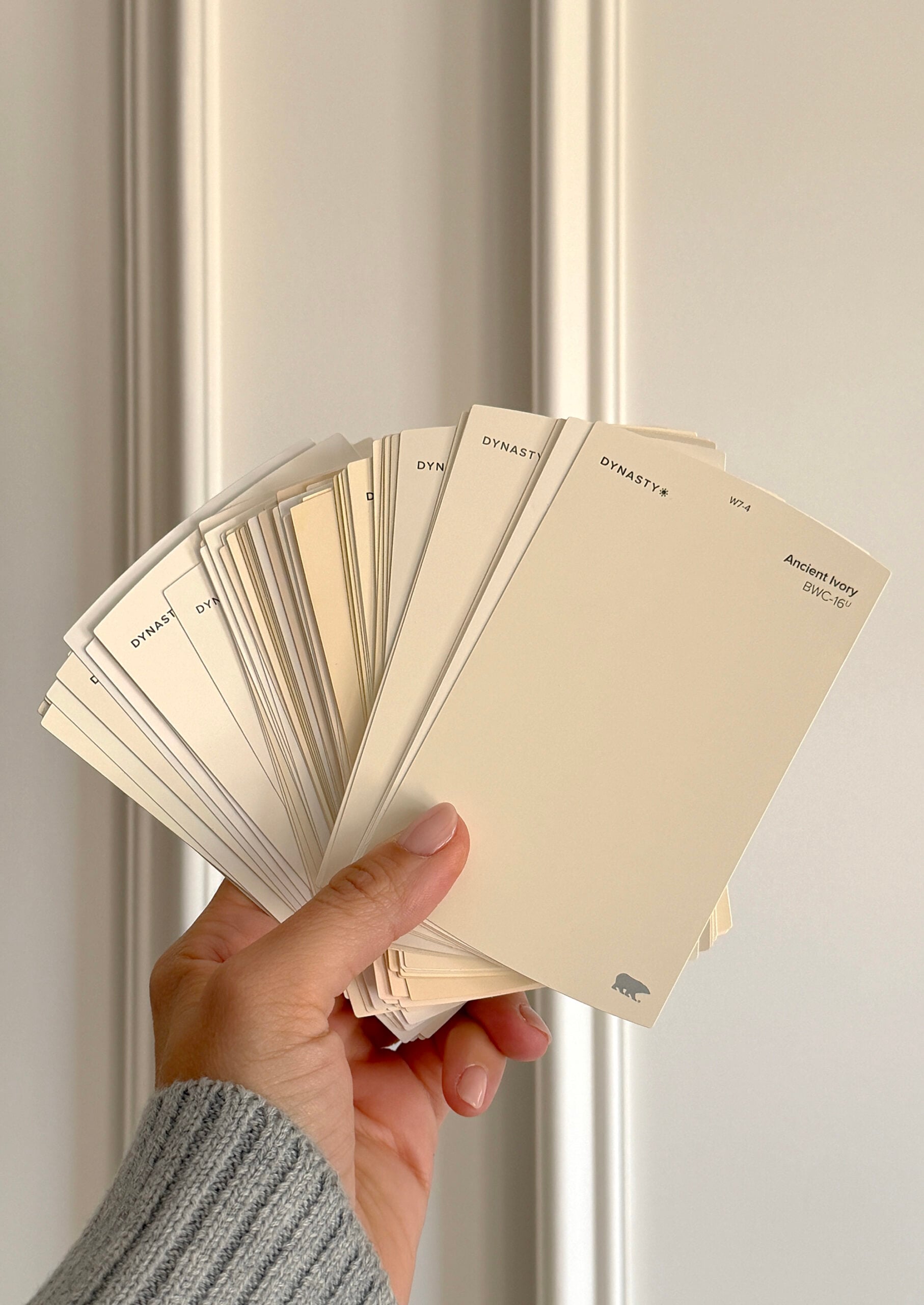
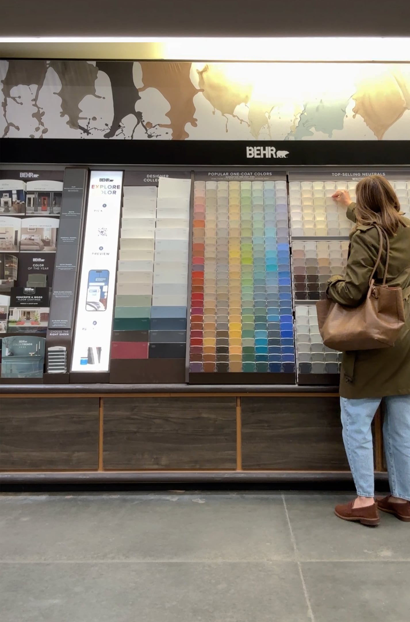
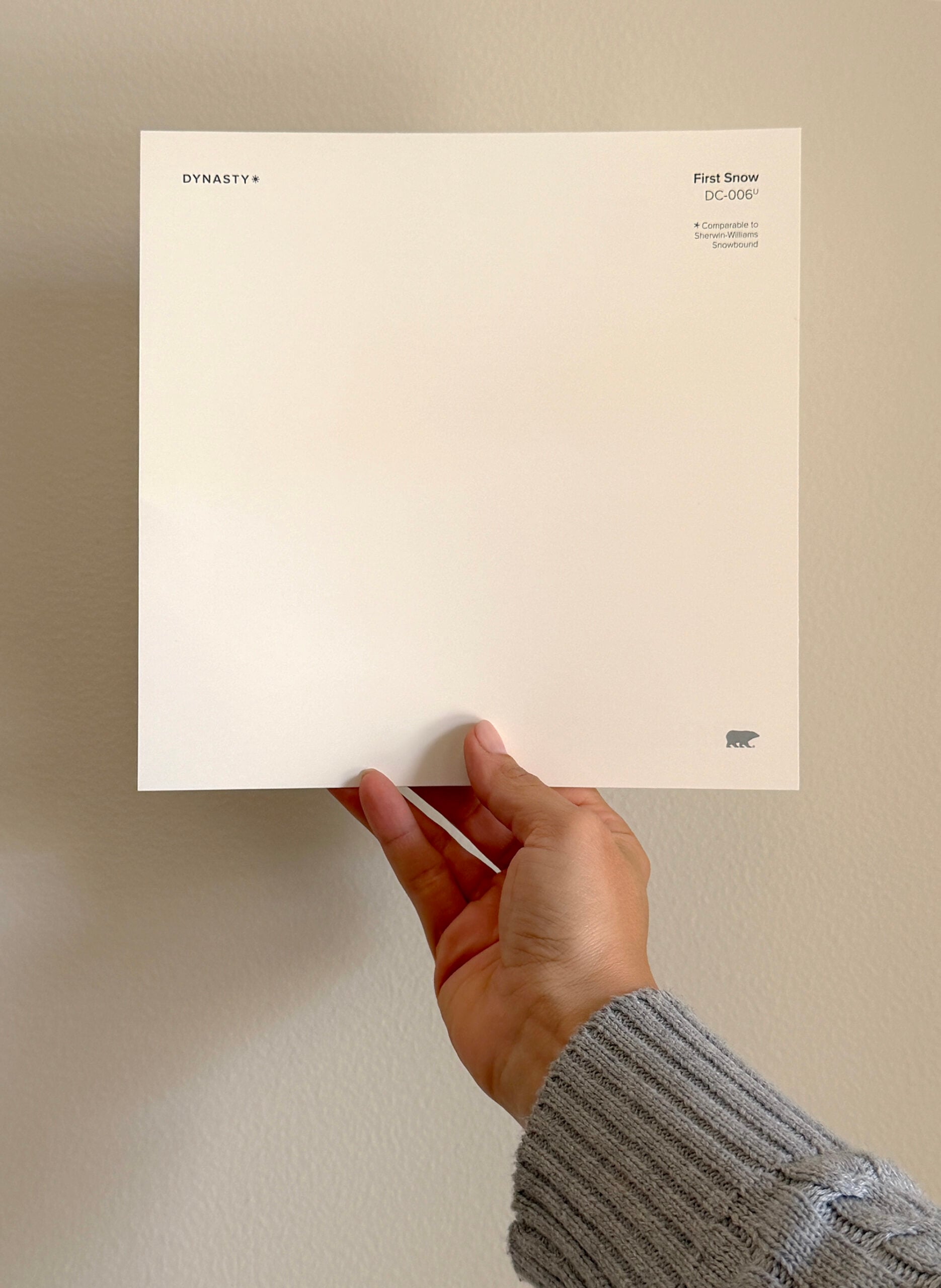
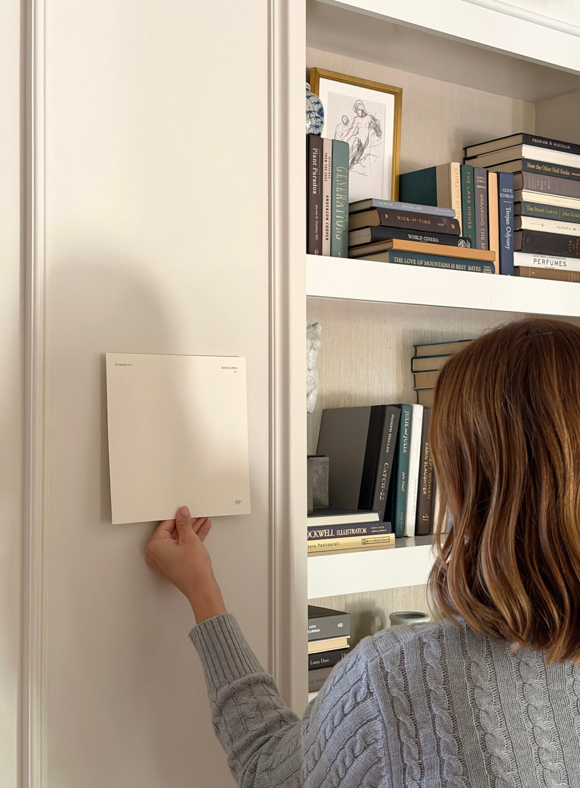
Once I narrow it down to two or three colors, I want to see them at a larger scale before committing to gallons of paint. Luckily, BEHR Paint offers these oversized swatches for free. I grabbed a few of my favorites from the Home Depot. Stick them up and look at them from across the room.
5. Move the sample around.
I’d also recommend going a step further. Look at it on different walls and at different times of the day. Don’t forget to check it at night with your lamps or ambient fixtures turn on!
My Designer Picks Warm Whites from BEHR Paint
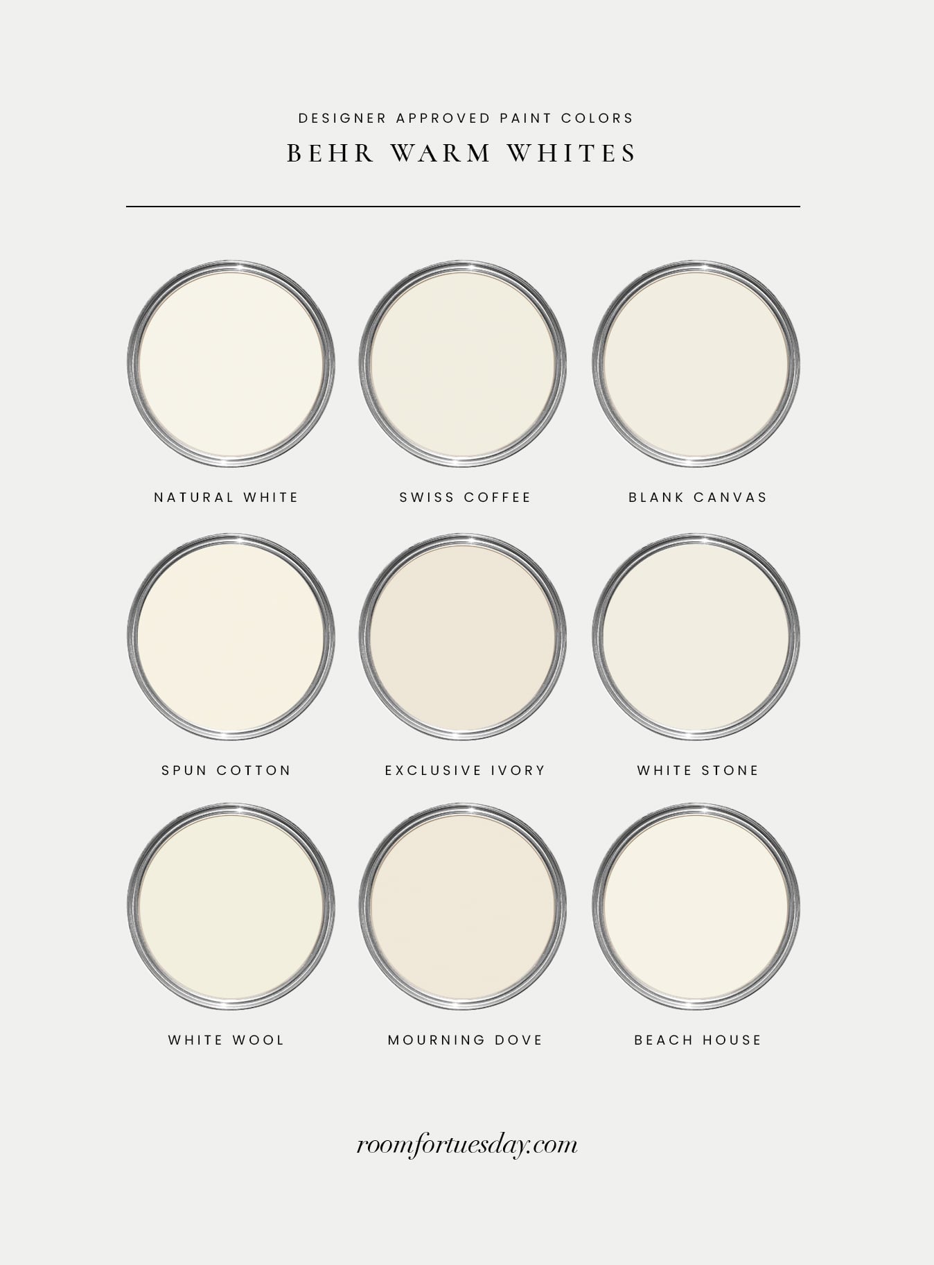
I think of paint recommendations as a starting point, not the final answer. I can show you a warm white that looks beautiful in my home, but your light, flooring, windows, and surrounding finishes may be completely different. Use my recommendations and designer picks to build your shortlist. Definitely bookmark these are your starting point…
Pay Attention to White Paint Undertones
Put several BEHR warm white paint colors next to each other and you’ll start seeing the differences immediately. One may lean creamier, another may have a subtle beige undertone, while another reads much more neutral. Don’t try to perfectly match the existing undertones in your room…. instead, I’m usually looking for balance. If you have warm oak floors, a soft creamy white may be perfect. If the entire room already has strong yellow and orange undertones, an equally warm white could push everything too far.
What Does LRV Mean in Paint?
You’ll probably come across LRV when researching the best warm white paint colors. LRV stands for Light Reflectance Value. It tells you how much light a paint color reflects on a scale from 0 to 100. Higher numbers reflect more light, while lower numbers absorb more. It’s helpful information (on the label or swatch), but you should never choose a paint color based on LRV alone.
One misconception I see is that the brightest white will automatically make a dark room look brighter. That’s not the case. A very bright white in a room with limited natural light can sometimes emphasize the lack of light and feel flat, cold, and clinical. A slightly warmer, softer white may actually create a much more inviting, brighter space. Use white paint LRV as another piece of information, but not as a rule.

Questions?
There isn’t one warm white that works in every home. The best warm white paint color depends on your natural light, room orientation, flooring, countertops, cabinetry, and surrounding colors. I recommend narrowing your options to a few favorites and testing them side by side. I’d start with these… BEHR Blank Canvas, BEHR Spun Cotton, BEHR Coastal Beige, and BEHR White Stone.
A higher sheen reflects more light and emphasizes texture, while flatter finishes absorb more light and tend to disguise imperfections. I have an entire designer guide for choosing the best paint sheen or finish if you want a deeper explanation of when to use flat, eggshell, satin, and semi gloss finishes throughout a home.
They certainly can be. I love using the same white in different sheens for a cohesive, subtle look. If you’re choosing two different whites, compare them side by side first. Similar whites with conflicting undertones can look more accidental than intentional. Instead, I prefer using the same white in a different sheen!
Swatch the paint in your room and look carefully at the undertones. If your room already receives very warm light or contains lots of yellow and orange tones, an especially creamy white may amplify them. The white paper trick is an easy way to check those undertones before painting. One option to sample is BEHR Natural White.
I think it can read cold, clinical, too modern for my aesthetic, or easily feel dated. I’d much rather choose a warm white.
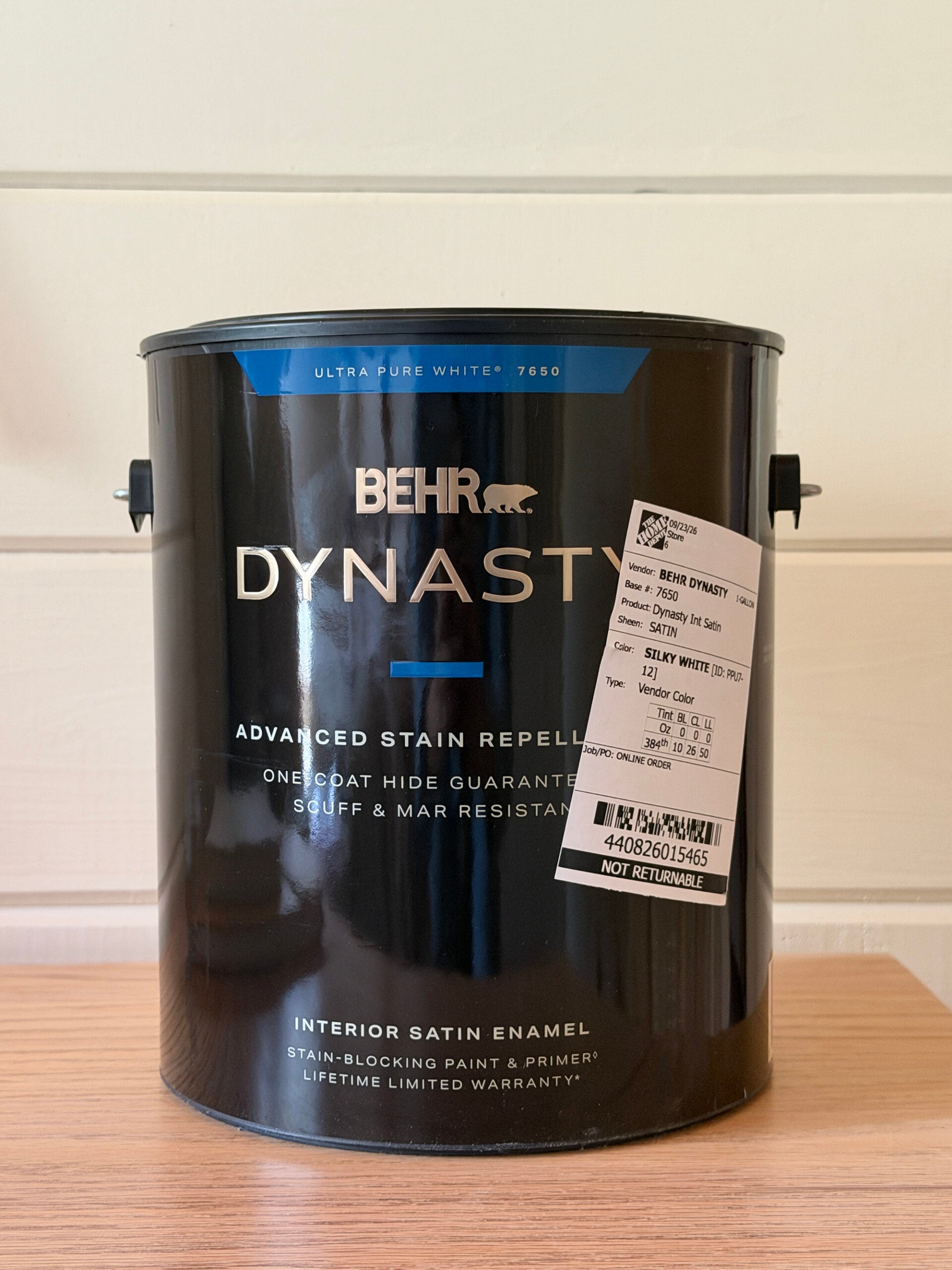
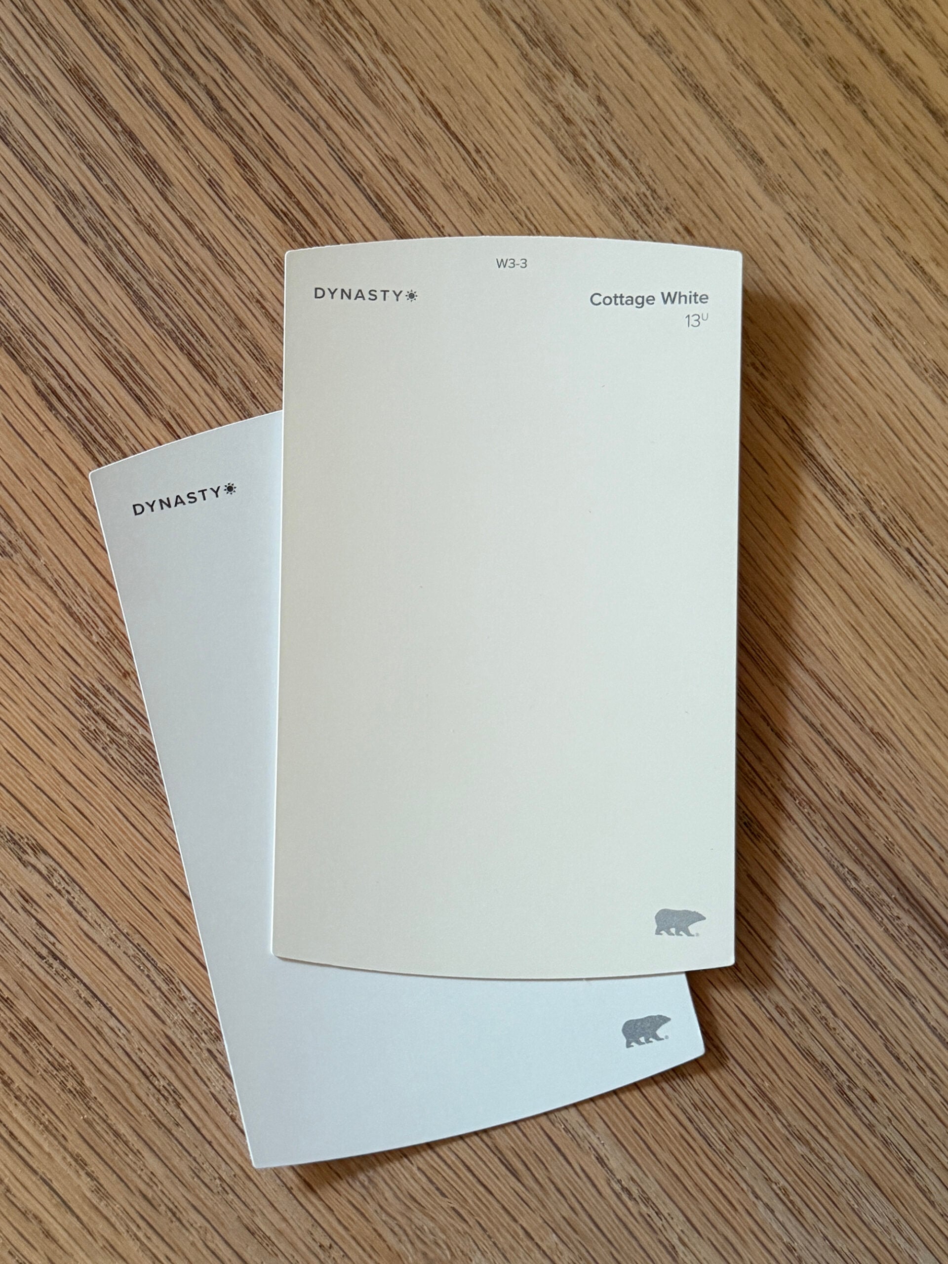
In our cabin, the two white swatches we’re using alongside all the wood is BEHR Cottage White and BEHR Silky White. Both are great choices, pictured below… one lighter, one darker.
Related Paint Posts
Looking for more paint posts to guide in you in the right direction or provide inspiration? I’m going to link some reader favorites for you below…
- How Paint Color Percentages Work and When To Use Them
- 24 of My Favorite Neutral (Non-White) Paint Colors
- Designer Guide for Choosing the Best Paint Sheen or Finish
- My Top Paint Color Picks for Dark Kitchen Cabinets
- How to Smooth a Textured Ceiling (Skim Coat Tutorial)
- Tips for a Durable, Professional Looking Spray Paint Finish
- How to Paint a Door (A Step-by-Step Tutorial)
- How to Antique a Mirror with Paint… The Easy Way
White paint can be tricky. I hope this post was helpful if you’re trying to choose the right swatch! Instead of searching for the one perfect white that everyone recommends, start with a few good warm white paint colors and test them in your own space. My favorite whites are the ones you almost don’t notice. They soften a room, work with the materials around them, and give everything else a beautiful backdrop. That’s when I know I’ve found the right one.
White is so hard! I second every one of these recommendations. I sampled no less than 10 whites for the front room. Side by side there was minimal difference between them. Once the swatches were on the wall it was a different story. Our south facing living room has a ton of natural light, even with window coverings, so undertones get picked up quickly! I love Samplize for swatching paint colors- they have an incredible catalogue of Behr, Sherwin Williams, and Benjamin Moore colors; and the best part is the swatches are peel and stick! They aren’t expensive either, and I love that they can be reused. I was pretty sold on the white we landed with rather quickly, but I kept my top three up on the walls for about a week, and moved them to different spots before deciding. Ultimately, we went with the one I kept coming back to, and I’ve never been happier with a white. When it came time for the kids’ rooms I pulled them all back out, and even ordered a few more. Sherwin Williams has a paint app that was helpful for that. In their app you can search a color and it will show you coordinating colors; I found that to be super helpful for finding coordinating whites. I love the white you landed on for the cabin. It’s perfectly creamy and coordinates so well with the woodwork. It’s turning out so gorgeous Sarah! Keep up the fantastic work, and have a happy Monday!