
Home Tour : Lexington Square by W Design Collective
Every once in a while, I come across a home that makes me want to study every single image, zoom in on the details, and immediately rethink something in my own house (or in this case— our cabin). Lexington Square by W Design Collective is one of those homes. Built in 1885, this East Coast home was thoughtfully restored to preserve its historic charm while making it comfortable and functional with modern amenities. It feels traditional without being stuffy, collected without feeling overdone, and is warm & inviting without relying on the same predictable neutral palette we see everywhere. Basically, there is a lot to love. Come tour Lexington Square with me!
Design & Styling: W Design Collective | Photography: Jared Kuzia
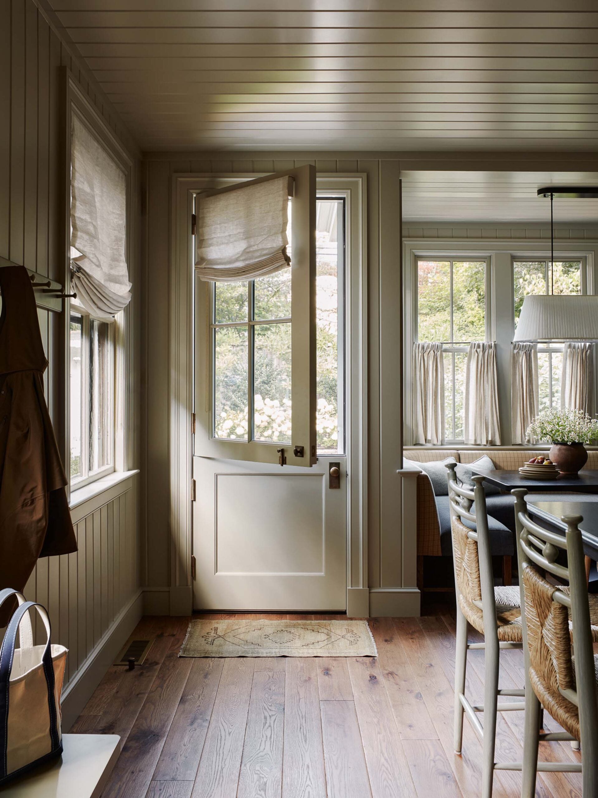
Before we dive in, be sure to follow W Design Collective on Instagram, as well as Jared– who artfully photographed this project. They both have stunning portfolios that are worthy of a browse, bookmark, and follow!
Entryway
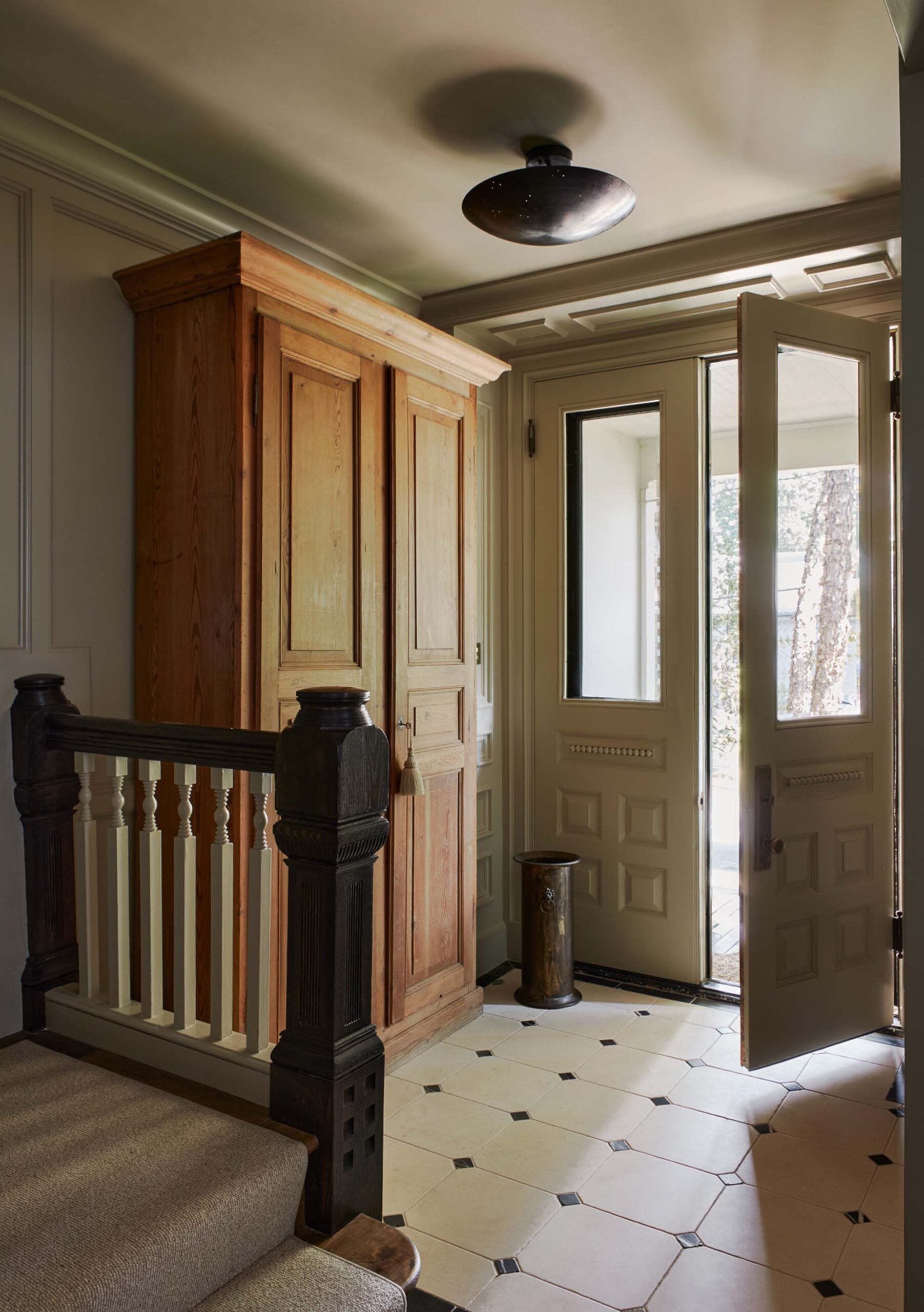
An entryway is the first impression, and this one tells you exactly what to expect from the rest of the Lexington Square home tour. There is warmth, history, pattern, and personality, but nothing feels overly formal. I think that balance is much harder to achieve than it looks. A beautiful antique, interesting lighting, and impressive millwork makes this space feel edited, but certainly not empty. That is a sweet spot I’m always chasing!
Library
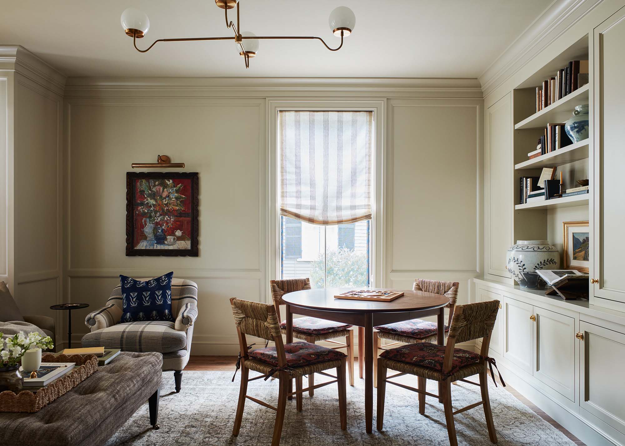
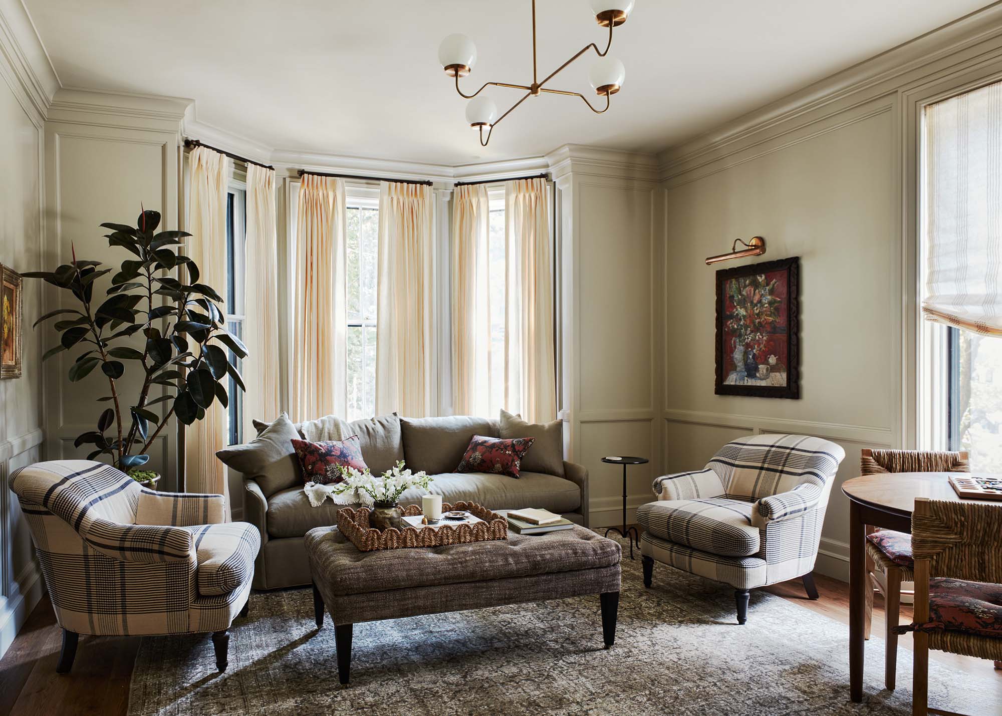
The library sits just off the entry, which makes it a smart place to lean a little brighter and more traditional. This room also proves that traditional doesn’t have to mean formal. There is a looseness to the styling that keeps everything approachable.
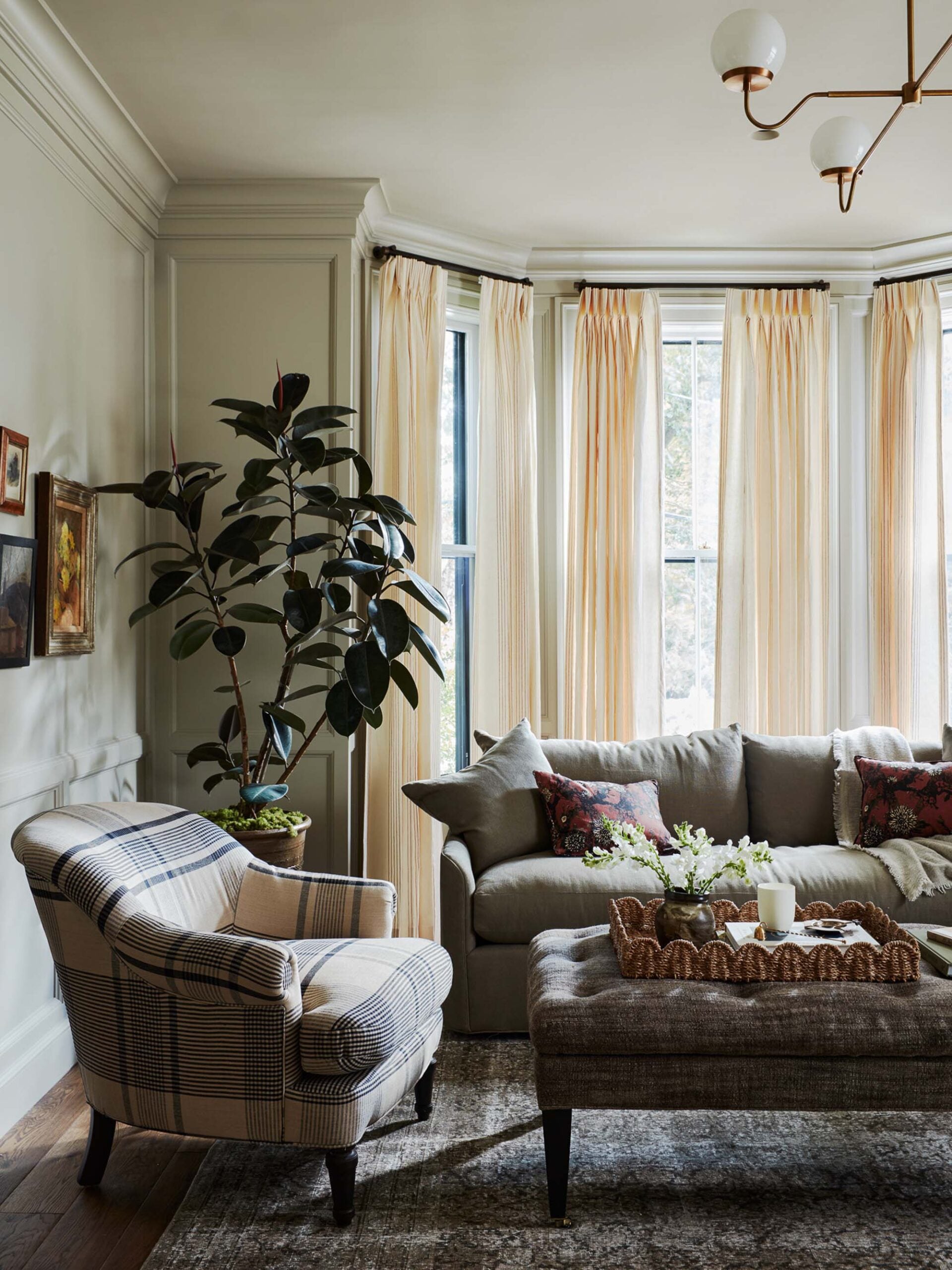
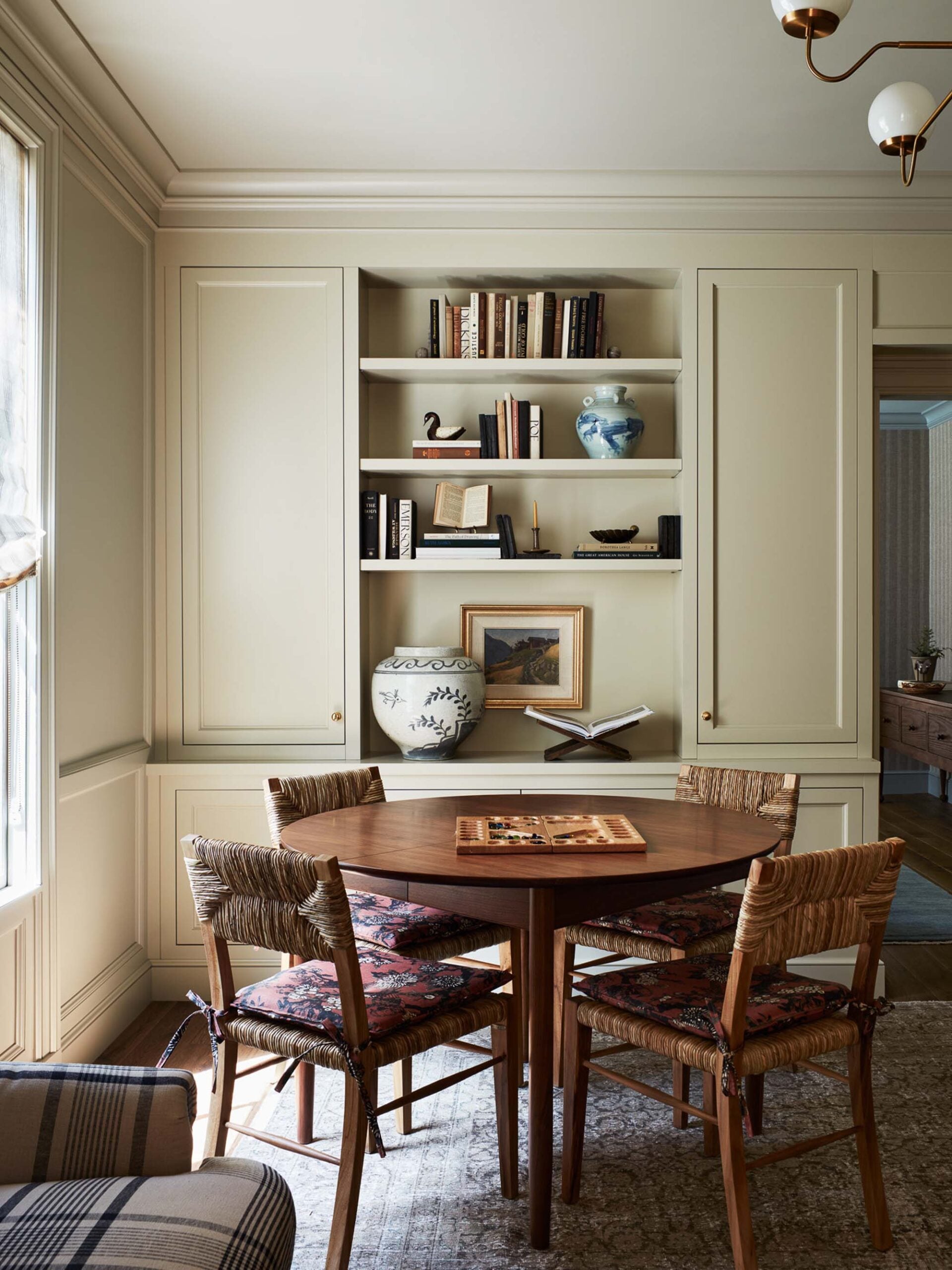
With plenty of comfortable seating, both open and closed storage, and natural light flooding in… this room is ideal for reading, studying or homework, and games & drinks alike.
Kitchen & Breakfast Nook
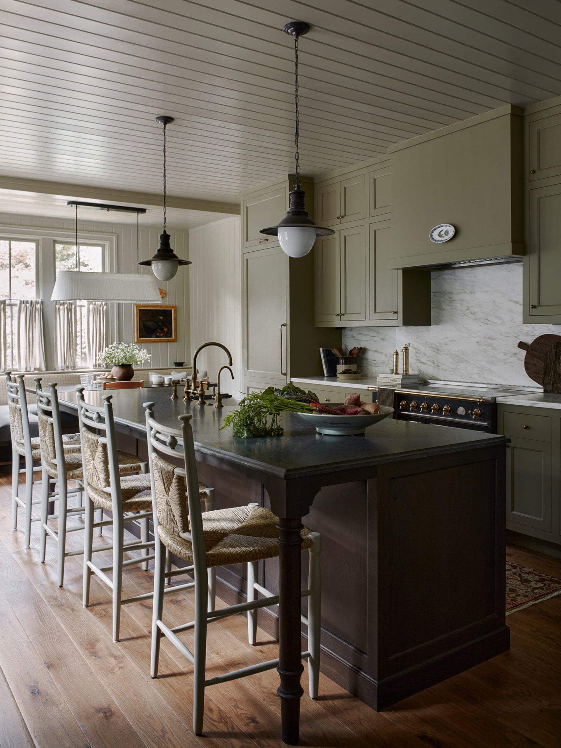
Let’s meander into the kitchen because this might be my favorite room in the entire house. The palette immediately pulled me in. Muddy greens, warm brown tones, natural wood, and aged looking finishes give this room so much depth.
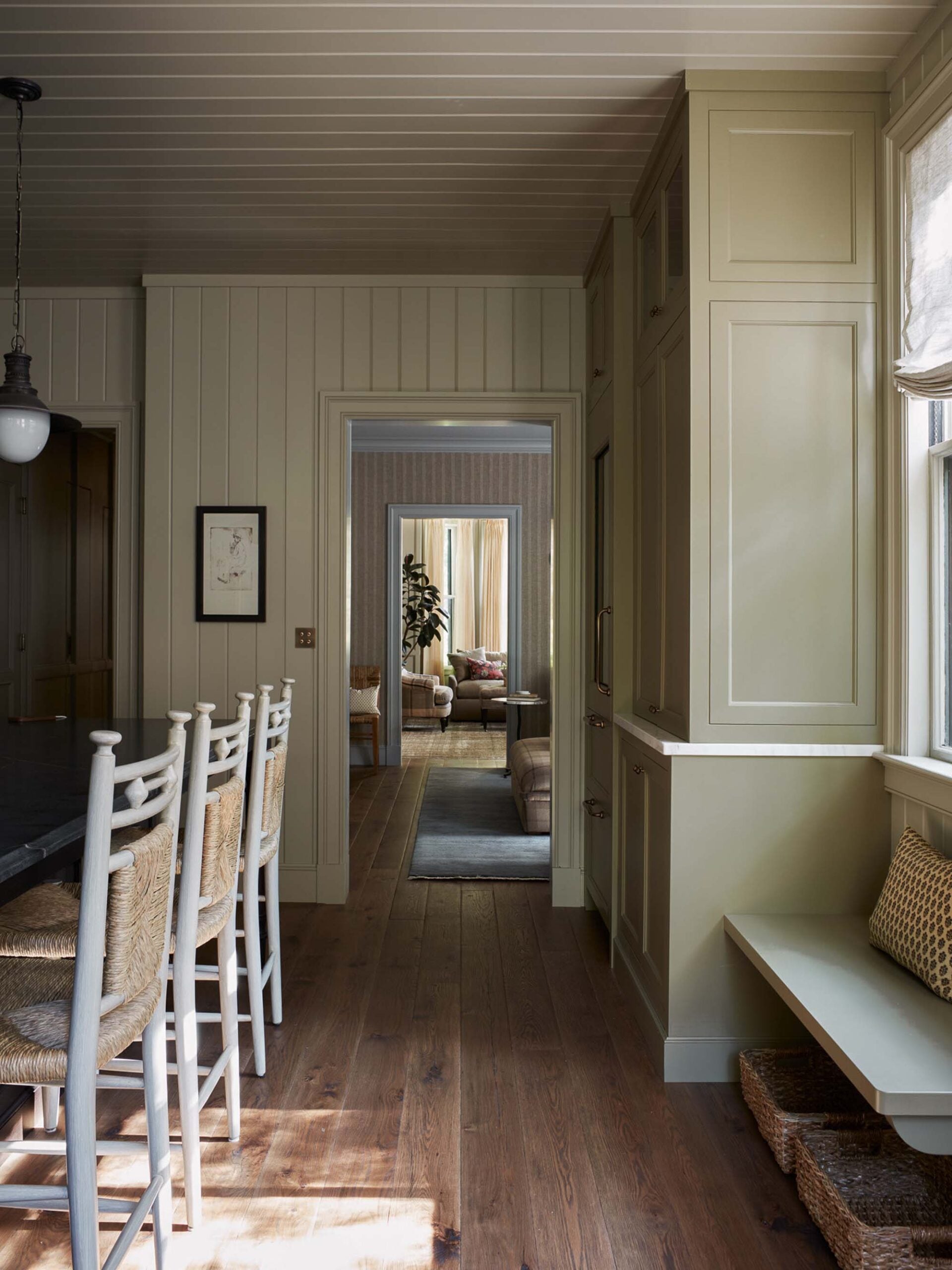
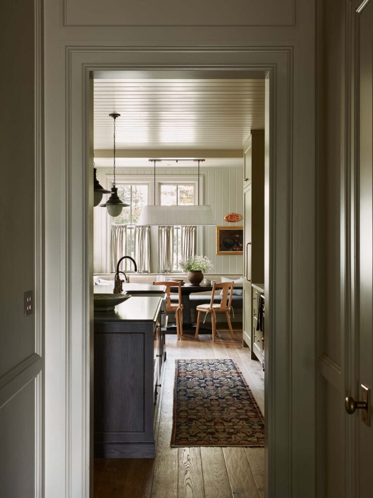
This is also a really good example of why I rarely think a kitchen needs to be white to feel timeless. Timelessness has much more to do with materials, proportions, and architectural integrity than choosing the a safe color palette. Look at the profile of the island (that feels like furniture), the paneled cabinetry, and the lighting. Those details feel appropriate for an 1885 home without turning the kitchen into a historical reproduction.
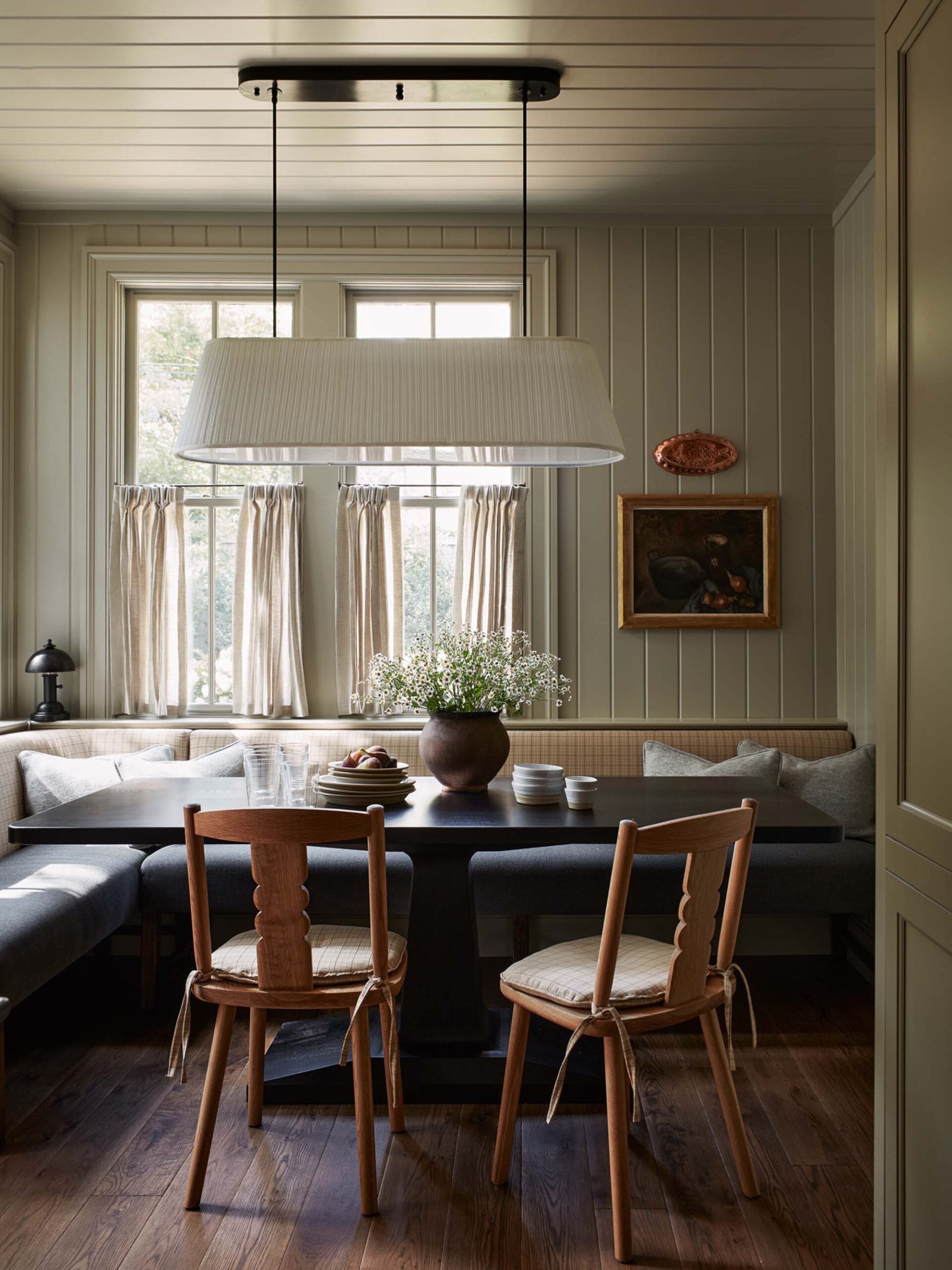
The breakfast nook continues that same warmth. I love when an eat-in kitchen feels like a little room of its own instead of simply becoming an extension of the cabinetry. It gives you another opportunity to layer furniture, textiles, art, and lighting. The custom banquette upholstery was a standout for me… along with the simple cafe curtains.
Powder Room
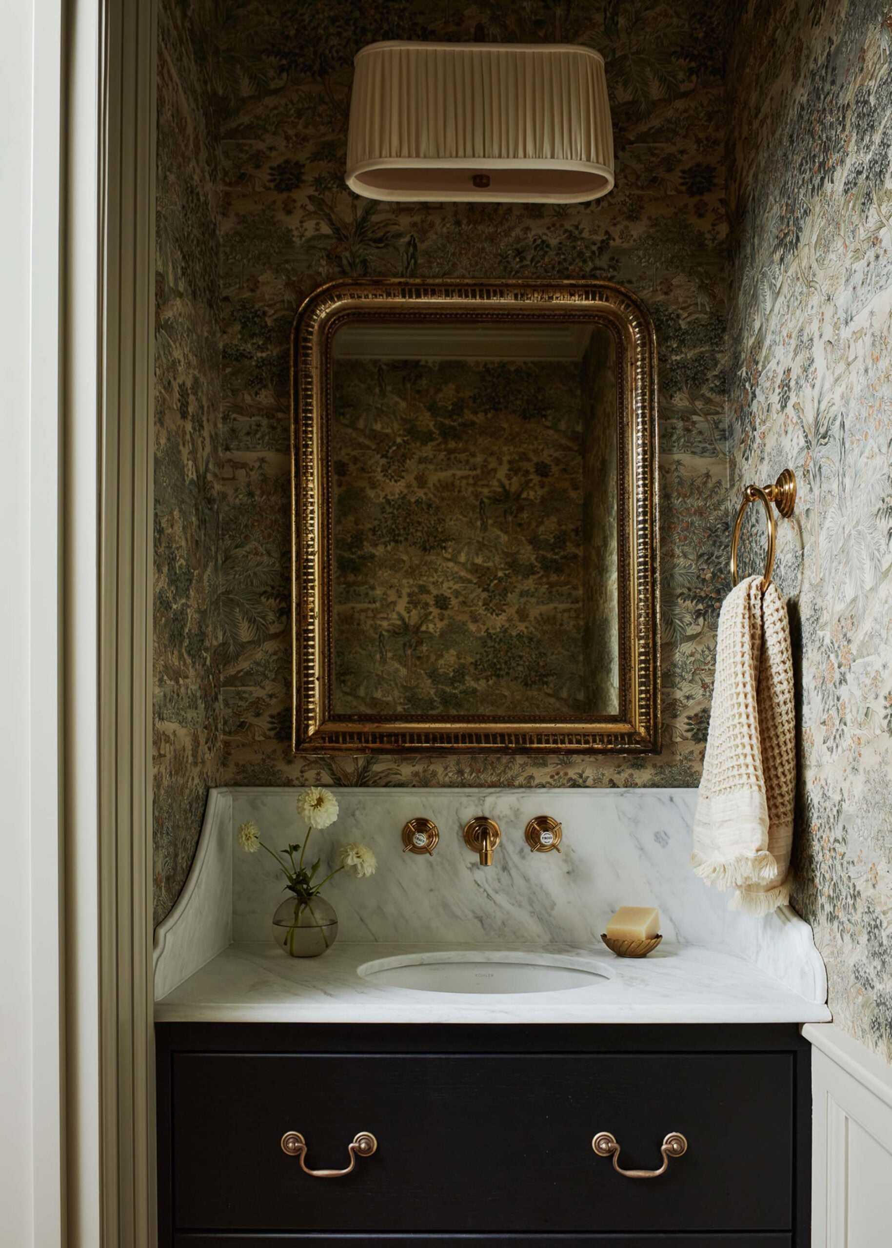
You know I love a powder room. It is one of the few spaces where I will almost always encourage someone to take a bigger design risk. Because it’ is’s small and somewhat separate from the main living spaces, you can treat it almost like a little jewel box. Pattern in wallpaper, color, unusual lighting, interesting plumbing fixtures, or a custom vanity can completely transform a tiny space. This powder room is the perfect example!
Family / Living Room
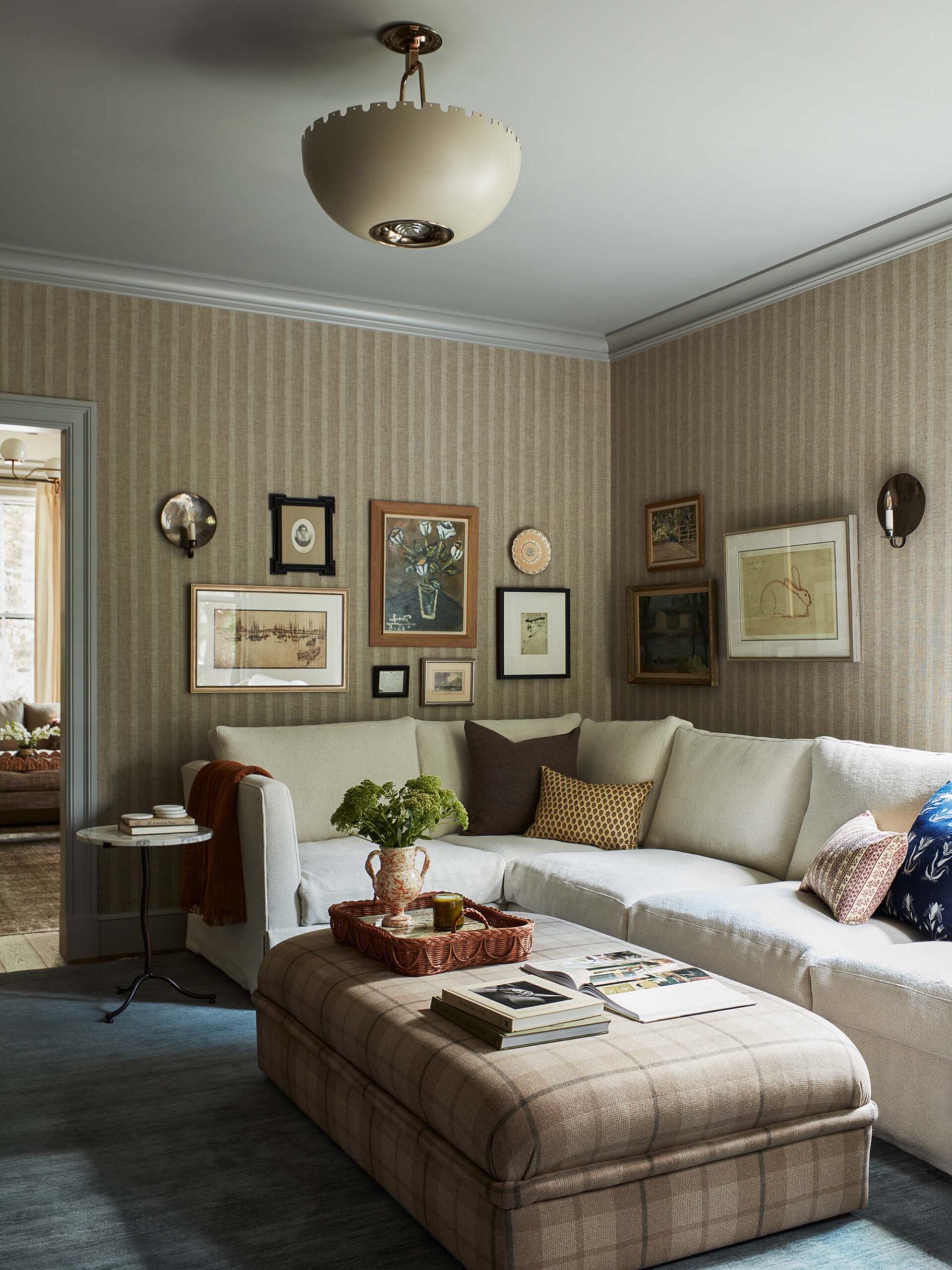
The family room is where this home really demonstrates how to make traditional design livable. There are layers of pattern, texture, warm colors, substantial upholstered furniture, and plenty of visual interest, yet it still looks like a room where you could actually curl up and watch TV. That matters to me. I love a beautiful room, but if the most used space in the house feels too precious to use, it’s a miss for me. This feels like the perfect vignette to unplug and lounge.
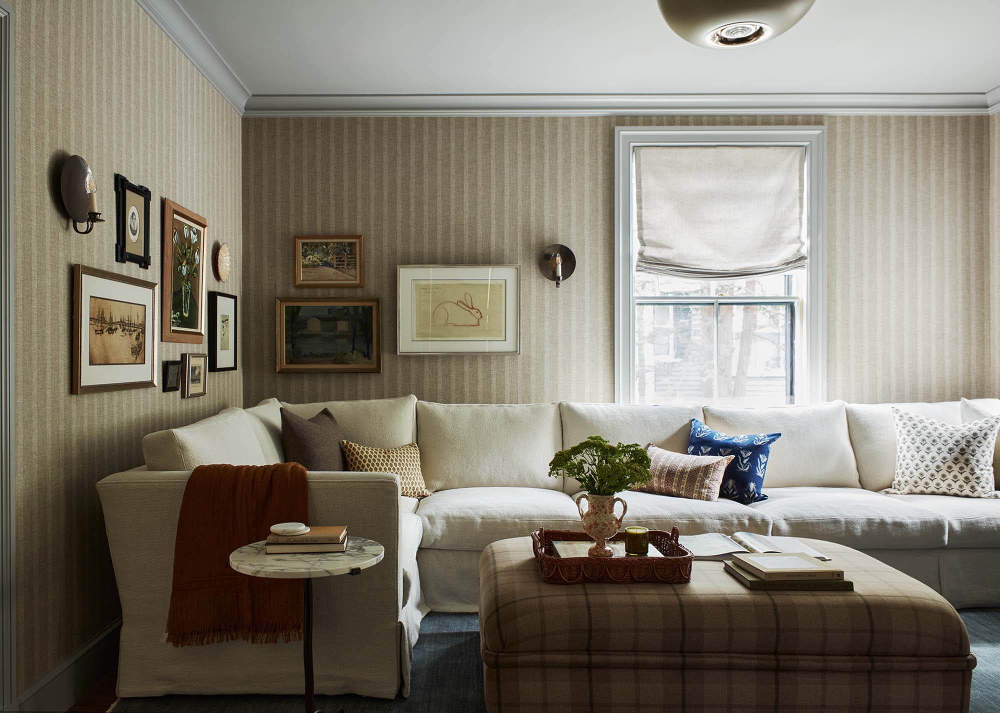
The striped wallpaper, plaid ottoman, and block print floral accessories are the perfect complements in varying scales. This is pattern mixing at its finest, if you’re taking notes!
Primary Suite
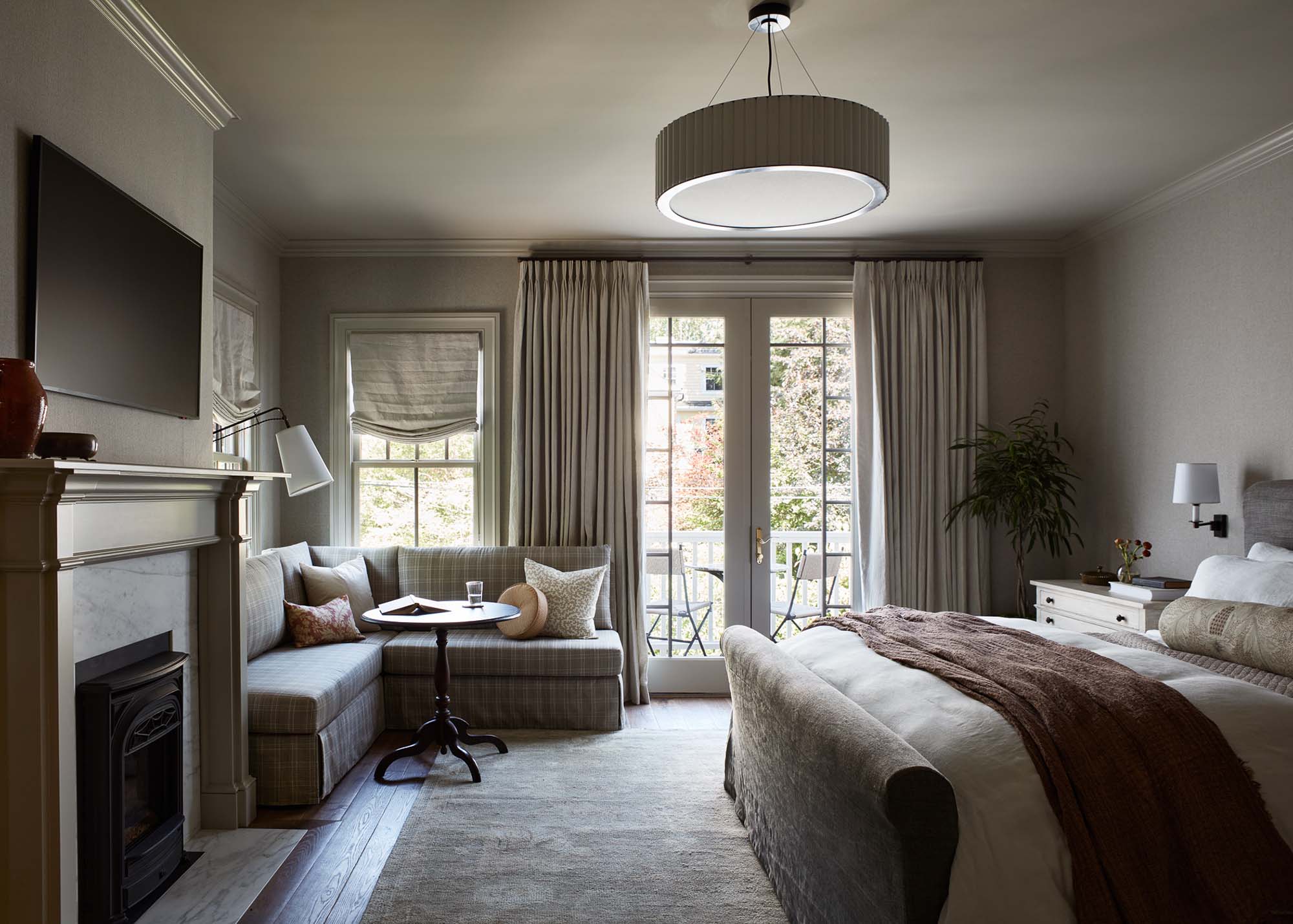
The primary bedroom shifts into something softer and more restrained, which feels calming and relaxing. The walls are covered in wool wallpaper, and this is exactly the kind of detail that reminds me how much material choice matters. You could paint the walls the exact same color and the room would feel completely different (and not nearly as luxe). Texture totally changes how light moves across a surface and adds depth that paint alone just can’t achieve.
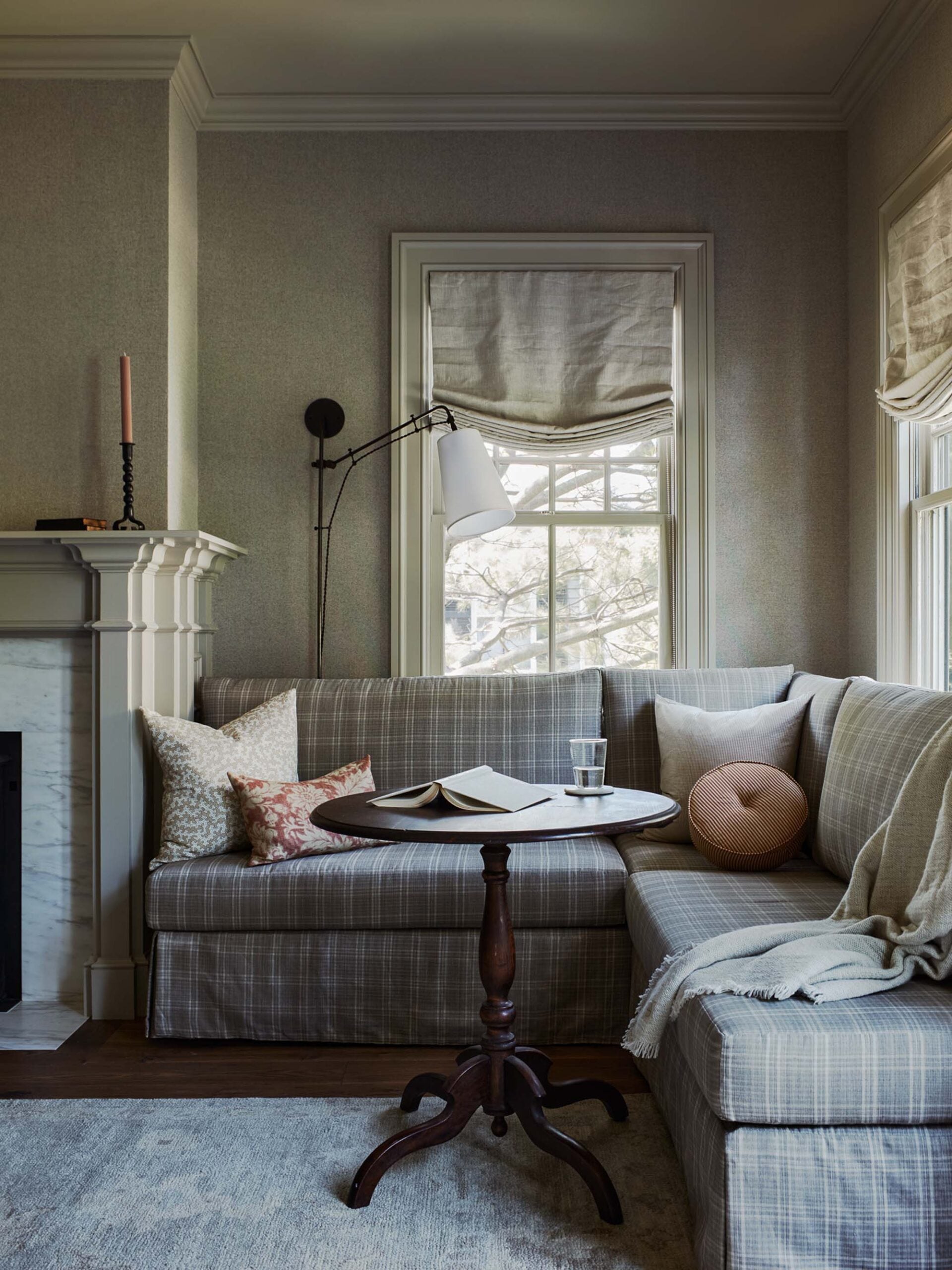
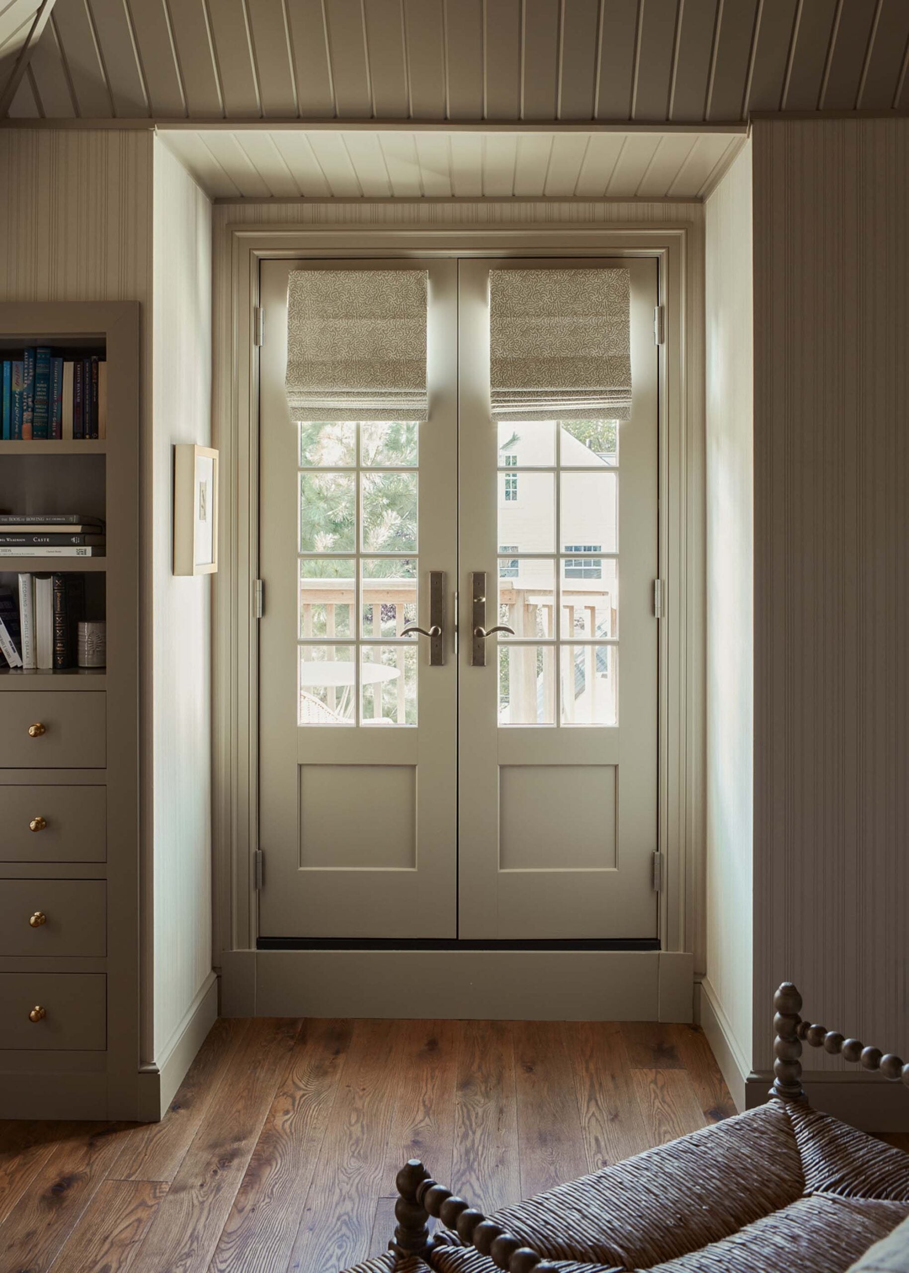
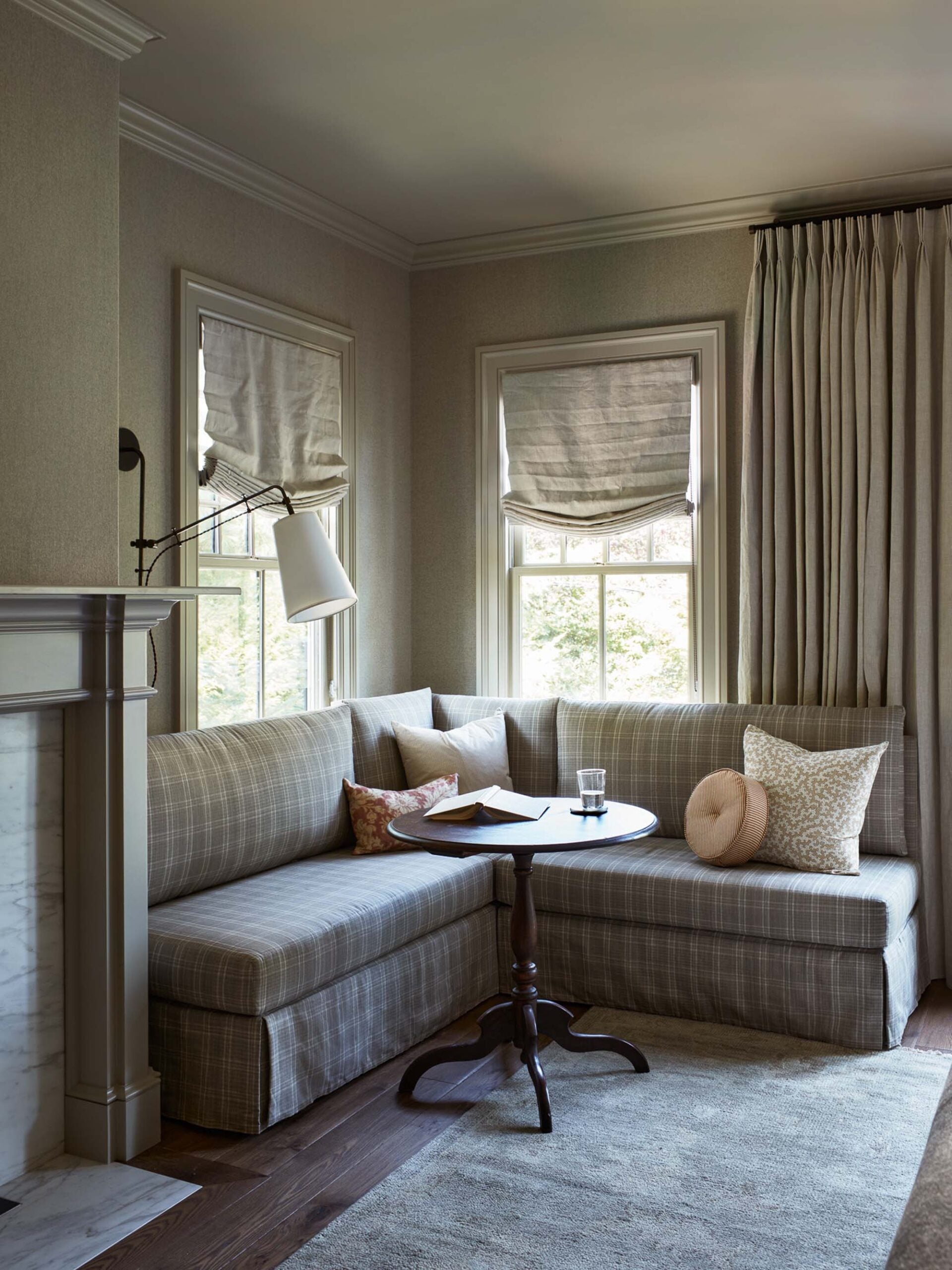
While the wallpaper and fireplace were standouts for me, I think the corner seating is the star of the show. This plaid banquette is genius— functional as it is cozy. It perfectly balances the asymmetric room and French doors.
Primary Bathroom
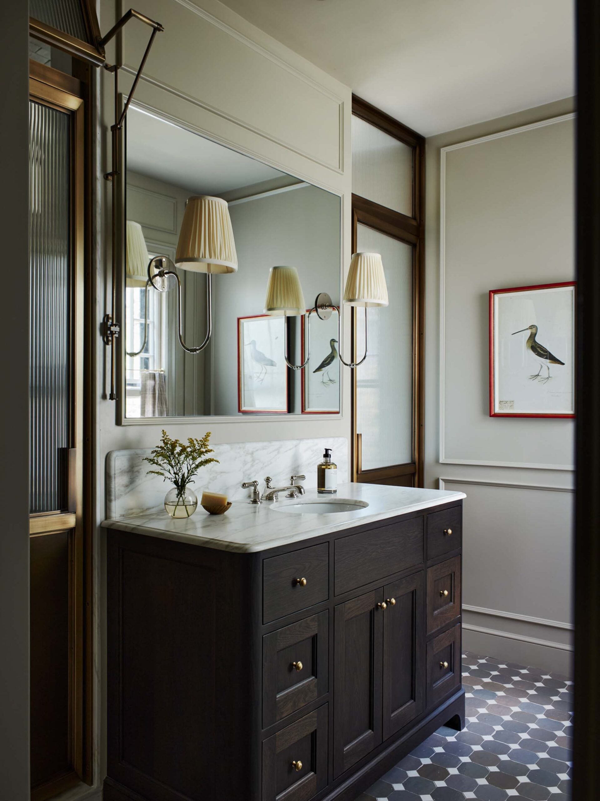
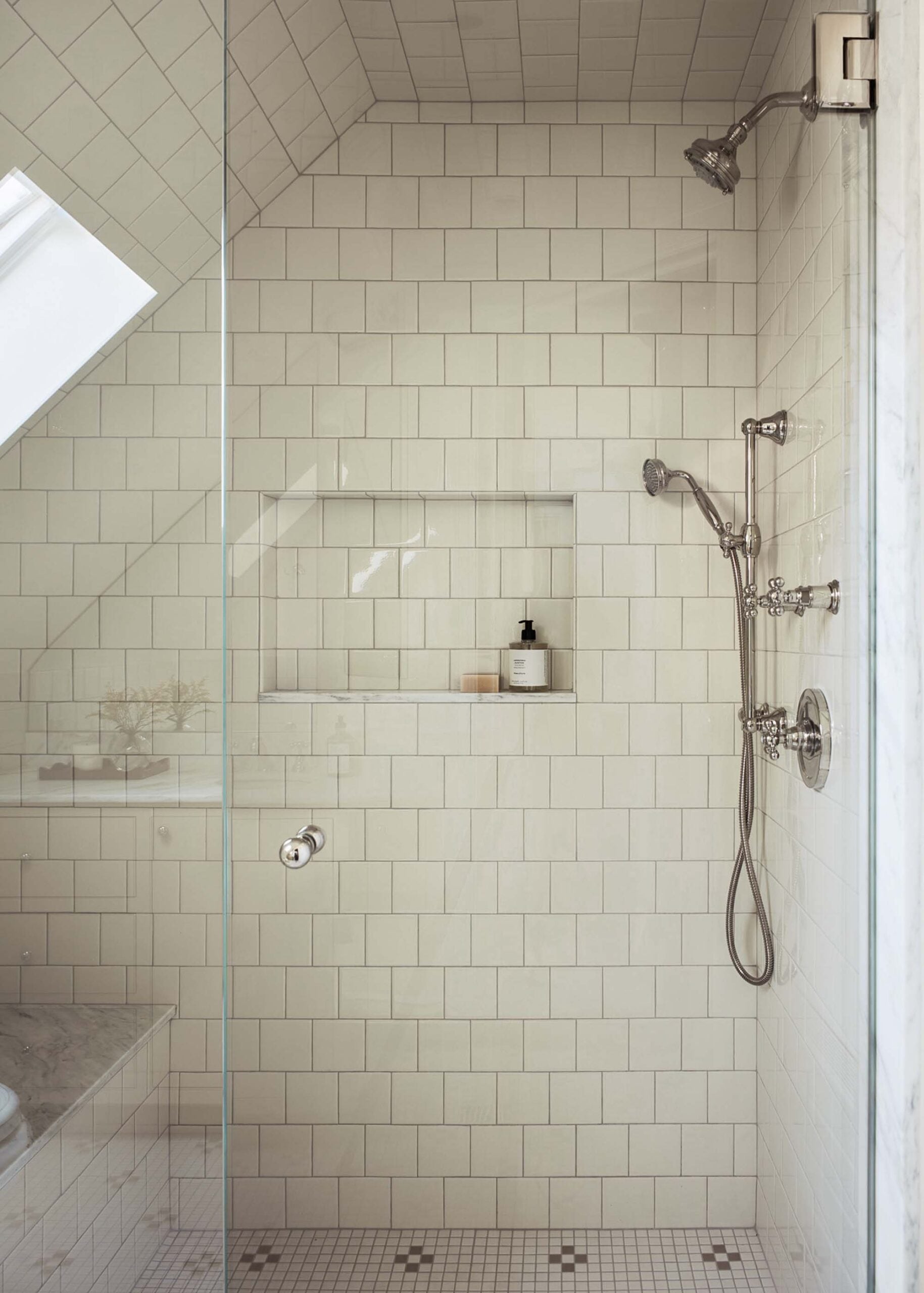
The primary bathroom carries the same restrained palette into a more utilitarian space, but the brass shower enclosure really elevates it. This is a perfect example of knowing where to spend. Not every finish needs to be the splurge. In fact, I think rooms often look more expensive when there is one memorable investment surrounded by simpler choices. Here, the shower enclosure and reeded glass framed by brass becomes that focal point.
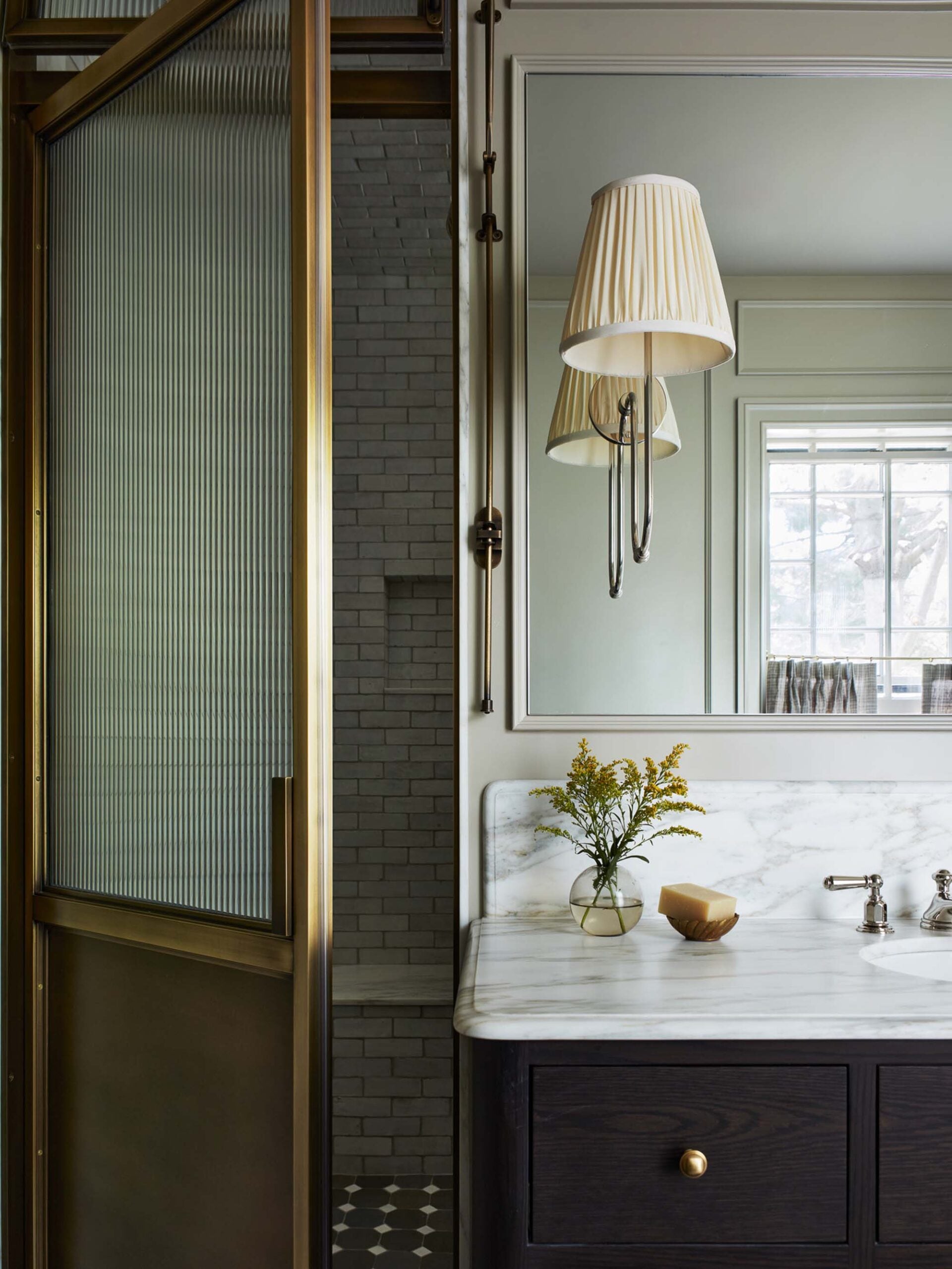
I also really appreciate the tile choices, classic marble counter, radius edge vanity, and pleated shades atop polished nickel light fixtures. Also peep those pleated cafe curtains in the mirror? All lovely details!
Office / Guest Room
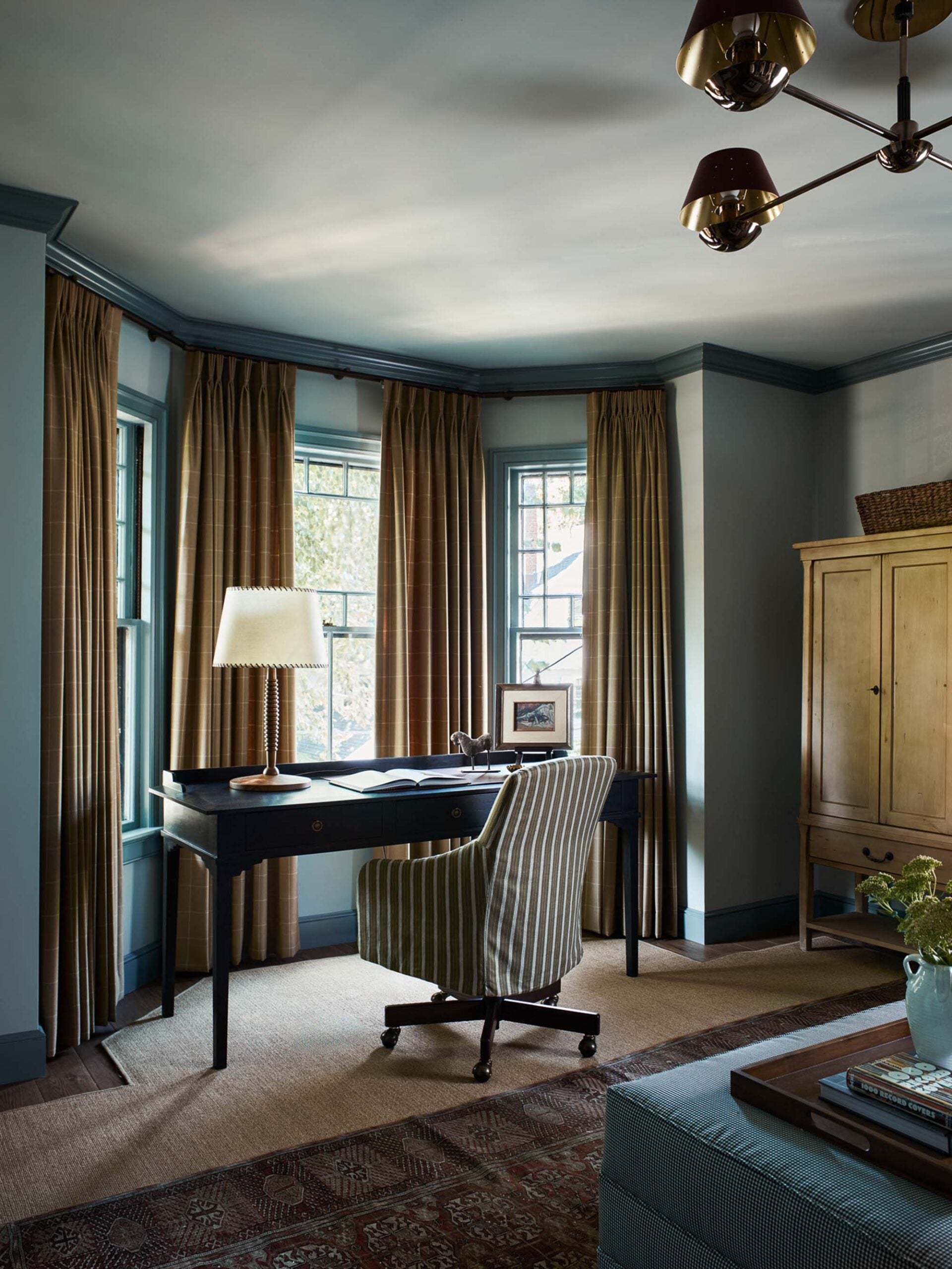
I love a hardworking room, especially when it has multiple functions. This space acts as both an office and a guest room, using a two-tone palette and rich accents. The paint colors are really gorgeous, with a contrast trim… you know that hue is right up my alley!
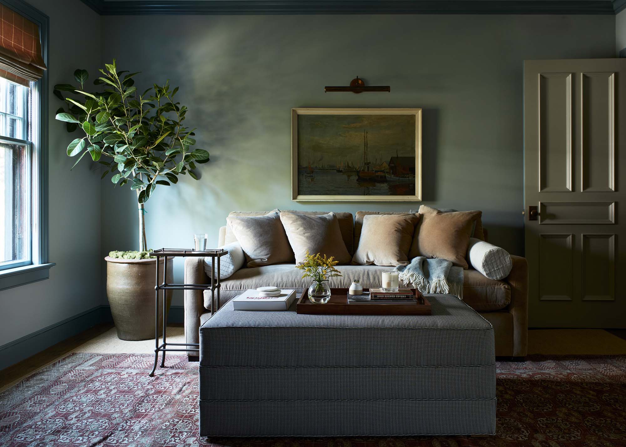
I’m guessing the sofa is pull-out bed, with the linens neatly tucked into the corner armoire. I have to imagine the desk is a hardworking piece of furniture, if this space primarily functions as an office. I like how it takes advantage of the view, perfectly floor planned into front of a bay of windows.
Guest Bathroom
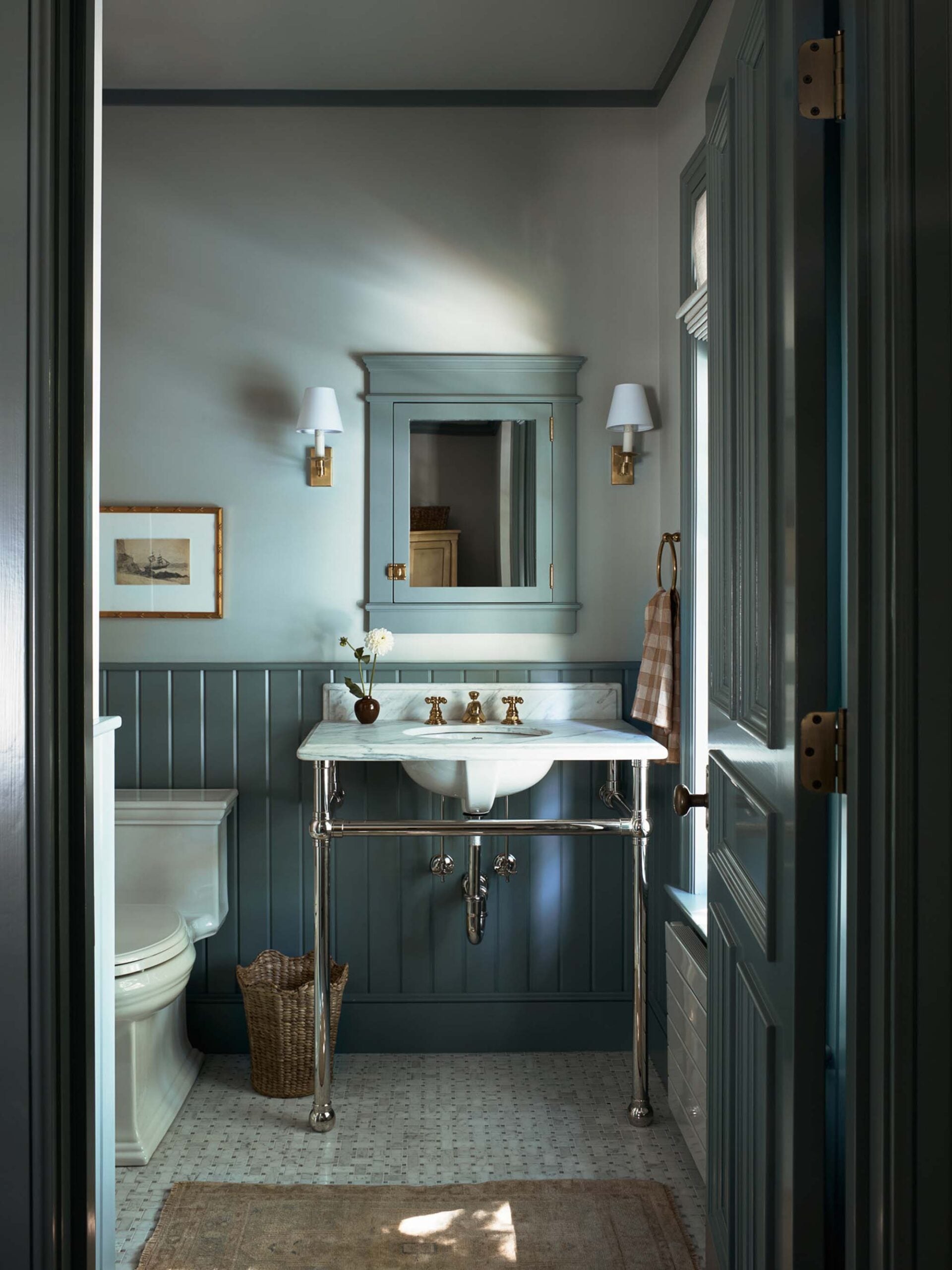
Moving into the guest bathroom, I immediately spotted the timeless basketweave carrara mosaic floor tile. That’s actually what we just installed in our primary bath. I love the historic aesthetic! With a polished nickel open sink and painted board & batten to anchor the bath, this simple room is actually one of my personal favorites.
Loft Bedrooms
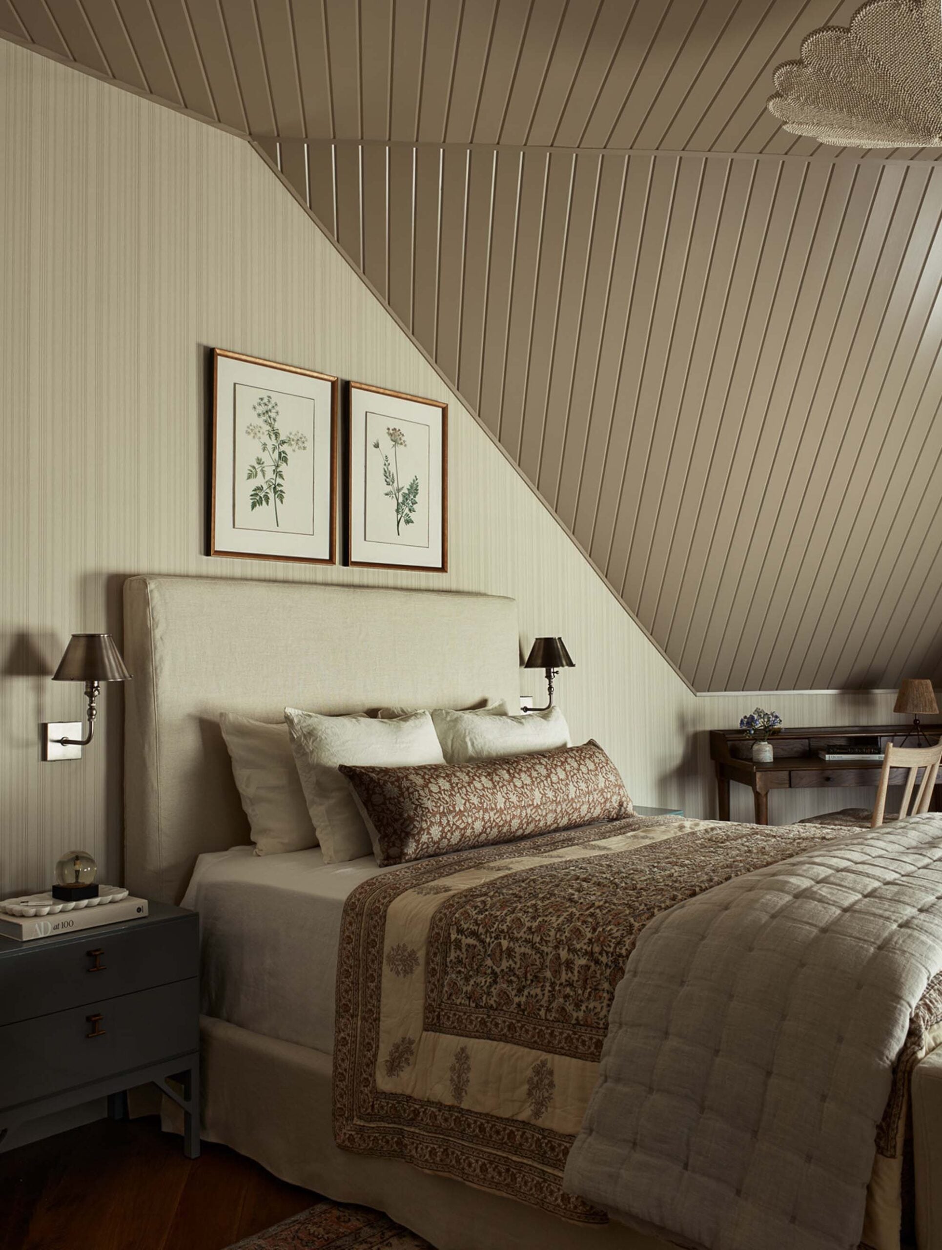
Loft bedrooms are tricky to design. Trust me… I’ve been in the process of rendering three in the cabin this month. Despite odd angles, these really utilize the space well. These loft bedrooms also bring another personality into the house while still maintaining the overall traditional feel.
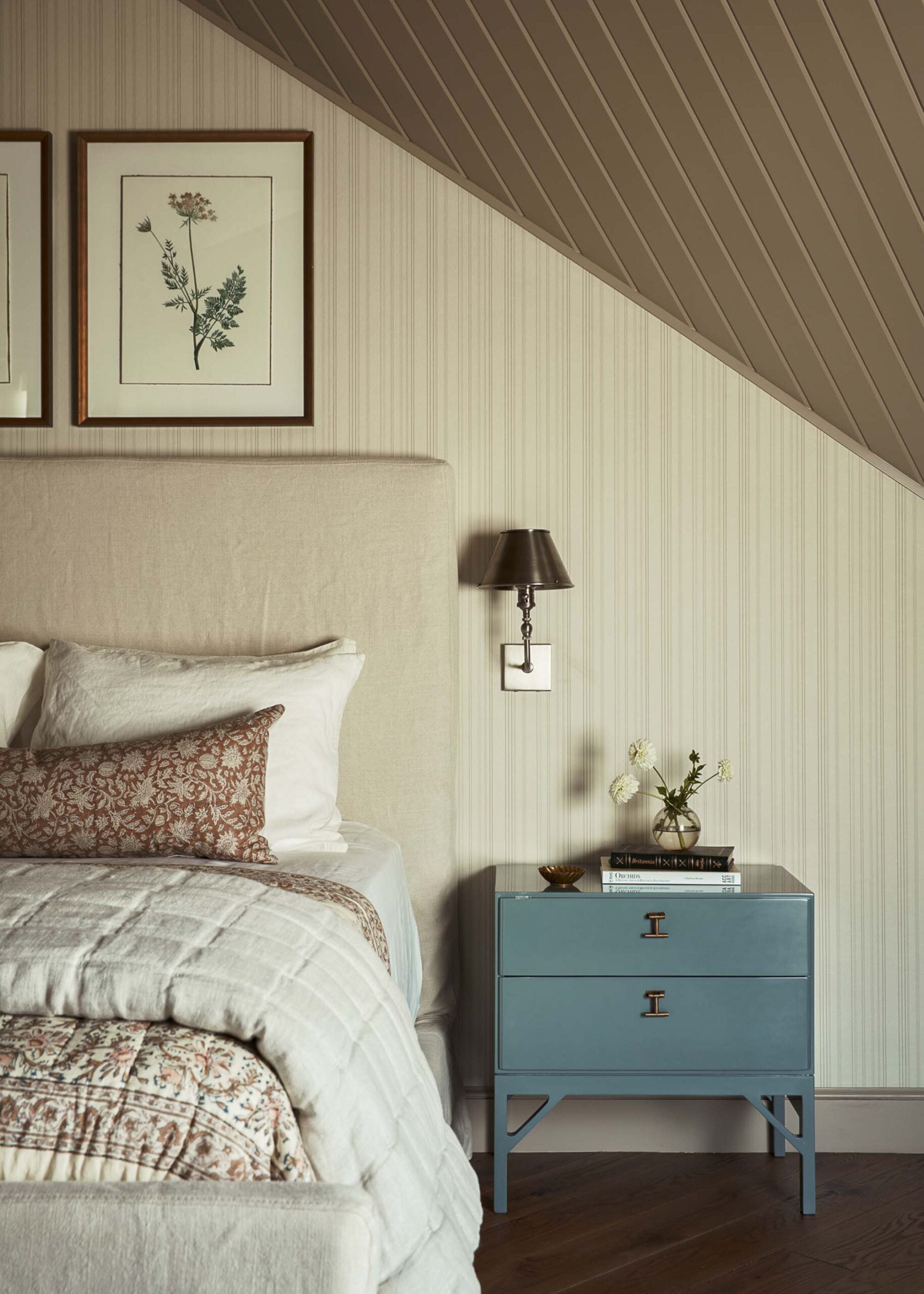
With striped wallpaper and beadboard, all of the visual lines could be very chaotic… but instead, feels very thoughtful and soft.
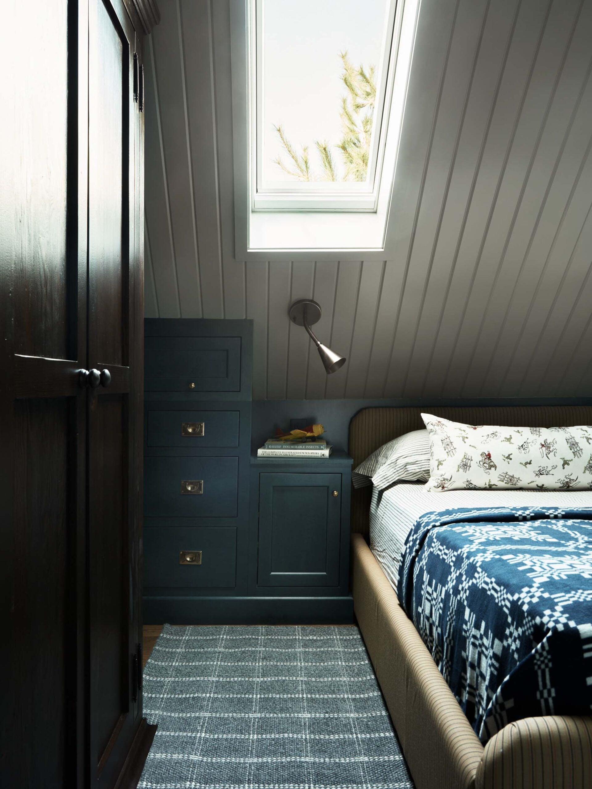
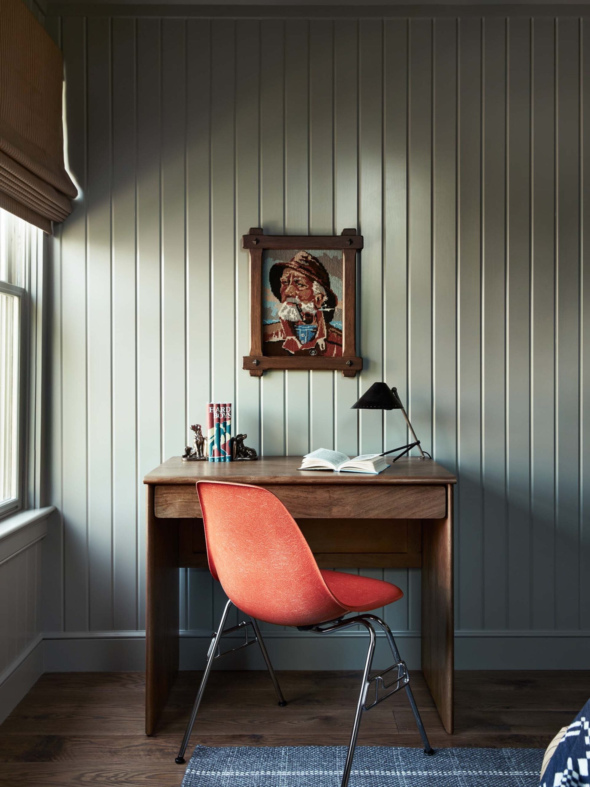
These upper bedrooms are where I think it makes sense to loosen the aesthetic rules a bit. They don’t need to perfectly match the common areas. In fact, I would rather see bedrooms that feel more interesting in a loft. The trick is maintaining a few connecting elements. A consistent approach to the millwork, similar finishes, and repeated wood tones throughout make these bedrooms feel like cousins… they’re unique, but belong under the same roof.
Loft Bathroom
This bathroom is shared by three kids, so storage must have been a major consideration. What really caught my attention, though, is the angled ceiling. Instead of treating the architecture as a problem to disguise, the design works with it. The shape of the mirror helps visually open the room and turns an awkward condition into something intentional. It’s actually giving me a ton of inspiration for our cabin loft bath.
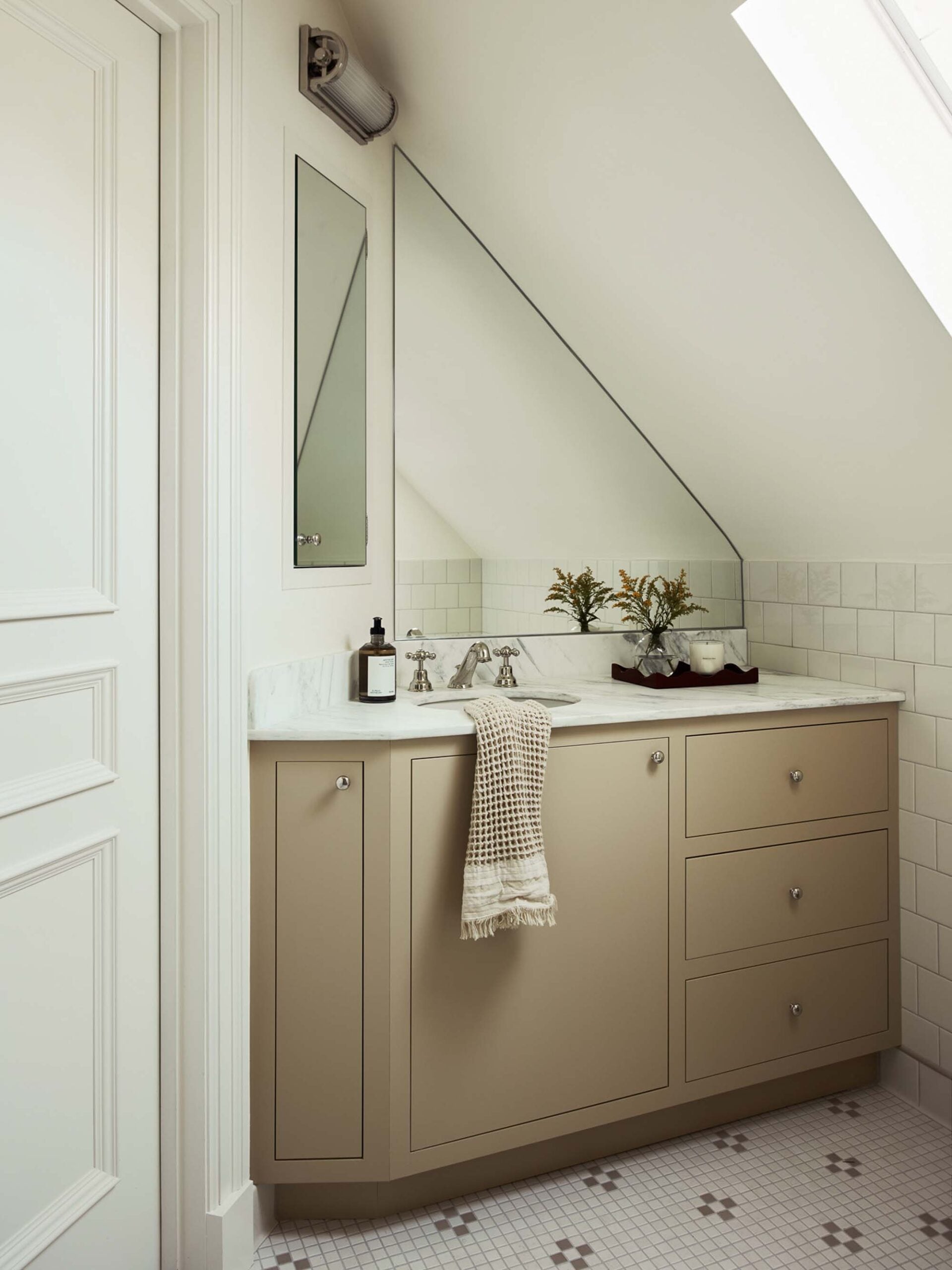
This is one of those design lessons that applies to almost any house. Before trying to hide something unusual, ask whether you can emphasize it instead. Odd ceiling? Follow the angle. Strange nook? Build into it. Off center window? Create a composition that makes the asymmetry look deliberate. Working with a house is almost always more convincing than fighting against it.
FAQ Interview with Marianne
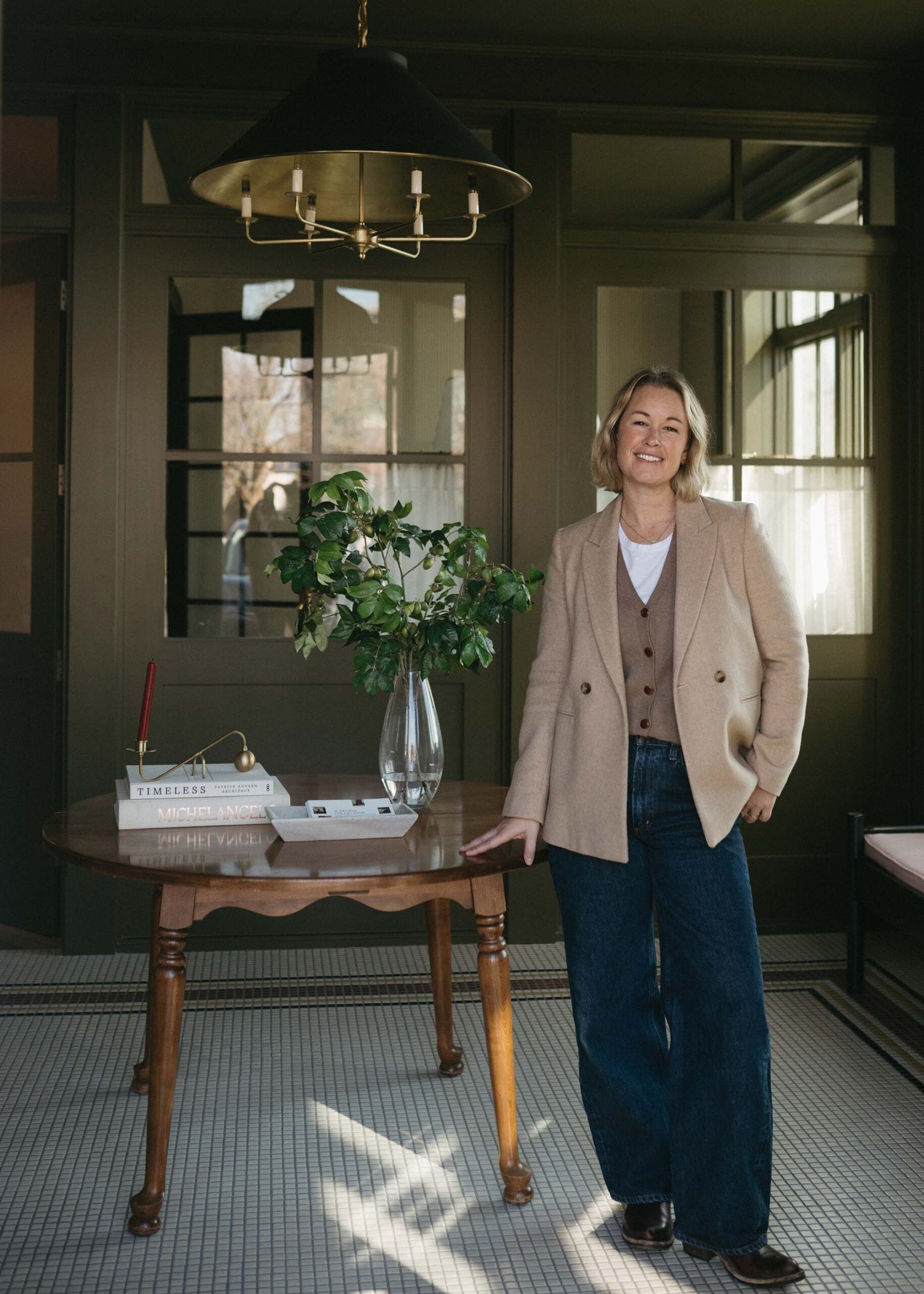
The biggest design challenge with any old home from a design standpoint is usually the layout of the home. We had a lot of floor plan constraints, narrow hallways, sloping rooflines, etc. that we needed to work around as we tried to update the home for modern living. For example, they had little to no closet space, and adding furniture pieces like wardrobes and framing out closets while working around low ceilings was a challenge. That sort of thing.
I know I’m biased, but I think our WDC Home Newbury Chandelier in the breakfast nook really completes the space and adds visual weight to the room in just the right way. A close second is the Urban Electric Leasowe Flush Mount in the family room.
This might not be the “right” answer, but it’s the most honest answer – spending a lot of money on your window treatments is the only way to achieve the look of the window treatments in this house. Our client trusted us and invested in using great fabrics. In my opinion, when I really love a window treatment, it’s usually because of the fabric used, and usually that fabric is quite expensive, but can be so, so worth it. I’m slowly investing in replacing some of the window treatments in my own home as I save up money for the fabric I want to use.
It really is so hard to choose in this home because it’s such a perfectly sized home, and therefore every room feels so intentional and cozy and layered. It’s the “smallest” home, as far as square footage, I have designed in the last 5 years and it’s one of my all-time favorites. Our client invested in all the right things, and it’s pretty perfect, but I do love the family room – the way the sofa takes up the whole room, paired with the gallery wall and wallpaper and that blue rug. It’s a great room. But I also love the primary bedroom/bathroom suite so much, and the kitchen and the front room and office! It’s truly too hard to choose.
There are so many wallpapers that I love the pattern and colors of and I want to use them all, but restraint is really important when it comes to choosing wallpapers, in my opinion. Sometimes wallpaper should be the art piece, the focus, the pattern in the room, but often for me, I find the most successful rooms incorporate wallpaper in a more quiet way. We have our own wallpaper collection, and I refer to it as “the white tee shirt and jeans”, of the wall covering world. I think wallpaper is often meant to be the basic part of your home “outfit”, like a white tee and jeans and then we layer on the jacket, jewelry, shoes, etc. to complete the outfit. A subtle stripe, a soft linen wallpaper, a textured grasscloth, or a small scale print that is easily layered over and around. That was our approach with this home. We added a soft, quiet texture in the primary bedroom with a linen wallpaper, a subtle stripe in the girls’ bedroom that plays off the tongue and groove of the ceiling, a slightly more bold stripe in the family room, and a colorful mural wallpaper in the powder bath to enjoy in that small space. And of course, all of the molding on the walls and ceilings added a lot of visual interest as well, so every room in the home felt finished and layered.
More Home Tours
If you’re interested in browsing more home tours or posts covering interior design inspiration, I’ll link some reader favorites for you below! I’ve also covered another one from W Design Collective… Mill Road is one of my all-time favorite home tours.
- Home Tour : Black Forest Carriage House
- Home Tour: Nantucket Captain’s House
- Home Tour: Mt. Airy Carriage House
- Home Tour: Arts and Crafts Cheshire Kitchen
- Home Tour: Sun Valley Ski Chalet by Jennifer Miller Studio
- Home Tour: Townhouse by Centered by Design
- Home Tour: Mirada House by Kate Lester
- Home Tour: Charleston House by Bria Hammel
- Home Tour: Sycamore House by Josh Young
- Home Tour: Varick Apartment by Hayley Bridget Interiors
- Home Tour: Central London Townhouse
I hope you enjoyed a glimpse into this incredible east coast home. What were some of your favorite vignettes? Any standout design moments? I’d love to hear what features were most memorable for you. Will you apply any of these design ideas to your own home? Thank you to Marianne for the fun interview and for allowing me to feature this one! Feel free to send me more inspiring designers or homes you’d like me to feature. Be sure to follow W Design Collective and Jared Kuzia for a closer look!
This house is hard to choose just one favorite room, but I can unequivocally say the library room and kitchen are at a tie for top spot. The understated, lived-in comfort of the library room pulls me in. I love the warm off-white paint, the thicker textures reminiscent of your favorite blanket, and all of the light. Giant pottery? Say less! (I need the giant pottery on my life). In short, a library room that makes me want to get lost in a book and a cup of something hot just from first glance, is almost always going to win over everything else. And the kitchen!!!! I spotted the banquette in your opening image and knew it would slay me dead- but damn. That’s a sexy kitchen. Walnut island, woven chairs, sweet cafe curtains, upholstered banquette- this one is checking all the boxes for my own kitchen desires, right down to the muddy green! My favorite element in this room is the tiny bench under the window- I almost didn’t notice it, but how sweet! I imagine a child sitting there to put on shoes as they’re talking to mom who is finishing up packing the lunches. This kitchen is like the sigh you get when you come home after a long vacation. Complete with a mini lamp no less!! The entire house is stunning and I’m going to be coming back for days to view this one. Side note- I’m obsessed with beadboard and nickel-gap lately, and the way this house scratched the itch… impeccable! Thanks for sharing Sarah! I hope you’re having a great week!