Home Tour : Mt. Airy Carriage House
This historically designed carriage house instantly captured my attention. From design team Kaminski + Pew, this Philadelphia dance studio was converted into a timeless guest home. Originally built as a charming Tudor Revival in 1902, this traditional home was restored to its former glory, but with all the amenities for contemporary living. I can’t wait to dive into today’s home tour because it’s one of my favorites I’ve shared. With heavy stonework, tin ceilings, and classic wainscoting, this house is filled with design details to admire. Click through for the tour and a fun interview with design duo, Kevin & Alexis…
Design & Styling: Kaminski + Pew | Photography: Jason Varney

Before we dive in, be sure to follow Kaminski + Pew on Instagram, as well as Jason– who artfully photographed this project. They both have stunning portfolios that are worthy of a browse, bookmark, and follow!
Entryway
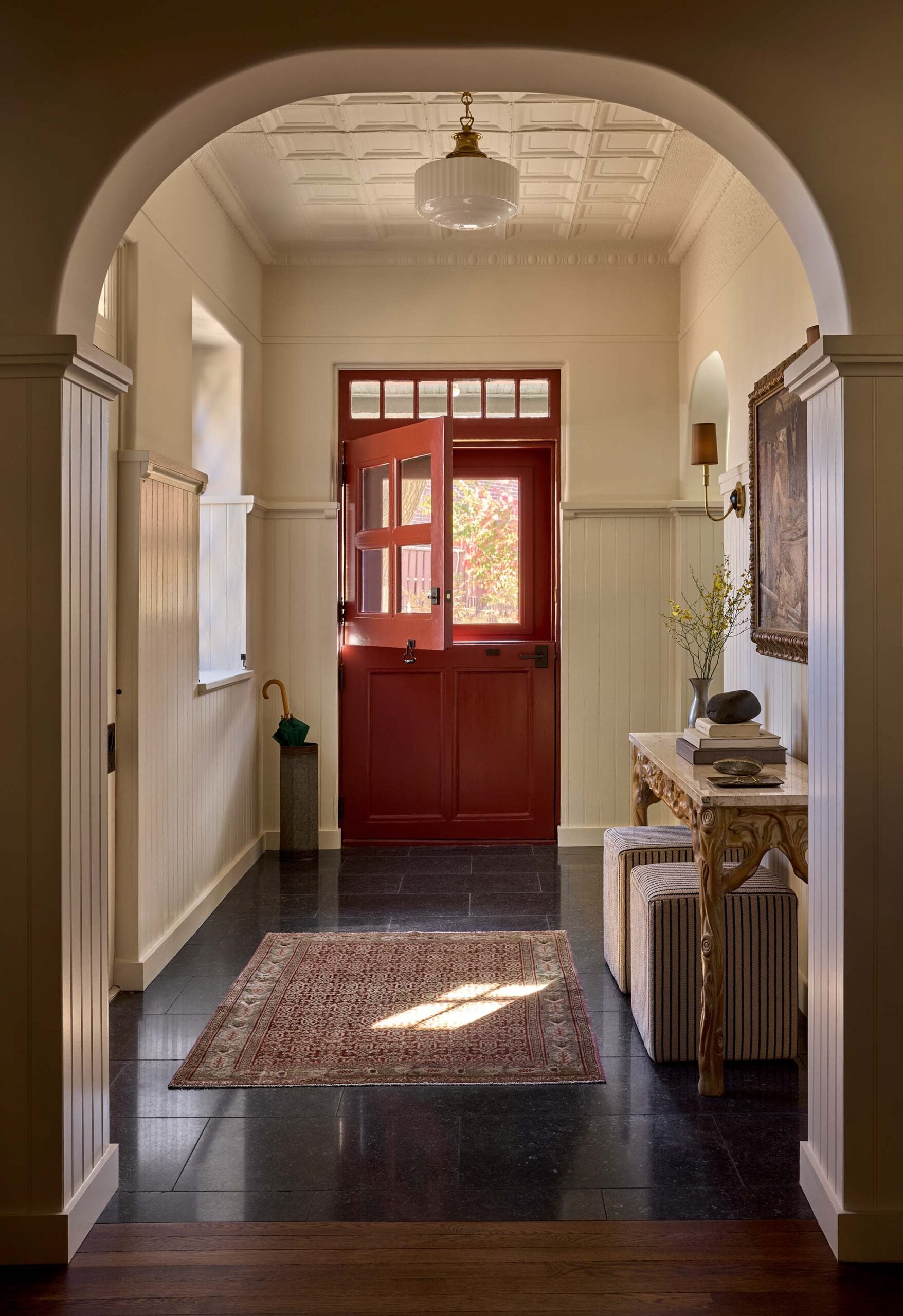
I’m absolutely smitten with the red entry dutch door. It’s paint color Antique Red SW 7587, by the way… that’s one to save! Paired with stone flooring, a vintage rug, and antique console table, this classic vignette sets the stage for the aesthetic of the home, while allowing a functional drop zone.
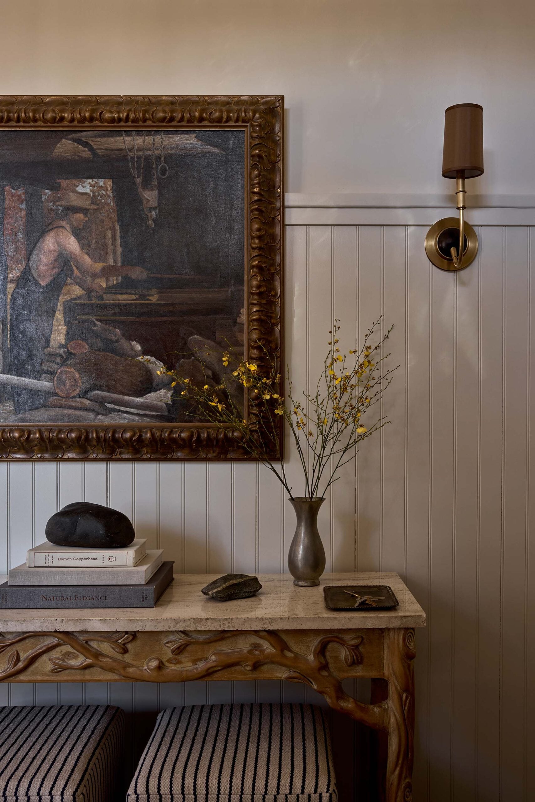
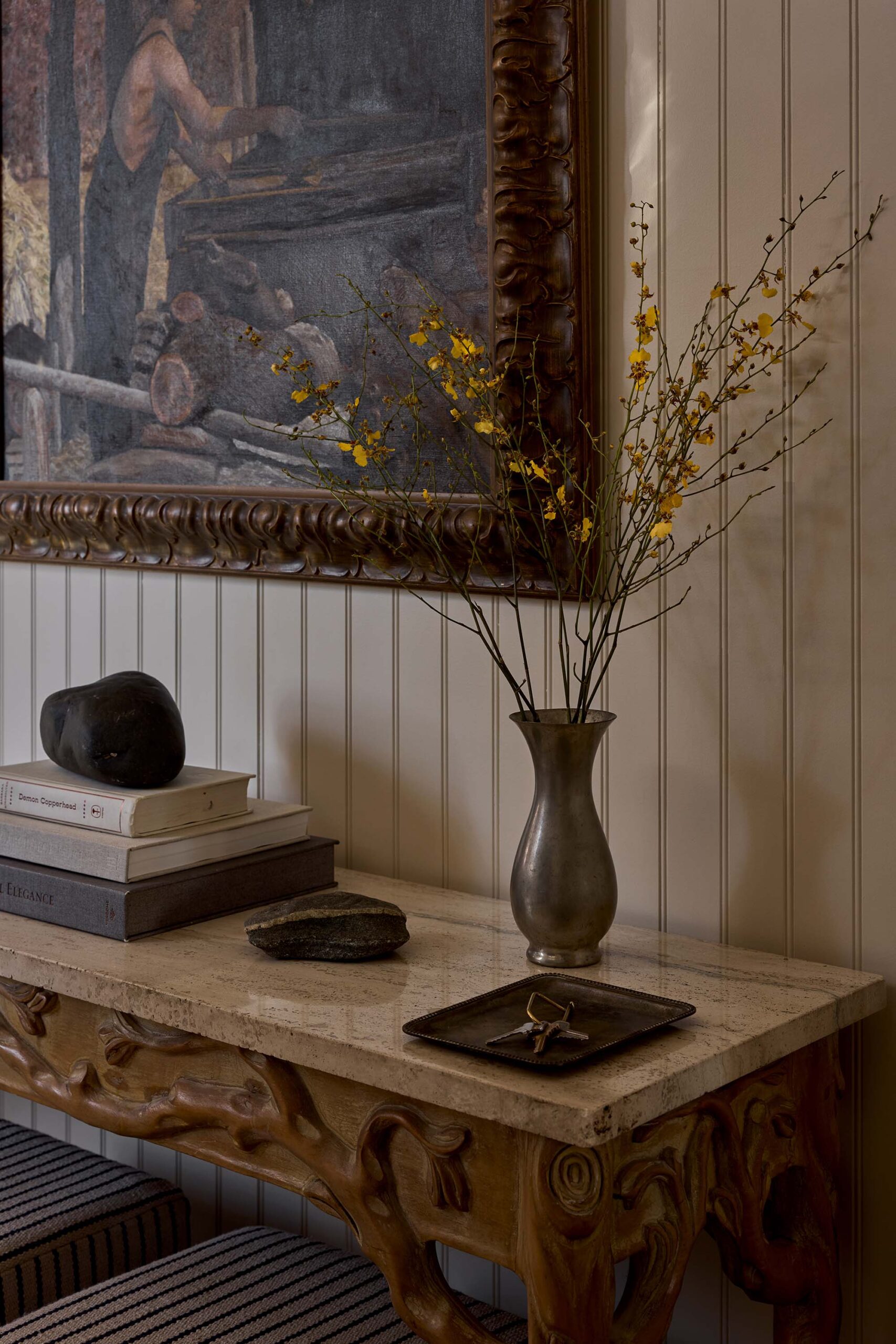
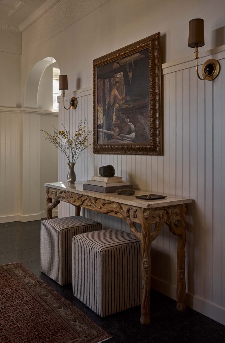
Minimalistic styling works well in this vignette, allowing the millwork, materials, lighting, and art to become the focal point.
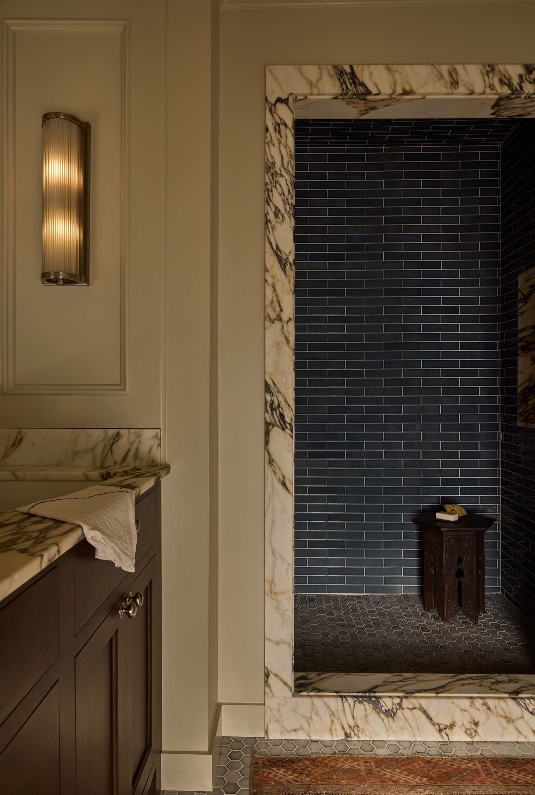
Bathroom
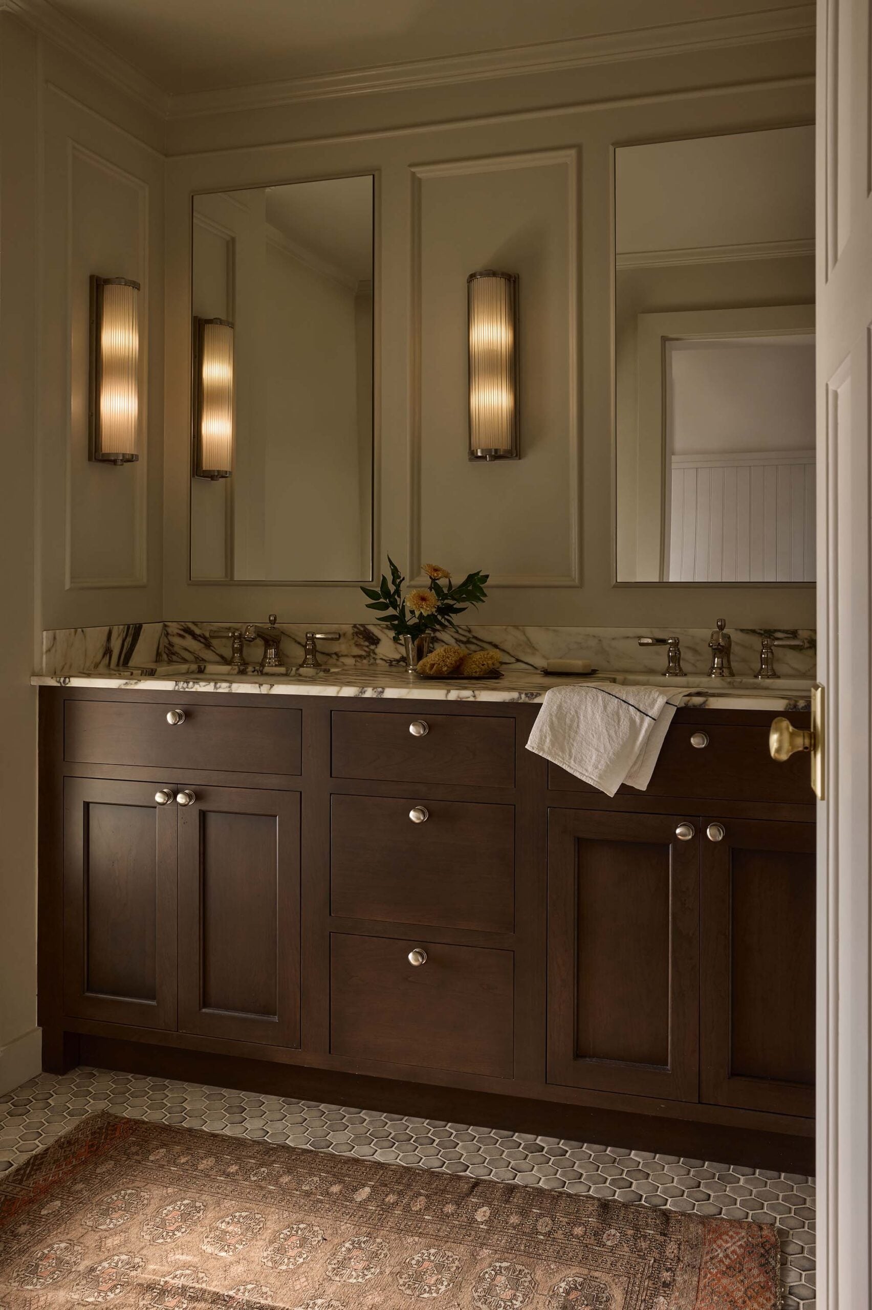
As we peek into the bathroom, you’ll notice beautiful marble countertops and stone casing details- the striking veining definitely becomes a luxurious focal point in this room. Set atop a streamlined walnut vanity with modern lighting and polished nickel fixtures, the double sink vignette is both aesthetic and functional. I also love the trim treatment on this wall, that perfectly frames the sconces.
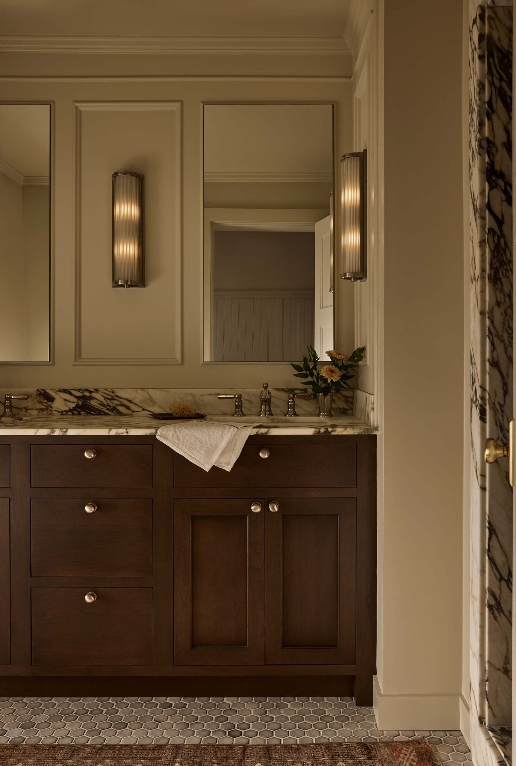
On the floor, a historic looking hex tile in various shades of gray grounds and calms the bathroom. Just around the corner in the shower alcove, we discover a fun sea of classic navy subway tile that enhances the overall look of the marble… really pulling the veining.
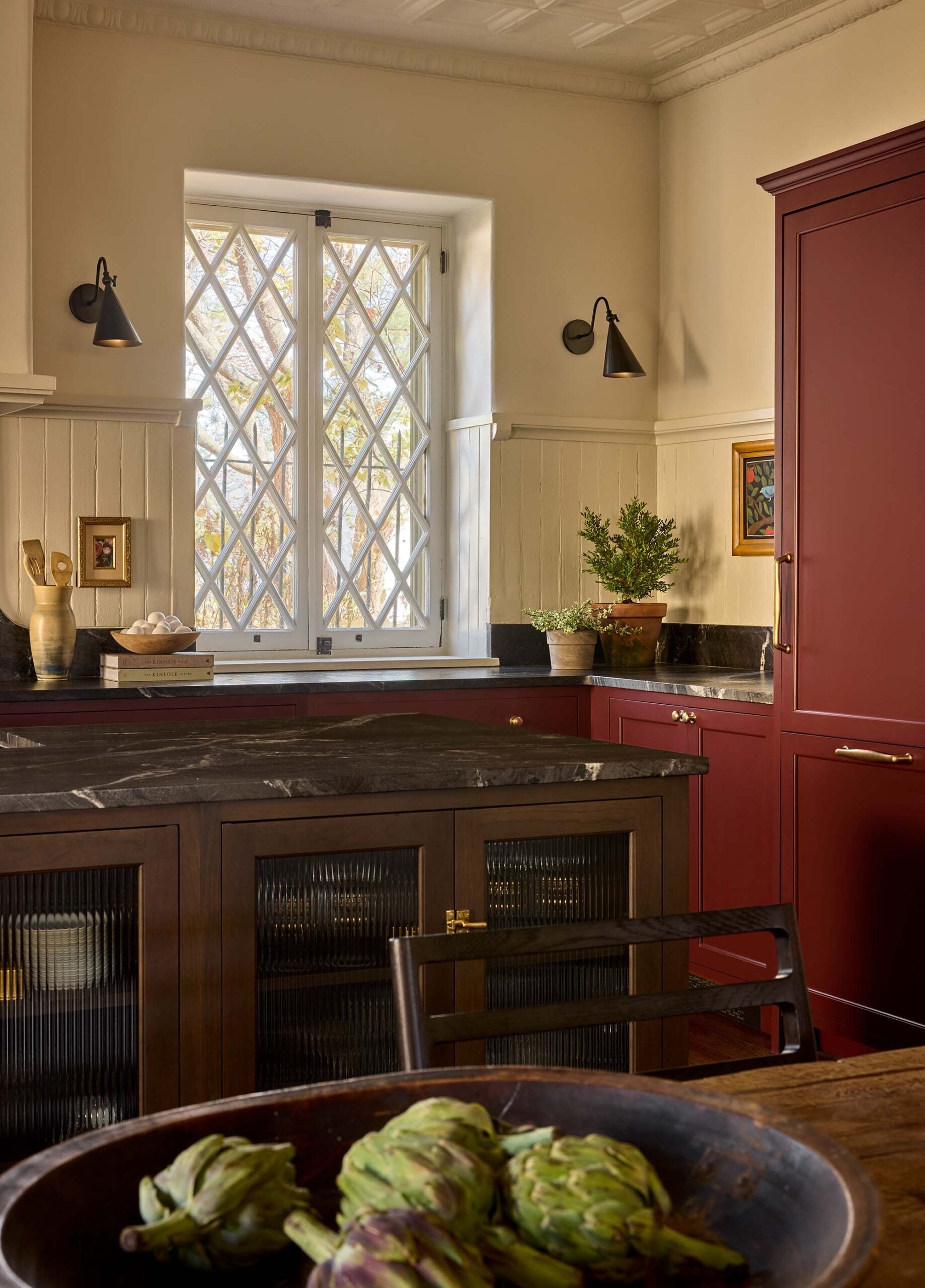
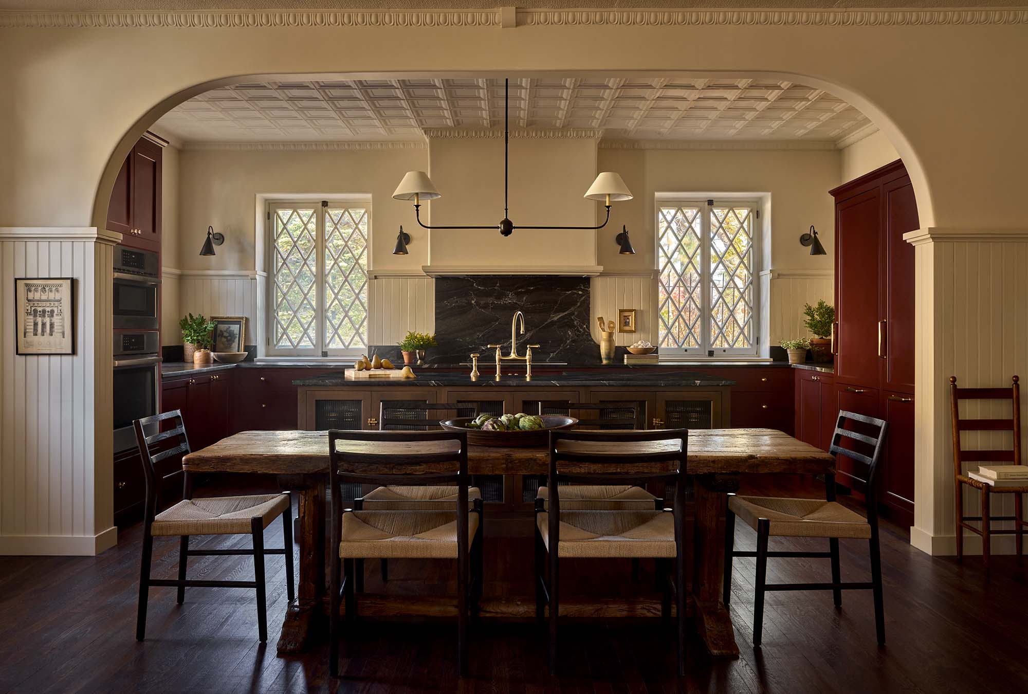
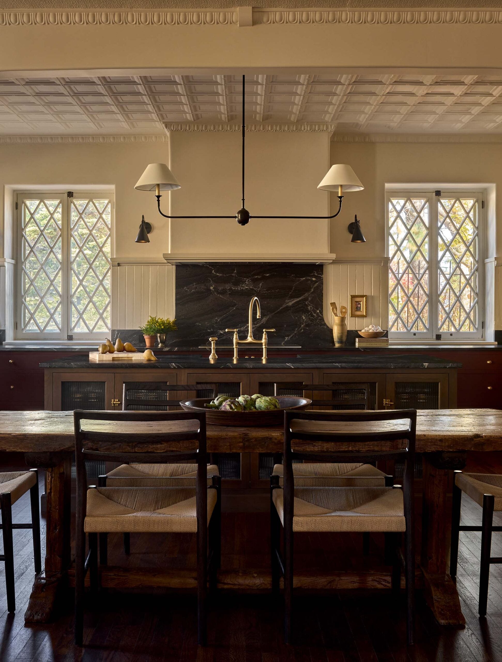
Kitchen
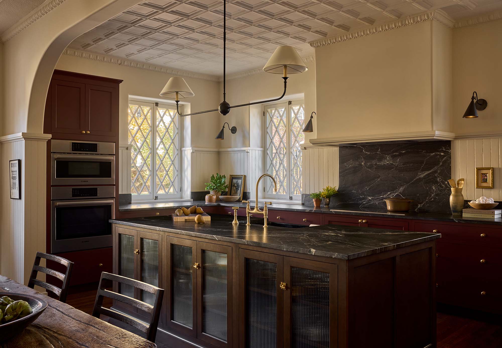
As we make our way into the kitchen, I’m struck by the original tin ceiling. Isn’t it beautiful? The designers went to great lengths to save the ceiling, designing around it, wiring behind the perimeter of added trim.
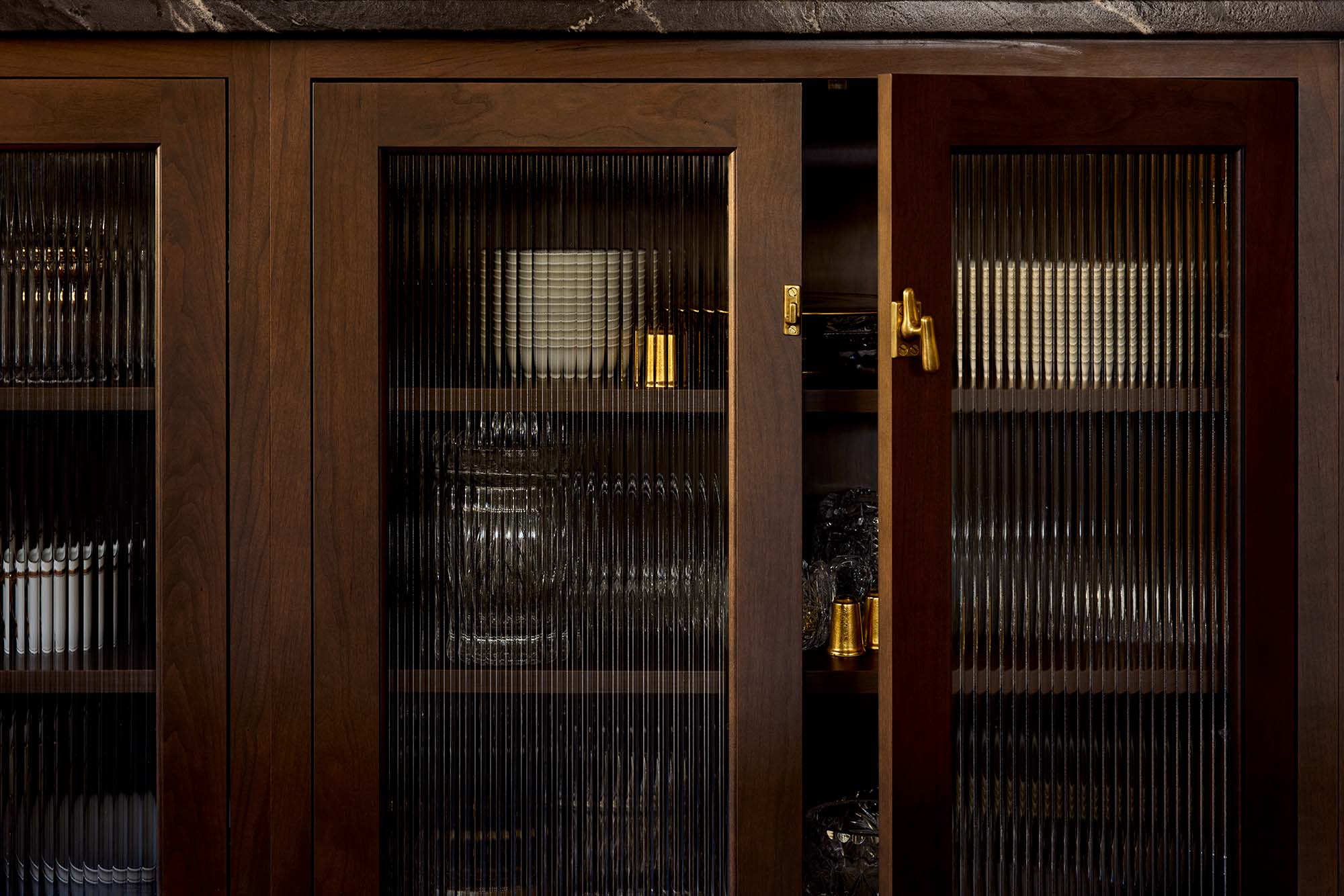
The dark kitchen cabinetry is painted in Rookwood Red SW 2802… another swatch to save! I noted the reeded glass doors that make the large island feel almost like an antique piece of furniture balancing the room. That’s an application I haven’t seen on lowers, but I really enjoy it.
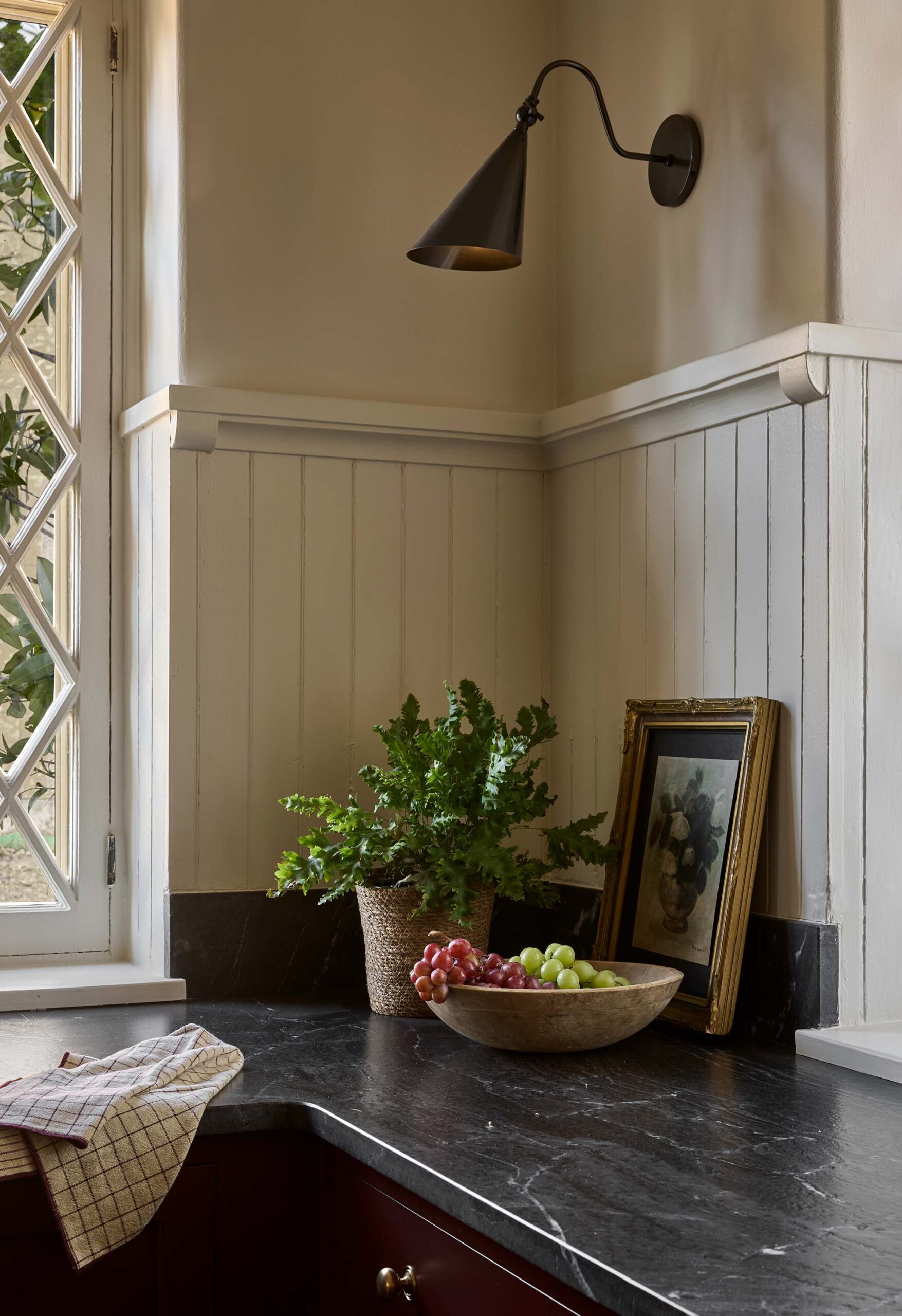
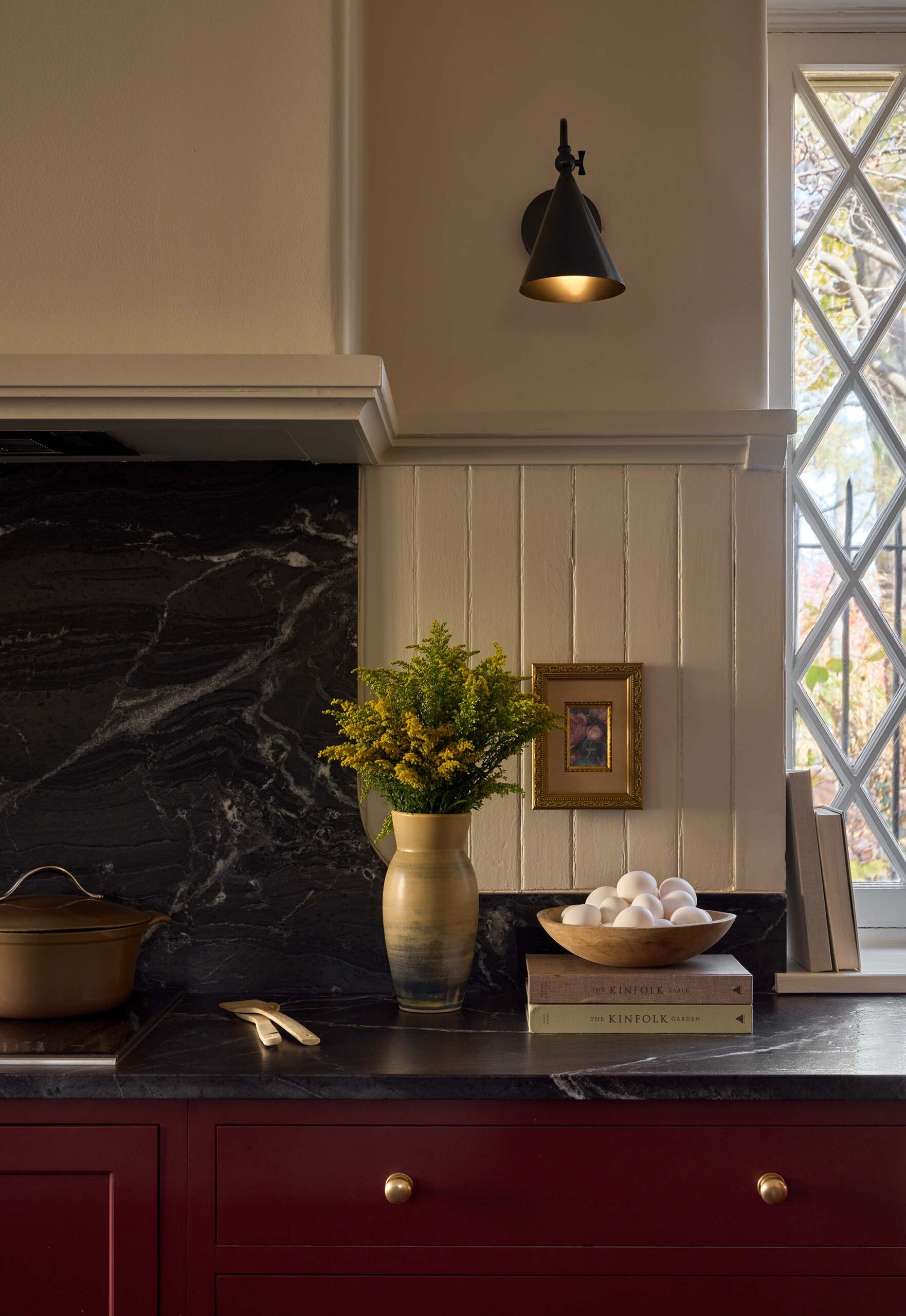
As for the countertops, they opted for nero mist granite as a durable stand-in for soapstone. Being a soapstone lover myself, I thought this was a very suitable alternative… and I especially love the contrast, veining, and movement in the slabs they selected.
Powder Room
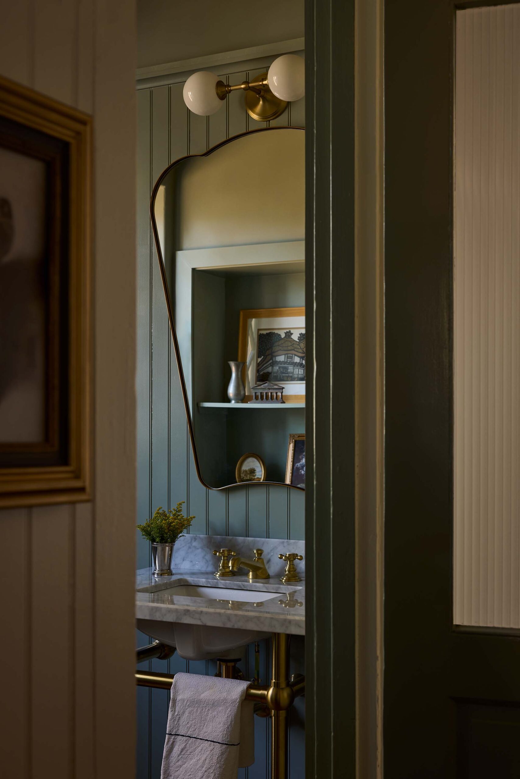
The powder room boasts a marble console sink with antique brass legs and a matching lavatory faucet. Again, I was mesmerized by the perfect paint color selection… this one is Acacia Haze SW 9132 (the designers were kind enough to share)! The modern mirror gives us a view at the opposing wall that houses built-in shelving.
FAQ Interview with Kevin & Alexis
Our client approached us to help renovate a carriage house they recently purchased after relocating to Philadelphia from Iowa. The space was most recently used as a dance studio and the owner lived on the second floor. The client wanted to move the kitchen to the ground floor, remove a spiral staircase in favor of a safer option, and create a primary suite on the ground floor to allow for aging in place. The home was designed in the Tudor Revival style by G.W. and W.D. Hewitt and built in 1902. The home originally served as a carriage house for a larger home on a now adjacent lot. The client wanted to respect the history and details of the home while creating a welcoming space for family and friends. We took inspiration from the existing building to inform the design direction and finish selections. We had a lot of original features to work with: diamond lattice windows, heavy stonework, tin ceilings, and a muscular wood wainscot. We used the existing details to inform the design while preparing the home for contemporary living.
Thank you for the kind words! Having a tin ceiling in good condition was a luxury. It adds interest, texture, and serves as a great backdrop for the space. At the same time, tin is unforgiving and a challenging material to work with. We needed to infill a few locations, run new lighting, and add the egg and dart trim around the new walls and kitchen exhaust. Luckily, we were able to find a fabricator that still produced similar trim profiles and an installer to make the new work blend seamlessly with the existing.
Thank you! For this kitchen we used Nero Mist Granite as a durable stand-in for soap stone. It requires less maintenance and still has the same look. When selecting a stone, we always push for a natural option over a manufactured slab. The depth and feel of natural stone is hard to beat. We typically trend toward more neutral colors with consistent veining for a timeless look. The profile of the slab edge also has a big impact on the feel of the room. For example, an ogee edge will feel much more formal than an eased edge. In this room we selected an eased edge to soften the formality of the cabinetry layout. The backsplash is another area where you can add interest to the design. In this case, we added a low 6” backsplash to protect from spills while highlighting the existing wood wainscot above. We also added a gentle radius to soften the transition where the backsplash steps up behind the cooktop.
The kitchen. It was transformational. The ground floor was previously wide open and served as a dance studio. We wanted to create a comfortable workspace that was beautiful and functional. The client loves to cook and the kitchen was designed full of personal touches, from pull out spice racks to a swing out stand mixer station. The space is full of natural light and plenty of counter surface for prep. We picked a deep red tone to ground the space and create a sophisticated yet unfussy feel.
Oh course! I never understand why designers are so guarded about paint colors. What looks good in one space is no guarantee it will look good in another. Here’s our list (all Sherwin Williams):
General: White Duck SW 7010
Bathroom: Wool Skein 6148
Kitchen Cabinetry: Rookwood Red SW 2802
Powder Room: Acacia Haze SW 9132
Entry Door: Antique Red SW 7587
Respectful. Context drives our design work so each project is unique but there is definitely a throughline. We work to balance the existing elements of a space with thoughtful interventions to creates spaces that are timeless and soulful.
More Home Tours
If you’re interested in browsing more home tours or are in search of more interior design inspiration, I’ll link some more for you below…
- Home Tour: Arts and Crafts Cheshire Kitchen
- Home Tour: Sun Valley Ski Chalet by Jennifer Miller Studio
- Home Tour: Townhouse by Centered by Design
- Home Tour: Mirada House by Kate Lester
- Home Tour: Charleston House by Bria Hammel
- Home Tour: Sycamore House by Josh Young
- Home Tour: Mill Road by W Design Collective
- Home Tour: Varick Apartment by Hayley Bridget Interiors
- Home Tour: Central London Townhouse
- Home Tour: Aldourie Castle
I hope you enjoyed a glimpse into this incredible carriage house. What were some of your favorite vignettes? Any standout design moments? I’d love to hear what features were most memorable for you. Will you apply any of these design ideas to your own home? Thank you to Kevin and Alexis for the fun interview and for allowing me to feature this one… and for generously sharing paint colors throughout! Feel free to send me more inspiring designers or homes you’d like me to feature. Be sure to follow for a closer look.
Good morning! This one is a treat. I love what they did here with using a historic color palette, maximizing functional and keeping design minimal. A few standouts for me are the egg and dart trim around the tin ceiling in the kitchen; such incredible detail. I feel the same sentiment with the blue subway tile against the marble veining in the bathroom. And the vanity area?? Showstopper! I also love the continuity of their choices- the Nero mist granite echos the tile floor in the entry, and its chef’s kiss. This was a fun tour to browse. I hope you had an incredible weekend!
Good morning! Hands down, that kitchen is my fave! Although the navy subway & dramatic marble shower is a close second. (But I guess a shower is not a room…🤣) Love the deep red cabinets and dark counters, and I second your thoughts on the reeded glass in the island…adore! My eyes are also thrilled at all the geometry-diamond windows, square tin ceiling, egg & dart crown. Delish. I must confess that the detail in the entire house I keep revisiting is that entry console! I’ll be google-imaging and 1st Dibs-ing my brains out later. 😆 Thanks for a lovely start to this sleepy Monday. (Yes, at my big age, I still moan about daylight savings time.) Cheers to a fantastic week, Sarah!💜