Design Eye Training : 112
Happy Friday, friends! It has been awhile, but I’ve got a new Design Eye Training post set for you today. We’ll be analyzing and admiring a gorgeous high contrast living room designed by the talented, Whittney Parkinson. I’m often looking to Whittney for interior inspiration and I love that designs in Indiana. It’s fun to watch her transform the beautiful & familiar homes I grew up admiring. Today we’re going to look at a butler’s pantry that doubles as a mudroom off of a gorgeous kitchen. You can see the entire remodel and tour here! Click through for the twelfth post in the series and chat design with me…
To quickly recap… in our Design Eye series, we observe and admire design fundamentals like scale, texture, pattern, material use, lighting plans, color, floor plan & layout, and a variety of intentional styling & interior moments pulled together by the pros. It’s an exercise I used to practice often in design school, and one I still enjoy today. By discussing and breaking down well designed spaces in greater detail, you’ll begin to train your “design eye”, build upon the design fundamentals, and can apply some of these things to your own home, if they appeal to you. I also feel like this series can really help you hone in your personal aesthetic, determining what you like and dislike… and most importantly, why. Ready to give it a try?
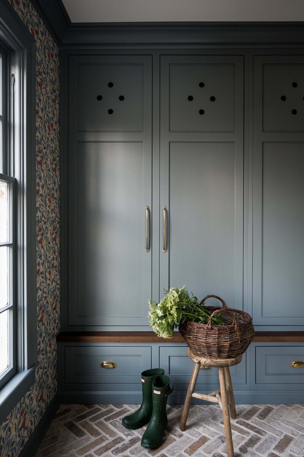
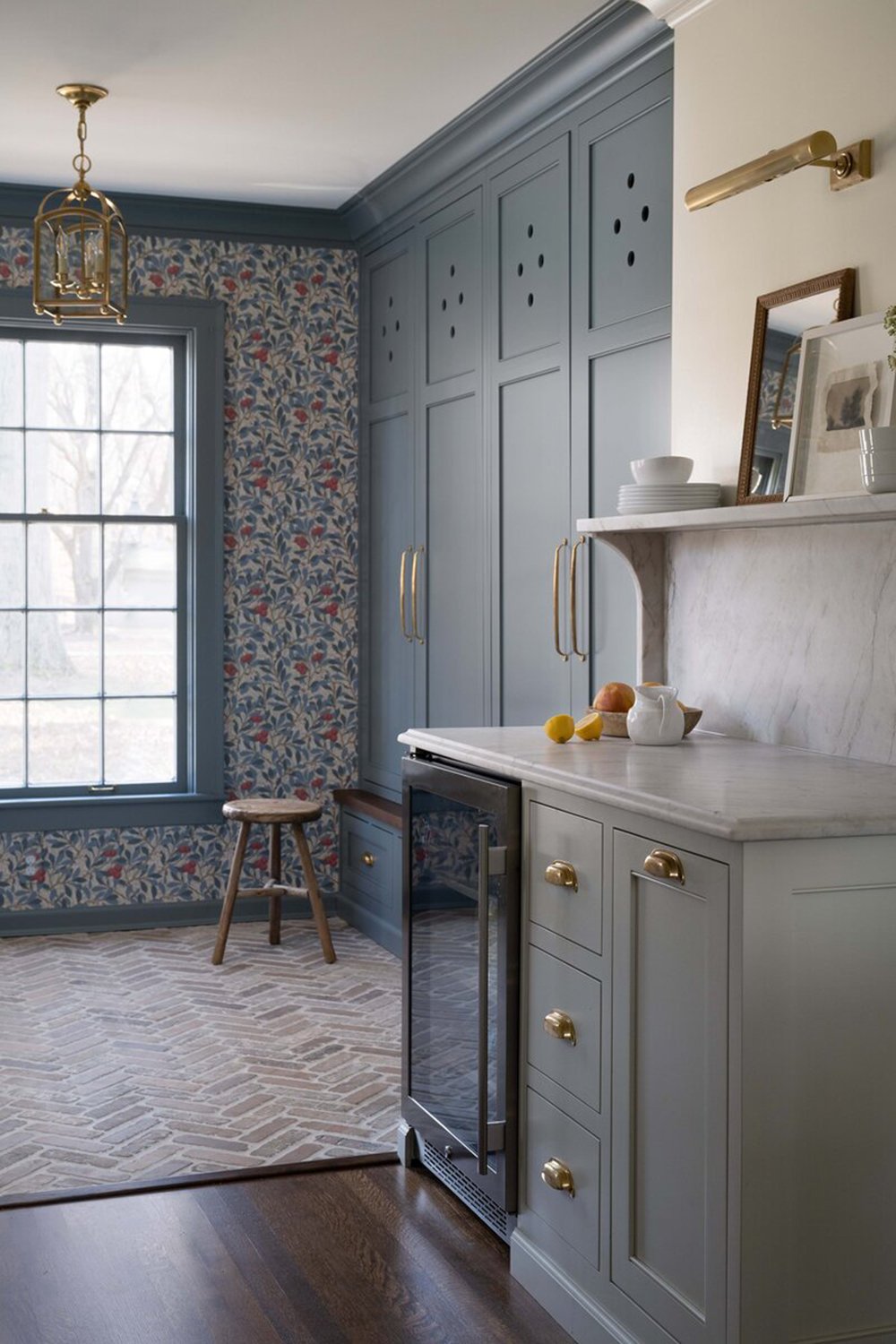
The most obvious and striking part of this space for me is the pattern play. I absolutely love the wallpaper, the herringbone brick floor, and the textural wood elements throughout the space. The millwork is also exquisitely done. Did you notice the contrast trim? The cabinetry details also really stood out to me- I noted the die cuts and slightly deeper depth of the lower cabinet drawers with the wood ledge. Whittney is so great at incorporating these little thoughtful details.
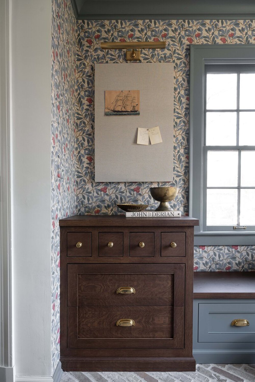
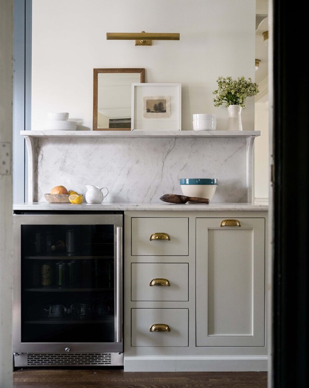
I’ve always loved the use of furniture as cabinetry- or custom cabinetry built to look like furniture and the above component is exactly that. The apothecary style drawers, the brass hardware, the inset drawers, and the entire cabinet being wrapped in matching baseboard really makes it feel fully integrated. This little area seems to double as a workspace or storage cabinet, with the pin board styled directly above… complete with a gallery light for added emphasis.
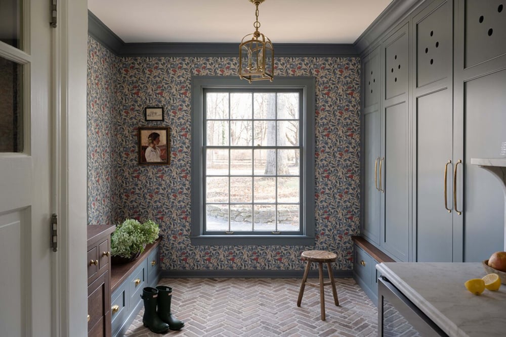
This room feels very balanced and symmetrical, thanks to the matching lower cabinets that frame each side of the room. The window allows for ample natural light, and as a result- this space looks really open, inviting, and functional. I’m also admiring the lantern pendant fixture, that I’m sure perfectly illuminates this space during the evening hours with a cozy glow.
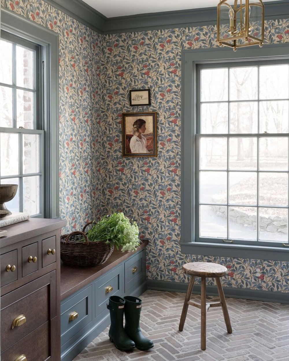
You know I love a good vintage stool, and the minimalistic styling is perfectly executed in this room. In regards to the floor plan, this space is right off the kitchen, which I’m imagining would be great for kitchen storage that spills over. It also includes a bank of cabinets with a marble countertop and beverage cooler… ideal for a butler’s pantry. I also like the styling moment that the marble shelf provides. Leaned artwork, pretty stoneware dishes, and florals add the right amount of warmth, texture, and life to this vignette.
What did you love about this room? Did anything specific jump out to you? The color palette is especially beautiful. Be sure to follow Whittney on Instagram for more traditional & classic design inspiration. She’s amazing! Here’s to a wonderful weekend ahead. I hope you have a good one!