Exterior Paint Color Combinations
Lately, I’ve really been analyzing and pinning exteriors to my heart’s content. Maybe it’s because I’ve been dreaming of adding a garage and architecturally changing the exterior aesthetic of my own home, or maybe it’s the fact that Emmett and I have been focused on improving our backyard and carport area since the warm weather has settled in for good. Either way, I thought it’d be fun to share exterior color palettes and combinations I think are timeless, classic, and true winners- no matter the style of your home. Click through for the paint colors and good examples of uses for them!
*The following images are linked accordingly to the original source, designer, or architect. These are color swatches I pulled together based on the original images to recreate the exterior look. Please keep in mind all paint should be swatched and will look different depending on your home, the exterior material, the lighting, and the surroundings that reflect and bounce color in an exterior setting. It’s always best practice to test before painting!
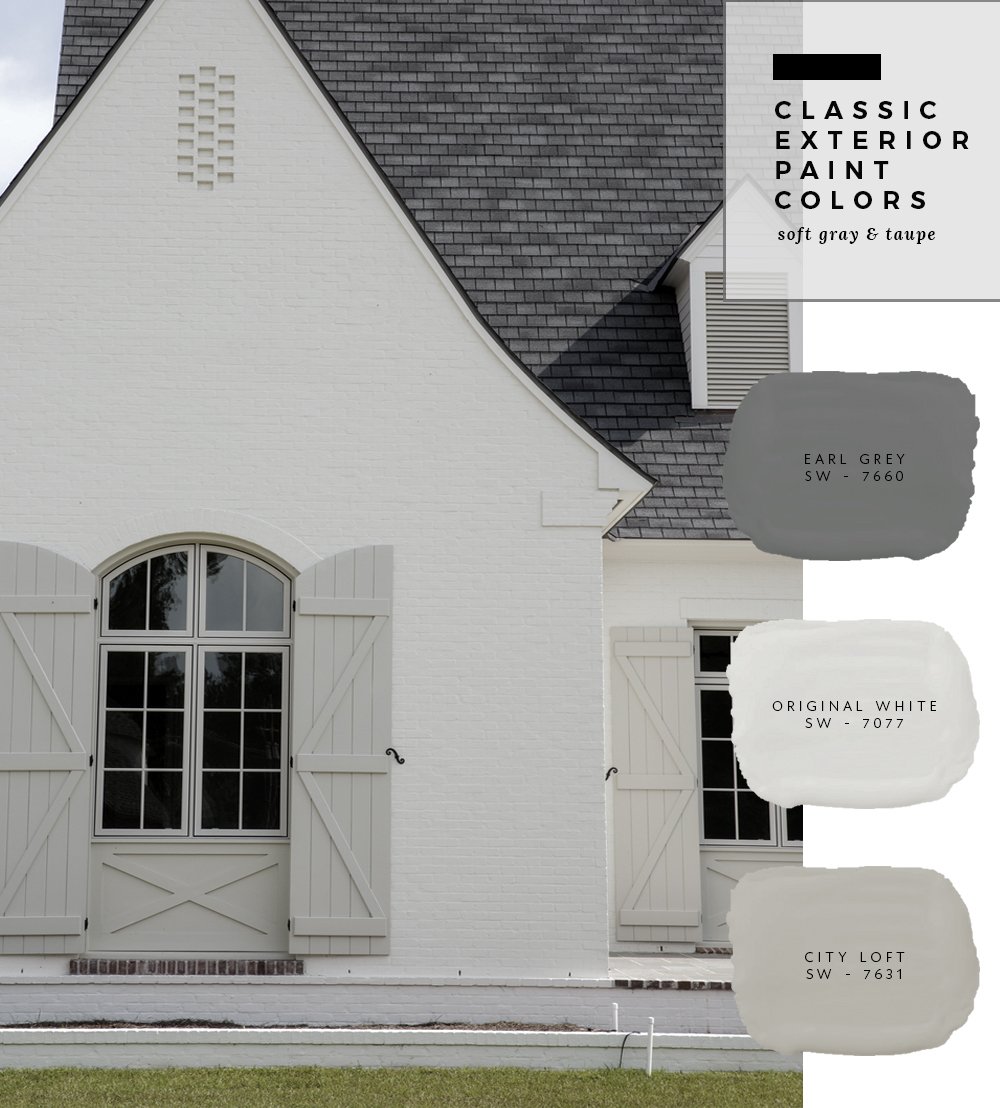
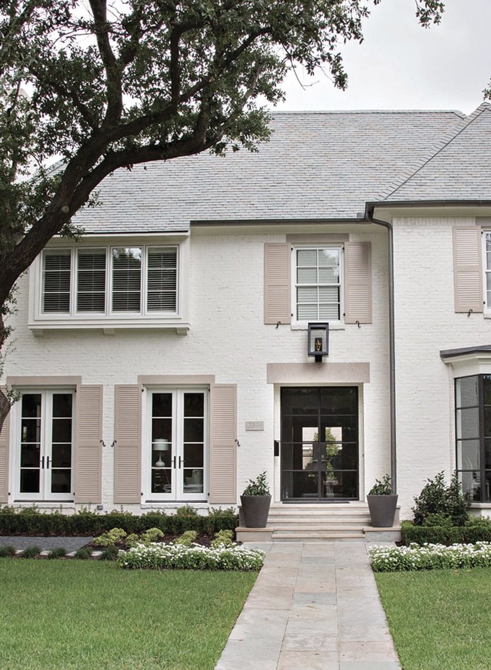
I’m kicking things off with a classic light and neutral palette. It doesn’t get better than soft creamy gray and greige tones for an exterior. It looks fresh and timeless- yet modern.
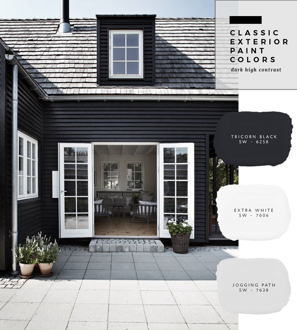
Next up, dark and moody… aka, the beautiful high contrast that occurs when you paint an exterior black. We’re actually in the process of painting our carport black right now and I’m loving the way it instantly modernized the exterior. I’m happy to see this trend sticking around. I think it’s pretty timeless, despite the fact it continues to gain popularity.
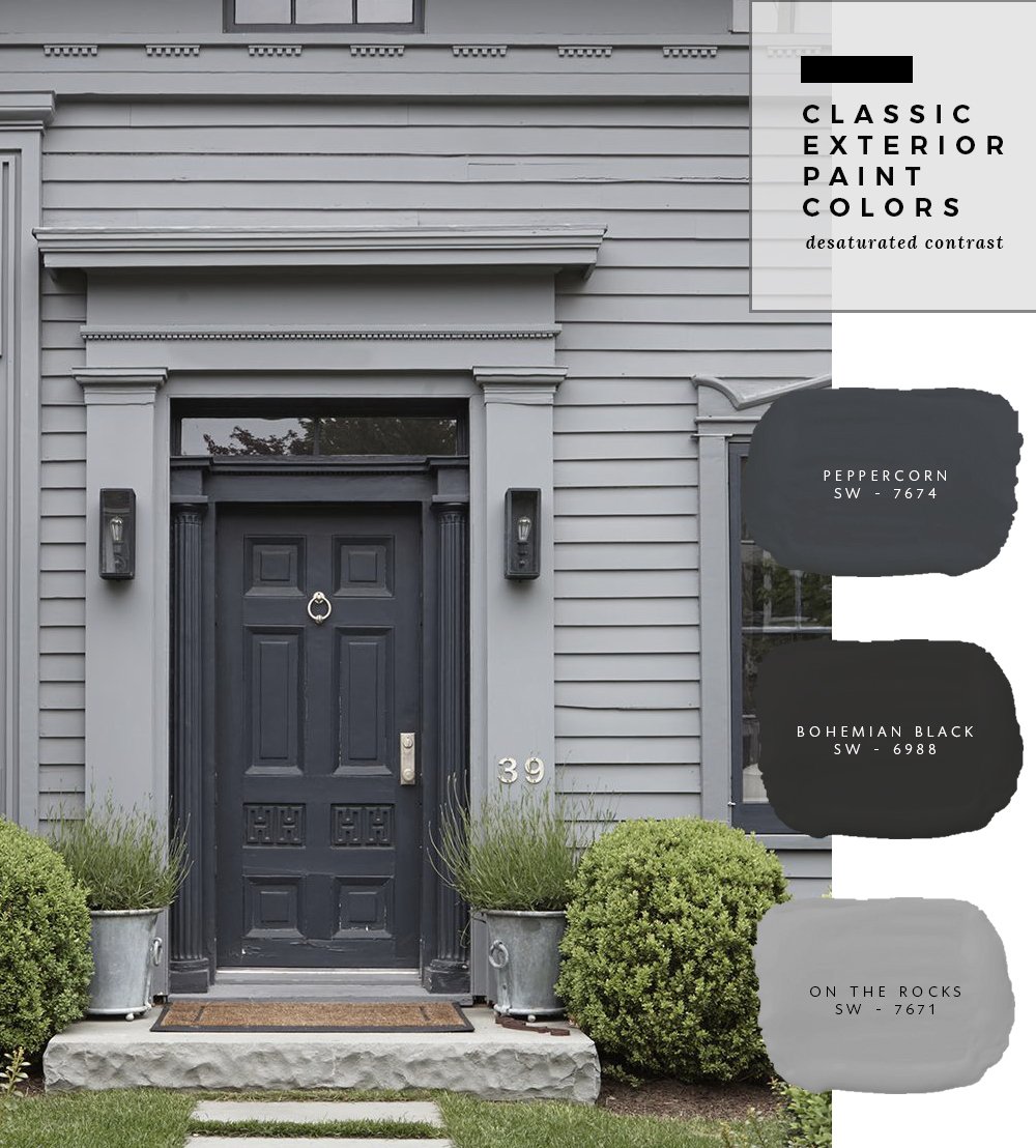
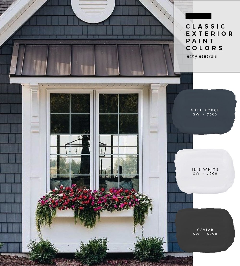
I’m officially on board with desaturated exteriors- with the tiniest bit of navy mixed in. I love the way the greenery pops off of this gray abode.
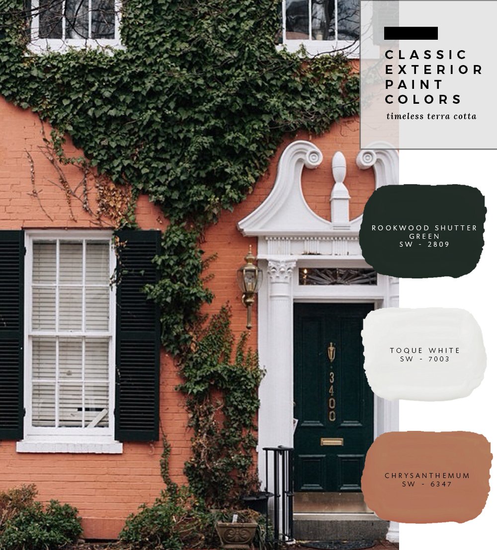
If you have a home that is begging for painted brick, but you want to keep the “look” of brick… try using a terra cotta tone. I love this fresh take on it! Add a hunter green / almost black front door, and you’ve got yourself a chic looking exterior.
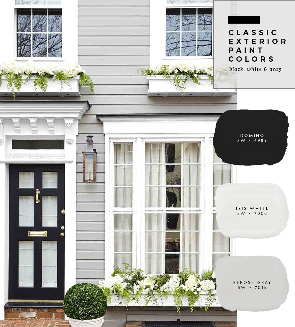
Another classic combo that will NEVER go out of style is timeless black, white, and gray. I’ll never tire of exteriors that look like this- especially when landscaped with classic, traditional greenery- such as boxwoods, topiaries, and flower-filled window boxes.
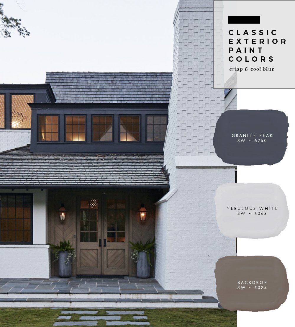
If you’re not afraid of a little color, navy or blue hues are always a classic option! I love when it’s paired with a light black / charcoal shade and crisp white for added contrast.
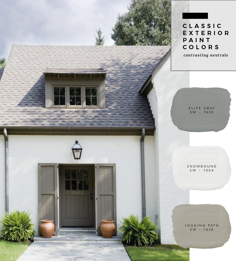
This soft and subtle taupe home is ideal for terra cotta planters and lush green landscaping. It feels very old-world and traditional, yet the color palette modernizes the entire exterior. I love that the gutters were painted in contrast to the white body. That’s one way to make a home look much more expensive and unique.
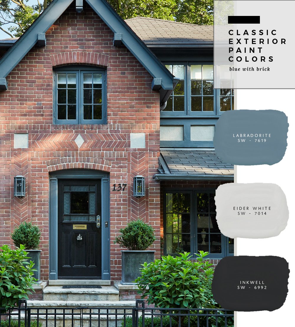
I’m all about a brick home with blue and black accents. The blue color on this timeless home almost goes a little in the direction of teal- and I’m digging it!
Lastly, don’t be afraid of classic colors when paired with wood. I especially enjoy the application of the paint on this exterior- with the second level being painted in a contrasting navy. If your home is naturally “sectioned off” try some exterior color blocking like the example above!
Do you have other favorite exterior color palettes? I’ll definitely be pinning these for when the time comes to address my own exterior. You can’t beat a classic color combo! As I’ve said over and over again in previous paint posts, it’s VERY important to swatch and test your paint before committing. Exterior paint is a bigger commitment than interior, just because of the amount and square footage. It can be costly, and nobody wants to paint their exterior every single year. It’s important to get it right and choose a style that will last for at least 5-10 years. You also have to keep in mind, a specific paint color might look totally different on your home than on your neighbors or an image on the internet. There are so many factors that come into play when it comes to color and paint (exterior surroundings, reflection, material, light reflective value, etc). Use these palettes for inspiration and be sure to swatch them!
For more exterior inspiration, follow: my front door Pinterest board // my garage Pinterest board // my general exterior Pinterest board
images (in the order they appear) : one // two // three // four // five // six // seven // eight // nine // ten
THIS POST!! I love all of these combos. Do you think that Labradorite color would work as a main siding color, too (brick second to last house)? Or do you think it might be too saturated to be more than just an accent color? I love it so much!!
So happy you like it Jacqui! I definitely think it could work as a main siding color with neutral accents / brick… it’s so pretty! xo
Whatever you choose, make sure you try out several samples! Our home’s exterior (1978 modern ranch) is stucco, wood trim, and warm-stained cedar siding, and we had the entire house re-painted/stained about a year ago. We went through a few rounds of paint/stain samples to end up with the right ones. And I’m happy to note my husband selected the winning stucco paint, I would have never even considered it b/c it looked really yellow in the store, but on our stucco it was just warm enough once next to the dark wood trim paint and warm stain.
I’m all about samples! I always use them and recommend them to clients as well- you never know until you see the paint applied with the correct lighting / surroundings / etc. Such a good point, Karen! xox
I just wanted to let you know the color swatches you put next to the picture are wrong. We painted our house the colors you put on the pictures. Thinking the painter messed up we went to sherwin Williams and looked at the colors and they’re different than the ones you put. On the rocks is actually white. We were so upset
Hi Christine, I’m sorry to hear that. Per the copy in the blog post- these are palettes I pulled to achieve a similar look to the original images. I also mention in the post, that swatching is very important before committing to a paint color because paint in an image or even on your neighbor’s house can look TOTALLY different than your home for a variety of reasons (the surroundings, your landscaping, the exterior material of your home, light reflective value, etc). Gray hues can look warmer, cool hues can turn out brighter, etc. Hopefully you’re able to find a color you love!
I didn’t read the entire post (and hence didn’t know these weren’t the actual colors) first since I was in such a time crunch to get some samples today. I scrolled right past the tricorn black house since it wasn’t the look I was going for only to realize the color I was hoping to use for trim (jogging path) looks COMPLETELY different in the picture with the snowbound and elite gray. Back to the paint store for more samples!
I’ve been mulling this over lately too, we bought a total dump and my brain is occupied with fixing the inside currently but I also know that we may need to address the exterior maybe as soon as this summer since we have seasons in the PNW. Right now the exterior is raw cedar that could really use some power washing and love or paint and the trim is a weird kind of blue with maroon around in weird spots. The facade is mostly garage/shop doors (3!!) and I am really wondering what to do here. I love contract exteriors and even dark colors but I’m not sure if that make this place seem odd with that much garage door space and do we paint the cedar or leave it!?!.. I wish I could send a picture and get reader (or professional) advice…it’s one of those things that’s really got me stumped…
contrast not contract
Love this! The exterior of our home was alllll brand new when we moved in, two years ago… but all in beige/brown tones. No white or contrasting colours to be seen. We’ve added some easy updates but eventually want to do a lot more work. How does one find someone who can do realistic drawings/renderings?? It’s so hard to plan when you can’t visualize!
Where are these paint colours from?
All of the paint colors in the post are Sherwin-Williams brand.
We are scheduled to start construction on our new home next month and I’m still looking for the “perfect white” for the exterior. The house will be on the river in Savannah, GA, partly in the sun, partly shaded by mossy oaks. I do not want a “toilet bowl white” as my husband puts it, but I don’t want too many undertones either, just a warm cozy homey white. We have been planning for a stained medium wood front door and dark green shutters, for which I still haven’t picked the exact paint color. There will also be black iron on the large second story river-side porch as well as up to the front door (as the home is elevated). We are planning for the roof to be a charcoal shingle. If you have a white exterior and green shutter paint combo combination suggestion, I’d love to hear it! Thanks!
I’m a big fan of Alabaster, Origami White, and Snowbound… all by Sherwin-Williams. They’re nice and creamy- not too sterile. Hope this helps! Good luck with the construction; that’s so exciting!! xo
Hi! I wanted to follow up on our house. We are finally moving in! After many paint samples we decided on BM China White with Marvin bronze windows and are still loving it. Thanks for your help, your blog was definitely a great starting point for us.
Anna
Hi Anna, Congratulations!! I’m so excited to hear that. I bet it’s beautiful. Enjoy making it your own :) xo
Hello, beautiful ideas. DO you have to do a primer on the brick?
Typically you’d want to apply a latex primer before painting, unless you’d like the brick to show through or are painting a wash. Hope this helps! xo
We’re painting one of our properties in Nashville TN right now… All the out buildings have been painted, shed, shop, garage which are wood siding.. The main house is brick.. Our painters that work on our properties recommend that you power wash the brick prior to priming so as to remove any mold/mildew,etc.
Check out this tutorial on painting brick, Wayne. Hope it’s helpful! https://roomfortuesday.com/how-to-paint-exterior-brick/
Are the colors you pinned SW, BM or some other brand? I have white siding and brick and want to do a accent on my brick. Love image #8!
I color matched for Sherwin-Williams colors, but the images are from other designers (see the links at the bottom). If you’d like to know the exact color, you’ll have to message that specific designer. Hope this helps Rachael! xo
Great website, if I pick the Gale Force “Navy Neutrals” for my cedar ciding, what color front door do you recommend?
You could go black or white for a classic look!
Sarah
I am plastering my home and am looking at a soft warm gray to accent my windows that are white and my roof that is deep gray. I have wanted my door to be languid blue from SW… Any ideas.. I have Revere peuter and lattice SW as samples but the lattice was too light and the RP was too dark.
Thanks
Emily
On the classic light and neutral colors palette, the house is original white, the trim is city loft, where is the earl grey?
Doors?
Roof?
My home is white stone with driftwood roof ( beige brown with specs of light green). Can you recommend colors for the siding and trim. I do love the colors in the photo with repose gray, ibis white and domino. Would this combination be a good match or do you have any other recommendations?
Hey Sarah! We have a brick home with a fairly new brown shingled roof. The brick is a boring red/brown so I’d love to update. I love greys but not with this roof, I’m afraid. What would you recommend?
Hi Tonya! I think you could either go light or dark… perhaps a white hue or darker color such as navy?
Hello Sarah! Were painting a new building repose grey (at 125%) and will have black window/doors. (it’s a professional building) and wondering if you have any suggestions for a good white trim to use with that color scheme?
These are all great color combinations! If I were to send a photo of a building I own, could you suggest a color to paint the trim?
Hello Sarah,
I love the classic greys and Taupe for exteriors. I’m in uk so SW brand not available. Do they send out cards/swatches so I can match up??
I’d definitely send them an email inquiry and ask! I wish I had the answer for you. I’m sorry!
This is a great post to help visualize different exterior colors of siding, panes and roofs!
So happy it was helpful, Miranda!
Hello, on the second picture I can’t see where you used the Earl Grey?
Do you know what colors were used on the title picture? Specifically on the shutters? Thanks!
Thank you !So helpful! I wish I saw this a year ago as I’ve already committed to a bm bravarian cream house with bm Marscarpone trim on my French style home. I am very stuck on front door shutters and garage doors colors though! I like a few posted here but appreciate any other suggestions.
We, unfortunately have new sand colored windows, a special order mix up by our contractor. What would be some color combinations for tan or sand windows?
I love the idea of sand / tan colored windows! I’d opt for black accents and white siding / brick / exterior :)
Love this post! We are doing dark gray siding with white trim and are trying to figure out a color for the front door to make it pop. What would you recommend? Maybe the labradorite or perhaps a light aqua? We love the idea of blue but don’t want it too close to dark gray.
Hi I want do a warm white on my brick home and am also needing to replace the windows. Will plain old white windows be ok with a warm white, probably like Snowbound? Front door and shutters will be either a light grey or a blue/grey. I would so appreciate your thoughts.
It really depends on the type of windows, Anne! Without seeing them I’d hate to say for certain- but I’d say they should be ok… Snowbound is a great neutral white that can adapt to warm or cool hues. Hope this helps :)
What are the colors of the first house in this post, cream tab and black? This is exactly the look I’m going for but want to know exact colors. Thank you
Hi Renae! I linked the original sources at the bottom of the post- check those and try contacting the designer / source. Hope this helps!
Hi, Living in south Florida, I’m looking for exterior paint colors. We have a red barrel clay roof. Currently our house is a soft yellow with a white trim.
We need a change.Can you please recommend some options?
Thank you!
Hi sarah! There are two paints labeled “jogging path” here… the first being very light, and the second being much darker. do you know which one is more accurate? I wanted the darker but when i went to the store, it came out light like the first one!
I love the brick on the home with the labradorite. Does anyone know what brick that is?
I have a questions about soffit colors, I didn’t think soffits were generally painted, I am going from a red brick/red painted wood cottage/bungalow and looking at the neutrals in the subtle taupe colors above, the soffits in the pictured house don’t seem to be deep and look like they match the gutter color, is that what you recommend? Also rather than paint gutters could you use bronze gutters with those colors?
Hi Sarah
I was wondering if you’ve ever posted exterior color combinations for orange-red tiled roof & cream coloured brick on siding??Im having such a hard time deciding what color to accent with..ie; front door,planters etc..also we have to replace gutters??brown or stay with white??
Hi Charlene! I haven’t, I’m sorry.
Hi Sarah! I love this post and would love ANY suggestions for exterior paint for our 1970s farmhouse that we are getting ready to re-side. It has a dark brown roof and wraparound porch with a slate colored patio in the back. I am not good with decisions and feel completely overwhelmed with so many choices!!! Just want a clean, more updated yet timeless look.
Hi Sarah! Do you have any plans for a similar post like this in 2022? The images you chose in 2018 are all timeless, but I’d love to see any other exteriors that caught your eye over the past few years. I know you plan out your blog post calendar, so I’m just bumping this topic idea for consideration if you have any blank days!
Hi Alexa, I actually stopped sharing paint posts (especially like this one) because I think people forget that paint looks different in every setting. A color inside (or outside, if we’re chatting exterior) my house will most likely look totally different at yours. Color is tricky since it absorbs and reflects its surroundings… I’ve never taken on virtual paint consultations because of that. I love making suggestions, but it’s important to use swatches for your specific scenario. Long story short- I was tired of receiving negative messages from people who used exact paint from my posts that doesn’t end up looking the same as the swatches online. It’s also tough to translate color on a monitor or screen, since it’s displayed in RGB. I think many missed the inspirational part of these types of posts. I also envisioned them as a jumping off point. Hope that helps to clarify :)
Hi Sarah,
I have white vinyl windows with stucco trim over each window. I have a black gutter and black shingled roof. It’s a ranch house, so not a tall roofline in front.
What are your personal favorite (hopefully timeless) color combos for my stucco wall and foam window trims? What sheen for the trims?
Thanks in advance….