Reader Design Dilemma : Bathroom
 Back in June, I announced a new series I wanted to try… do you guys remember me asking for YOUR design dilemma entries? Well, I selected five to tackle and although they’re taking a little longer than expected, I’m excited to share the first completed project of the series! Click through to see how I helped the most amazing Florida reader, Jessica, wrap up a dreamy bathroom project and encouraged her to embrace a little color in her beautiful home full of neutrals! I have a feeling you guys are going to like this one…
T H E D I L E M M A
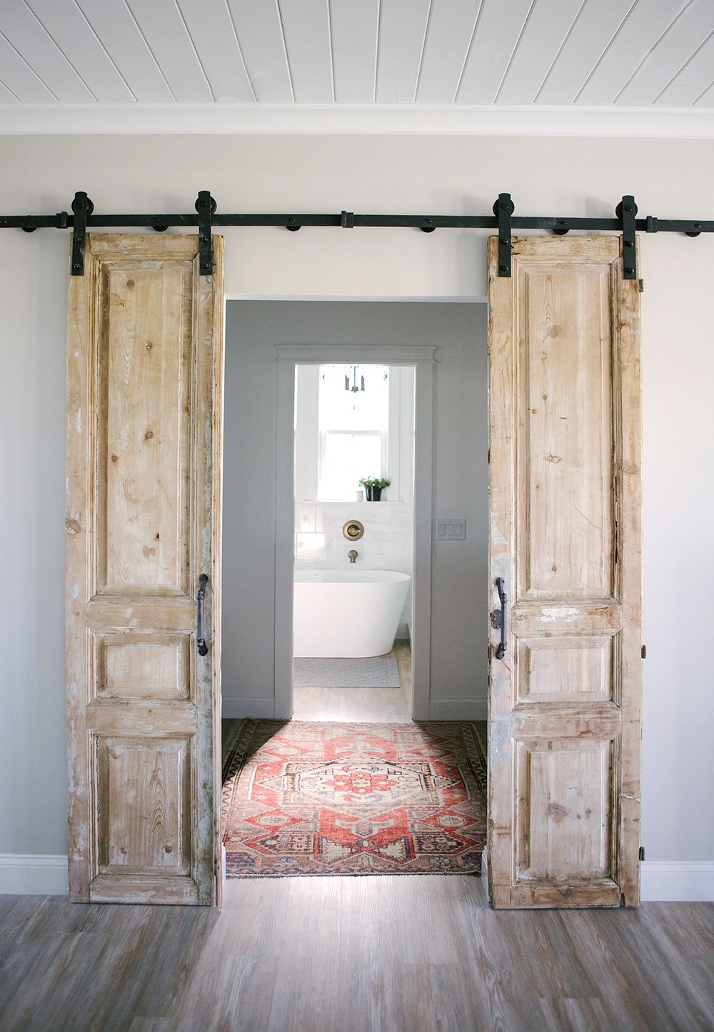
“I’m having trouble finding the perfect rug for our new bathroom. We have beautiful vintage barn doors as an entry point that lead to the tub and we need something to compliment, but not take away from them. I need help pulling the space together and completing it!” -Jessica
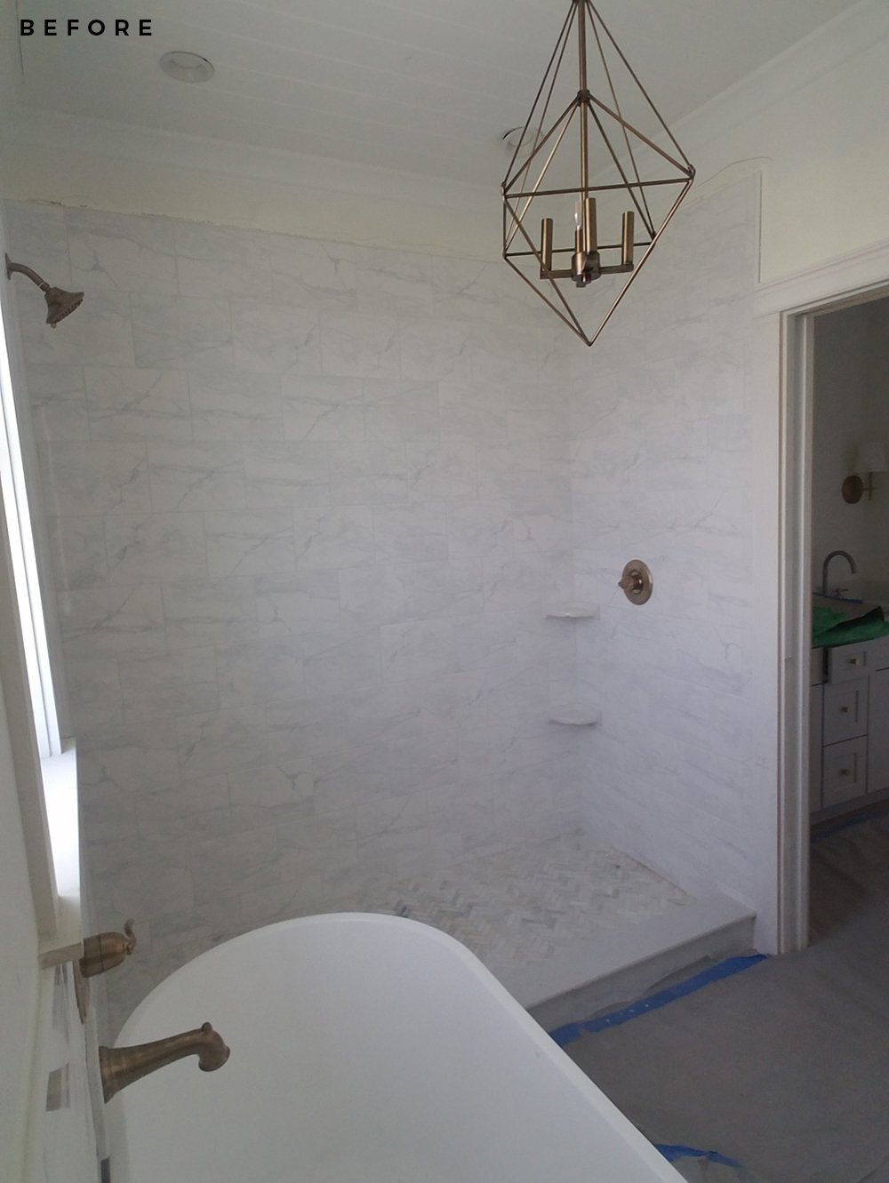
I have to say- this was an easy and fast project! Jessica had already designed a beautiful bathroom (she has a great eye) that was nearly finished, she just needed help tying it all together. Here’s a shot of the space during the construction phase right before we connected…
 During our first conversation, Jess asked me to help her find the following… all within an $800 budget:
- a pair of vanity stools / ottomans
- one or two rugs
- accessories
- artwork
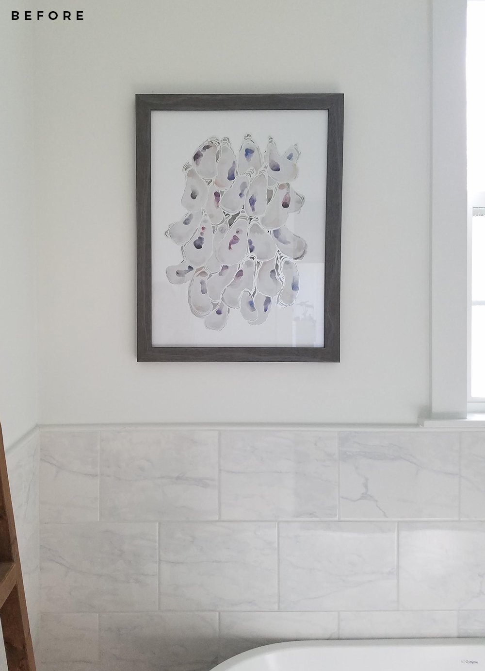
Easy peasy! I asked about her aesthetic, looked at other rooms in her home, and asked what she hoped to achieve in the space. It became obvious that she was super comfortable working with neutrals, but wanted me to assist with adding color in a sophisticated way. Given she needed a rug and updated artwork, I thought that would be the perfect place to insert personality. Here’s what the existing art looked like (shown below)… I wanted to find something more traditional with a bit of color to tie in the vintage rug. The previous art felt too modern for the look she wanted to achieve.
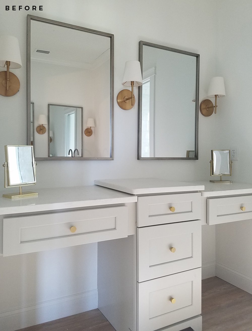
 Jess also asked if there was anything else I’d swap out, so I made some minor suggestions… one being trading the rectangular table mirrors (pictured below) for one round, vintage option. Sometimes too many shapes in a space can look repetitive in an overwhelming way. Throwing in a different number (I like odd numbers when it comes to design) or a different shape is a great way to break the grid and shake things up. The same goes for mixing metals… everything doesn’t have to look matchy matchy. When you get to the reveal, you’ll see how this little change made a BIG difference!
T H E P R O P O S A L
This is the floor plan I ended up proposing to her… given the odd shaped bathroom, and the fact that it is divided into two separate spaces- I felt two rugs would be more functional than a single runner, like she had initially imagined.
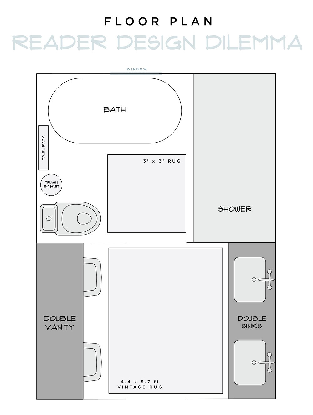 It was a bit of challenge to find the perfect vintage rug to fit the space, but I sourced three amazing options from Etsy. The one she selected actually worked well with the floor plan, because it allowed the vanity ottomans room to slide in and out without catching the edge of the rug. It was literally the perfect size. In this circumstance, the stools either needed to be all the way on the rug or totally off- and given the vanity has a column in the middle, that meant off was our only option. Below is the mood board I pitched to Jessica, and lucky for me- she loved it all!
Sources are linked below… if you’re interested in shopping the space- just click each product to be redirected.

I think it feels really curated and balanced with the added color and texture, don’t you agree? I linked similar options for the vintage products (the turkish rug and table mirror), but everything else is very budget friendly and accessible! Here’s how it all came together…
T H E R E V E A L
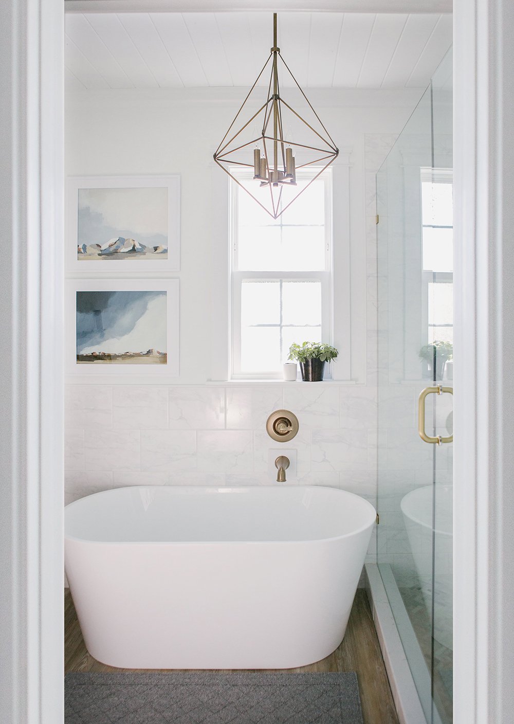
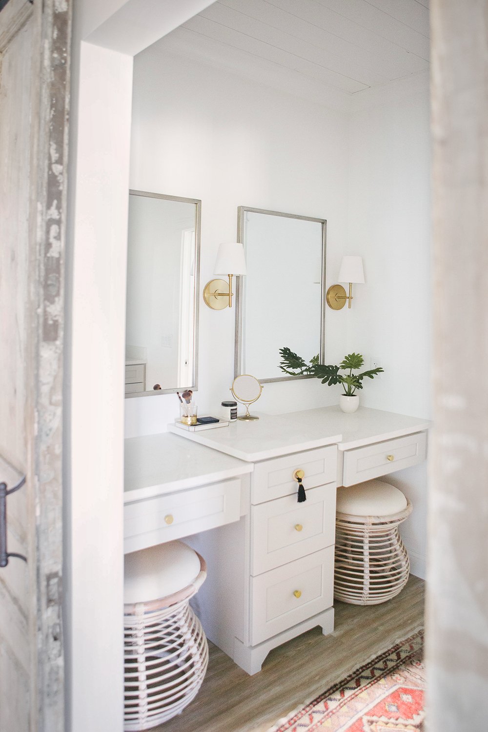
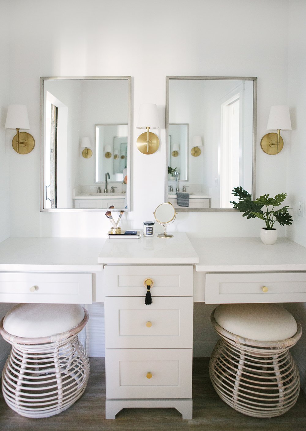
 Check out the totally finished space… I love how it turned out and I’m pretty sure Jess does too! She had an amazing start and took care of the most difficult part of the project- the only thing I had to do was find the missing puzzle pieces.
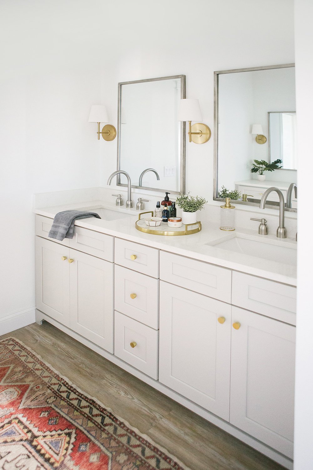
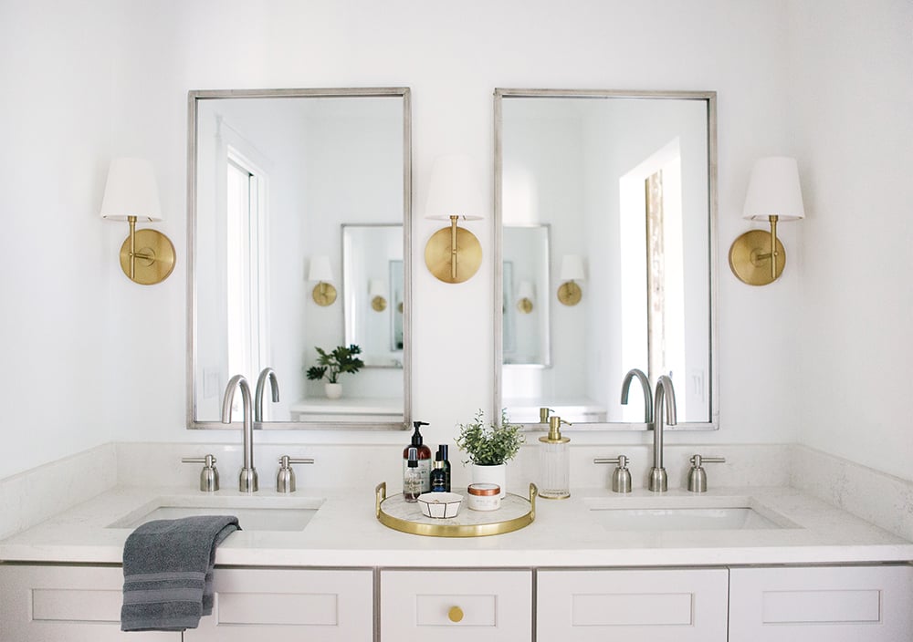 I was really happy to see that she mixed metals in the space! That’s something that intimidates a lot of people, but she executed it beautifully. The quartz countertops are very kid-friendly and perfect for her family. It was a smart decision for her to add a backsplash and side splash as well, for easy cleaning.
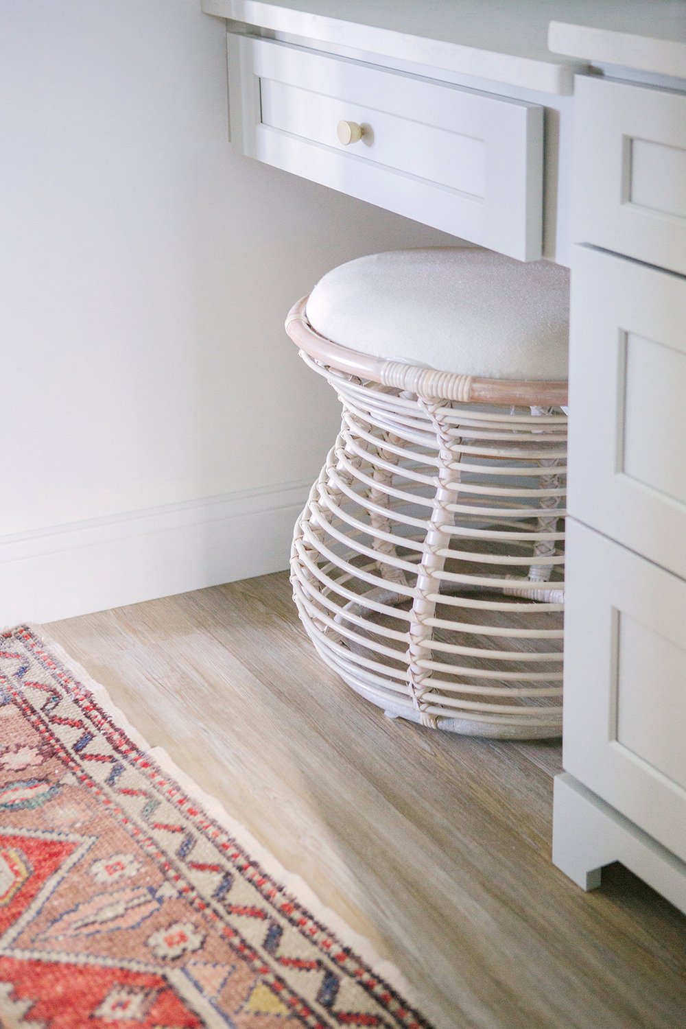 I love the upholstered rattan ottomans that perfectly slide under the vanity. I think they help the space feel more collected and less “farm house”. If there’s one thing I’m not into… it’s a themed space. For example, just because your favorite style is hollywood glam, doesn’t mean every single piece in your home has to be hollywood regency style.
Barn doors are difficult to pull off- I’ve seen a lot of poorly executed projects. The key to making it work or feel less expected is to bring in other styles for balance. The stools sort of have a bohemian feel that make her Florida home look curated and layered. I also have to talk about their shape… I love that organic curve!
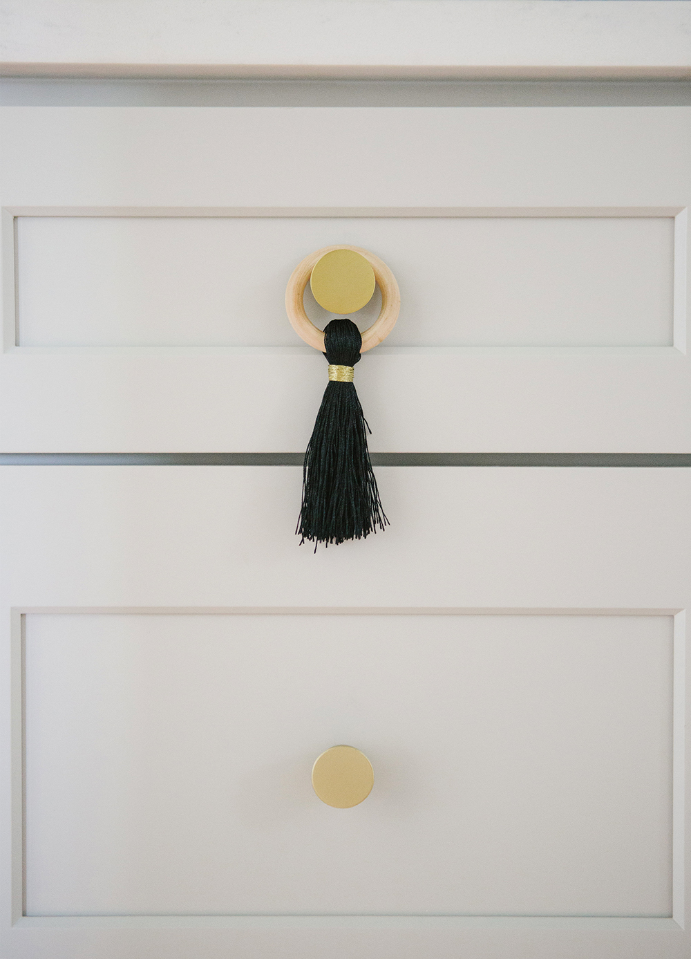
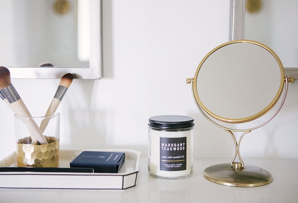
 I had the vision of adding a fun decorative tassel to the vanity for a feminine touch, but I couldn’t find one I liked online. Jessica took the DIY route and seriously nailed that thing! Doesn’t it look amazing? I should’ve asked her to photograph the process for a tutorial. Ha! But really- that’s how fantastic she is. I absolutely adored working with her. She ran with every single one of my ideas without question. That’s basically the dream as a designer. How cute is that tassel though? I want one.
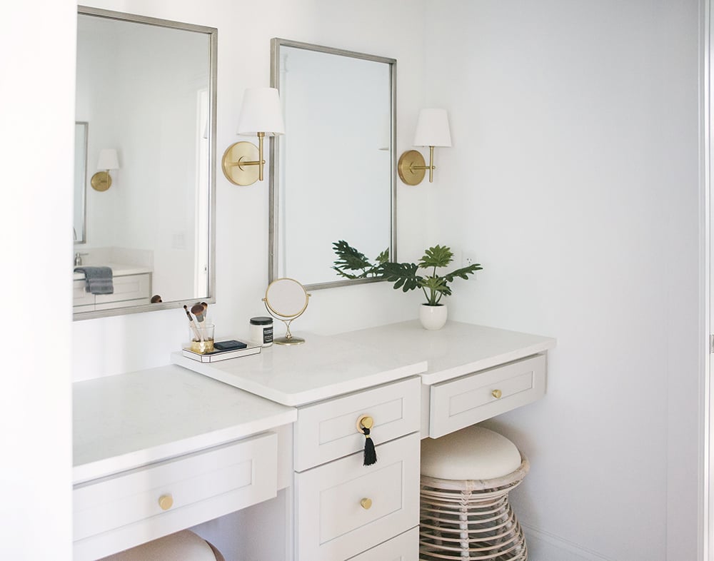 Remember me talking about removing the two rectangular table mirrors? Doesn’t it feel better? Sometimes it’s unintuitive to break the balance: two vanity seats + two wall mirrors = two table mirrors… WRONG! It’s actually a really common design mistake. I love how perfectly Jessica styled the new vintage mirror. Not only did I have her remove a mirror, but I suggested a totally different shape. It breaks the grid, can be floated around for functionality, and ties the sconce backplate into vignette so well. I’m really liking it! Less can be more.
 I also wanted to find some objects that would encourage Jess and her girls to leave everyday items out on the countertop for easy access. I found these bath accessories that are great for keeping cosmetics and jewelry contained in an organized fashion.
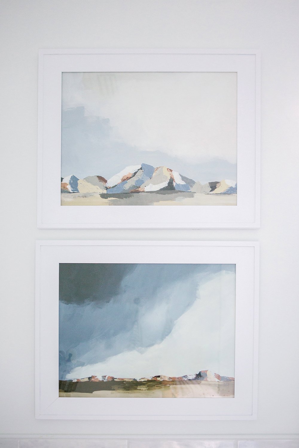
 Moving into the bath and shower portion of the room, you’ll notice the new artwork and bath linens. I love the traditional color palette of the paintings and the fact that Jessica was able to customize the size and frame. Minted is one of my go-to resources for artwork because of that very reason (it also fits the budget)!
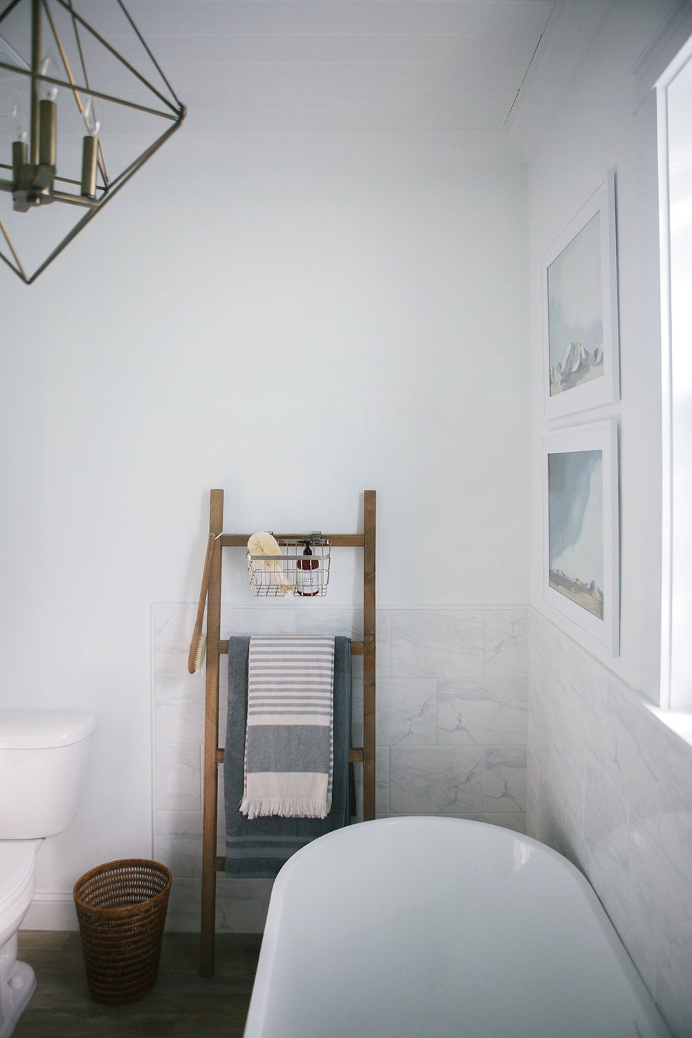
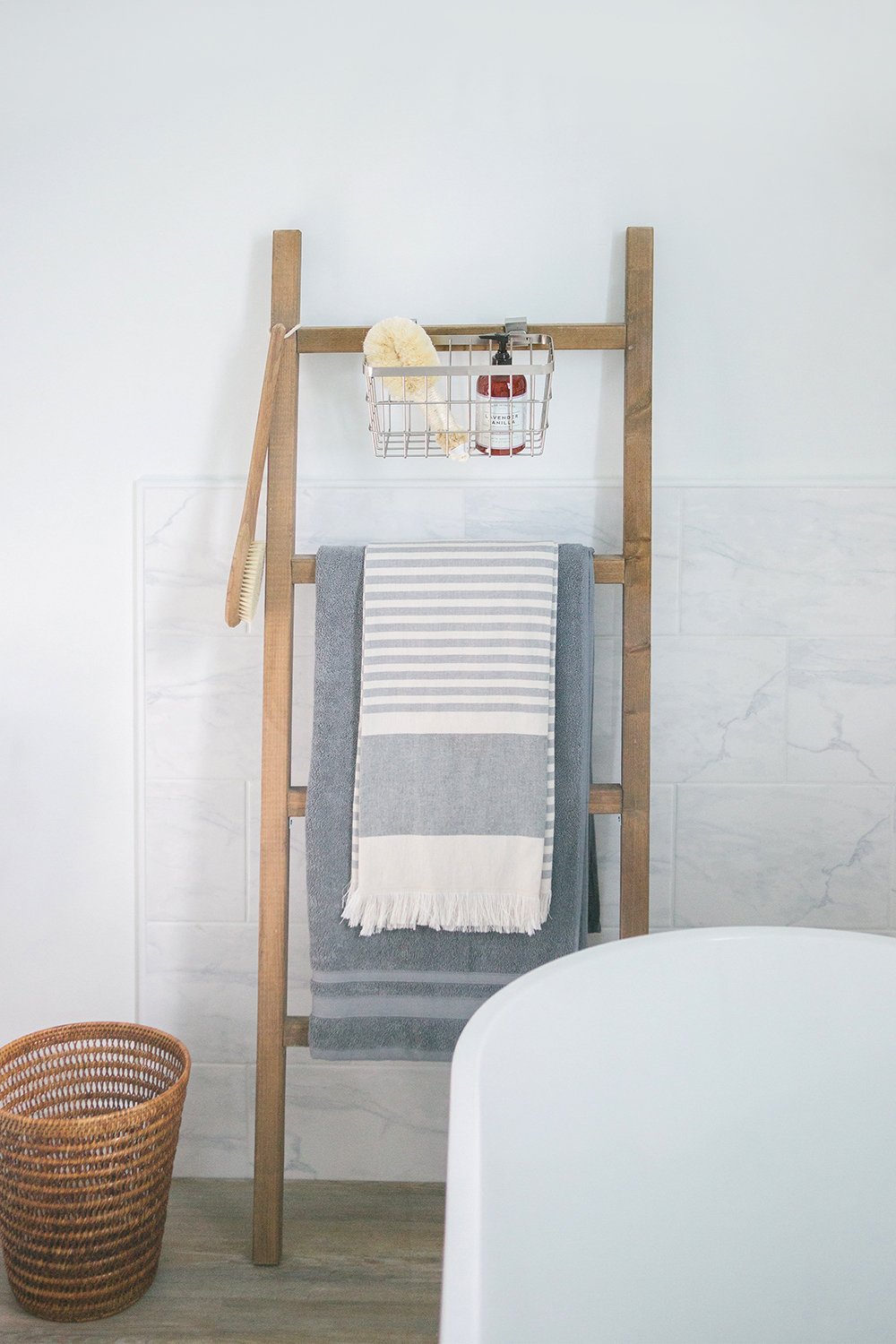
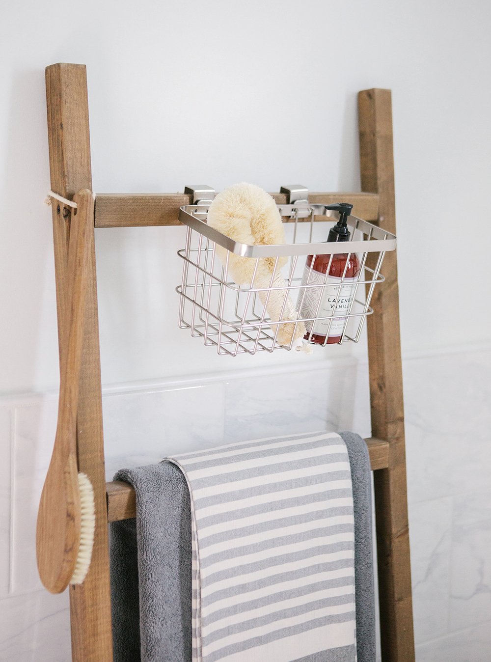
 She already had this cute linen ladder, I just made suggestions for layering the towels and bath products. I like that it’s functional and aesthetically pleasing alongside the soaking tub.
 If you’re wondering when the next reader dilemma post is scheduled, that’s a great question. I’m letting the homeowners take the project at their own pace, so it all depends on how motivated they are to finish. That’s part of renovating, right? At least that’s how it should be, in my opinion… it’s much less stressful. I can tell you, the remaining four projects are all really different- and all have varying budgets / dilemmas. It has been fun to help readers problem solve!
 I hope you enjoyed the first post of the series. I’d love to hear your thoughts on Jessica’s bathroom in the comments below! Didn’t she do an amazing job? My portion of the project was nothing compared to hers. Giant thank you to Jess for entering and being so open-minded to my ideas. I hope she and her darling daughters will love this bathroom for years to come! If you want to see the rest of her home, she has a beautiful Instagram feed- check it out here.
*Special thanks to my Florida friend Natalie Mathers for photographing the space for us!
Welcome back! Yes to all your suggestions! Those stools, rug and artwork were made for that space. I look forward to your other dilemmas/solutions. Tricky (and trusting!) to put your content timelines in the hands of others.
Thanks so much, Peggi! It might be a long series based on completion dates, but I think it’s fun (and realistic) to show the process. Hope you have a great week! xo
When you posted this Design Dilemma back in June, and directed us readers to provide just ONE sentence to explain the situation, I felt my description to be very bare. Loads of other readers wrote you a paragraph. I wish you had either stuck to your “rules” (if someone wrote more than one sentence, maybe they weren’t considered) OR adjusted the rules for us “follow the directions/one sentence provided” readers an opportunity to elaborate. Just my $0.02.
Thanks for the feedback, Sally! I based my selections more on the project itself and less on the description. If a project was a good fit, I emailed the homeowner for additional details before making the final decision. The process was very fair and I don’t think the length of the description would have changed the outcome. I tried find a variety of projects of varying dilemmas and budgets. Hopefully you enjoy the series, and if it works well- maybe I can run it again and ask for more entries. Hope this helps to clarify! xo
Perfect solution and ideas. This bathroom looks amazing. I love it all.
Thanks so much, Marty! It was a really fun one. xx
GAH! This looks amazing and I love this series. This is probably the #1 thing I struggle with is putting the final decor into a space to make it feel eclectic and homey. I’m very excited for the next room redo!
Also, am I missing something around the vintage mirror? Did the owner end up replacing the 2 mirrors for 1 vintage one? I read the post as she did replace it, but I look at the pictures and I still see just the 2 mirrors.
Thank you, Mary!! I also think this series will be fun… even if it takes forever, ha. I also think that styling is a big issues for many people- just tying it all together and making it feel cohesive and inviting.
For the vintage mirror, it’s the TABLE mirror- not the wall mirrors. The before image includes two silver rectangular options, and the after image has one round brass option. Hope this helps! xo
It turned out soooooo good!! I absolutely love the rug you chose and the entire space truly looks like a dream.
Thanks, Ashley! I know… I’m ready to move in, haha! It was so fun to work with Jessica- I hope she loves the space as much as I do. xo
You both did a fabulous job! Those stools and rugs are perfect!
Thank you! Jess has such an amazing eye for design- it was fun to come in and help with the accessories. xo
I love this series and can’t wait to see the rest!
So excited to hear that!! xo
Wow, LOVE this space! Jess you really did a great job with the renovation “bones” and Sarah, you’re so talented at tying everything to together. My favorites are those stools (how perfect they are for her space and that they bring in a nice, subtle touch of Florida) and the wire caddy hanging on the ladder…I’d have never thought to hang anything besides linens!
Is one of the keys to successfully mixing metals, to have a predominance of one over the other, rather than a more 50/50 approach and 2) should they be of the same finish (i.e.. polished with polished, etc.)?
Thanks, Sarah for doing this fun series. I’m SO excited to see the others!
Thank you, Anne! The ottomans are also one of my favorite things. For mixing metals, I like to keep it at 2 -3 metals. As I mentioned in the post, I’m more of an odd number type of gal when it comes to design, so rather than 1/2, I’d rather see 1/3 or 1/4. Does that make sense? It’s more about keeping the metal consistent… the same antique brass finish, the same polished nickel, etc… balancing them. Hope this helps! xo
This is so perfect – great job!!
I’m excited to see the rest of the series!
Thanks so much, Monica! xo
Absolutely LOVE how it turned out. Those finishing pieces really brought it all together.
Okay, I HAVE to know where those stools are from!? They are AMAZING!
Thanks, Jamie! You can find them here: http://bit.ly/2L3PJ1u xo
Excellent project, Sarah! Indeed remodeling a bath is more complex than a kitchen renovation. It’s often hard to determine the right balance between style and functionality. I love your minimalist approach and attention to detail in your project. Looking forward to the next one! Happy Holidays!
Thank you Paul! I really appreciate that. Happy Holidays!
Can you tell me who makes the sliding hardware for your two doors and also who makes the two doors and what finish did you use? They are absolutely amazing1
In reading this article you referred to in today’s post (4/14/20), I loved this bathroom. I was curious though, as you refer to an antique round mirror but the mirrors appear the same in the after picture (with rectangular mirrors) as they do in the before. Where is the round antique mirror?
If you’re referring to the Reader Design Dilemma bath, the round antique mirror sits on top of the vanity… it’s a cosmetic / pedestal mirror (it’s small)! Hope this helps, Linda ;)
Hi Sarah! I’m a new reader – for the last month or so, and am enjoying reading your posts for the day, and then clicking on a “recommended reading” post from before. This was recommended to me today, and I lived it. We’re the other reader design dilemmas completed? I did a search and am sad that they never happened. Thanks!
Thanks so much, Sharon! I selected 5 readers who entered the design dilemma series, and only the one got back with me and was able to follow through with images. I realize it takes money, time, and effort to transform a room, so it just ended up not being feasible for the other contest winners at the time (unfortunately). I still love the concept behind the series, but it’s difficult to pull it off from afar. Once I share my design plan and ideas, it’s tough to see it through and ask people to share photographs on a timeline. Hope this helped to answer your question!
You might also enjoy these makeovers for other people:
–Humane Society Makeover
–Nursery Makeover for Our Friends & Neighbors
–Laurie Anne’s Bedroom Makeover & Bathroom Makeover
–Tuxedo Kitchen
–Client Outdoor Living Space
-We’re currently working on transforming another one of our neighbor’s decks / outdoor living space… stay tuned for that!