My Living Room Palette & Paint Colors
 When I first shared BTS videos of the living room in progress, I think the expectation was that I would leave the living room bright and white… including the built-ins. Lots of people wrote back trying to convince me not to paint. The reaction from my social media friends, as well as those who see the space in person is always a surprise. I really wanted to add color to the living room this time around- and it totally works. In fact, it’s even better than I envisioned. Our old living space was bright, white, and all things neutral- so this felt really good. I thought I’d share the color palette, paint swatches, and an explanation of how it came to be. Click through for a little peek into my design process and how I landed on a complex palette over neutrals…
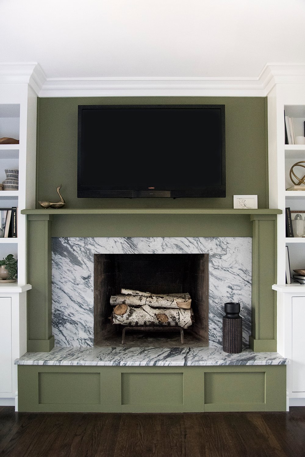 I was always leaning toward a little color in the living room, ever since moving into the house. However (I’m aware this is going to sound crazy), I thought you might want to know what sealed the deal? Sometimes I find inspiration in the strangest places. I was watching my favorite TV show (Grace and Frankie)… when Robert and Sol moved into their new home, I was smitten from the beginning. If you don’t know what I’m talking about, it’s worth a google and a watch. All of the color in their home is bold, masculine, a little dirty (muddy tones), and sophisticated all at the same time. Kudos to the set designer! It was enough to make me think while sitting in my own living room watching the show, “this space needs to be bold, include a statement color, and feel cozy”. That was honestly the aha moment for me.
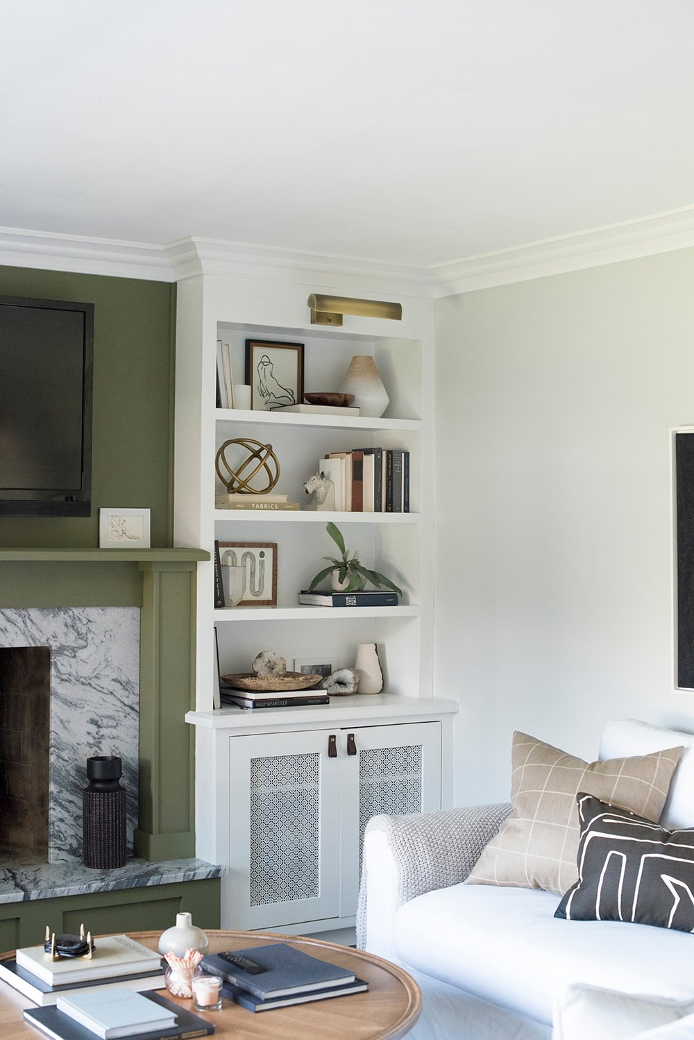
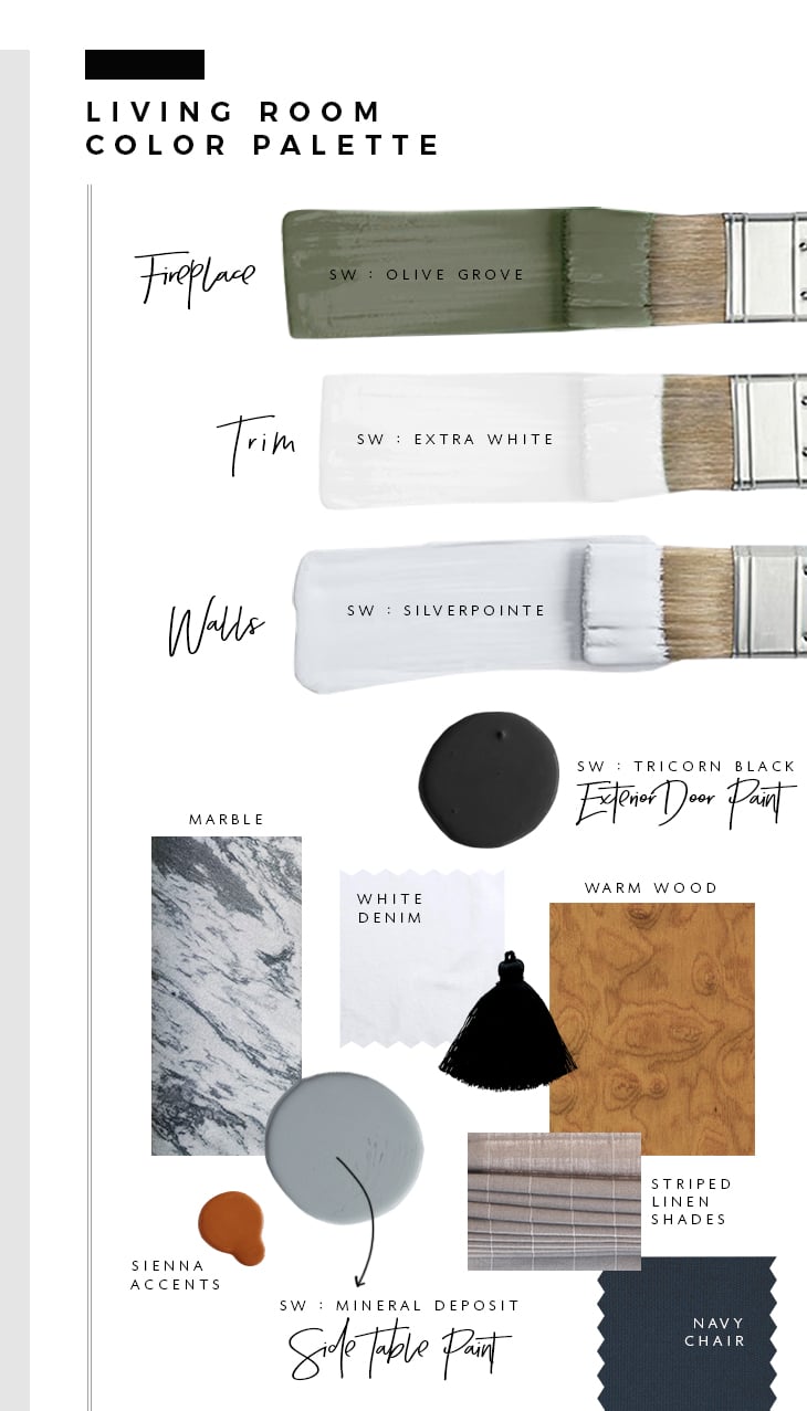
Of course my mind went to green and navy first because that’s in my wheelhouse. After selecting the perfect green (SW Olive Grove), the rest of the palette sort of fell into place. I like to create digital mood boards, as shown below… but I also order swatches and examine everything in person prior to committing. People- that’s SO important! Don’t forget to look at paint swatches, tape them to the wall, and examine them throughout the day in different light. This was one of my original boards, but you can see how it unfolded.
Here’s some free design advice for you guys… if you’re nervous about adding a bold color to your home, buy a sample and paint a giant square (3′ x 3′ or larger) on your wall. Live with it for at least a week! It’s amazing the conclusions you’ll draw over that time period. Also keep in mind that complimenting colors are always an easy solution.
 For instance, the navy chair and warm burl toned credenza work so well together in the same room because blue / orange are complimenting colors. I also like to add a little black and white (even if just a tiny bit) for a high contrast statement. For example, the black entryway door and window frame against the white trim looks super classic and timeless.
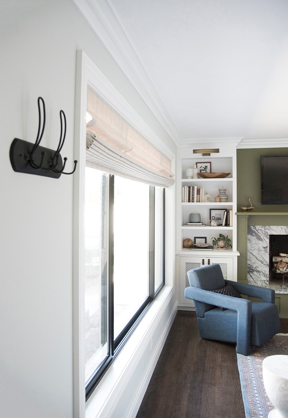
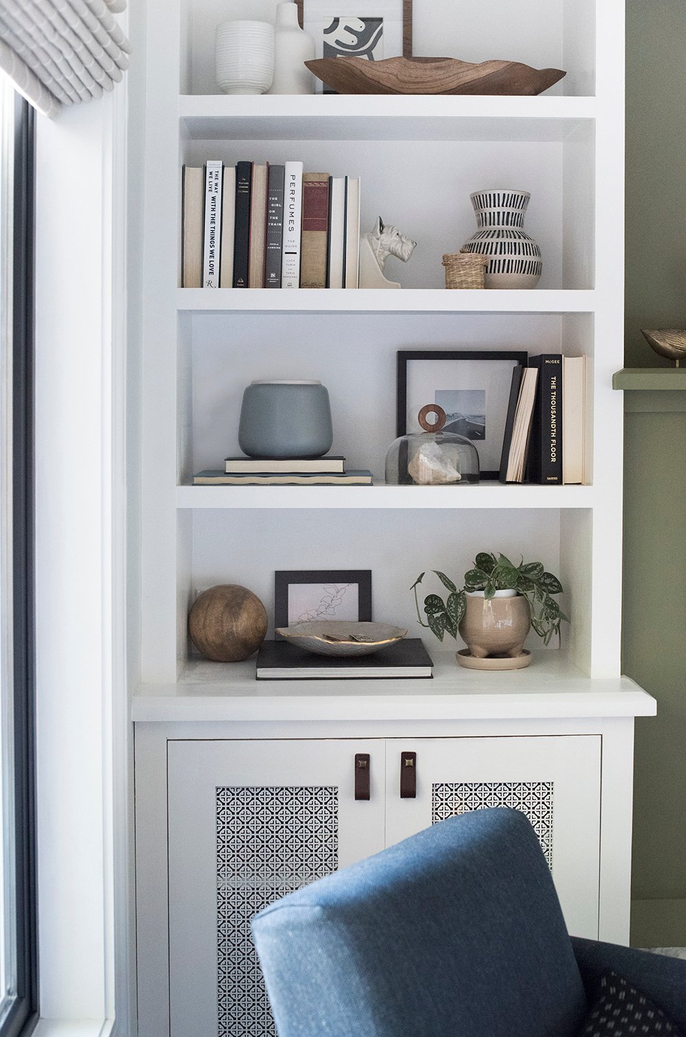 Lastly, be sure to “sprinkle” bits of the color palette throughout the space. Plants and greenery balance the focal wall of the fireplace throughout the room. You’ll also notice blue and grey tones throughout the space. The same goes for the orange (the compliment of green)… did you notice those tiny bits strategically placed?
 I feel really comfortable with color, but I know it can be intimidating if that’s not your profession (and that’s 100% ok). Feel free to ask any questions in the comments below! I’m happy to help. I’ll post the products links and resources for the entire room in a couple hours, so check back in for those if you have your eye on something. I know… two posts in one day, that’s a rarity around here!
The room looks amazing – no surprise there! I love the sconce over the couch and the fireplace marble – gorgeous! Not design related but what do you think about doing a post on the beauty products you use? Your eyelashes were on point in your latest insta stories – and your teeth are so white!! I think you’ve done one in the past but any updates to that would be great!
Thanks so much, Amanda! Maybe I’ll share my routine on insta stories or something- thanks for the suggestion and compliments. I actually have eyelash extensions because I’m allergic to mascara, and as far as toothpaste goes- I just use regular Colgate… but I swear by this toothbrush.
I love the color, and thrilled to see beautiful inspiration in something besides all white! Thanks for sharing.
Thank you so much, Rebecca!! xox
The shelving cabinets look great! I know that there are probably speakers behind the closed doors, but are there any speakers hidden on the upper shelves? My husband wants surround sound, a CD/DVD player, a receiver and a TV. The TV will be on an open shelf on one side because it would be too high over the mantle. So far we have 2 speakers in the ceiling behind the seating area. He says we also need 2 bookcase speakers, a mid range speaker, and a woofer speaker. I was planning to use wire mesh insets on the bottom doors to hide the woofer, but am not sure how to hide the other speakers and equipment without having more closed doors.
Thanks so much, Kristin! You can see an updated post (showing all the speakers) here: https://roomfortuesday.com/surround-sound-in-the-living-room/
Hi, Sarah,
First of all, I really enjoy your blog and your posts on IG!
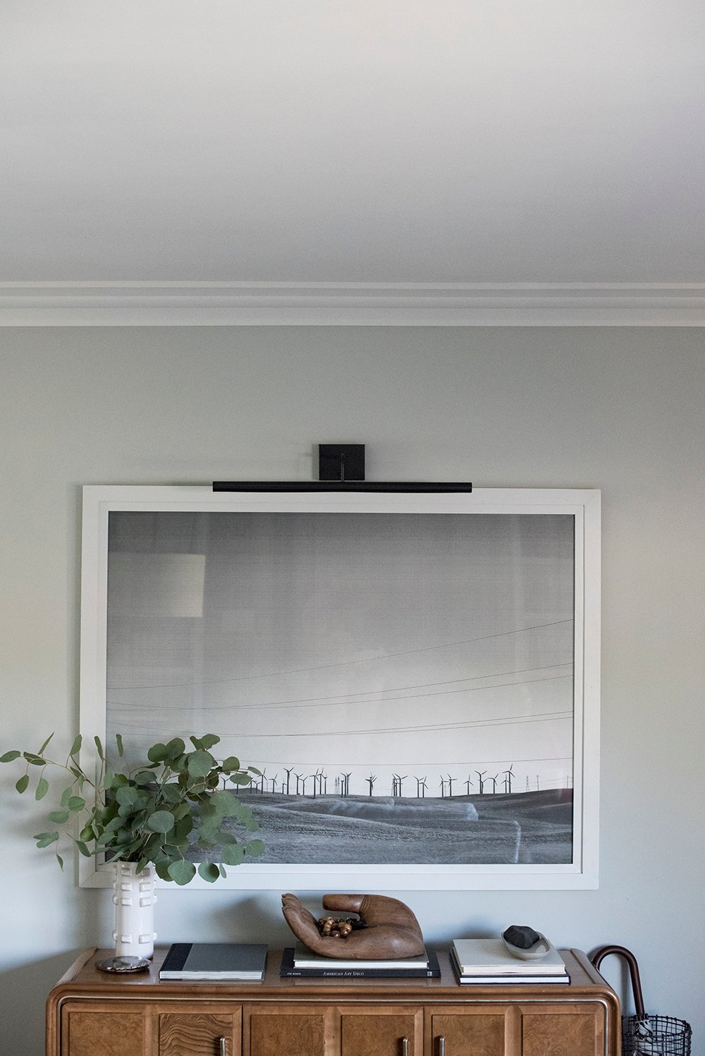
We are currently doing a gut renovation of a 117 yr old row house, and I’m planning on built-ins around the fire place. I would really like to install classic picture lights, similar to what you have. I’ve been searching for a good looking option that’s somewhat affordable (they are expensive!), especially ones that can be wired with a separate switch so I don’t have to climb on a ladder to turn them on and off. Would you mind sharing the source for your picture lights and any tips in building them into a bookcase? Thank you!
Thanks so much, Dani!! Ours are actually battery powered (which I think is amazing). You might find these posts helpful…
Living Room Resources (including the lighting): https://roomfortuesday.com/living-room-get-the-look/
Built-Ins: https://roomfortuesday.com/built-in-update/
Designing the Fireplace: https://roomfortuesday.com/designing-our-fireplace/
Thanks, Sarah!
Hi Sarah,
Love your vibe/style!
I wanted to ask…how did you create those cool ‘paint brush swatches’?
I create all of my blog graphics in either Photoshop or Adobe Illustrator. I have a background in graphic design ;)
great article. soothing colors
Thank you, Charmaine!
Hi Sarah ,
Did you paint the door yourself ? Any tips on that and maybe sources on the hardware use on your door . I have honestly become your fan . Getting addicted to your blog :) .
Love your work .
Thank you so much, Neha! So happy to have you here. Yes, I painted the door myself. You can find out more about the hardware selection in this post: https://roomfortuesday.com/how-we-choose-hardware/
Beautiful design Sarah! I’m curious did you use the Super White (trim) color for the ceiling as well?
that ceiling looks so amazing.
Thank you! We used ceiling white for the ceiling… so it’s different than the trim. Hope this helps!
Hi! Wondering about the decorative screens in your cabinet doors? Resource?
Thank you!
Hi there – I am going to try to paint the dark Evergreen from you OH house in my dining area. I have been searching for the white (I think) paint color you had in the OH living room. Would you mind sharing that? Thank you – I’m just wanting to make sure that the living room area is bright enough to not make the green look not right.
Hi Amanda! The white in our Ohio home was Sherwin-Williams Superwhite. Hope this helps. xox
Where is the black picture light from? The one above the black/white photo.
Hi Emily! You can find all of the sources for my previous and current home under the shop section: https://roomfortuesday.com/shop-my-house/ xox
Love the moodboard. So detailed and easy to follow while being visually easy to get the gist of it. What program did you use to create it? Could use something like this to help me! :)
So happy to hear that, Alex! I used Photoshop :)