10 Common Design Mistakes
 This was actually a suggested post from one of the reader surveys way back in January and I’ve thought long and hard about the top 10 mistakes I often see… six months to be exact. This post has been in the drafts for awhile and I kept adding to the list. It started at 5 and is ending with 10. Click through to see my list of common design mistakes, my thoughts on each, and how to avoid them. PS: I didn’t want to call out any bad examples or throw anyone under the bus, so the images throughout this post are all mine and show good examples. Hope that helps to clarify!
Let’s dive right into the list- here are my top 10, in no particular order…
# 1 : A R T W O R K I N S T A L L E D T O O H I G H
 I just had this conversation with a friend as she was trying to convince her husband to hang their artwork a bit lower. Although he is a pretty tall guy, the art was installed only a couple inches beneath the crown moulding. Artwork installed too high on a wall isn’t at proper viewing height and draws your eye upward in an awkward way. It actually makes the room look shorter, out of proportion, and messes with the scale of furniture, lighting, and other items that fill a room. I think it just looks weird.
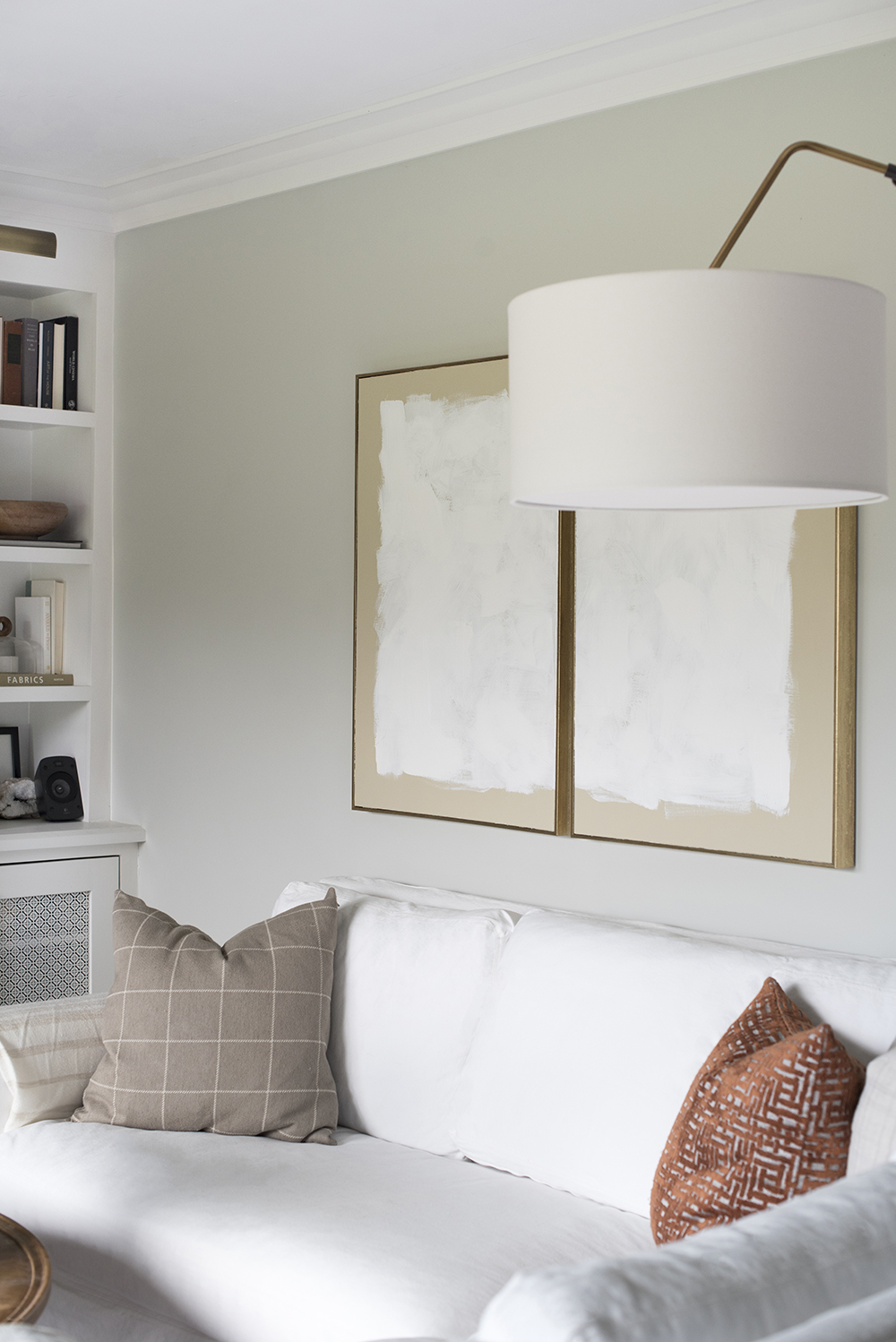
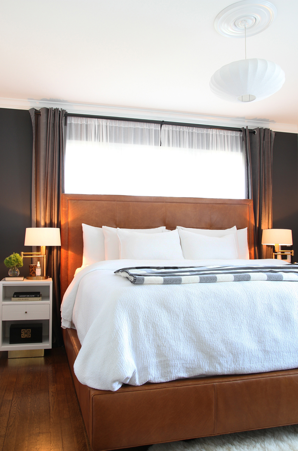
Think about walking into an art gallery- everything is installed at eye level based on average height and it should be no different in your home. Display your collection proudly! Sometimes you can cheat artwork a couple inches in one direction or another to balance a vignette, but a good rule of thumb is eye level. Even when installing art above a sofa (shown above), the bottom of the piece should only be a 3 – 6″ above the highest back cushion.
# 2 : A W K W A R D F U R N I T U R E P L A C E M E N T
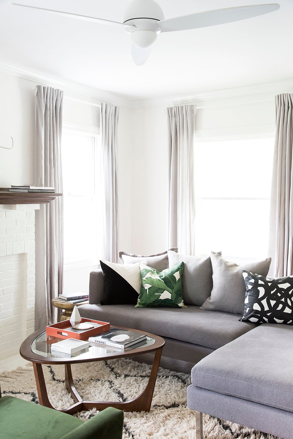 Floor planning can be tricky- especially in spaces that are really small or really large. I hate seeing furniture pushed up against a wall, or an excess amount of space between pieces (think a sofa or occasional chair) and a table surface (coffee table or side table). I think, “who can even reach their drink from that far away?”
In a tiny space, I’d rather see a smaller scaled apartment sized sofa, floated away from the wall- even if just a few inches. It really adds depth and dimension, is more functional because you can squeeze in a slender side table, and it’s aesthetically pleasing.
In a larger room, think of sectioning off the space into smaller, functional areas. If you have room for a tv viewing / lounge area, as well as a sitting space for conversation in another part of the room, by all means- break it up! Keep the furniture in tight groups that make sense based on their function in the space. I prefer 15″- 20″ between the edge of a sofa and a coffee table, but I like side tables on the end of a sofa much closer.
# 3 : T I L E S T O P P I N G S H O R T O F C E I L I N G
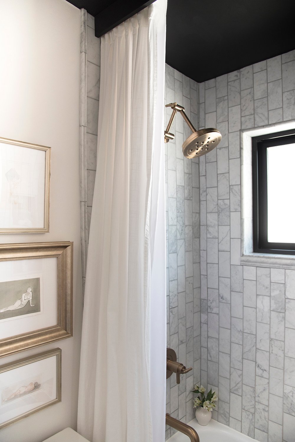 A big tip off that a home is lower end or builder grade is tile that doesn’t travel all the way to the ceiling. Often times I’ll see tile that stops at a weird place on the wall or looks super short because it’s well below ceiling height. Not only does it look awkward, but it cheapens the look of the entire bathroom or kitchen- wherever the tile is installed. If you’re tackling a tile project, take it alllllll the way up! It’s not that much more expensive and the end result is so worth it! It will look like more customized and increase the value of your home.
# 4 : W R O N G S I Z E W I N D O W T R E A T M E N T
 As a designer, I cringe when I see drapery panels floating wayyyyy above the floor or stopping at an awkward height. I know that custom panels are much more expensive than readymades, but you can easily buy long panels and hem them yourself to make them the correct length. Drapery panels should barely “kiss” the floor. I prefer to keep them 1/4″ above the floor or as close to touching as possible- definitely no higher than that!
Roman shades should fit the window perfectly. When fully let out, it should lay flat against the window without excess pleating or folding. If you have a 30″ tall window, don’t buy a 60″ roman shade. You don’t need all of that excess and it will look really weird… as well as make your windows look smaller- that’s never a good thing.
# 5 : C A B I N E T R Y H A R D W A R E P L A C E M E N T
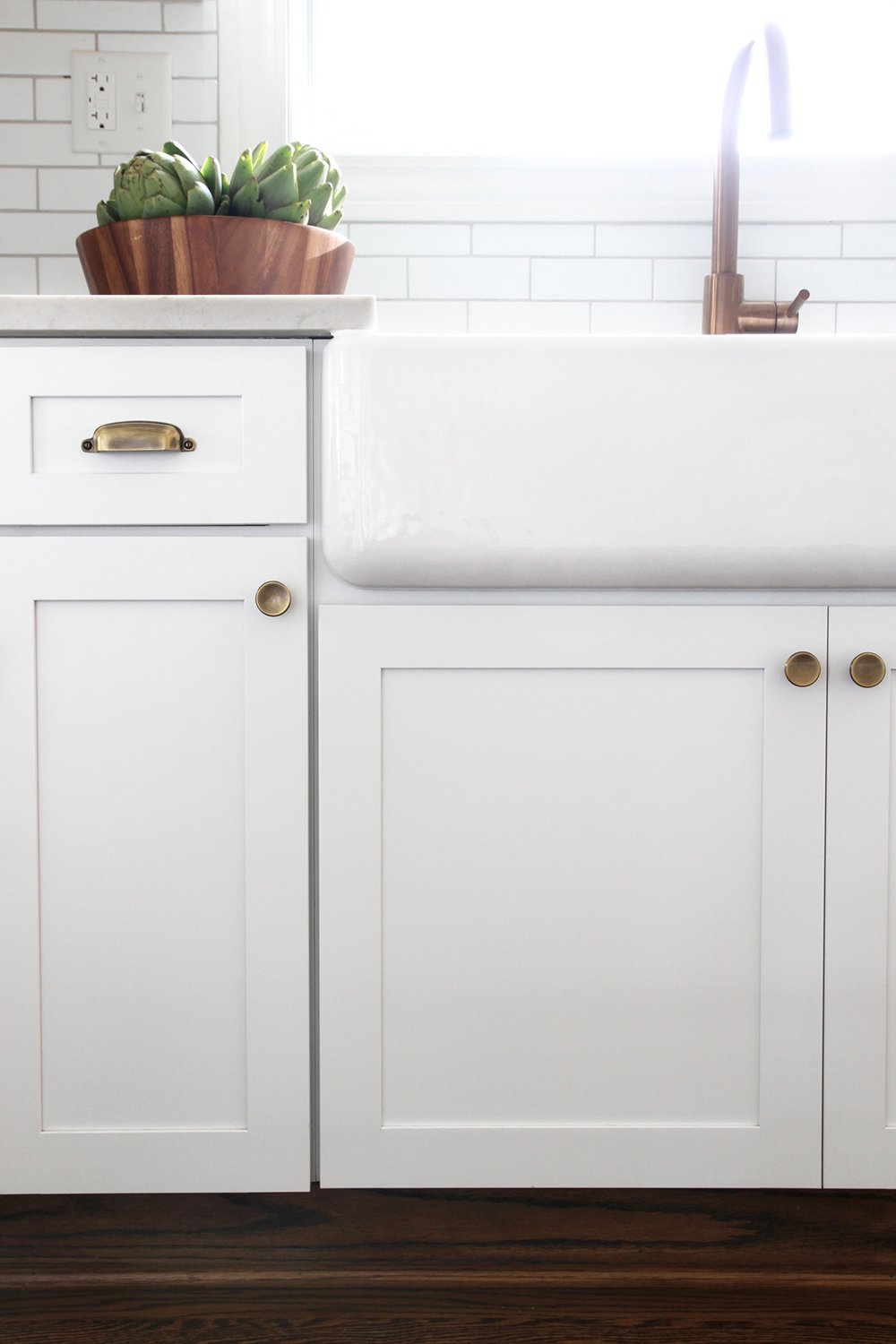 Sometimes it’s difficult to decide where to install hardware on cabinetry, and there can be a variety of different “correct” answers based on the situation. However, I’ve seen some terribly positioned hardware that doesn’t make much sense and it can make even the most beautiful custom cabinetry look awful in an instant. Check out this helpful guide on positioning hardware so your cabinetry can look its best. Hardware is like jewelry or accessories for you cabinetry, so it’s important to get it right and enhance the overall aesthetic.
# 6 : F I X T U R E S I N T H E W R O N G S P A C E
 No matter how badly you wish you had taller ceilings, resist the urge to order the pendant light or semi flush mount because taller people will end up hitting their head. It will also make your ceilings look even shorter. If you have standard height ceilings, keep in mind the scale and shape of a light fixture. Maybe sconces or wall mounted lighting is better suited for your room, especially when paired with recessed can lights or flush mount ceiling fixtures.
The only exception to this design rule is if there is something permanently positioned under the light fixture that makes walking beneath it impossible… like a bed or desk. Another thing to think about? Doorways and cabinetry- another one of my friends has a pendant light installed in her hallway and the ceiling is standard height. Every time the closet door is opened, it hits the light fixture. That’s an easy mistake that is something people don’t often think of: the clearance path.
# 7 : T H E S C A L E O F F U R N I T U R E
 Much like the floor plan we previously discussed, the scale of your furniture is super important. If you have a tiny space, an oversized extra plush sofa probably isn’t the best fit. It’s also important to make sure the pieces in your room are of the same scale. It wouldn’t make sense to buy a giant chair and an apartment sized sofa with a slender coffee table. One of those items is going to stand out in a bad way. Consider the scale of furniture in regards to the space, as well as in relation to each other. Measure, measure, measure!
# 8 : T H E W R O N G S I Z E A R E A R U G
 Much like the wrong size window treatments, using the wrong size area rug can really make a space look awkward. I prefer furniture to at least be HALF ON an area rug, or if not entirely sitting on top. You want to make sure the rug is appropriately sized for the room and enhances the overall aesthetic and scale of the furniture. It’s also necessary to consider the traffic path. Going too small isn’t the only faux pas… if your area rug is too large, that will also look awkward. Nobody likes to walk along a traffic path with one foot on the hardwood floor and one foot on the rug- so take that into consideration as well.
# 9 : U S I N G O N L Y O V E R H E A D L I G H T I N G
 There’s a whole world of lighting out there that is begging to live in your house- floor lamps, sconces, gallery lights, etc. By all means, install multiple types of lighting throughout your home. We hardly ever turn the overhead lights on in the evening, but opt for softer lighting instead. Sconces, picture lights, and lamps are a better option and give a glow that isn’t as harsh as overheads. I hate walking into a space that uses overhead lighting as the one and only light source- it doesn’t feel very inviting and often takes on a clinical feel… especially in the evening.
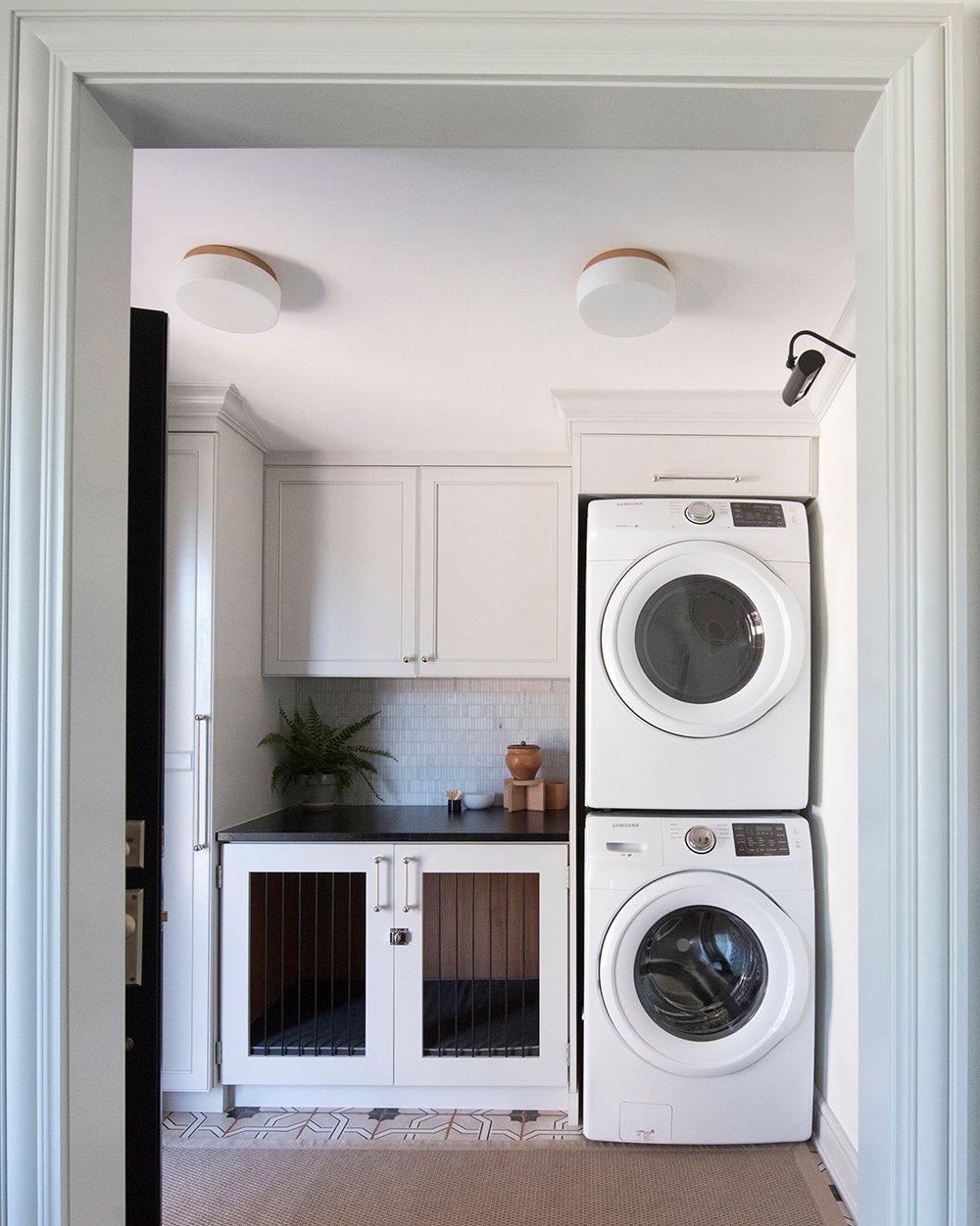
# 1 0 : H I G H & L O W T O T H E E X T R E M E
 You guys already know I’m all about mixing high and low pieces to fit the budget. I will say- I do think it’s odd to mix entire spaces with one extreme or the other. For example, if you splurge on custom cabinetry, natural stone, and high end furniture or artwork, it would be weird to install a laundry room or adjacent space composed entirely of IKEA products. I never want anyone to think, “ohhh, this was definitely a ‘budget’ space” or “she definitely tried to save money here”. Each room in a home should feel curated, collected, and of the same caliber. Does that make sense? Mix high and low in every room and consider the overall feel of the home. It’s kind of a like a DIY project that looks like a DIY… that’s never a good look.
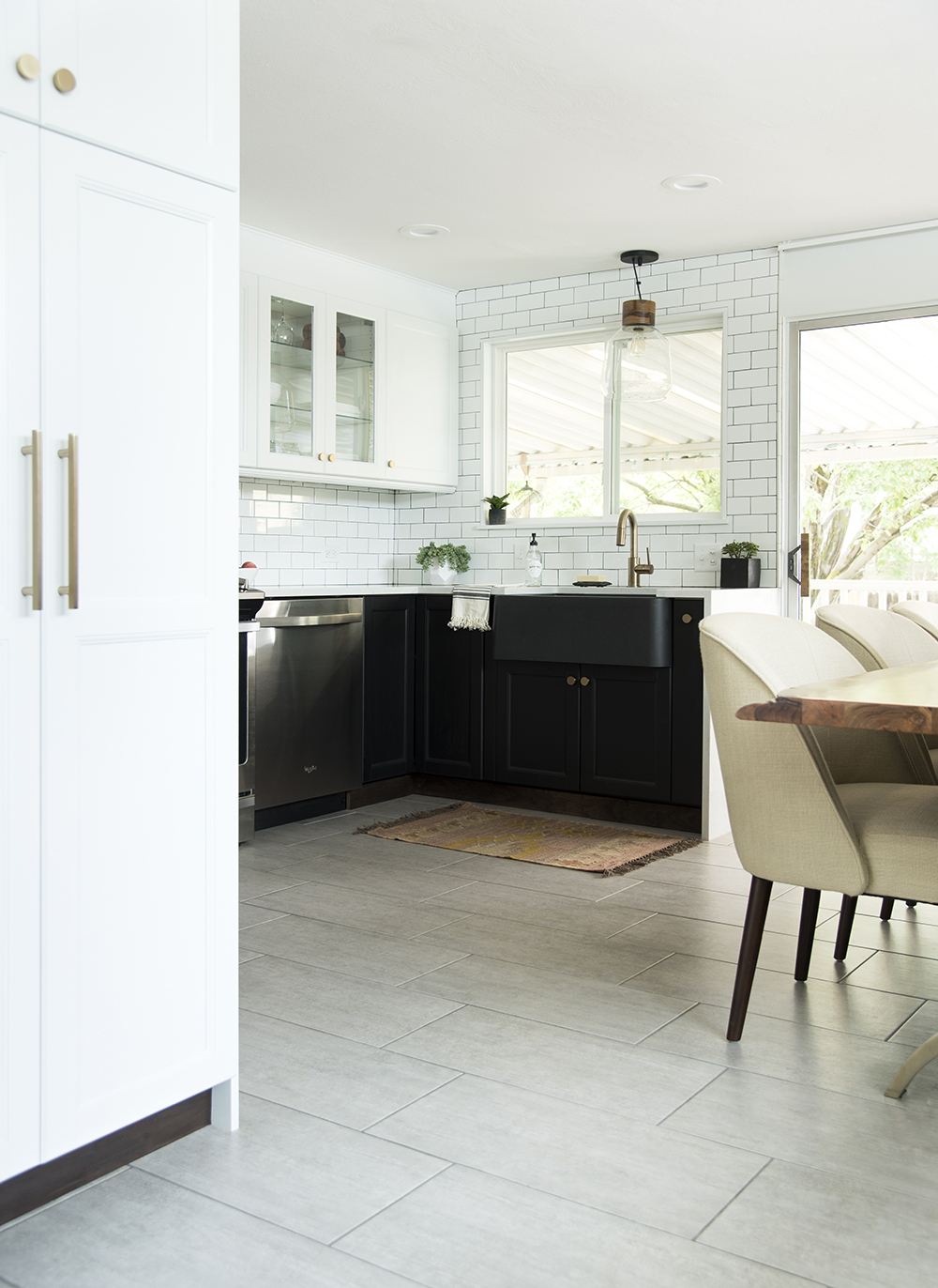
In the above image, I mixed higher end furniture and fixtures into an IKEA kitchen to balance the overall look and make the space feel more sophisticated.
In closing, I do realize some of these things cannot be avoided in certain scenarios, I just thought they’d be helpful if you’re unsure about any of these items. Maybe the aforementioned tips can offer some insight for your next project if it involves any of the talking points! What design faux pas makes you cringe or rethink a space? I’d love to hear your thoughts in the comments below!
I agree with all your points! Sometimes it can be hard to see the wood for the trees, but you just know that a room or area looks wrong – although the thought that at times living comfortably in a space IS more important than how it looks is true, if you have a tiny space with lots of seating needs then sometimes the huge sectional is the way to go!
Exactly, Sally! We have a sectional in our tiny living room and it’s only floated an inch or two away from the wall… in my ideal space, it would have much more room surrounding it, but hey- it’s comfortable and works well for us! xox
Thank you for the list! Wondering if you can update your front door under shop?
The link is no longer working.
Thanks so much!
#8 and #9 are big ones!! I see 5×7 area rugs styled in larger living rooms all the time, even in the product ad photos! Makes me cringe. And #9, I can’t believe people actually USE their overhead lights unless they’re sweeping or looking for something lost on the floor. ;)
We are remodeling for the first time so I wanted to see if I have done anything that wasnon this list. And… yayyy I haven’t, and some are my pet peeves too! I hate overhead lighting… although I want pretty overhead fixtures I don’t like to use them. :)
Woohooo!!! Great job, lady!! I also want to have allllll the pretty overhead lights- even if they hardly ever get used. Haha! xox
This is a good list, thank you. I missed the survey. Would you ad Decorating a hallway to the list? Specifically the walls.
oops, “add”
Lucky for you, that one is coming BEFORE the end of summer! We’re tackling our hallway renovation next month. Stay tuned :) xo
Oh good! Wow, you two move fast. What will you blog about when it’s done? Planning a move?
Haha! It’s hard to believe we’ve been renovating for two years. No move anytime soon- we’re ready to enjoy it! ha! xo
I love posts like this, and this is such a fantastic list! Can you clarify something for me on #2? Do you mean that the *backs* or the *sides* of the furniture should be floated at least a few inches away from the wall, even in a small space? Often, when I hear designers say this, I tend to think they mean the backs of sofas, etc., should be pulled forward a few inches, but now I’m wondering if the advice is just to not have the arms shoved up against the adjacent wall (which, I agree, would look weird). Thank you!!
Thank you, Julie! To clarify, I liked to have the back AND sides floating, but I realize sometimes that’s not possible… I guess if I had to choose between the two, definitely float the sides to allow for side tables! Every room and floor plan is different, so this could vary depending on the space. Hope this helps! xox
Awesome! Thank you so much!