September Moodboard
Good day, design friends! How are you faring this fine Tuesday? I’m back to share a September Moodboard. This month marks the much-anticipated changes of fall, but warm days still follow chilly nights in our area. Lingering on the patio, admiring the flower beds is actually pleasant now that scorching summer temps are behind us! Lately, the changing light has me especially appreciating the chartreuse varieties of my favorite plants-hosta, heuchera, Japanese forest grass and golden oregano. Their multiple tones brighten the space, complement every companion, and shine in both starring and supporting roles. What’s my garden got to do with interior design? Turns out, this lovely yellow-green brings the same energy inside! Click through to chat more about this versatile hue, peruse inspirational images and check out this month’s moodboard.
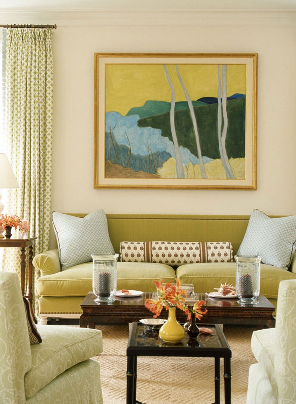
While I adore the vibrant chartreuses in the garden, I prefer a slightly muddier take for interiors. The range of intensity is one reason I feel confident recommending chartreuse. There’s a shade for everyone! Do you like your greens bright and zingy? You got it. Prefer something a touch softer? Can do. Crave more earthy notes? No problem! Just look at the variation in these images.
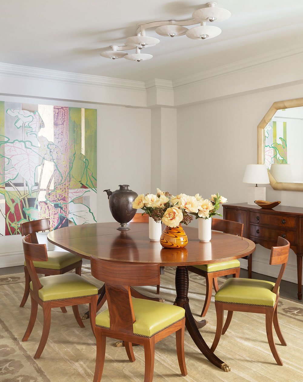
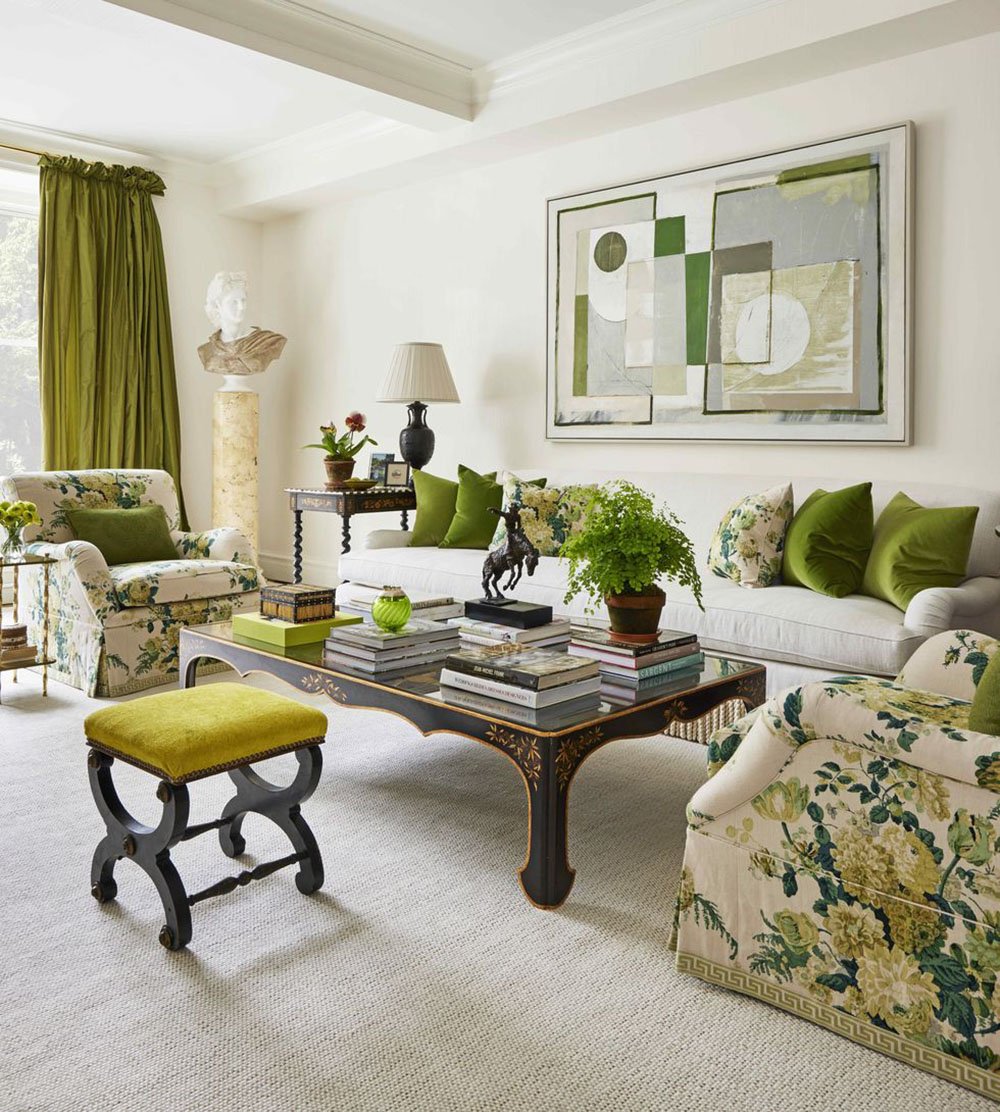
Let’s say you’ve found your preferred shade of chartreuse, but you still have concerns about complementary hues. The possibilities are endless, but I am often inspired by color schemes in the landscape. Chartreuse blends seamlessly with other greens, browns and neutrals. Think of ferns in the forest or a sunny stand of birch trees. Try it with gray or black for a more dramatic look. I stumbled on this very palette in lichen on desert rocks; I’ll spare you my amateur photography, but the combination is striking. In my own home, I pair chartreuse with blues, reds and purples. That may sound daring, but any wildflower meadow will offer expert examples of these vivid mixes. Mother nature employs chartreuse with confidence! Will you?
Click directly on the objects to be redirected to the source, or use the numbered links below to shop my finds…

01: mohair throw // 02: abstract forest print // 03: spoon rest // 04: pottery horse // 05: linen napkins // 06: modern pitcher // 07: wallpaper // 08: suede journal // 09: pillow cover // 10: table lamp // 11: handmade mugs
You can’t go wrong with any of these beautiful selections, but if I had to choose… I think that forest print (#2) is magical with its striking graphic composition. Art might be my absolute favorite method for adding this captivating shade to a room. If I was to go all-in, I would absolutely adorn a space with that spectacular Schumacher paper (#7). Dressing room dreams, right there. Speaking of dreams, why not record all of yours in a fresh new journal (#8)? The softness of the shade and the suede feels inspiring. And lastly, a horse, of course! Although certainly a splurge, I had to include the equine beauty (#4)! I love Bitossi pottery, and I know we’ve got plenty of horse fans in these parts. This guy will be the star of someone’s built-in.
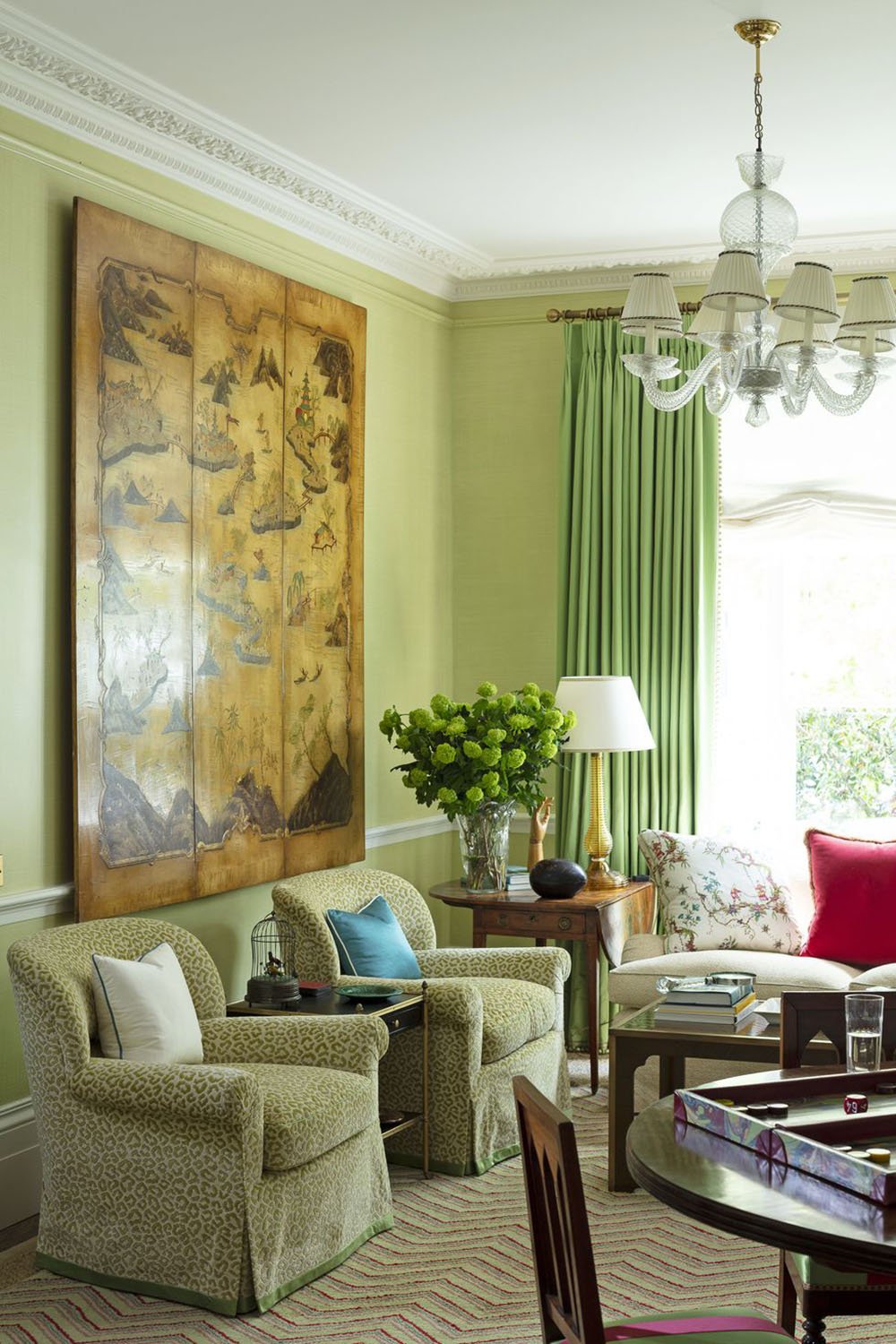
Not quite convinced to paint your walls chartreuse? It’s a bold move, for sure. Luckily, this gold-infused green adds its bright charm, whatever the dose. I am all heart eyes for rooms drenched in chartreuse, statement sofas or luscious drapes. Adding small glimmers around the home, though, offers more opportunity to experiment. Pretty napkins on the dinner table. A cozy throw for lounging. A special mug to invigorate your morning routine. Are you in?
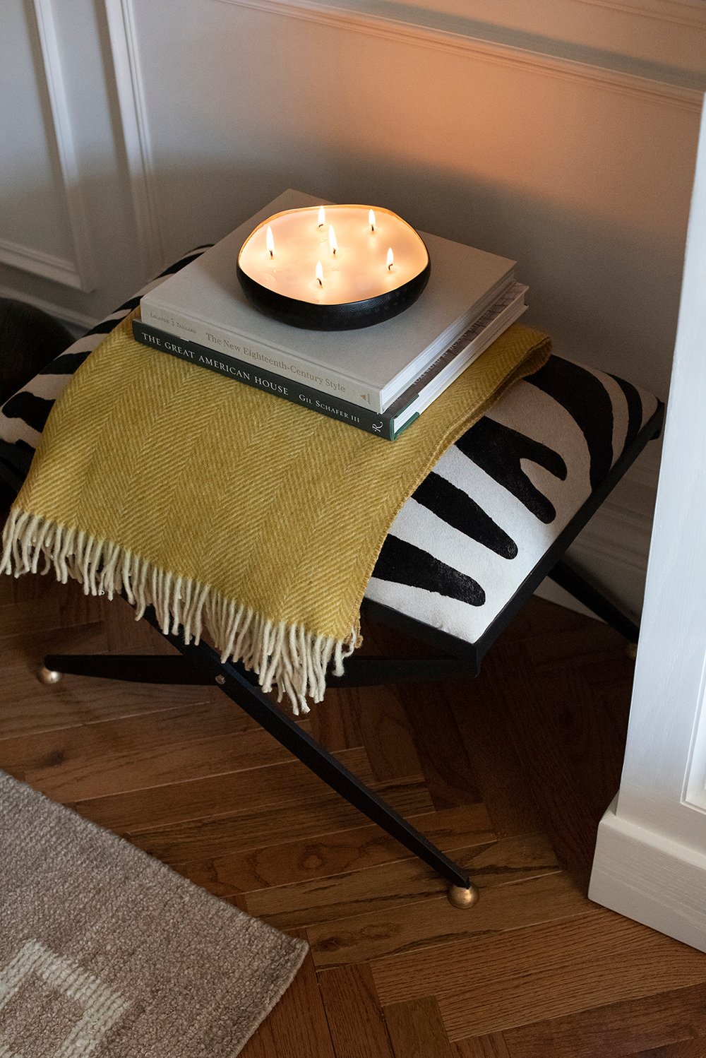 Can you tell I’m mad about this color? Have you seen the two yellow and green wool throws in Sarah’s shop. The mustard one is pictured above. Whatever color combination you’re feeling, either of those could fall into this category! I’m also anxious to know your thoughts. Do you dig this lively yellow-green? Could you imagine using it in your home? I hope your days are full of fresh fall air and zesty chartreuse spirit! Until next time, friends.
