November Moodboard
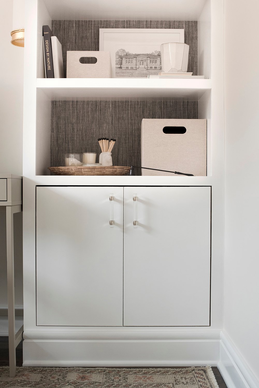
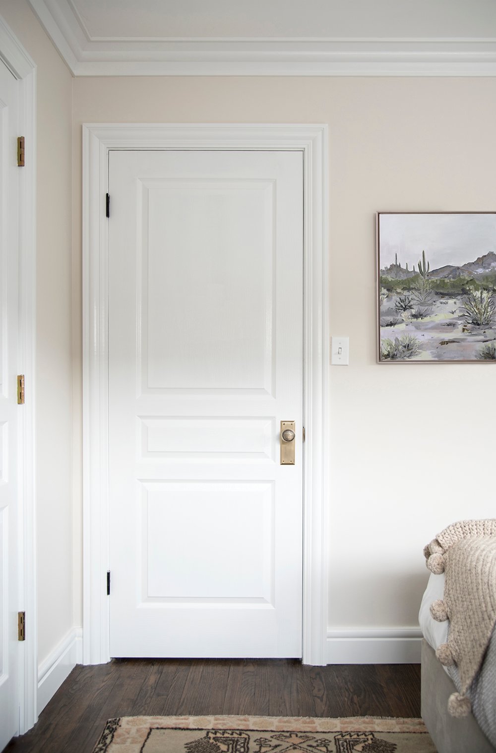
 Typically coming into Thanksgiving and November, I crave all of the moody burgundy, red, and burnt orange colors- but this year I’m gravitating toward warmer neutrals. I’m not sure if I’m longing for a sense of calm, or just loving the fact that you can pair this palette alongside any other color. Regardless, my bright office inspired me to source some favorite warm white decor items in this versatile non-saturated hue. It pairs well with holiday greenery, cozy flannels, colorful cable knits, and is anything but boring when styled right. Click through for some serious inspiration to kick off the week in this month’s moodboard!
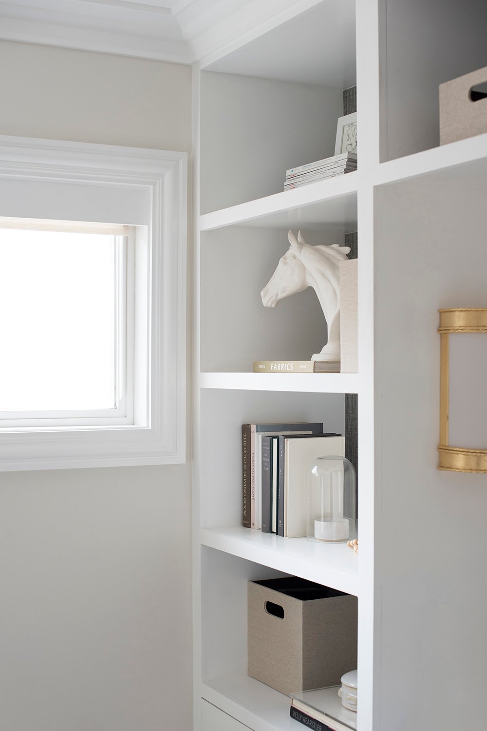
 I got a ton of questions about my horse head sculpture in the office reveal last week, so of course I included that in the monthly decor roundup as well! I’ve had it for over five years and still love it as much as I did the day I bought it. It could easily be painted a different color if you’re not into white. But back to the moodboard… I’m feeling warm, soft neutrals this November. They’re cozy, inviting, and feel really fresh. The palette honestly made me think of cuddling up inside during the first snowfall of winter. The more texture (think shearling, boucle, & wool), the better!
01: white and brass bed // 02: white chandelier // 03: vase // 04: figure drawing artwork // 05: hand knotted rug // 06: boucle chair // 07: off white vintage turkish rug // 08: white tassel pillow // 09: horse head sculpture // 10: floor lamp // 11: warm white serving bowl // 12: off white sofa
Someone please snatch up these items before they’re gone! I already bought the pillow (#8) and bowl (#11) for Thanksgiving entertaining, but I’m especially digging the vintage rug (#7), the chandelier (#2), the figure drawing (#4) by my talented friend Laurie Anne, who spent all weekend visiting from Arizona, as well as the classic floor lamp (#10).
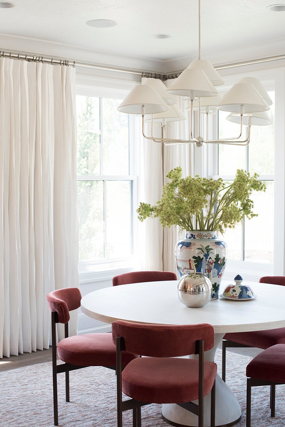
 I’m also into the idea of pairing bold colors alongside warm, textural white. I snapped the above image at the Alice Lane parade home a few months ago. I really think the pleated drapery panels are the perfect backdrop for those crimson dining chairs.
 Have you also been gravitating toward lighter colors despite the fact that it’s November? I have to say, it’s refreshing and cozy all at the same time if you bring in plenty of texture. Let’s make this week a great one! Happy Monday friends.

