January Moodboard
Good day, design friends! Peggi here. How have you been? I hope you are feeling rested, rejuvenated and ready(ish?) to tackle 2022! Today I’m sharing a January moodboard that might surprise Room For Tuesday regulars accustomed to the blues and greens we all favor. This month I’m feeling burgundy! The deep, dark red offers a vibrant counterpoint to the snowy white and foggy gray of early winter. Folks born in January may recognize the hue of their beautiful garnet birthstone, said to balance energy and promote courage and hope. Sounds perfect for a new year, right? The rest of us can incorporate this powerful color for the warmth, richness and dignified drama it brings to interiors. Are you ready for a little bold January inspiration? Click through for lots of burgundy goodness!
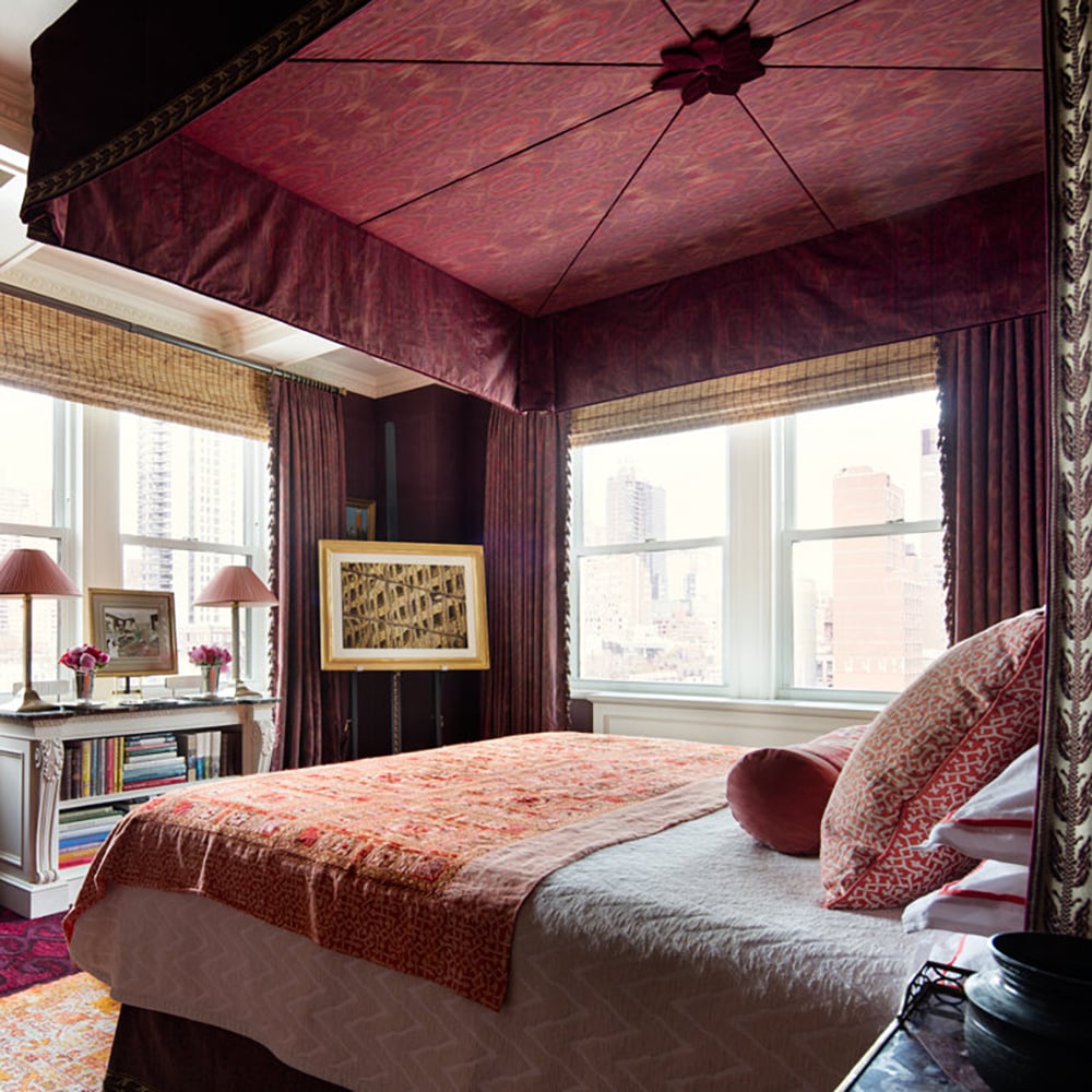
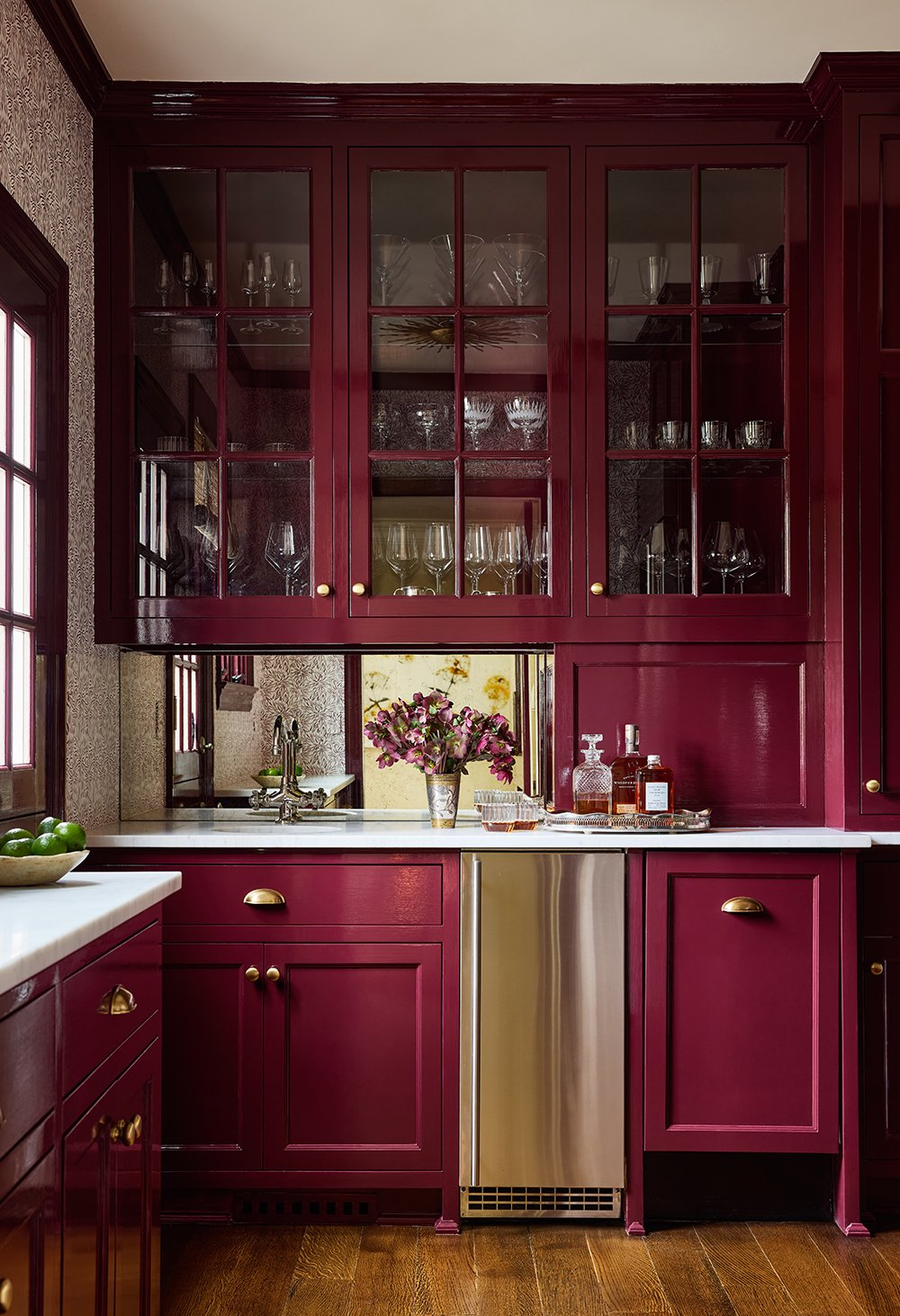
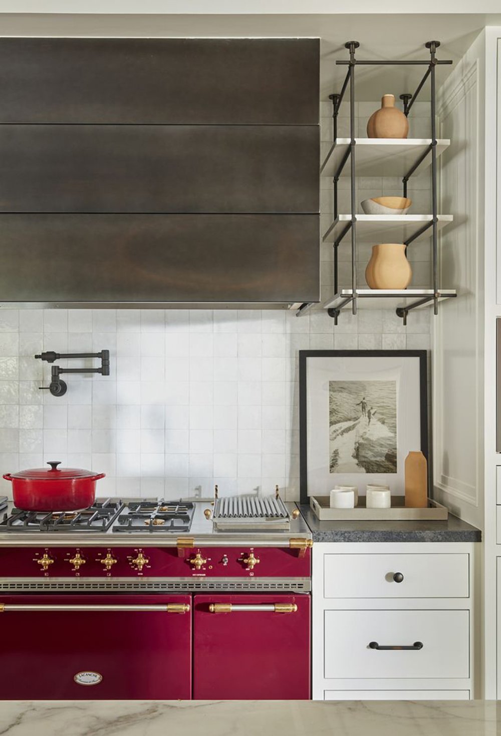
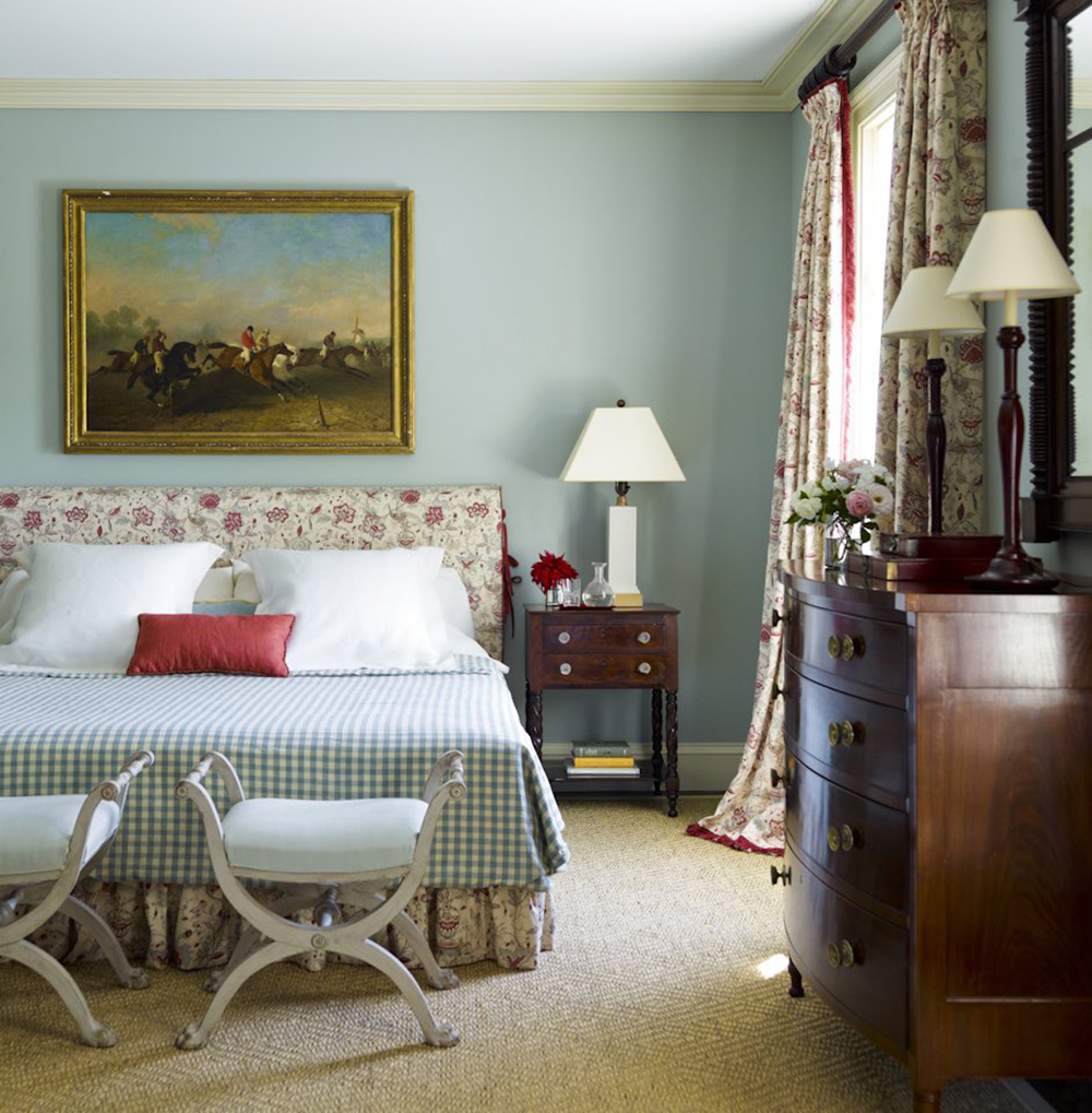
Burgundy, maroon, wine, garnet, brick, ruby, claret…puce? Whatever name you use, this strong, brownish red works in many contexts. Dark, glossy library built-ins and a perfectly-warn Persian rug are a winning combination. Who wouldn’t want to curl up with a good book? Burgundy wainscoting could offer a new slant on the traditional red dining room; just add candlelight and your favorite people. What about a sumptuous burgundy bedroom, complete with glorious drapes and an extravagant canopy? While these spaces want the cozy cocooning quality of this shade, burgundy adds to other areas, as well. It provides a grounding element in large open spaces or a striking focal point in lighter rooms. Just look at the luxurious velvet sofa and the stunning French range in these images to see what I mean.
Now for the fun part! Check out my moodboard and then see which items I’m coveting!
Click directly on the objects to be redirected to the source, or use the numbered links below to shop my finds…

01: burgundy range // 02: dutch oven // 03: embroidered pillow // 04: ming chest // 05: wallpaper// 06: vintage vanity set // 07: appetizer platter// 08: velvet chair// 09: bath towels// 10: leather and brass lamps// 11: floral hand towel //
Phew. For the record, I would own every single item in this collage, but I will narrow down my favorites to three. Wait, four. We’ve been discussing ranges lately, so I had to include this smashing example. If you would like to see it in an actual kitchen, check out Shavonda’s instagram. The incredible pair of lamps is more traditional than my typical taste, but the leather shades grabbed me. (See previously discussed lampshade obsession.) I have yet to use wallpaper in my home because indecisive, but I can’t resist a classic William Morris print. That palette! The piece I’m craziest about though is that grasscloth-covered chest! I envision it in an entry, a dining room, a bedroom-such a versatile size, and the texture! Eep. Does anything strike your fancy?
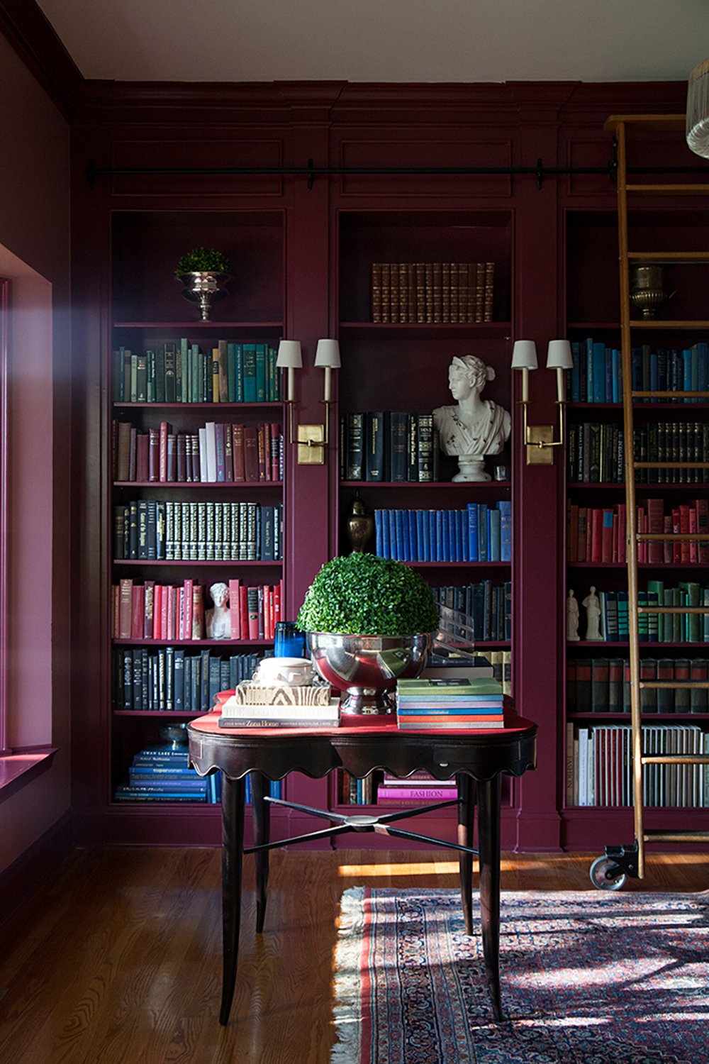
Full disclosure: my home sings with color, and I’m naturally fearless about embracing new shades. I get most excited about interesting pairings, so let’s delve into that! The simplest mix is probably white, ivory, gray, brass and light-medium toned woods like the kitchen and bar images above. Burgundy integrates seamlessly with neutrals. In fact, I think its darkest iterations can act as a black or brown substitute. For a more vibrant look, try a complementary scheme with blues or greens. Note the blue books on the library shelves and the soft blue of the Gil Schafer bedroom. Pretty, right? The wallpaper from the collage has both a dusty blue and muted sage tones. Those of you old enough to bear the scars of 90s burgundy and hunter green, have no fear! Olives and muddier shades are the modern antidote. Although I adore a burgundy/blue match, the ultimate combination for me is burgundy, tomato red and orange. The subtle tension and zing in this analogous arrangement is glorious! See the burgundy sofa, orange rug and nutmeg pillow? How about the canopy and coverlet situation above? Dreamy. Honestly, burgundy plays well with everything.
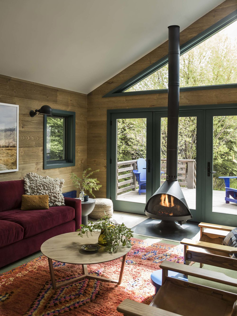
Maybe you’re not *quite* ready for the commitment of burgundy walls. I hear you. Luckily, this gorgeous shade packs design power even in small doses. In the image below, I count six hits of burgundy that really animate the design; can you find them all? (I wish I could put the answers upside down at the bottom of the post. Ha!)
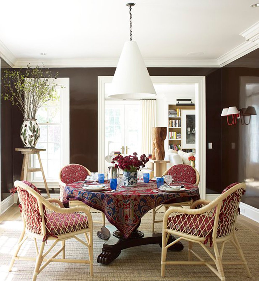
If you’re still a little hesitant about such an audacious choice, create a luscious (but fleeting) floral arrangement! The single specimen bouquet below could not be simpler, but what impact. Also, note the lovely burgundy tablecloth and chair cushions for temporary burgundy flair-again with the dazzling blue accents. I also spy a delicate burgundy sconce on the wall!
Well? Do you share my burgundy crush? Can you imagine a spot for it in your home? I know shades of red can seem intimidating, but I find the deep tones more forgiving. Do you agree? Color fascinates me and can be so polarizing! We’re all friends here, so share your thoughts in the comments! Reading them always makes my day. Until next time, friends.
