January Moodboard
 We’re halfway through January and I’m wondering where the heck the holidays went?! It’s flying by as usual. How’s everyone holding up with their goals, resolutions, and intentions for the year? I’m still hanging in there, despite the renovation, lack of kitchen, and busy schedule that comes with the new year. From a design and decor perspective, one thing is certain… I’m craving COLOR. Last month I was really feeling warm leather (tis the season), and this month I’m leaning toward a color that goes great with those warm leather tones. Any guesses? Click through for a new moodboard and to see my coveted color of the month.
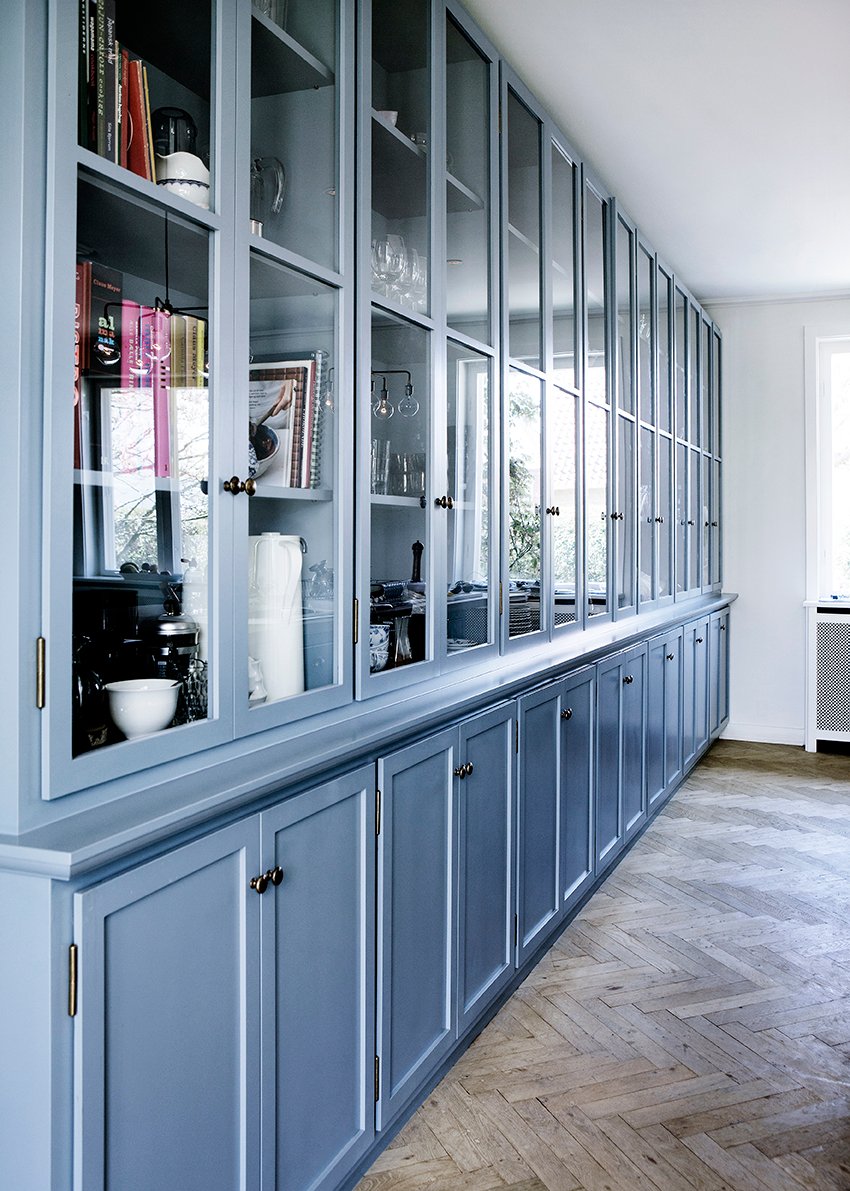
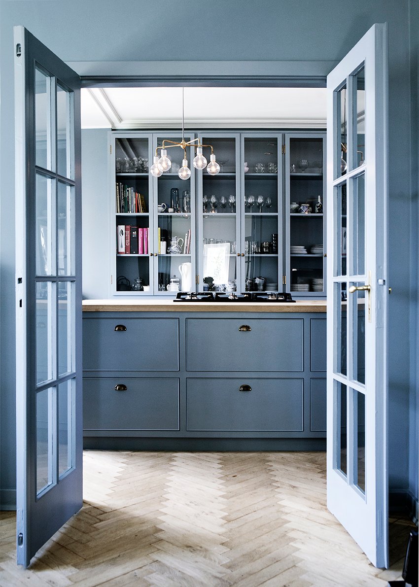 Did you guess blue? Maybe not the blue you were expecting? This blue isn’t dark- certainly not navy, but it’s also not powdery. It’s the perfect medium blue hue. I’ve heard it called cornflower blue, so I’m going to roll with that! It’s not bright, but it’s not desaturated… it’s sort of perfect, and feels really fresh!

01: blue serving platter // 02: alpaca throw // 03: newport cross pillow // 04: cotton duvet // 05: tinted highball glasses // 06: profile portrait artwork // 07: indoor / outdoor rug // 08: greek vases // 09: bedside lamps // 10: desk lamp // 10: (again, ha) cocktail ottoman // 11: pair of nightstands
If you’re nervous to jump on the cornflower color train, this tone really works well with most other colors. It’s easy! If you’re reluctant to commit to painting an entire wall, or aren’t ready to invest in a pricey piece of furniture, start by adding a pillow (#3), throw (#2), or a piece of artwork (#6). For those of you who are a bit bolder, try the bedding (#4) or a piece of furniture – the cocktail ottoman (#10) is calling my name, and you can’t beat the price on that pair of nightstands (#11).
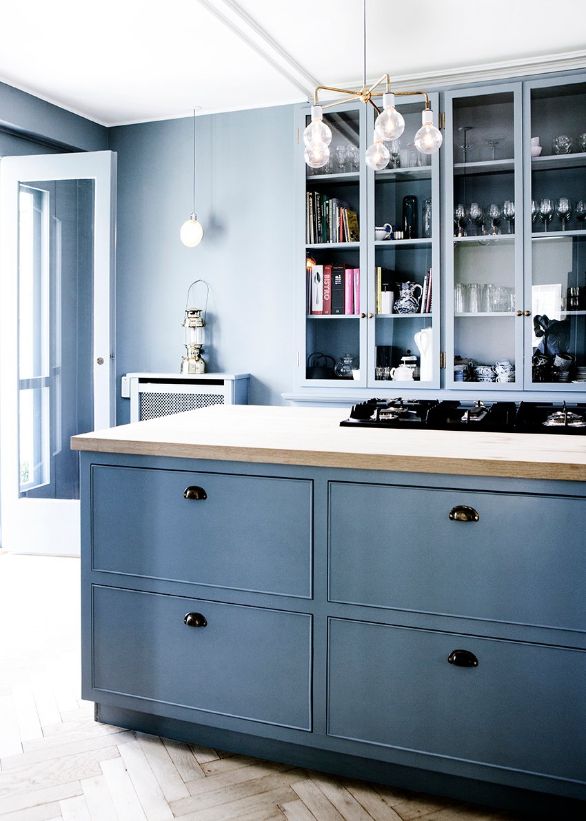 Are you guys feeling as inspired by this kitchen and color as I am? There’s something so energetic about it that makes me really excited. You can checkout more of my color predictions for 2018 in this post.
images: kbhsnedkeri
