Design Eye Training : 116

Design Eye Training : 116 - roomfortuesday.com
design : virginia tupker

It’s already time for a new Design Eye Training post! These have been really fun for me, so I hope you’ve been enjoying them, too. It’s hard to believe we’re already 16 posts into this series. Today we’ll be analyzing and admiring a beautiful open concept primary bath designed by the talented, Virginia Tupker. This bath lives within a stunning Upper Eastside brownstone, which you can tour here. This bright and airy bath felt appropriate for today’s post, as it definitely takes on a summery May vibe… natural light flooding in, fresh cut florals & greenery, a soft yet crisp & clean palette, and plenty of textural elements fit for the season ahead. Click through to chat design with me…

To quickly recap… in our Design Eye series, we observe and admire design fundamentals like scale, texture, pattern, material use, lighting plans, color, floor plan & layout, and a variety of intentional styling & interior moments pulled together by the pros. It’s an exercise I used to practice often in design school, and one I still enjoy today. By discussing and breaking down well designed spaces in greater detail, you’ll begin to train your “design eye”, build upon the design fundamentals, and can apply some of these things to your own home, if they appeal to you. I also feel like this series can really help you hone in your personal aesthetic, determining what you like and dislike… and most importantly, why. Ready to give it a try?

Design Eye Training : 116 - roomfortuesday.com
design : virginia tupker

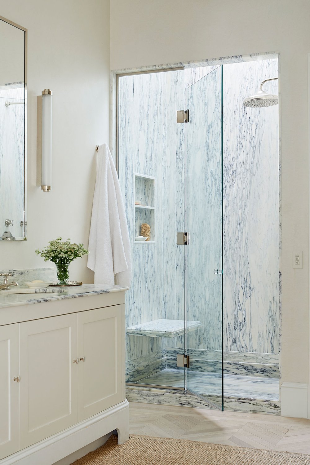
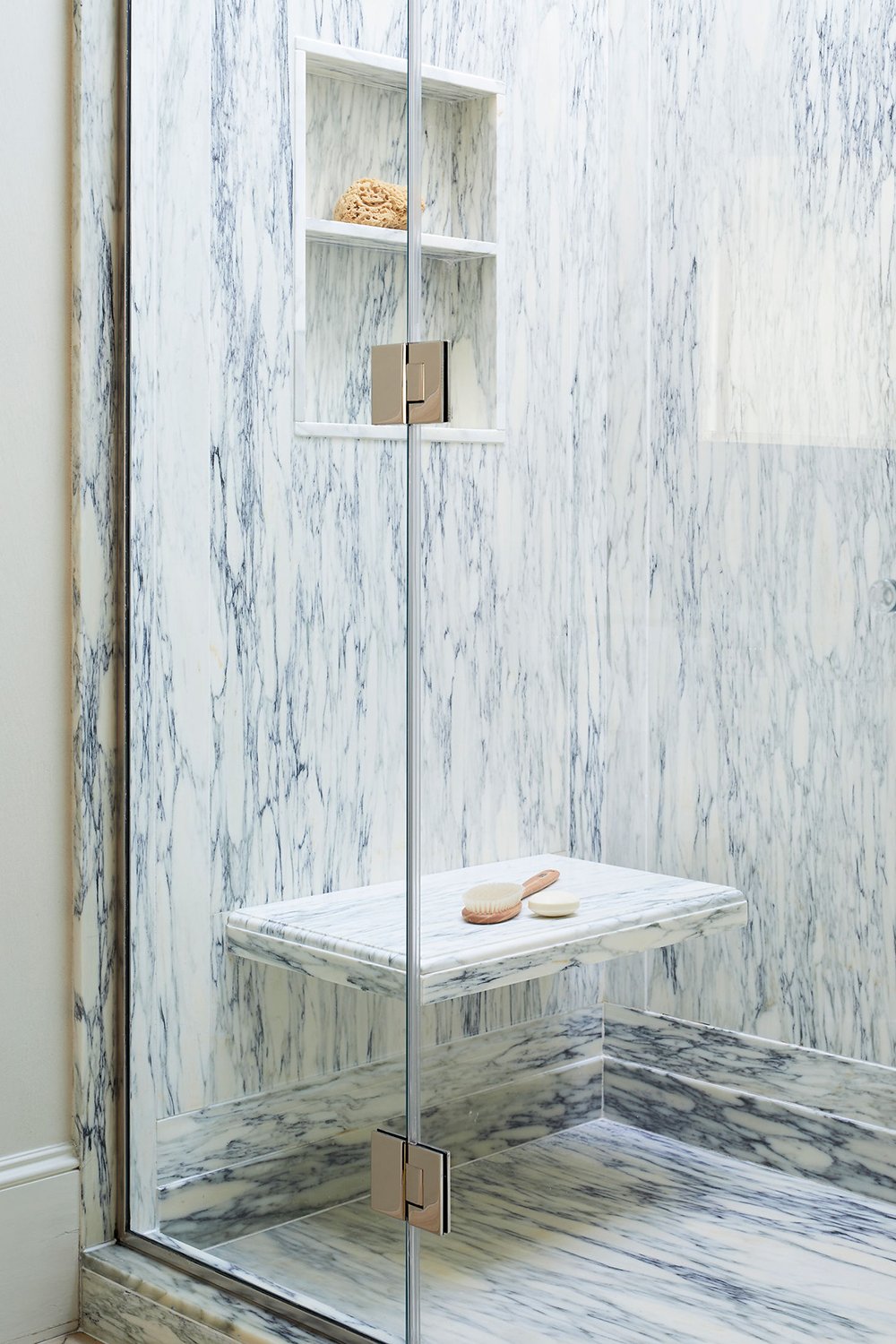
The marble is the star of the show for me in this space! Can you believe that gorgeous violetta veining? The entire shower almost feels like interior artwork, with stacked marble base, a projecting ogee edge bench, a recessed niche, what I presume is a skylight for flooding additional natural light, and an oversized rain head gives this nook the perfect spa-like ambiance. Paired alongside the creamy white wall and vanity color, it’s the perfect cooler toned complement.

This room also includes other natural elements: a sisal rug, hardwood flooring, plush cotton towels, soft roman shades, and some florals & greenery. For a minimalistic space, it still feels warm and inviting.

Design Eye Training : 116 - roomfortuesday.com
design : virginia tupker

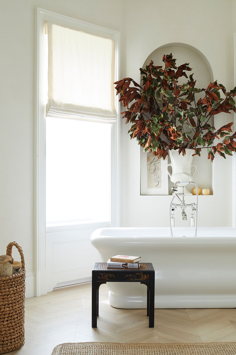
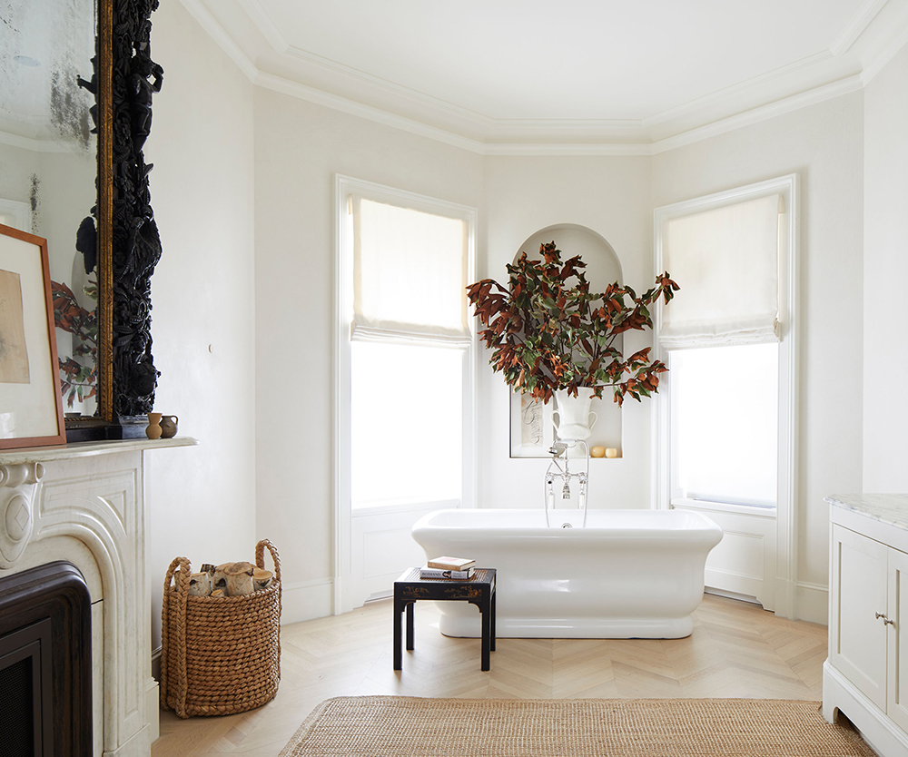
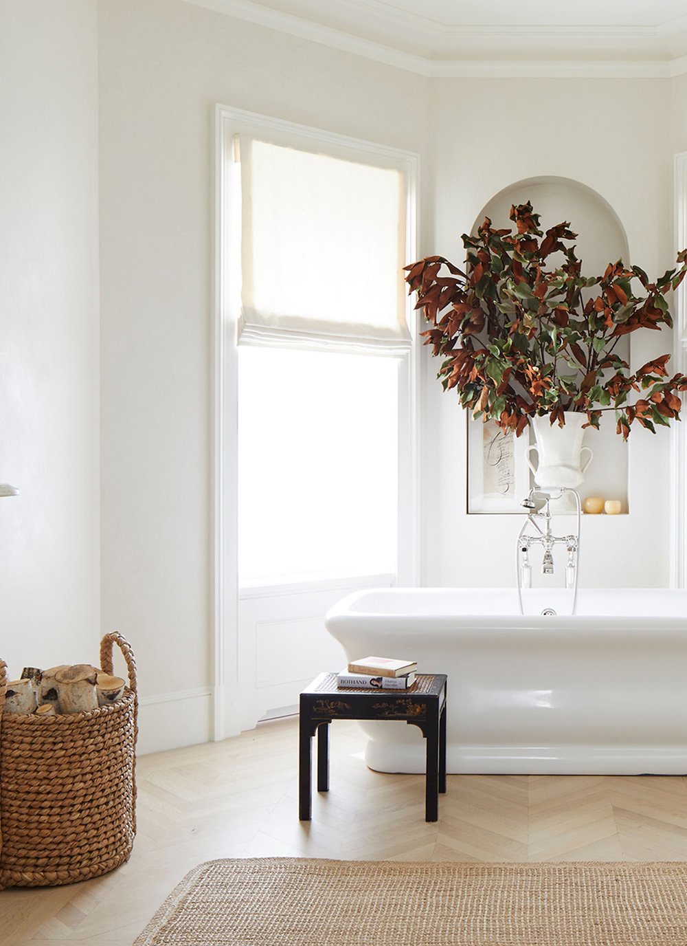
I also enjoyed the soaking tub vignette. When it comes time to renovate our own primary bathroom- this is honestly my dream bathtub… the curvy shape with the pedestal base is my favorite! Flanked by two windows with roman shades and an arched alcove above the tub for displaying artwork and statement magnolia branches, this simple vignette fits the floor plan nicely. I would love to see a pendant dropped above the tub though- even if only for added drama.

Design Eye Training : 116 - roomfortuesday.com
design : virginia tupker

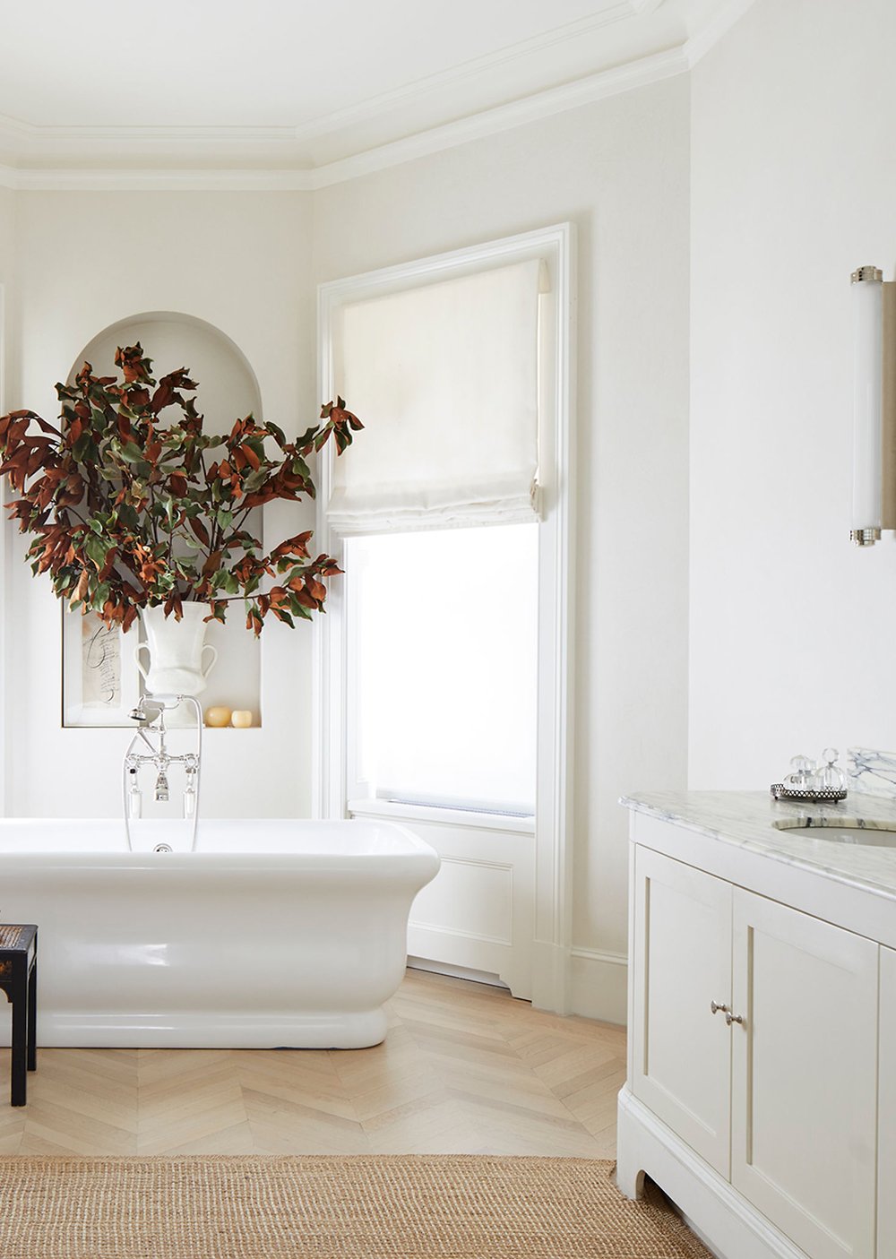
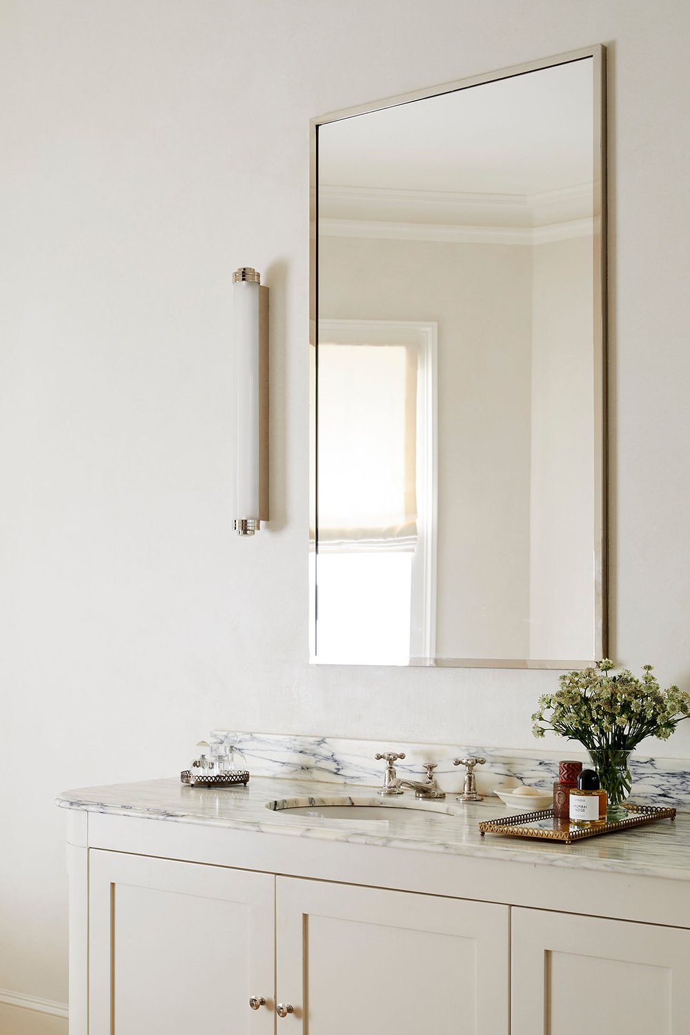
An odd moment I noticed that I’m unsure of? The woven area rug meeting the vanity leg. Has the rug been cut to accommodate the curved foot? Is it resting on top? It’s tough to tell, but I’m intrigued (and unsure). What are your thoughts? The simple vanity styling, on the other hand, is very well done. With matching graphic marble, an oversized mirror, a cylindrical vanity light, and a couple vintage vanity trays, it’s such a sophisticated and functional vignette with plenty of storage.

Design Eye Training : 116 - roomfortuesday.com
design : virginia tupker

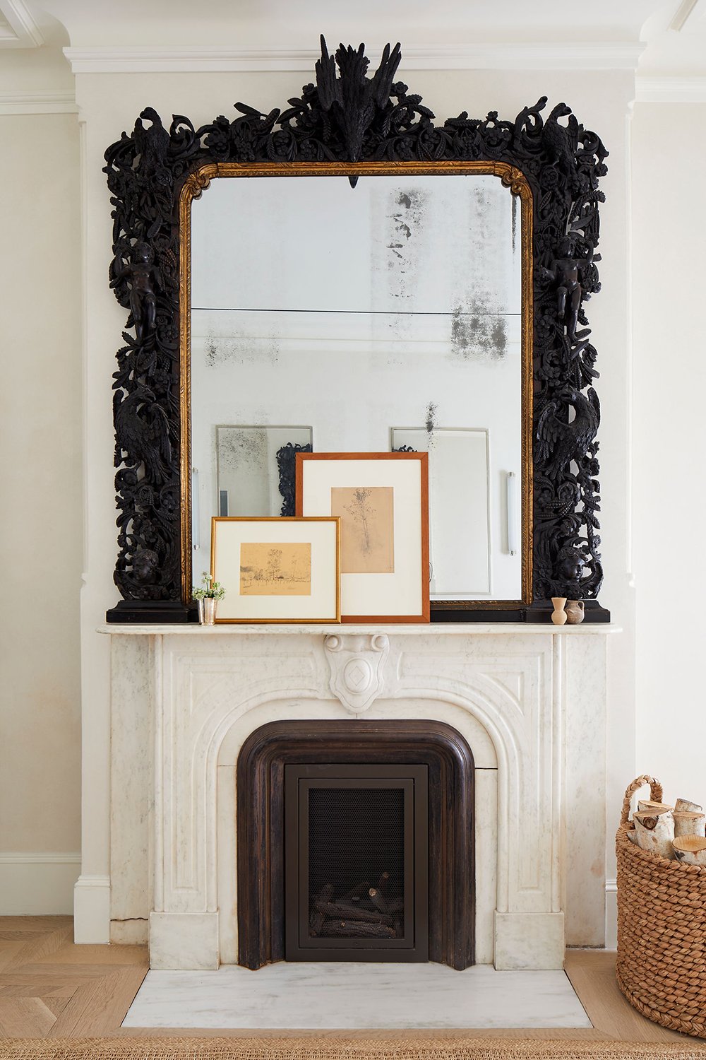
Can you even imagine having a fireplace in your bathroom? Talk about a dream come true… and what a bonus for an antique, ornate marble surround! However (even being a Scorpio), I’m not super into the dark ominous antique mirror, but I do love the gilded interior portion. Solely based on my personal aesthetic, I would have just went with a simple gilded mirror with less visual weight. That’s just my preference though.

Design Eye Training : 116 - roomfortuesday.com
design : virginia tupker

Spatially, the floor plan makes a lot of sense and fills the space nicely without feeling clinical with too much negative space (a problem I have in my current bathroom). The soaking tub especially looks perfect in its current location… the ideal backdrop!

Design Eye Training : 116 - roomfortuesday.com
design : virginia tupker

I also noted the classic polished nickel plumbing fixtures that match throughout, along with the vintage hand-painted ottoman… what a beautiful addition to the soaking tub vignette!

Design Eye Training : 116 - roomfortuesday.com
design : virginia tupker

What did you love about this space? Did anything specific jump out to you? I found the color palette, textural elements, and plumbing fixtures especially nice for the summer season ahead. Be sure to follow Virginia on Instagram for more design inspiration! Looking for more bathroom design inspiration? You may found this Pinterest board I’ve compiled to be helpful! I hope you’re having a great week, friends. What kind of space should I search for next month?

Leave a Reply

Your email address will not be published. Required fields are marked *

2 Comments

  1. Good morning! A more stunning and dramatic start to my Wednesday than I expected! Without question, that incredible marble shower takes the prize, and the inclusion of a skylight (I agree with your assumption) was key. The natural light in the entire space is lovely, but otherwise, I only note the sconces flanking the vanity mirror. Surely there must be other fixtures? I would also want some sort of chandelier or pendant over that gorgeous tub. I adore the curvy goodness of the tub and its subtle echoes in the rounded corners of the vanity and mantle. From a strictly utilitarian perspective, I’m wondering where one might hang a towel or robe nearby though. While I acknowledge that photos limit my complete understanding of a space, the rug placement feels awkward-like it’s cutting the room in half and doesn’t quite fit. Now, the fireplace. A perfectly imperfect marble dream, to be sure. As for the Black Forest, gothic phantasm of a mirror, I’m actually torn. I dig the drama. But the one dead (or diving?) raven right at the top ruins it for me. I know; my focus on the weirdest minutia is maddening. Overall, I think I’d actually prefer more detail in the space- art, plants, textiles-to mesh the statement moments. There’s certainly no denying the quiet luxury of the creamy walls, light herringbone floors and gleamy warm nickel touches though. I’d brush my teeth here. Ha. Thanks, as always, for the midweek design-muscle flex! I love an invigorating analysis. Sending calming, healing vibes for you & Emmett today.💜

  2. Good morning! An upper east side tour? Yes please! It certainly didn’t disappoint. There are so many captivating spaces- the velvet blue sofa?! Jaw on the floor over that entire room. This bathroom isn’t the star of the show for me. I love the layout. It feels spacious, with a good flow. Paired with the neutral paint colors and lighter toned wood floor, it evokes a sense of relaxing calm. I agree that the tub is ideal; in size, shape, and placement. The shower is the art of the space. That veining is stupendous and gives the right amount of contrast to prevent the rest of the room falling flat. Although I’d forever be scared to sit on the shower bench. I love the look of it floating, but my brain would go wild with the idea of it falling off mid shower. Ha! The fireplace surround is also a gorgeous statement to the space. I’m noticing a subtle injection of roundedness throughout this bathroom: the vanity sconces, rounded corners of the marble, the arched niche, the fireplace surround and the log basket. That brings me to a few irksome elements. I don’t love the junction of completely round and slightly round- for example: the complete curvature of the arch feels visually disjointed from the slight curvature of the fireplace surround. The same goes for the complete curvature of the sconces and the slight curvature of the base trim. Speaking of- there are two different curved profiles in the base trim- one profile for the windows, another for the vanity- where the trim meets the floor. But the real OCD tick is the tile between the fireplace insert and the surround. At first I thought it was a difference in size of grout spacing- but when I expand the picture it appears that one side is grouted while the other is not. I’m also not loving the visual crack in the marble on the left side of the fireplace, just shy of where it terminates to the floor. For me, these standout and detract from an otherwise very pleasing vignette. While the mirror isn’t to my taste, I can appreciate the injection of a more visually ornate statement piece; although like you, I would have loved for that to be in the form of statement lighting above the tub. I also wish there was a bit more artwork on the walls. Perhaps a few pieces between the vanity and tub bay? The left side of the room feels visually heavy, while the right side feels minimal. And the rug. On my screen it’s very apparent that it was cut to accommodate the vanity; on both sides. I think if it weren’t noticeable to me that the rug is misshaped, I could easily overlook it. Overall it’s a beautiful space, and there are elements here that would be lovely in any bathroom. For me, I love the other bathrooms in this brownstone far and beyond this one. In other news, I hope all goes well with Emmett’s surgery today. I’ll be keeping the both of you in my thoughts. By the way- the landscaping is looking gorgeous and I dig the plant selections for the window boxes. It’s all going to fill in beautifully! I hope today you’re able to take the time you need to care for Emmett; here’s to hoping he follows doctors orders! Hahah…no chance, am I right?! Have a fantastic one Sarah! XO