Design Eye Training : 110
How was your weekend? I’m happy to be back home! We had a wonderful time in Hawaii and although it rained every day, we were still able to make the most of it and get outside and explore. Who is ready for a new Design Eye Training post to kick off the week? This is a space you’ve actually seen before… do you recognize this kitchen from this 10 Pins post? Designed by the talented, Sean Anderson, this kitchen boasts beautiful finishes and provides a lot of inspiration. It felt fitting for spring and the rainy season we’re currently in- somewhere in between wishing for sunny summer days and embracing the rain showers that come along with the month of May. Click through for the quick tenth post of the series…
To quickly recap… in our Design Eye series, we observe and admire design fundamentals like scale, texture, pattern, material use, lighting plans, color, floor plan & layout, and a variety of intentional styling & interior moments pulled together by the pros. It’s an exercise I used to practice often in design school, and one I still enjoy today. By discussing and breaking down well designed spaces in greater detail, you’ll begin to train your “design eye”, build upon the design fundamentals, and can apply some of these things to your own home, if they appeal to you. I also feel like this series can really help you hone in your personal aesthetic, determining what you like and dislike… and most importantly, why. Ready to give it a try?
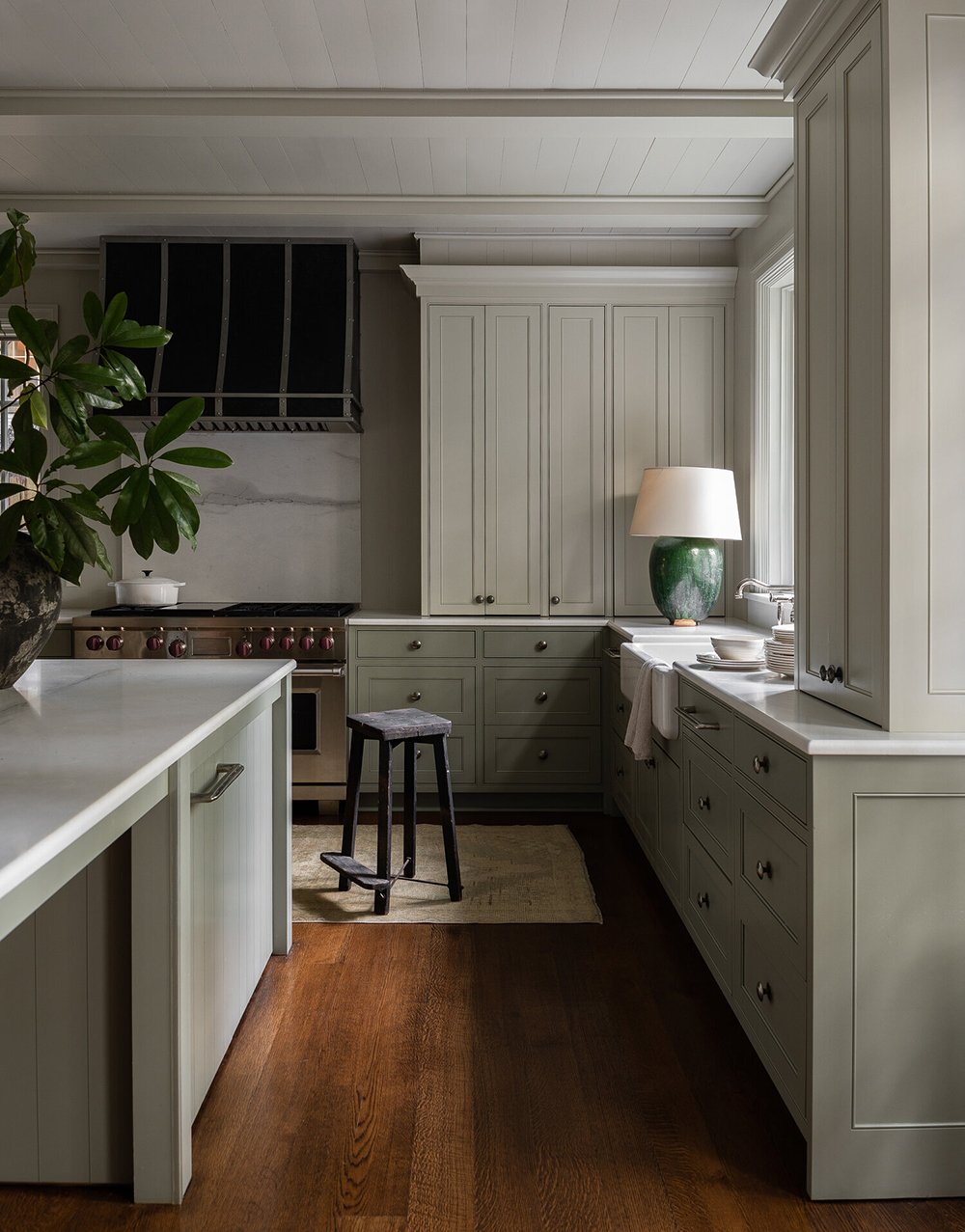
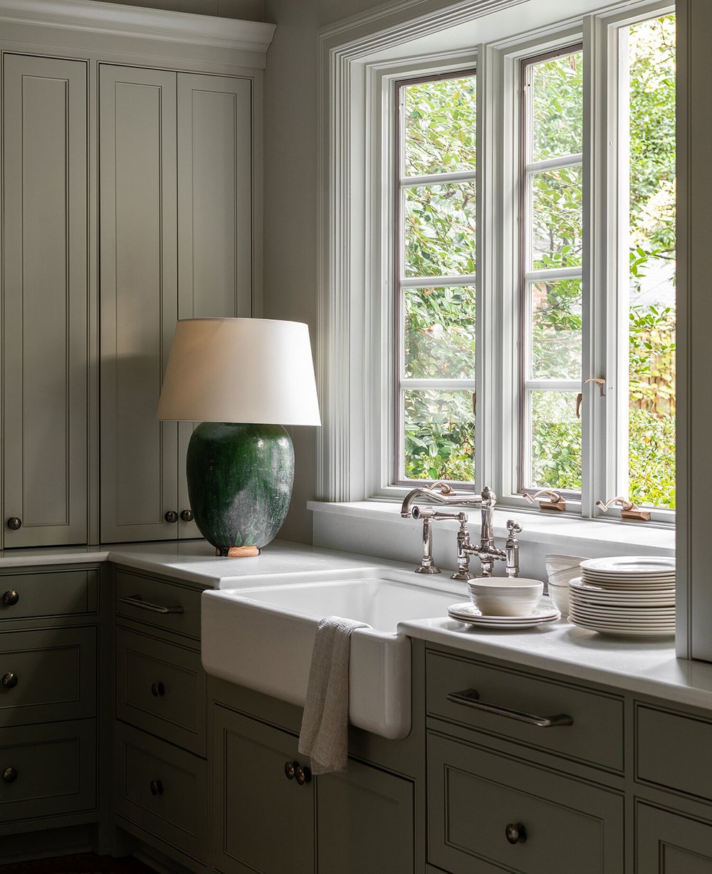
The first thing I noticed in this space was the dark, warm wood flooring. I think this is my favorite stain color for hardwoods- it’s very similar to what we had in our previous home and it feels very timeless to me. It goes to show that even with a cooler palette, warmth within natural materials (like wood flooring) can really make a space feel cozy and inviting. Oh- and if you missed this Design Discussion post on installing hardwoods in the kitchen, it’s a must-read!
While we’re talking color, I noted the gorgeous desaturated pale green cabinetry hue. It’s one of those chameleon colors that really changes with the light- looking lighter and darker in different areas of the space. I love the sophisticated tone and earthy element it brings to this kitchen. The simplistic cabinetry hardware is also very well done! Another cabinetry item to note… did you notice the small bead around the inset doors? Paired with the bead board on the island, yet painted in the same color, adds texture while keeping the cabinetry cohesive.
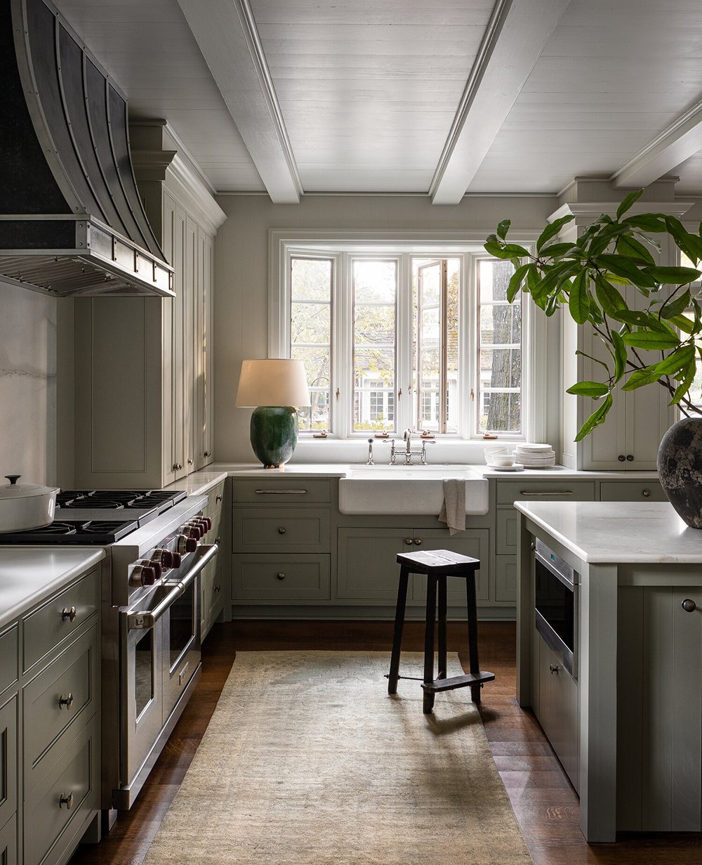
The ceiling treatment, large windows, farmhouse sink, industrial range hood, simple millwork, oversized branch arrangement, and vintage rug were also standouts for me… and you know I’m always here for a countertop lamp moment.
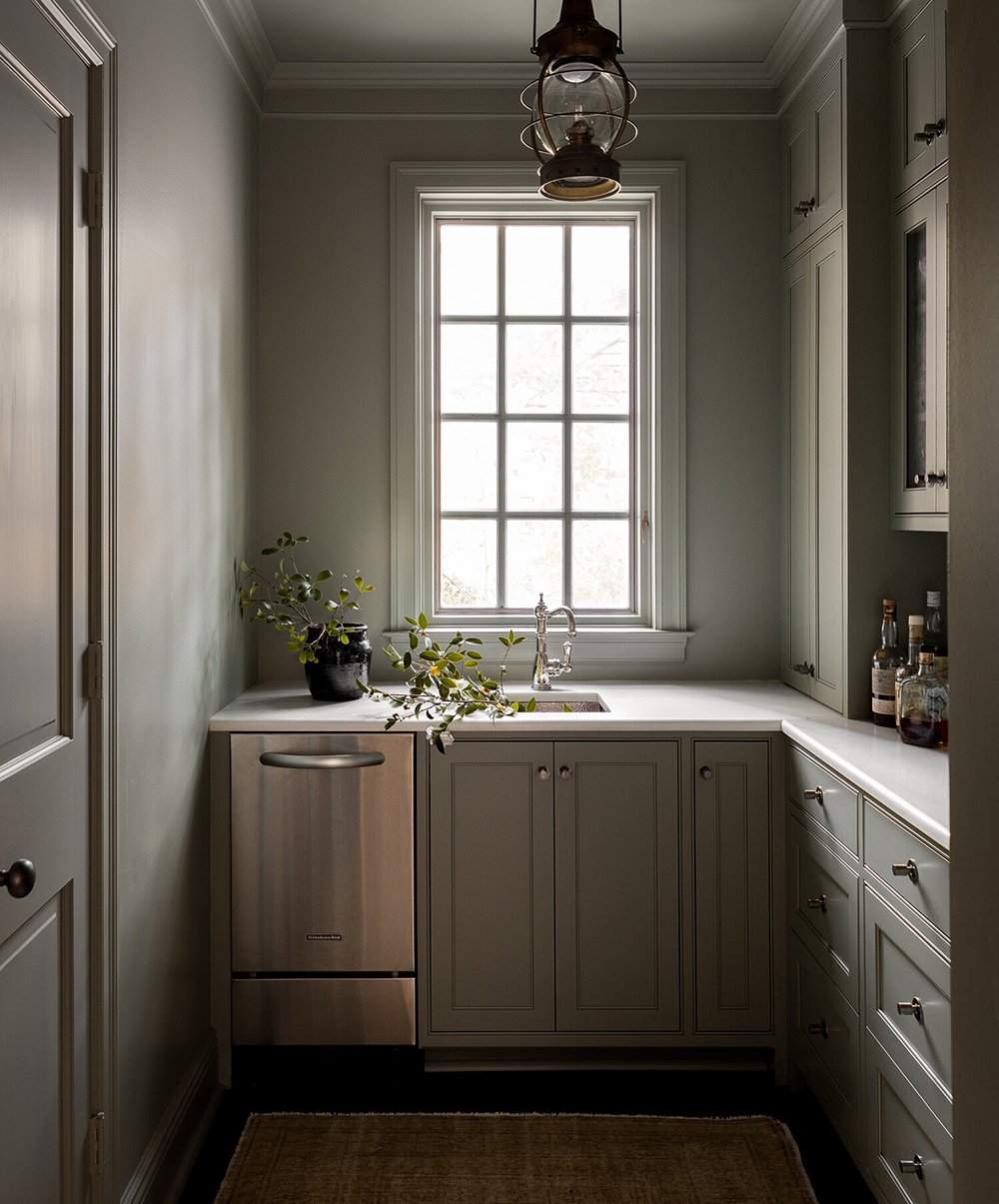
Adjacent to the kitchen is a cohesive or matching butler’s pantry. It also boasts polished nickel and aged bronze finishes. I love the vintage looking lantern light fixture and bar nook. I also wanted to point out the counter resting cabinets- which have been pretty popular this year. I’m seeing more of them pop up in my feed recently.
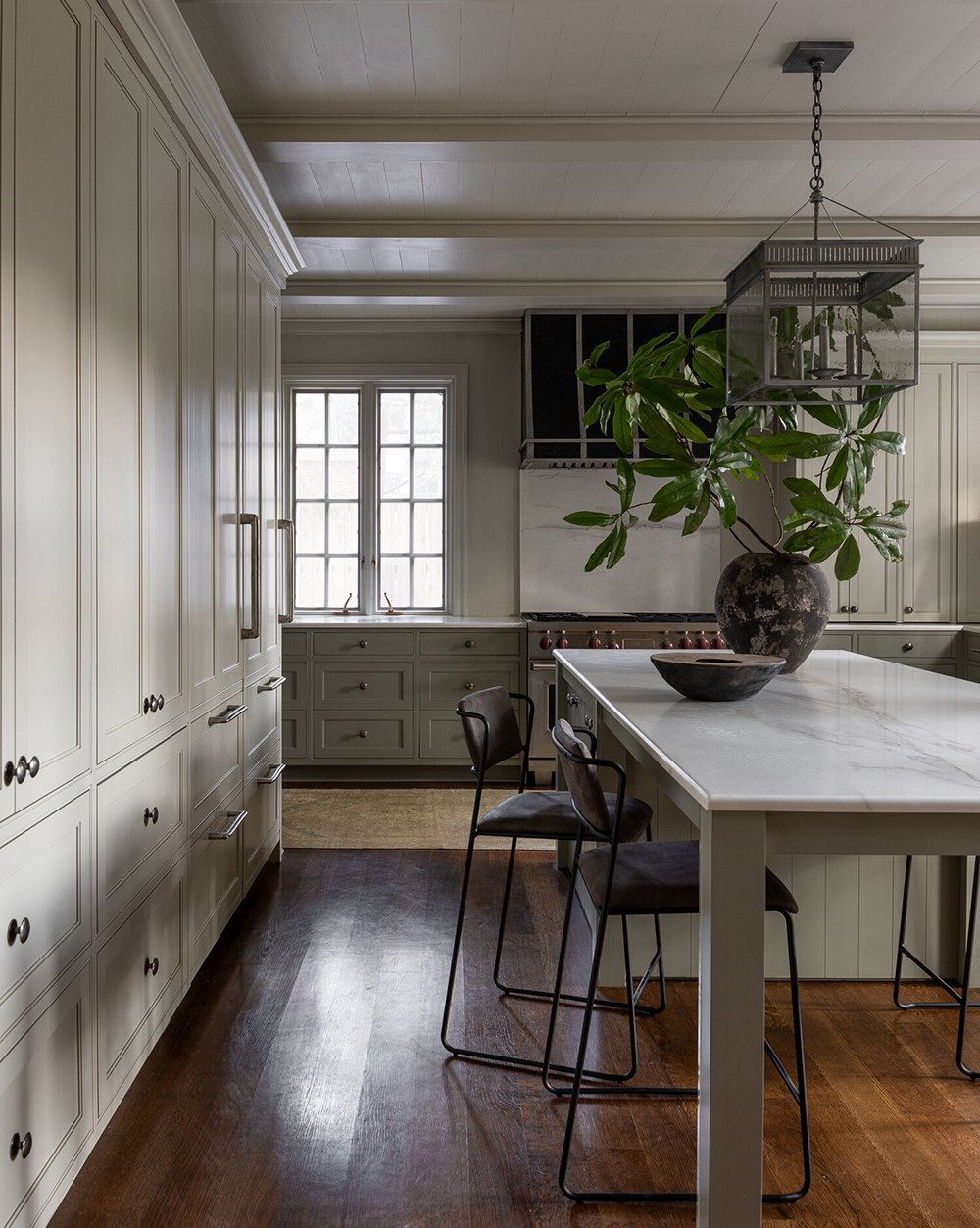
Overall, this organic and cozy looking kitchen expertly combines modern & classic elements. The modern barstools perfectly contrast the traditional cabinetry, flooring, and millwork. It’s really a lovely and calming space! Wouldn’t you like to spend a rainy day here cooking, baking, or sipping tea? I could definitely take a seat at that island with a good book and listen to a spring thunderstorm rolling through. Anyone else?
Here’s to a wonderful week ahead! I’m still playing catch up over here post vacation, but things are moving along in our entryway (I’ll share a tile update soon) and we made a random purchase the night before leaving for vacation- which will result in another fun project. I’ll be toting my laptop with me to doctor appointments this week (I’m still a medical mystery), trying to design on the go. I’m excited to share more! Hope you have a good Monday.