Design Eye Training : 104
Our first female designer, and one of my personal favorites, we’ll be admiring today in the Design Eye series is a stunning kitchen by the talented Leanne Ford. It actually appeared on season one, episode two of her popular television series, Home Again With the Fords. I honestly have yet to watch her series because we don’t have HGTV, but I’ve heard nothing but wonderful things about it. Have you watched it? Ready to get inspired by a beautiful kitchen that was apart of the Bell Project? Click through and let’s have some fun!
Since you understand how the series and exercise goes at this point, I’m going to skip the intro and work in a different format this time! I was lucky to find lots of stunning images of this space, so I’m just going to share what I see as I’m scrolling for this one…. rather than in an itemized list format.
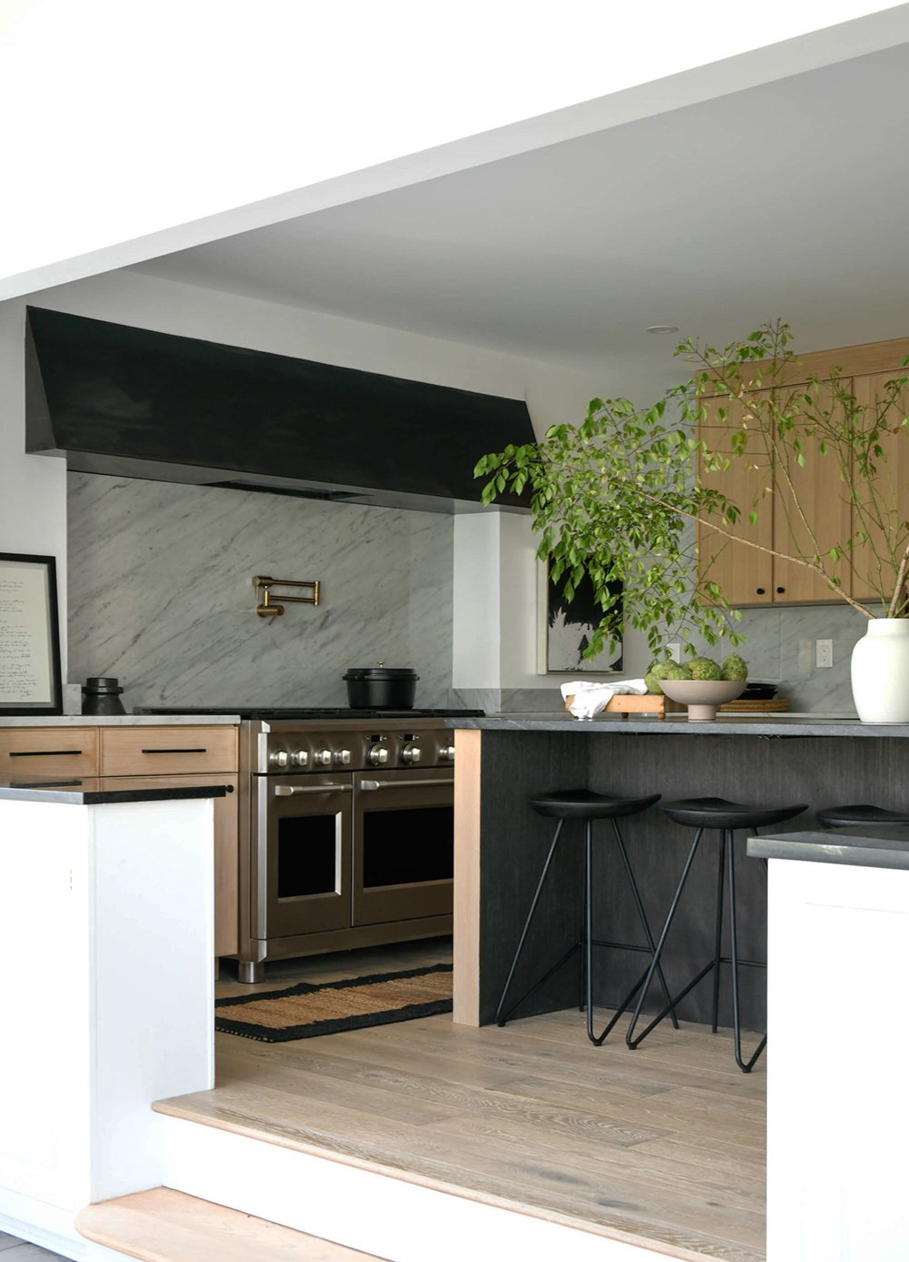
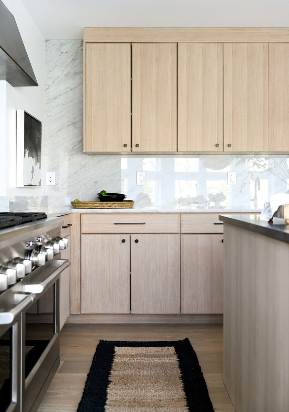
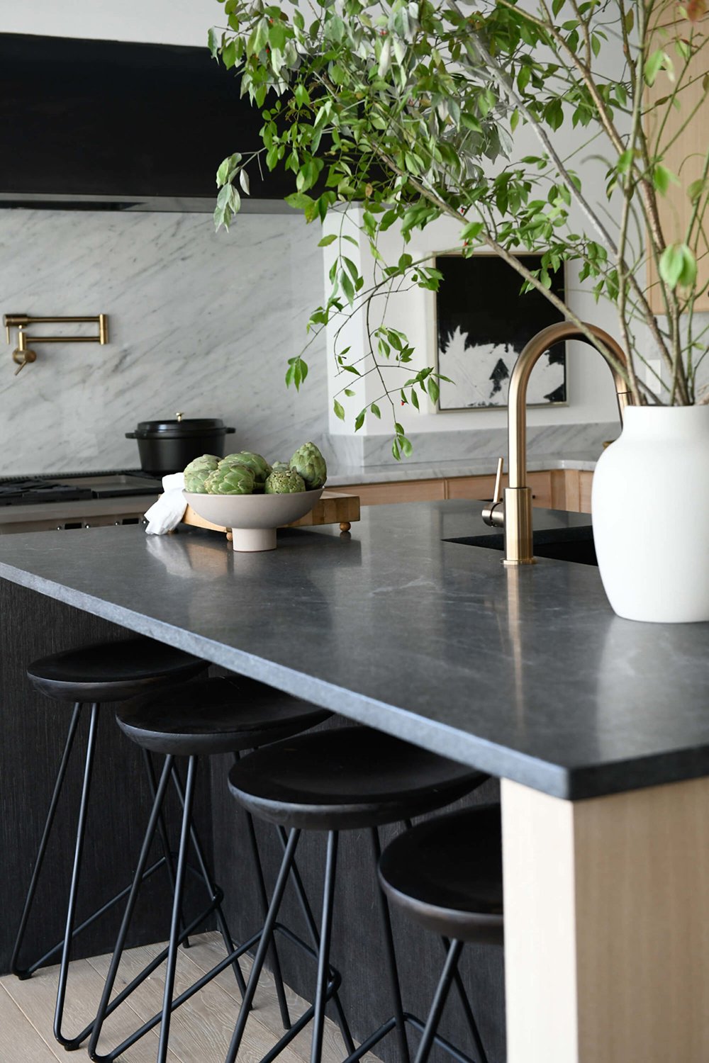
The first thing that struck me in this kitchen was the high contrast, neutral palette and use of materials. I immediately noticed many linear shapes jumping out, based on how the materials were paired. There are lots of hard edges in this kitchen, and I love the way the organic materials help to soften or offset them… like the unruly tree branches, the natural wood cabinetry, the use of wood and woven accessories, etc.
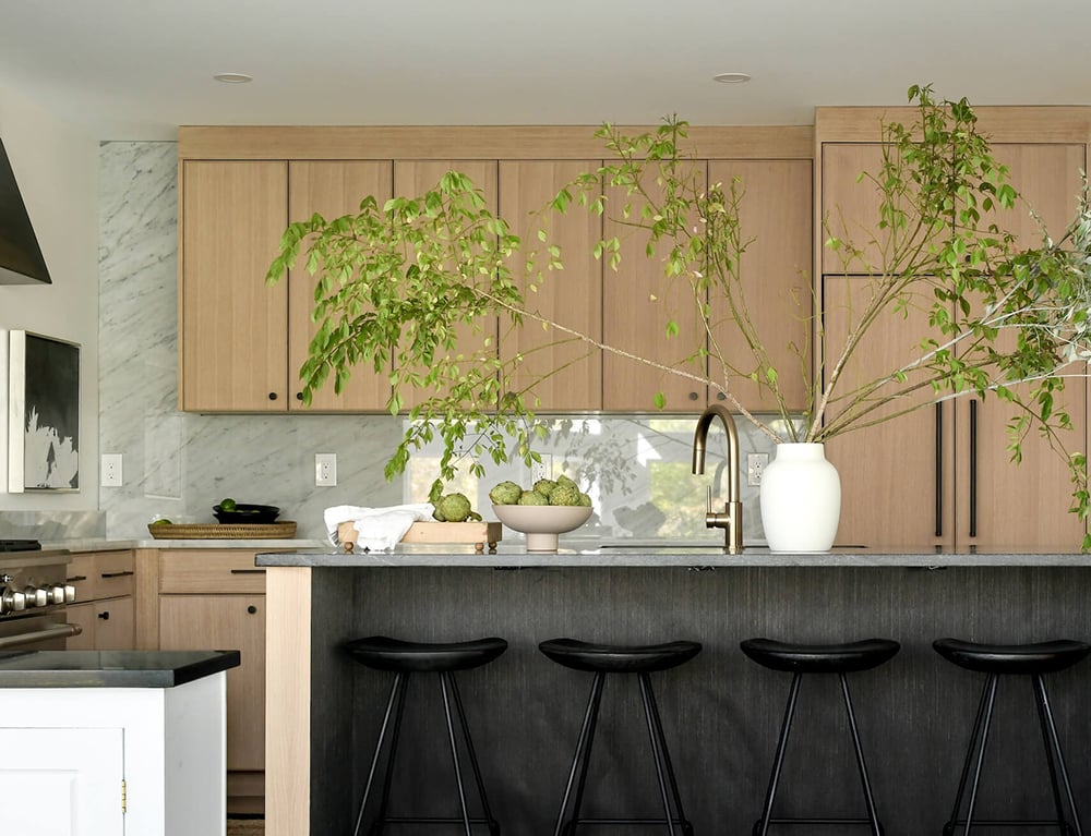
I also admire the juxtaposition between different surfaces. I’m normally not a polished marble type of gal, but it works really well against the soft wood cabinetry and island. In modern spaces especially, form plays a big part in the design, and this room is no exception. Do you spy lots of shapes? Circles, rectangles, ovals, triangles, and sculptural shapes (like the bar stools) really look striking against the minimal modern backdrop that is the cabinetry.
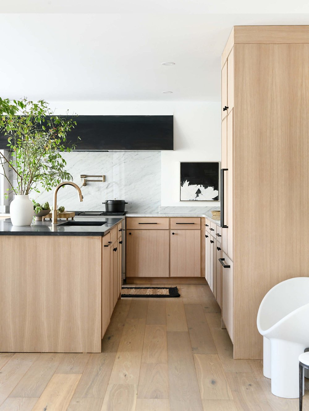
The monochromatic wood look (flooring that matches the tone of the cabinetry) really works well in here. It helps the room to feel bright, warm, and inviting. It also adds interest, since the space is architecturally minimal. What material do you think the island countertop is? Soapstone? Quartz? It’s so difficult for me to tell in the photos, but I want it to be soapstone that adds another layer of softness to the space. I also noted the hardware and mixed metals: antique brass with matte black for a streamlined, but warm look.
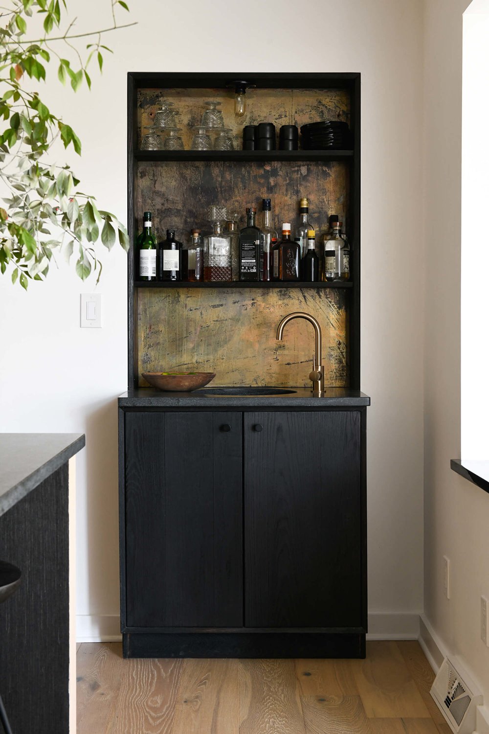
This little bar cabinet may be my favorite vignette in the room! I’m taking note of the antique gold shelf backing and the faucet installed to the side of the bar sink. It really adds some rustic charm to this modern space without feeling out of place. I also like that there is both traditional AND modern barware styled on the shelf… the tension or contrast is really good! Did you spy the tiny bulb at the top? I’m wondering how this looks lit up during the evening hours.
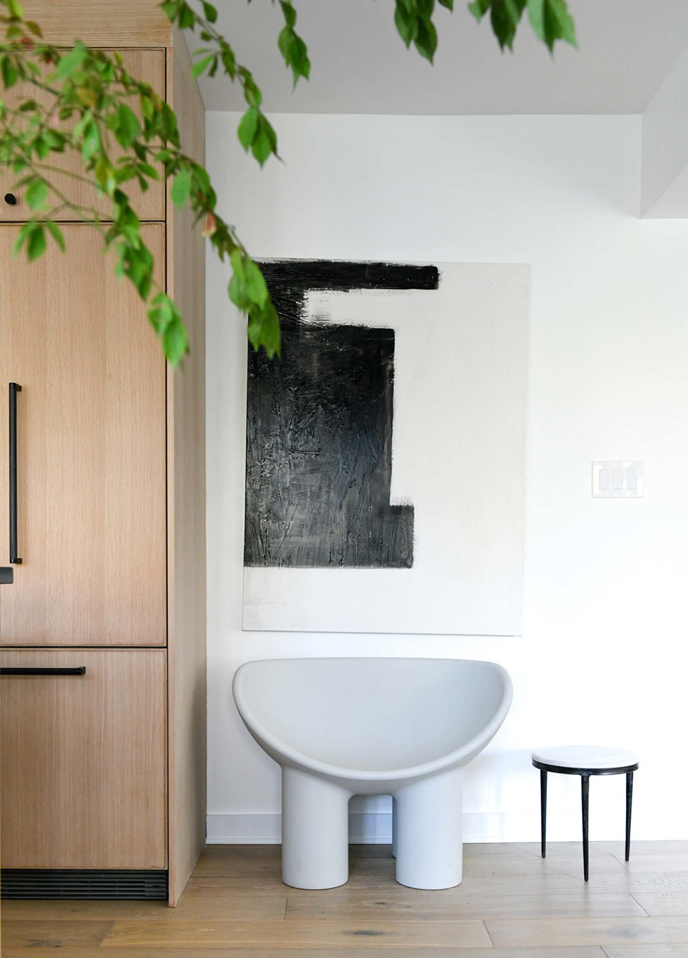
The last vignette is another minimal one: a single chair paired with a side table and modern art that perfectly fills the negative space, repeating the high contrast palette. Have you noticed these chairs everywhere lately? I have!! I’m going to go ahead and call it- these are going to be the next uber popular molded plastic chair… like the Eames style dining chairs that took the world by storm a few years ago. Too much of a good thing, my friends. I don’t think I’ll be hopping on that train. The shape is fun though!
If you’re interested in viewing the entire home makeover tour, click here! Are you still liking this series? Did you notice lots of fun details? I enjoy admiring and analyzing spaces from designers who are amazing at what they do. I feel like it makes me a better designer, shapes my thought process, and allows me to see things from a different perspective, looking in from an outsider. Happy Wednesday! I hope your day is off to a fabulous start.