Design Eye Training : 103
Many of you asked for more of these posts this year, and your wish is my command! The Design Eye Training series is really fun for me, too. This was one of my favorite exercises in design school and something I still love doing to improve my interior skills. This month I wanted to analyze a space from one of my favorite designers, Mikel Welch. I love following Mikel because he’s an incredibly talented designer who uses texture and color so beautifully, but also because he a kind, genuine, and fun person to follow. Be sure to join him on IG if you’re not already! He also has some pretty great blog posts. One of my favorite rooms he has designed is his Atlanta studio apartment living area. Click through to admire, analyze, and talk about the third space in the series with me. Luckily, Mikel has a lot of beautiful photographs of this one, so we’re really able to dive deep into this room.
I’m going to share what this series is all about (it has been awhile)… keep it simple, make observations, and try to spot intentional design moments. We’ll be analyzing the images throughout this post, I’ll ask some guided questions, and share my own thoughts on the room. By discussing and breaking down well designed spaces in greater detail, you’ll begin to train your “design eye”, build upon the design fundamentals, and can apply some of these things to your own home, if you wish. I also feel like this series can really help you hone in on your personal aesthetic, determining what you like and dislike. Ready? Let’s do it! Give yourself a couple minutes to jot down your thoughts. What are you observing in the images? Is there anything specific that stands out to you? What do you think works well? What would you change? Can you imagine how this room functions? Does it feel like a cohesive space? Why?
Here is the quick list of design-related things I noticed, jotted down, and loved in this room…
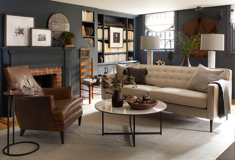
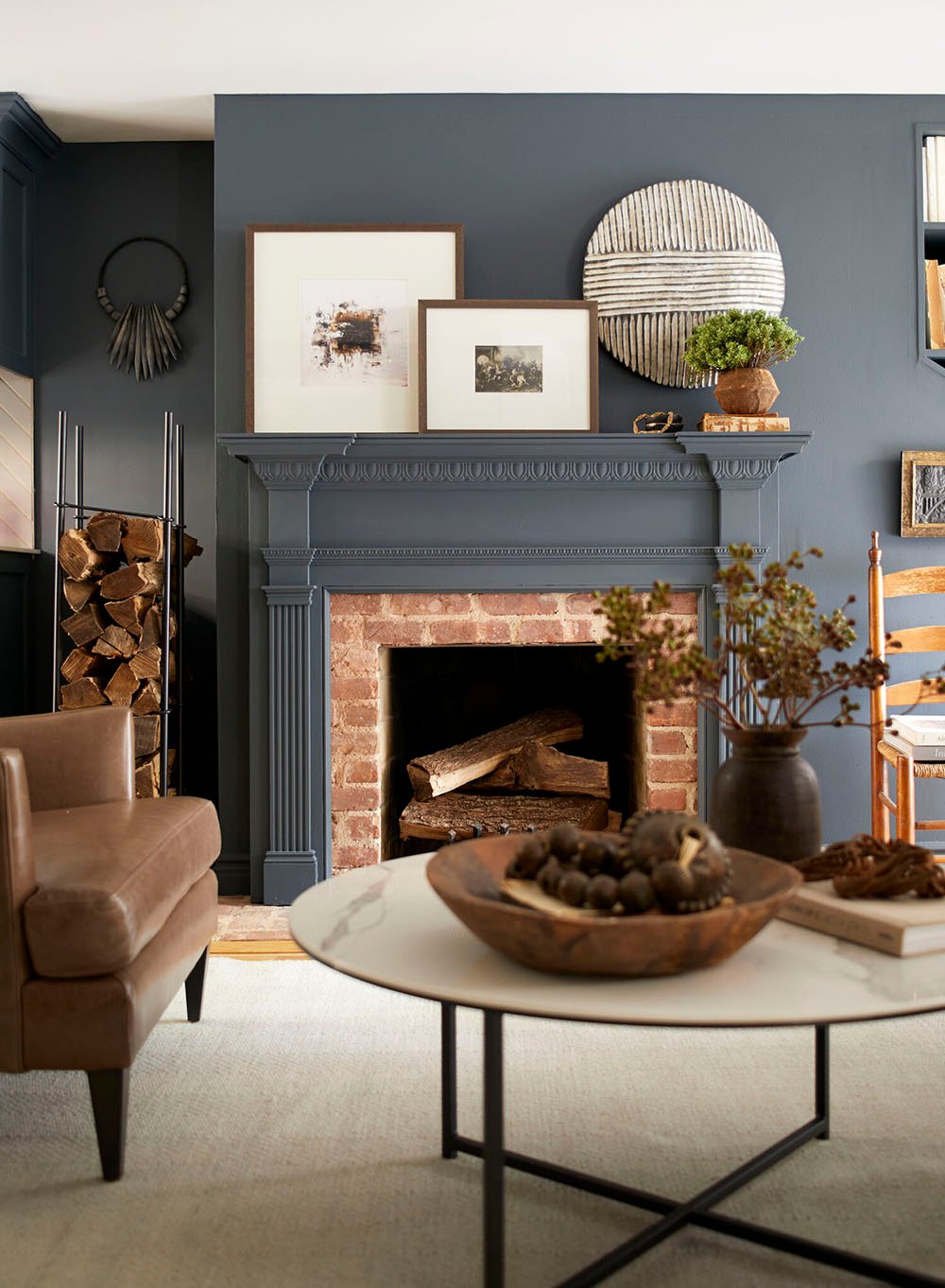
- The timeless color palette (navy, off white, black, and gray) mixed with plenty of neutral organic elements.
- How existing architectural elements were painted to blend seamlessly (the windows, built-ins, & fireplace painted the same color as the walls for cohesion).
- The installation of single hinged arm sconces as gallery lights- to emphasize works of art and textiles… genius!
- Excellent floor planning and use of a small space. The seating area is functional, to scale, and the traffic paths are well thought out.
- This space has a great modern meets traditional balance, in terms of furniture and decor. The opposing styles really balance one another.
- Embracing organic and textural elements: hardwood flooring, woven materials, soft linen window treatments, aged brick, stacked wood, incorporation of leather and wool textiles, etc.
- The millwork is beautifully done in this space… it’s not too large or too much, and fits the scale of the room nicely.
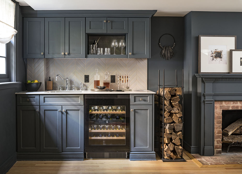
- The kitchenette is small, but mighty- I like how Mikel tiled around the duct work in the left corner. It makes it blend and look less noticeable. I also like the removal of the microwave space, which was turned into open shelving with some sort of grass cloth backing. Nice touch!
- I really enjoy the subtle use of pattern in this space… the chevron backsplash tile, the running bond bricks, and the subtle stripes in the area rug.
I also wanted to share some notable styling moments that stood out to me, because Mikel is impeccable at styling!
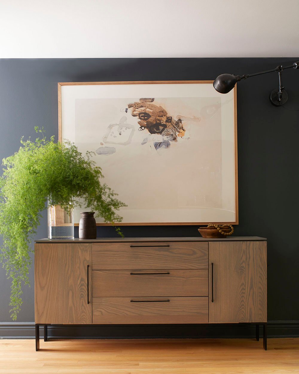
- The intro image is just PERFECT… the beautiful soft, textural fern arrangement (gahhh!!) with the large scale art and modern credenza- again with the offset hinged arm sconce… so stunning and balanced!
- The art placement above the antique chair makes for a really nice vignette and fills the negative space below the odd angled built-in… another great styling move that provides symmetry.
- There are lots of repeated shapes within the furniture and decor… circular elements (wall art, sculptural necklaces, tables, bowls, baskets, etc). These repeated shapes feel intentional and help the space feel cohesive.
- I love the use of plants, greenery, and branches. I enjoy seeing living elements and touches of greenery throughout the space.
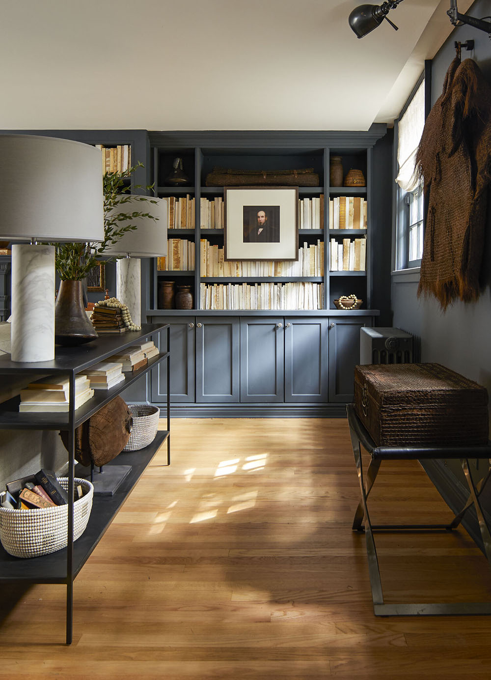
- The deconstructed books are definitely a planned design move- I personally love the look and textural & color consistency, if you’re trying to fill shelf space. I also took note of the balanced shelf styling- if you look at the quadrants, you can see how everything is nice and symmetrical.
- The layered artwork is another big win for me in this room! Did you notice all of the frames are the same- despite the different content? They all have a thin, modern, wood frame- another cohesive element.
That’s pretty much all I could fit into 2-3 minutes before my timer went off. Did you notice lots of similar things? Maybe there is something you took note of that I missed?
Wasn’t that fun?! I feel like it was an inspiring start to the morning. I really enjoy these posts! I’d love to hear some of your favorite designers- maybe we can admire one of their spaces in the next post of the series. I tried to find a room with more images and a variety of angles this time around. I’m hoping for a productive, peaceful, and positive day. Have a happy Wednesday, friends!