Design Eye Training : 101
After reading many similar comments and messages over the years, you all gave me an idea for a new series… how to train your design eye! I love getting messages like, “It’s so interesting to see how you dissect a space,” or “I never would’ve noticed that detail, but I’m definitely going to start, now that you pointed it out!” I’m all about sharing educational design knowledge I’ve acquired over the years, and this felt like it could be such a fun opportunity for a monthly or quarterly series (depending on how you like it). My advice for those looking to improve their design skills has always been practice- or consider a mentorship or additional design classes (if you’re looking to practice on a professional level), so I thought this series would be a cool critique of sorts, that would be fun and beneficial for both interior design lovers and experts alike. Click through to dive in with me, and admire our first space together!
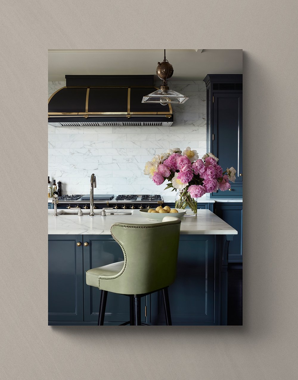
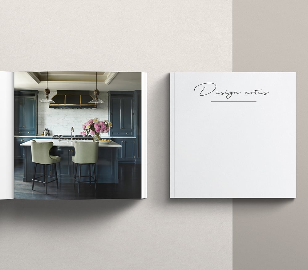
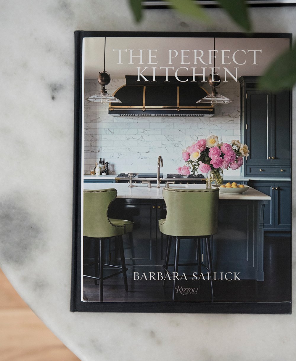 Alright- today’s image (drumroll)… we’ll be admiring and analyzing a space from one of my new design books that came in the mail this week… The Perfect Kitchen by Barbara Sallick. The kitchen on the cover immediately caught my attention because it feels very similar to my own kitchen. Did you notice that, too?! In fact, I had the book sitting on my desk and Emmett actually thought it was our kitchen (haha, I wish)! Anyway, it’s a beautiful space designed by the talented architect John B Murray, that will make a really exciting first “Design Eye Training” post.
Ready to read about my concept for the Design Eye Training posts? I want to keep it simple! I’m going to share an image or space, ask you some guided questions about it, and then I’ll share my own thoughts on the room. Within each post, we’ll analyze one image or room together. You’ll probably notice repeated design talking points throughout the series (the basics), and other items that are specific to a certain style, material, or space. By discussing these rooms in detail, you’ll begin to train your design eye, remember talking points, design fundamentals, and begin to apply them to your own home (in your own aesthetic). Ready? Let’s do it!
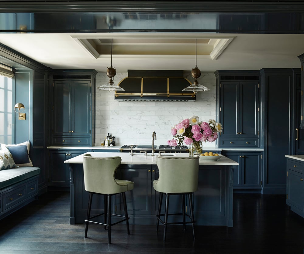
What are you observing in the above image? Is there anything specific that stands out to you? What do you like or dislike? Can you imagine how this room functions? Does it feel like a cohesive space? Why? Give yourself two fast minutes to jot down or consider your answers to these questions! I’ll copy my quick notes below…
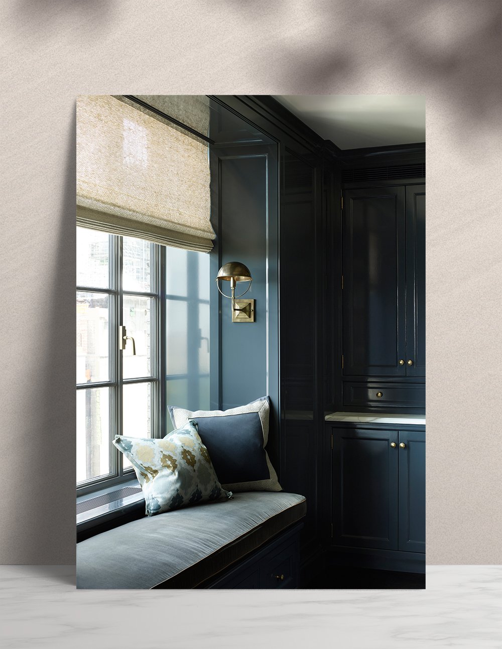
- High contrast & color // deep blue cabinetry, bright carrara marble, pink peonies, yellow lemons, dark wood flooring, heavy black range hood, creamy warm ceiling color
- Organic materials // wood floor, marble backsplash and countertop, wood barstool legs, floral arrangement, linen window treatment, leather barstool upholstery, ceramic bowl filled with lemons
- Depth // coffered ceiling detail, countertop cabinets, built-in seating, millwork
- Mixed metals // nickel faucet, nickel & brass range, brass and black range hood, bronze lighting, brass lighting, brass cabinetry hardware
- Textiles / velvet bench seat cushions softens the space, two contrasting accent pillows (geometric & organic prints), leather bar stools, linen roman shade, … would a rug be a nice addition?
- Texture / within the organic graphic movement of the marble, within the countertop floral arrangement
- Finishes / glossy lacquered cabinets, polished and antiqued metals, patina-aged hardwood floors, polished marble countertops, flat ceiling paint
- Lighting / natural light from window, sconces at seating area, double pendants over the island… is this sufficient? Would like to see more (countertop lamp, recessed lights, range hood lighting)
- Details to note / built-in radiator or air vent cover behind bench seat, window hardware, piped edge on velvet seat cushion, nail heads on barstools, curved feminine shape of barstool back mimics the curved corbels beneath the island countertop, TONS of storage
- Balance / range is framed by bookend cabinets, island is centered in front of range, pendants and coffered ceiling center frame the entire vignette, bench seat balances bank of cabinets to the right, everything is paired (pendants, cabinets, bar stools, double knob hardware, etc)
My list may be longer than yours, but remember- I’ve been doing this for a long time and notice alllll the details. Whatever you can squeeze into your thoughts during those two minutes… analyze why you noticed those things. Do you like the way the room works together? I think it’s brilliant! Well done, Mr. Murray.
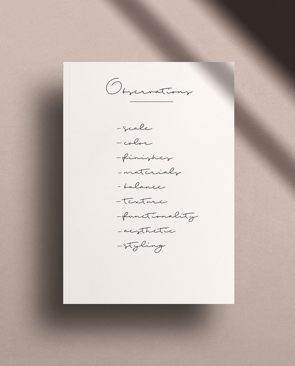 In the above image, I listed out some things to look for… the basics, if you will. I always like to observe scale & proportion, color, choice of finishes, use of materials, balance, texture, functionality, the overall aesthetic, and of course- the styling. If you can point out observations in the aforementioned design areas- you’re doing amazing! Maybe you already have a great design eye, you’re just looking to hone and refine it. Is there anything I didn’t talk about that you noted? In design school, we used to do this exercise and jot down our initial thoughts about a room in a “design notes” journal. I still practice this and it’s a really fun activity if you’re into design books, magazines, or even Pinterest images (that’s where my idea for the 10 pins series originated).
This series is already really fun for me because it’s more of a two-sided discussion and another way to connect with you and share my knowledge! Often times I feel like I’m rambling since I’m the one doing all of the writing and talking on here, but I love chatting in the comment section. I can’t wait to hear what you noticed or what things were new discoveries that you might begin noticing in the future. What do you think? Are you into this series idea? Does it feel helpful? Next time, would you like me to elaborate more on my thoughts outside of the two minute timer? I hope as a design professional, I can offer some solid advice, educational content, and feedback within this series. Tell me everything below, and have a wonderful weekend!
