The Bathroom : One Room Challenge – Week 3
![]() How are we already in Week 3 in the One Room Challenge? The days are flying by! This week might be my favorite progress post to date (of all of the room shares in my home). There’s something about tile that really does it for me, and that’s exactly what you’re going to get today… all things tile. And let me tell you- this tile is good. So much for modesty… but really, I’m obsessed! I also have a few designer tricks up my sleeve that I’m sharing in the post. If you have a small bathroom that you’d like to look larger, these hacks are for you. Click through for the details.
How are we already in Week 3 in the One Room Challenge? The days are flying by! This week might be my favorite progress post to date (of all of the room shares in my home). There’s something about tile that really does it for me, and that’s exactly what you’re going to get today… all things tile. And let me tell you- this tile is good. So much for modesty… but really, I’m obsessed! I also have a few designer tricks up my sleeve that I’m sharing in the post. If you have a small bathroom that you’d like to look larger, these hacks are for you. Click through for the details.
In case you missed the first couple weeks, no worries… catch up here: click for Week 1 (before images and the plan) and Week 2 (demo and prep).
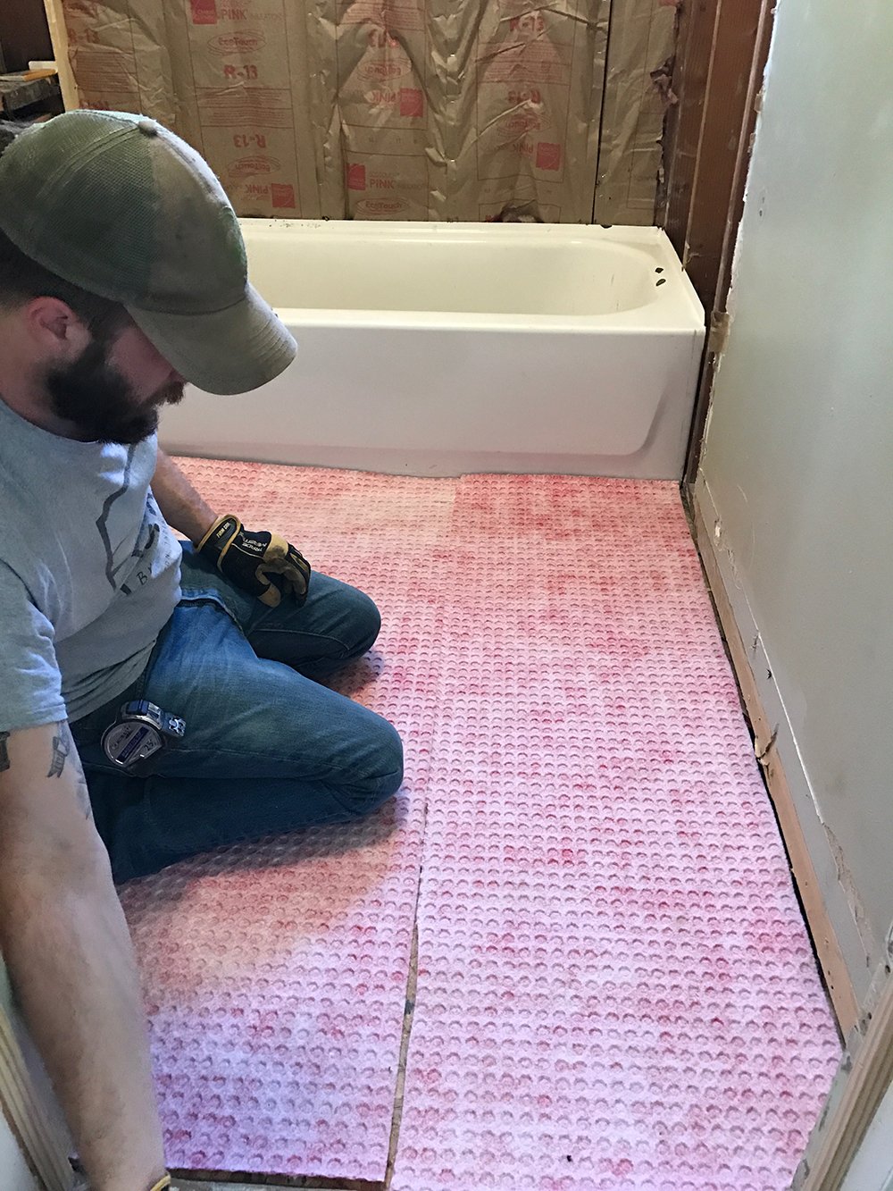
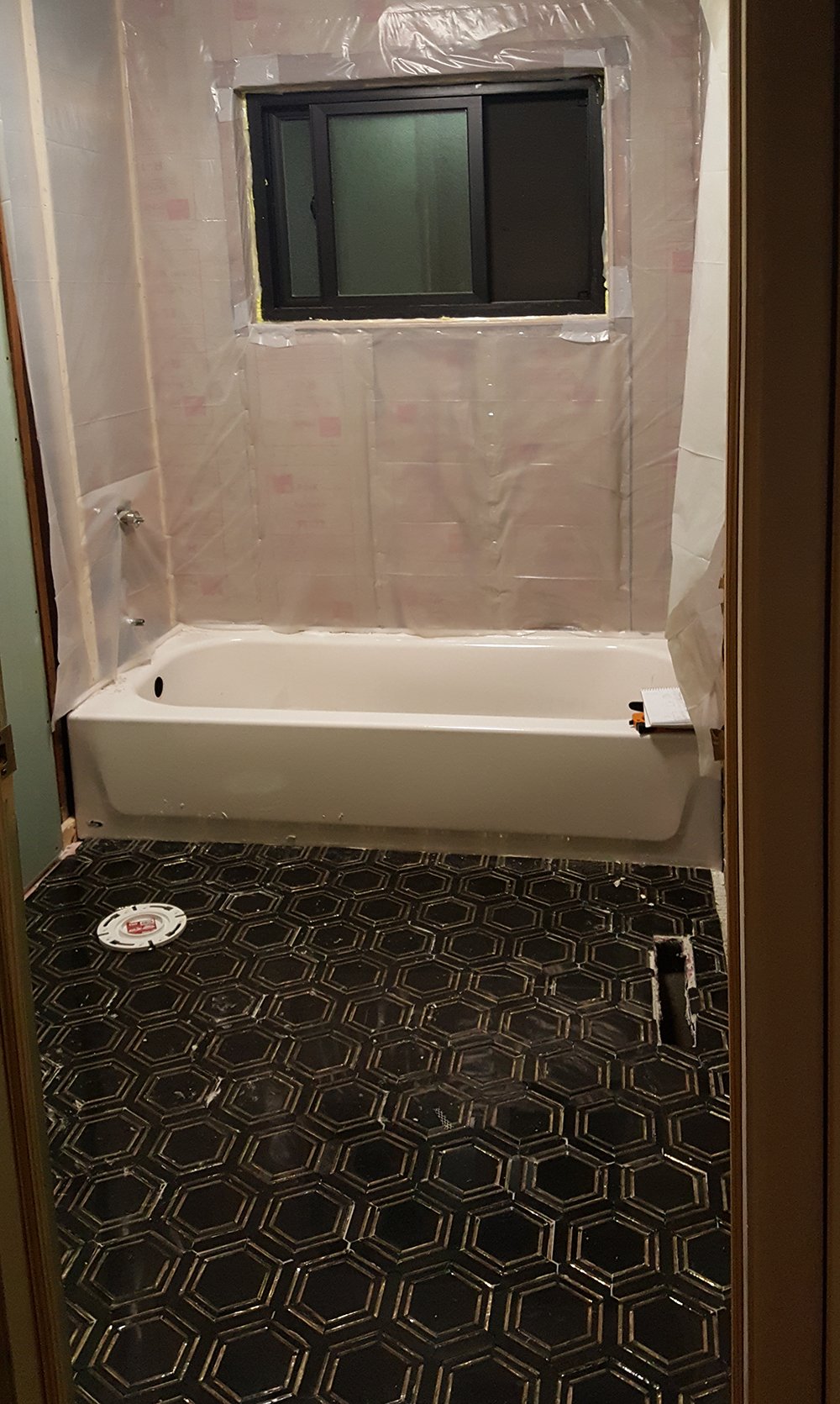
Last week, we completed demo and prepped the bathroom for tile. Now for the fun part: tile installation! This is really where the bathroom starts to take shape. We tried a new product that worked amazing for the floor tile. Emmett installed a waterproofing membrane prior to starting on the floor tile. After rebuilding the subfloor, we wanted to ensure zero moisture was capable of soaking through the floor tile to the wood. Being overly cautious pays off.
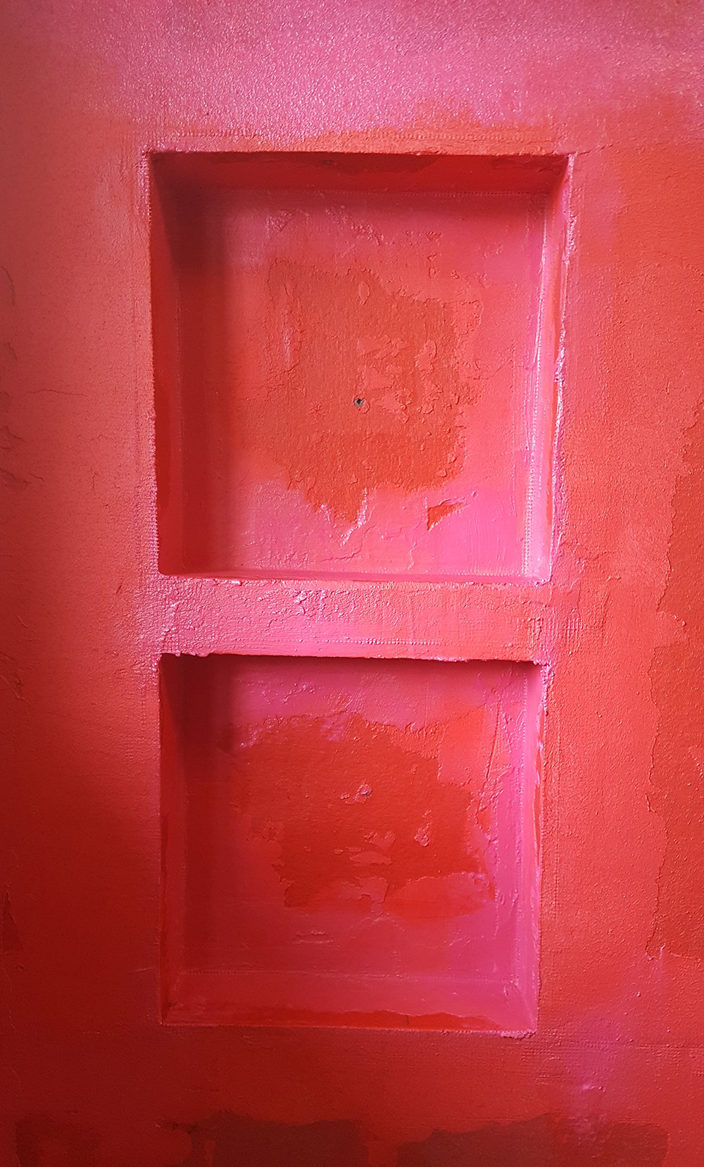
 We applied a similar waterproofing membrane to the walls. Unlike the floor padding, the wall application is painted on. It starts off as a bright pink and dries into a pinkish red once it has solidified. It almost had a rubber texture to it.
 Before I dive into the fun part (tile), I wanted to elaborate on my tile selection. This might come off as harsh, but in the design industry, things are constantly evolving… including trends. Although subway tile is classic and timeless, in my opinion it’s kind of overdone right now. If I see another bright white space filled with standard subway tile and the same boring fixtures, I’m not impressed or awed. The same goes for basic ceramic or marble hex tile on the floor. As a designer, I enjoy pushing the limits, not playing it safe, and my goal is always to share things that have yet to be done- or at the very least prove to be interesting inspiration. Normal, boring, average, or ‘been done’ are descriptive words I try to avoid. So if you’re wondering how this philosophy affected the bathroom, I’ll explain it below.
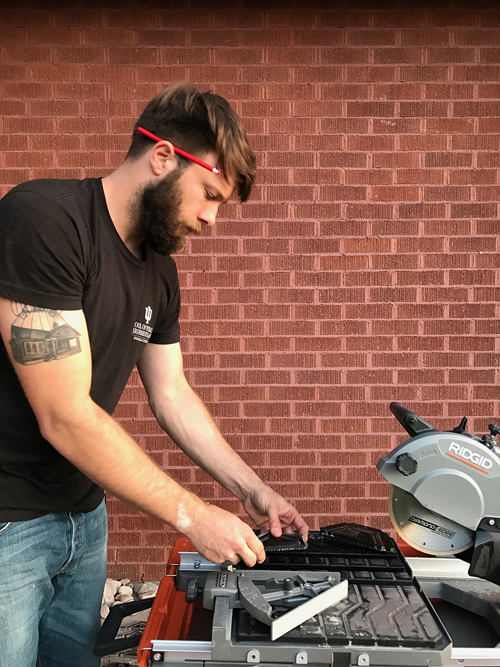
But first- shoutout to our fellow Hooisers (Emmett’s shirt and our alma matter) and in honor of our last home (Emmett’s tat), let’s get this reno wrapped up!
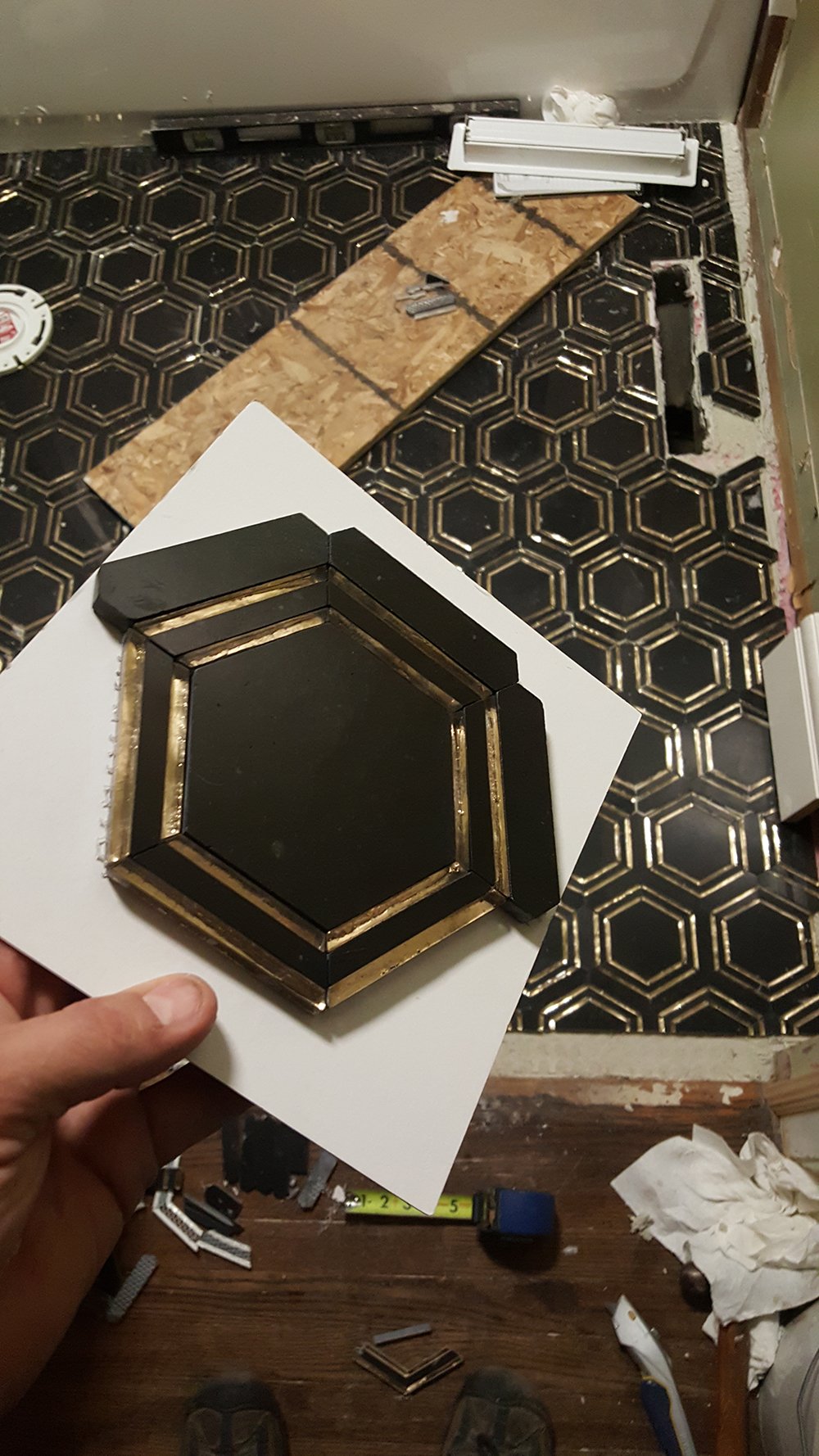
 I knew I wanted to make a statement in this tiny bathroom while maximizing the space. It’s so small, I really wanted to elongate the height of the room, eluding to more square footage than there actually is, all while making the design feel fresh. So, how exactly did I do that? Everything happened around the floor tile. It was truly my jumping off point. This gorgeous nero (black) marble is flashy yet timeless, and incorporates a brass element I so desperately wanted to add to the floor. At first I researched metallic grout or joints, but realized a tile was more feasible for the budget and timeframe. Once I nailed down the large hex floor tile, I sourced a wall tile. I didn’t want the walls to compete with the floor and the space is small enough as it is, so I opted for a subway tile, BUT not in the way you’d expect.
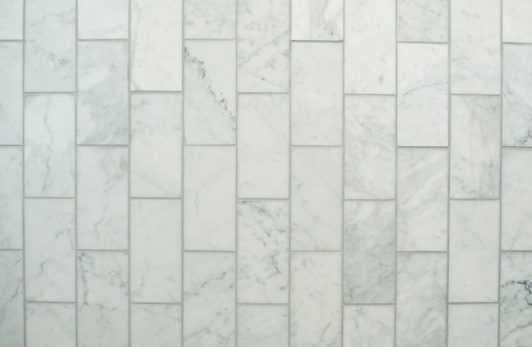
 I ordered honed carrara 3×6 subway tiles (basic, I know) with the intention of running them in a vertical running bond pattern. Why vertical? Remember how I wanted to elongate the ceiling height? Running tile in a vertical pattern helps with that… and it’s unexpected (a win / win).
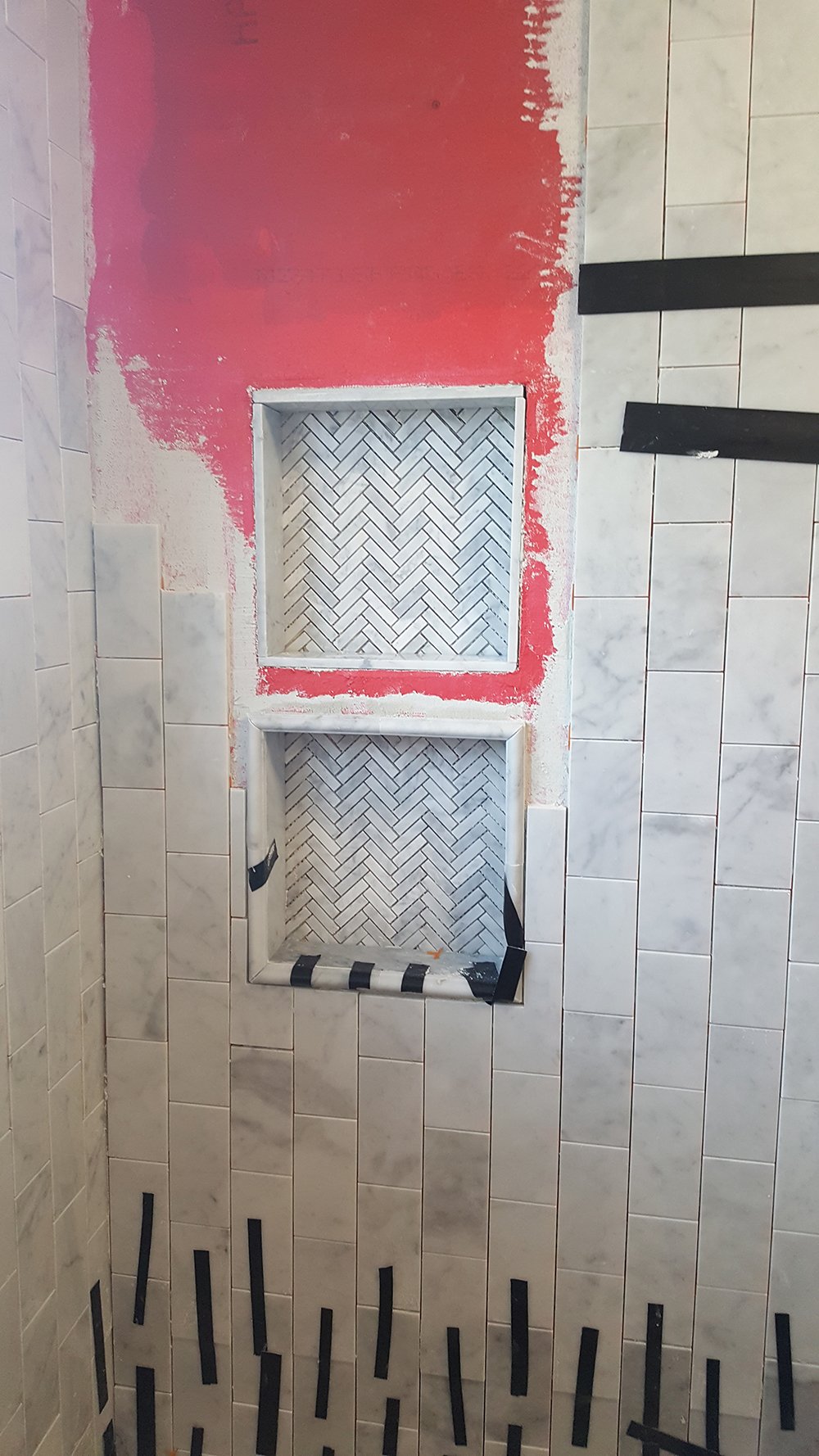
 I also wanted to add contrasting tile to the shower niches. A good rule of thumb when selecting multiple tiles in a single shower is to use different shapes or patterns of the same material. I opted for a small carrara herringbone tile for the niche (also shown in the intro), as well as matching pencil trim for framing them.
 In regards to the details, the window received a similar treatment. I sourced carrara trim with a curved edge that elegantly frames out the window and the ledge. Everything matches, looks stylized, and most importantly- compliments the flooring. The floor is really the star of this space.
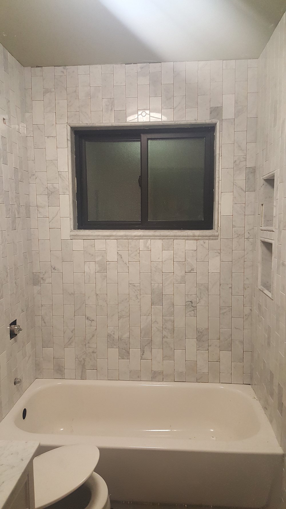 Here’s a peek of everything before grout! It came together really nicely- Emmett did a great job. I can’t wait to rip out that big ugly light fixture. You can’t really tell from this image, but it’s super dated and houses lots of dead bugs (gross). The plan is to patch the ceiling and relocate it because it isn’t even centered in the room.
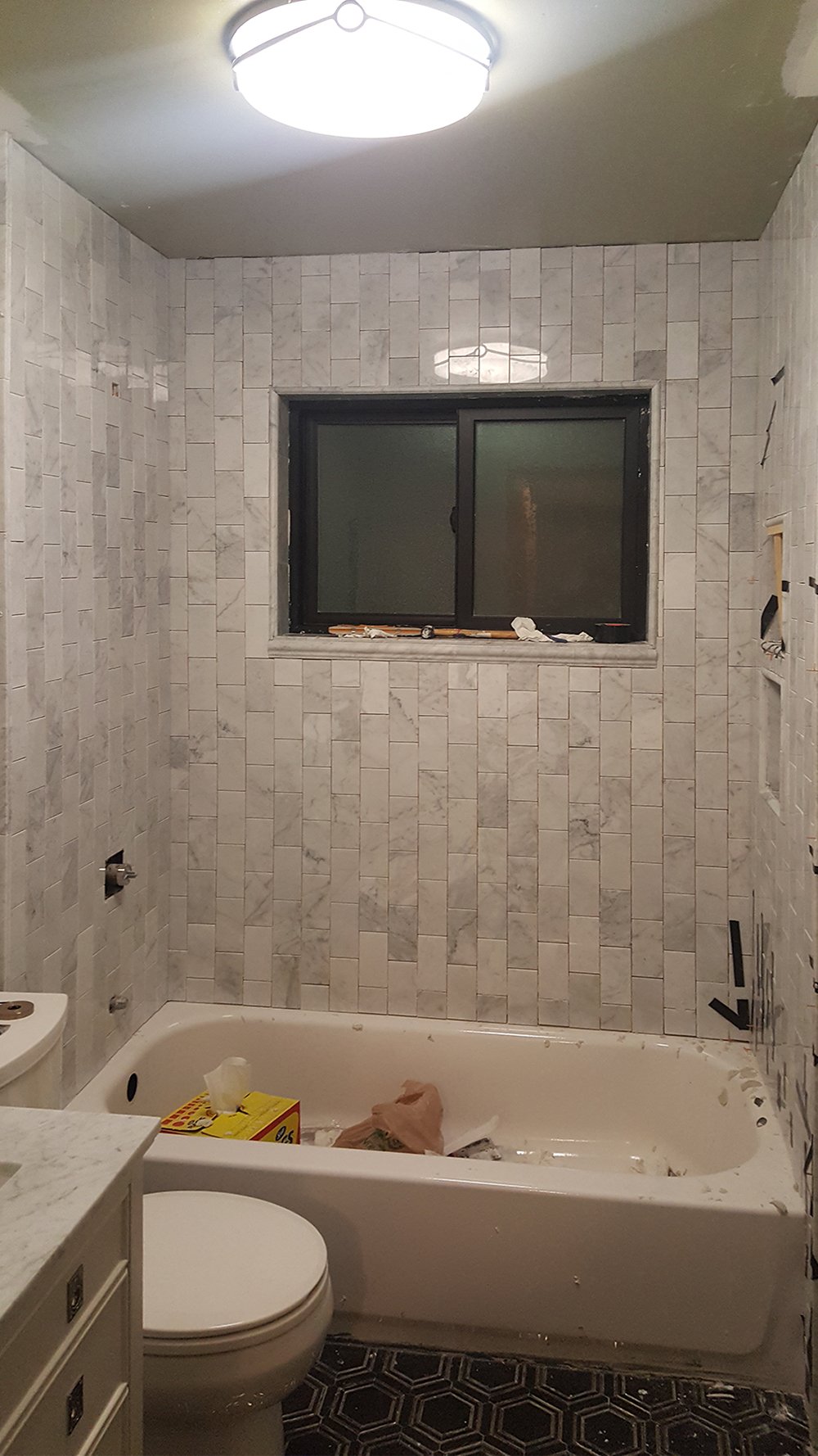 You can also catch a tiny peek of the installed vanity in the lower lefthand corner. Emmett started installing trim and I’m planning a shower curtain DIY for next week’s ORC update (hint… it’s being installed from the ceiling). Definitely come back for that if you’re short on space in your bathroom. It makes a big difference!
 I’d love to hear your thoughts on our process so far! Are you into the tile I picked out? I’ve really been enjoying everyone’s ORC spaces. Click the logo below to see the other talented guest designers participating….